WordPress 4.4 was released earlier this month, and it came loaded with new features and enhancements. We now have responsive images, better embeds, phase one of the REST API, and of course, a new WordPress theme: Twenty Sixteen.
So, how does the new WordPress theme fare? In this post, I will be taking a closer look at the Twenty Sixteen theme.
Twenty Sixteen
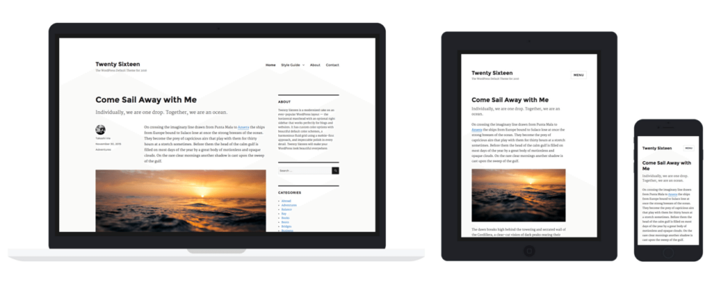
At first look, Twenty Sixteen does not seem to deviate much from its predecessor in terms of genre. It is a clean and minimal theme, with a good deal of white space, clean typography, and responsive layout making it ideal for blogs, much like Twenty Fifteen was.
The annual WordPress theme for 2016 is a modern take on an ever-popular layout. Twenty Sixteen‘s horizontal header area with an optional right sidebar works perfectly for both blogs and websites. It features free custom color schemes, a harmonious post grid that will make your homepage look sharp on any device, and impeccable polish in every detail. Your WordPress will look beautiful with Twenty Sixteen.
Let us dig deeper, and check out what Twenty Sixteen is actually capable of.
The Layout
Twenty Sixteen offers a traditional blog layout with a sidebar next to the content area. You can add widgets to the sidebar to make it visible, or if you prefer something more simple, don’t add any widgets and the sidebar will disappear.
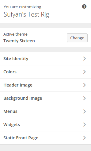
The theme also offers two additional widget areas below the content. You will need to navigate to a single post or page in the Customizer, then head to the Widgets section and add widgets to the relevant section. I tried multiple times, but even on single posts, the only place where I can place widgets is the sidebar. It might be an issue specific to my test site, but it is something to be aware of.
Content
By making use of excerpts, Twenty Sixteen lets you add a post intro section. The theme relies heavily on large featured images, which is especially good if your blog specializes in long-form content.
As with most other decent WordPress themes, Twenty Sixteen supports the standard set of features: pull quotes, flexible header, post formats, social menus, editor styling, and so on.
Customization
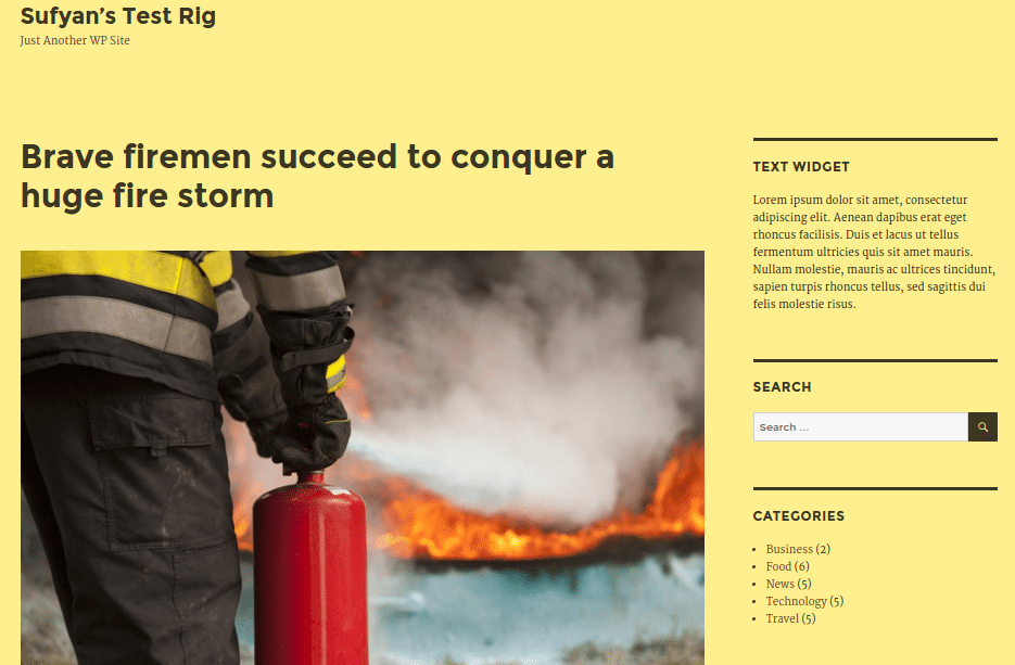
Amidst all other features, Twenty Sixteen also comes with a set of custom color schemes that you can choose from. Below is a look at the yellow theme:
Beyond that, you can also add a custom header, custom logo, and other customization tweaks to personalize your site.
Last Thoughts
Twenty Sixteen feels like a blogging theme mixed with a magazine layout. The theme does its job well: the typography is legible, the layout is clean and user-friendly, and there is no bloated back-end stuff to deal with. Overall, Twenty Sixteen is a decent WordPress theme that does not give you much to complain about.
I don’t understand the logic behind the obsession with large featured images. I will agree they look better on a minimal layout, but if your blog does not rely on gigantic featured images to get the point across, you are not the target audience for any of the theme released under the banner of Automattic or WordPress.org.
Having one theme or two loaded with big featured images is a good idea, but having nearly all of your themes shove the featured image down user’s throat is not. Look at some of the most popular WordPress themes released by either Automattic or WordPress.org — Publication, Adaption, Satellite, Canard, Twenty Fourteen, Twenty Fifteen (to some extent), and of course, now Twenty Sixteen.
All of these themes rely too much on enormous featured images, and this becomes slightly repetitive. It might look good in terms of screenshots, and it might be functional when dividing big chunks of text, but I’m personally not a fan of this layout. Also, I don’t believe these large images have any UX advantage either: if nothing else, users on smaller screens have to scroll an extra bit to get to the content, and that does not make up for a good UX practice.
Furthermore, I personally would have preferred the ability to change fonts from within the Customizer itself, without having to resort to custom CSS. Beyond that, a widgetized footer would make Twenty Sixteen even more awesome than it currently is.
Verdict
Twenty Sixteen is a solid WordPress theme and one that you can’t go wrong if you decide to use it. It serves its purpose well, makes your content stand apart, and requires no major backend efforts. Looking closer at it, for some users, myself excluded, Twenty Sixteen does appear to be slightly bland, and probably lacking in personality, but that has more to do with minimalism being the current trend in blogging and less to do with Twenty Sixteen in itself.
You can download Twenty Sixteen here, or check out a demo here.
What do you think of Twenty Sixteen WordPress theme? Love it or hate it? Share your views in the comments below!


3 Comments