Responsive design has been around for quite many years by now. And with the advent of WordPress 4.4 in December last year, responsive images became a part of WordPress core.
What does this imply for WordPress users and developers? In this article, we will be discussing what is meant by responsive images in WordPress core, and why you should be happy about it.
Working With Responsive Images In WordPress Core
Background
While responsive images have only recently found their way in WordPress core, the concept of responsive images in itself is not new to the world of WordPress. Prior to version 4.4, this feature was being offered through the RICG Responsive Images plugin, and it is this very plugin that has been integrated in WordPress core in version 4.4.
Mode Of Operation
Basically, the feature works by adding two new attributes to all your uploaded images: srcset and sizes. The entire process happens in the background, and when a given image appears on the page, it carries the srcset and sizes attributes, which inform the web browser what version of the image it should use on the basis of the user’s device resolution.
Naturally, there is no visible user interface for this, and the end user does not need to specify any additional information when uploading the images to WordPress. Everything happens in the background, and the end result is that users get crisp and responsive images that look great on their devices. Furthermore, it also yields benefits in terms of performance, as the browser need not download larger images and this can give speed boost to your website.
Theme Developers
As a theme developer, you’ll probably wish to adjust the image attributes in the functions.php file so that your theme can make full use of responsive images. WordPress 4.4 has provided some new functions and many new hooks that you can make use of for this task, and you can find all the info you need in the documentation.
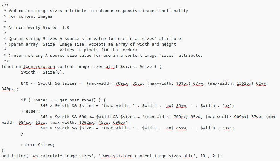
A good example is the Twenty Sixteen theme, which is the new default theme for WordPress. If you check out the theme’s functions.php file, you will notice two extra functions at the end, that are filtering image attributes so that responsive images can fit the breakpoints inside the theme easily. See this:
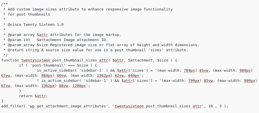
And for thumbnails:
The above two functions are filtering the sizes attribute for images in order to make them fit the viewpoints. Of course, this is a sample implementation, and you can edit your own functions accordingly.
Disabling Responsive Images
Considering the fact that responsive images are still a fairly recent addition to WordPress core, there might be issues with certain themes or plugins, or you might face conflicts in terms of code.
If this is the case, you might wish to temporarily disable responsive images. Unfortunately, there is no direct way to do this, so you will probably have to edit the theme’s functions.php file or make use of an external plugin.
You can place the following code in your theme’s functions.php file in order to disable responsive images:
add_filter('wp_get_attachment_image_attributes', function($attr) {

   if (isset($attr['sizes'])) unset($attr['sizes']);

   if (isset($attr['srcset'])) unset($attr['srcset']);

   return $attr;

}, PHP_INT_MAX);

add_filter('wp_calculate_image_sizes', '__return_false', PHP_INT_MAX);

add_filter('wp_calculate_image_srcset', '__return_false', PHP_INT_MAX);

remove_filter('the_content', 'wp_make_content_images_responsive');
The credit for the above code goes to Stack Overflow user Birgir Erlendsson.
Alternatively, you can also use the Disable Responsive Images plugin which follows a similar approach but does not ask you to edit the theme files.
Conclusion
While you might need to disable responsive images temporarily if you have issues with your existing set of themes or plugins, you should know that responsive images are the future of the internet. As the web moves more and more towards mobile devices such as smartphones or tablets, responsive web design in general and responsive images in particular become all the more important.
As such, the presence of responsive images is a very welcome addition to WordPress core. This will give a much-needed performance boost in terms of reduction of resource usage and unnecessary requests between the browser and the server, and also yield a faster and better experience for website visitors.
Lastly, since everything happens behind the scenes, there is no need for end users to be worried about configuration or tweaking their WordPress sites.
If you build themes for WordPress, have you given responsive images a spin yet? Share your views in the comments below.


No Comments