Information architecture (or IA) may sound as if it’s purely academic, but it’s actually quite practical. How you present the content you’re publishing on your site, together with the paths you lay out for your users to find and consume that content, are essential to the user experience.
In this article, we take a broad look at IA, and offer some practical advice to help you build a better WordPress site.
What Is Information Architecture?
Essentially, IA is the science of figuring out what you want your site to do and then constructing a blueprint before you dive in and put it all together. The key is making your content easier for your user to find, understand, and use, no matter what format it’s in.
There are four basic functional components of an IA plan:
- Organization – how content is assembled, presented, and organized
- Labeling – what you call your site elements and how that’s represented (e.g., the words on the tabs in your navigational menu)
- Navigation – how users get around on your site
- Search – how users find what they’re looking for
Preliminary IA Work
Before you can build the IA plan for your site, you first need to do some preliminary work.
Step 1: Start by identifying the site’s goals and objectives. What is the site’s purpose? What do the owners of the site want the site to accomplish?
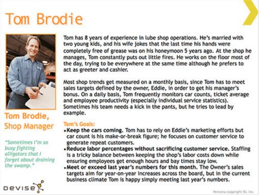
Step 2: Next, identify the site’s end users. The more specific you can be about who those people are, the better your IA plan will be. One way to accomplish this is to create user personas. An example of a completed user persona can be seen in the screenshot below from Smashing Magazine.
Step 3: Next you want to sketch out the user’s journey(s) through your site. Where will they come from? How will they enter your site? Keep in mind there’s more than one entrance into your site — theoretically, any page could be the “door” for a user.
Consider where the user will go next, and how they’ll know where to go — this will give you ideas about how to help them with navigational aids.
Step 4: Finally, you’ll need to analyze your content needs. If you’re redesigning a site, you’ll need to conduct a content inventory, identifying the pieces of content you have to work with.
Then you can proceed to identify any gaps in your content — what new content will you need, and how will it be created (i.e., via outsourcing, client, your team, etc.)?
Organizing Your Content
The next step is to convert your user journey maps, content inventory, and content gaps list into an organizational structure and scheme.
Organizational schemes can be either exact, subjective, or a hybrid of the two. Exact schemes are those that are objectively identifiable. Examples include alphabetical (phone directories, staff listings), chronological (timelines, tutorials), and geographical (or location-based) schemes.
The most common subjective scheme the topical scheme, but task-based and audience-based schemes can also be used effectively.
There are also different types of organizational structures. For most topical schemes, the hierarchy is the most appropriate choice. In a hierarchy, you work on the basis of an outline, with nested pages covering sub-topics.
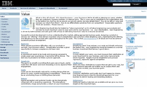
When creating your organizational scheme and structure, think long term. Your structure must be scalable for future anticipated growth. Additionally, try to avoid being too narrow or too shallow in your content approach. Look for the balance between breadth of topics and depth of detail, as depicted graphically in the annotated screenshot below.
Labeling: What It Is And How to Do It
How you label site elements is also important. Labels are how users interpret your structure and how they navigate your site.
Labels are both signs to and shorthand for content. Think about your “Contact” page. Your users immediately know when they see the word “Contact” in your navigation menu that they’ll find contact information or a contact form when they click that tab.
Users carry certain expectations into their site experience. For example, blue underlined text on the web means “clickable link” to most users. Tinker with those user expectations only when necessary.
Vocabulary is crucial in labeling. You want to ensure you’re speaking your user’s language and using the words they would use. In other words, if your users say “lawyer,” don’t say “attorney.”
Helping Your Users Navigate Your Site
It’s important to build redundancy into your navigation systems. You never want a user to feel lost or confused on your pages. One approach to consider as a guideline is the “two-click rule”: a user should be able to get to any page on your site from any other page within two clicks.
Placement of your navigation elements matters, as well. A 2004 study from Kingsbury and Andre suggests that users prefer navigational patterns that are either “top-left-left” or “left-left-left” as depicted in the two screenshots below:
Example of top-left-left navigation pattern:
Example of left-left-left navigation pattern:
Breadcrumbs can also help users see where they are on your site and how to get to the next page they’re interested in, as can other navigational aids such as “next” buttons and status bars.
To Search Or Not To Search?
As easy as it is to add a Google search bar to your site, you may wonder why it’s even a question. Why wouldn’t you want search functionality?
For one thing, searches fail for many reasons. When they do, the result can be user frustration, which can negatively impact the user’s view of your site. Additionally, if a user search returns sparse results or no results at all, the user may (inaccurately) view your site as incomplete or non-authoritative.
If your site only contains a few dozen pages, search isn’t really necessary. You can replace it with a strong organizational structure, clear labeling, and primary plus secondary navigational tools.
Additional IA Resources
If you want to dive deeper into the subject, several books are available, each of which can give you a deeper understanding of IA in practice and theory:
- Information Architecture: For the Web and Beyond (4th ed.), by Louis Rosenfeld et al. is considered the leading work on the subject
- Intertwingled, by Peter Morville
- How to Make Sense of Any Mess, by Abby Covert
- The Elements of User Experience: User-Centered Design for the Web and Beyond (2nd ed.) by Jesse James Garrett
Finally, Usability.gov has a solid selection of tools and articles that will help any site owner or developer create a better IA.
Conclusion
Hopefully, now you see that information architecture isn’t some esoteric, “thinky” subject with no practical application — quite the opposite, really.
It’s designed to help you make your users happy, give them a smooth experience, and aid them in achieving their goals with respect to your site.
In a nutshell:
- Start by identifying and understanding your user base thoroughly, through the use of user profiles.
- Create your organizational structure and scheme, based on what makes the most sense for your niche or topic, your goals for your site, and your users.
- Add navigation and labeling systems, always keeping in mind the end user.
- Use the recommended resources we’ve provided to dive into these steps in more detail.
Do you have any questions about IA that we didn’t cover here? Ask them in the comments section below!


No Comments