One of the core elements in a new User interface has to be that it is easier to use on a mobile device. People are using mobile devices more for content consumption and content production but so far (as an android users) I haven’t really been convinced enough to make the switch to using my tablet or phone [or more recently Phablet in a Glaxey note 2] to produce web content.
The main issues have been
- prolonged writing on a touch screen keyboard
- auto correct spelling
- image positioning
- editing text
The Native app addresses some of these issues, providing a simple interface and large interface for both your text and touch screen and some simple editing options including inserting photos, but for full editing options you have to log in to the dashboard (which you can do from the mobile app).
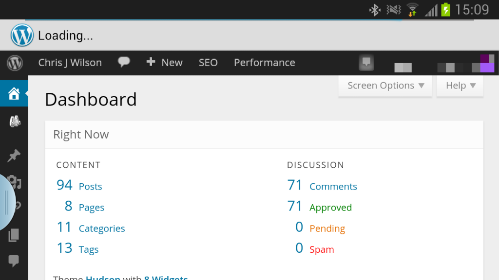
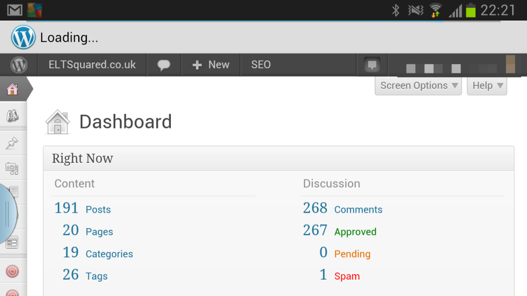
As such the question about how mobile friendly the new MP6 interface is important and I decided to do a little experiment by uploading the plugin to one of my blogs and using the interface on my Note 2. I’ll compare it to another one of my blogs where I’m still using the traditional interface.
Bolder Icons
The icons on the side bar certainly stand out more and there is a much clear contrast between the sidebar and the main content area (since the change from a white and grey colour scheme to a black and blue one).
On a mobile interface with a reduced area to work on these differences are more important and assist in navigating around the interface more.


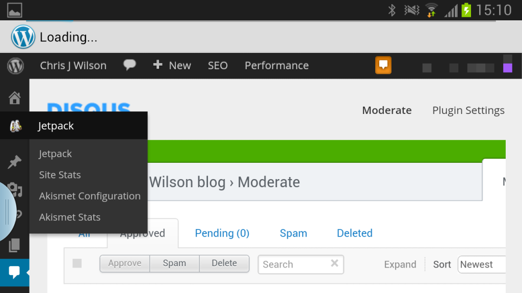
Drop down boxes stand out
Trying to select and option from within the interface isn’t the easiest and but a long touch will bring out your options who also contrast more with the background.
Of course this intrudes massively onto your screen but if you want to change screen I guess you don’t mind.
Do touch your Jetpack notification
I noticed I had a Jetpack notification when I was on my site so I decided to touch it. It made everything go crazy and whilst this isn’t something exclusive to the MP6 plugin it is an area which needs to be improved upon.
“A” for Effort, But…
I keep wondering how could automatic improve upon their mobile experience. I remember using the mobile app back in 2009 and not being amazed with it back then. It was a great way to draft a post idea but you certainly couldn’t use it as your only means of blogging.
Fast forward four years and I don’t really feel that a great deal has changed. I still only really use my phone to draft or write an outline and rarely write a full post on it.
Although the MP6 interface, a sign of the future direction of the WordPress interface, does help the mobile interface still leaves room to be improved upon (especially for the un-html proficient writers out there who really should learn some basic html).
My recommendation would be
- more adjustable imaging positioning
- more wysiwyg editor options (such as headers, (un)ordered lists etc)
- more cowbell
- and more drop down lists so you don’t have to keep scrolling to get to your format/catagory/tags etc that you want to enter.
For now I’ll keep my notebook for writing blog posts.


No Comments