Although you may already have some opinions on the new and upcoming yearly theme, Twenty Thirteen, perhaps it was just the color that was the most “dramatic” for you.
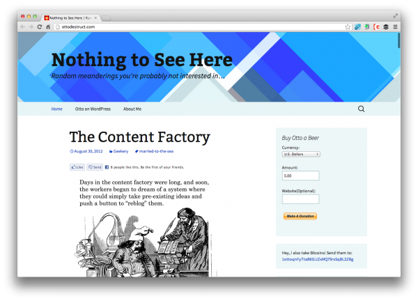
Well, if you’re not a fan of the orange then Otto has a solution – go blue folks, go blue:
I’m not a fan of the color orange. Dunno why. I prefer soothing and relaxing colors, like blues and greens. … So, I did a palette swap. Basically, I took the three header images, and swapped the Red and Blue channels, leaving the Green channel alone. Easy enough to do in Photoshop.
You can see the full implementation on his other blog here, OttoDestruct and you can also download the child-theme for your own use as well: Twenty Thirteen in Blue.
But either way, will you be using Twenty Thirteen in any of your upcoming projects? Or does it still give you the willy’s? We sat down and chatted about it briefly on our latest podcast episode as well, Hello Dolly. Check out our opinions on the matter.
Thanks Otto for your work. By the way, one of my favorite colors is orange.
😛


5 Comments