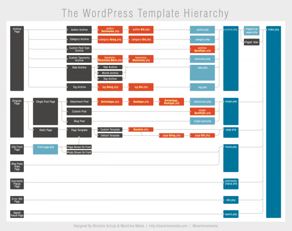
Although WordPress wasn’t built with native theme capability out of the gate it was obvious over time that a templating system just made sense.
And an entire industry was born, seemingly overnight (and it keeps getting better and better).
Well, in an effort to increase the usefulness for anyone interested in building designs for WordPress, Michelle from Marktime Media redesigned to make it easier to read and much more aesthetically pleasing. An interesting take, for sure:

As a person with a passion for infographics and simplifying the display of data, I am always looking for ways to make information more clear. The world is filled with an ever-increasing amount of data, but this data is only useful to us if it is usable.
A well designed infographic makes even the most complex ideas understandable, but a poorly designed infographic can make simple ideas needlessly confusing. It is this exact usability issue that plagues most infographics today, even within a place I seem to be spending an ever-increasing amount of my time: the WordPress Codex.
However, while the information compiled on the Template Hierarchy is great, the visualization of it can hinder its use due to its inability to be quickly scanned and understood. So, I decided to take it on as a personal project!
I’m glad she made a go at it. Thanks Dusty for the tip! Her priorities were as follows with this project:
- Better quick scan left-to-right readability
- Ease distinguishing primary templates, secondary templates, and templates with a variable from the content types
- Cohesion with the WordPress brand, including colors and aesthetics
What do you think of this implementation? Have any thoughts?

9 Comments