In scouring the many WordPress plugins that exist on the web for my work on Tidy Repo, I’ve noticed some trends. Some plugins do very little; I’ve often said that plugins like Quick Page / Post Redirect and Simple Google Maps Shortcode “do just one thing, and do it well.”
Others are more robust, offering turn-key solutions for large-scale problems. Think WooCommerce or Buddypress. It’s only very rarely that I come across a plugin that is actually somewhere in the middle of these two categories, and it got me thinking about which approach I prefer. And the more I thought about it, the more I seemed to approach my general philosophy toward plugin development.
Do Less
My thought process started when I was watching Forgetting Sarah Marshall again, which is an excellent comedy I hope y’all have seen. In one of the scenes in the movie, Kunu, played by Paul Rudd, is teaching Peter, played by Jason Siegel, how to surf. His advice is hilariously counter-intuitive.
Don’t do anything, don’t try to surf. Don’t do it. The less you do, the more you do.
Being the avid WordPress nerd that I am, my mind instantly made a connection to plugin development. “Do Less!” should be the motto of plugin developers everywhere. There are too many plugins that come bloated with endless options, most of which are never used. Plugins that have a confusing UI and are hard to navigate. My favorite plugins do most of the heavy lifting behind the scenes, then give you just enough room to make small tweaks. It gives you every option you need, and none that you don’t. There’s a fine line in the sand somewhere, and I know it when I see it.
So that must be the answer. We need plugins that do less. That do one thing and do it well. If the functionality is too verbose, move it to a new plugin, and move on. And just like that I felt as if I finally crystallized my thoughts on plugin development down to one simple phrase.
Do Less, Sometimes
That feeling lasted for about a minute. Utility isn’t always that simple, and some of the most useful plugins out there are loaded with options. Ninja Forms, which I think a lot of WordPress users out there have really liked, has options to customize individual forms, global options, a full developer API, and even it’s own extensions. It’d be silly to dismiss all of these extra features as unnecessary. Or say that the plugin should just be able to create forms, that you shouldn’t be able to say, send email notifications, or mix in custom CSS. These things are required by WordPress users that want to create forms. The plugin needs to be able to do several things, or it just wouldn’t work.

And where is the line drawn? I’ve gone on record and said that Advanced Custom Fields is one of my favorite plugins out there, and I use it on virtually every project. Should each separate custom field be its own plugin? Should they be separated by groups? How many options should be included, and how well should they integrate? At the end of the day, I like that Advanced Custom Fields offers me a wide range of options and customizations. Period.
Thinking in terms of functionality silos just isn’t going to work. My “Do Less” slogan doesn’t quite work.
Do Less, Revised
But short of a few notable exceptions, I still tended to gravitate toward simple functionality, isolated use-cases and user interfaces that provided subtle options and tweaks. And I do think that, unfortunately, a lot of plugins become far too ambitious, filling in every single feature request they’ve ever gotten and slowly snowballing into something that is just a little too cumbersome.
There’s another quote that’s tossed around in the design community a lot these days. It’s attributed to Antoine de Saint Exupéry, a French poet from the 19th century.
Perfection is achieved, not when there is nothing more to add, but when there is nothing left to take away.
In the design world, this means pulling back the layers, giving content room to breathe, removing unnecessary flourishes until there is nothing left but the bare essentials. It stands at the foundation of minimalism and the new flat design trend.
It’s also the perfect answer to my Do Less slogan. A plugin really should do just one thing, perform one task, address one piece of functionality. But sometimes in order to do one thing well, a developer has to branch out. Only when it’s done a few things well, can it do one thing well.
Great, now I sound like Kunu.
Do as Little as Possible
The intent of this post was to find some nugget of advice from the hundreds of plugins that I’ve dove into and tested and pass it to you, the WordPress community. So here it is.
Make your plugin do everything it needs to do, and not a single thing more.
Nice and easy right? If that sounds a little vague, just think about your favorite plugins and consider the question: What is this plugin trying to do? The best plugins answer this with a single sentence. When you use these plugins, don’t you find yourself muttering “Oh, that’s nice” when you find that one feature you need, at the exact moment you needed it?
Let’s try to embrace this strategy in our plugin development. The first thing to do is boil down the functionality of your plugin to a single sentence.
My plugin does …
- “My plugin makes search more relavent.”
- “My plugin adds images to comments.”
- “My plugin makes editing posts easier.”
There shouldn’t be an “and” in this sentence. Really think about your plugin’s features and identify it’s essential functionality.
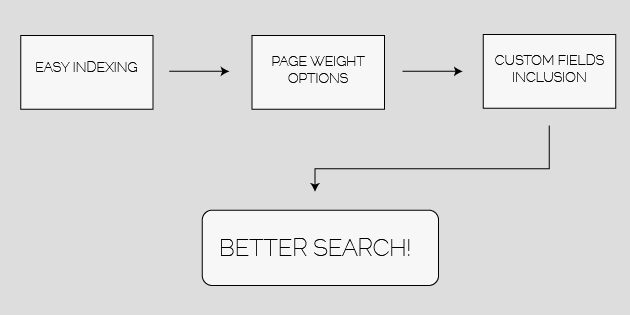
Then make a chart. Figure what a user will need to complete that task. Draw it out or scribble it on a napkin, but have it before you even start building your plugin. As you go along, it will help ground the process. If there’s a new feature or option you can also check to make sure it fits in with your chart.

Make sure options are absolutely essential to your logline, or don’t include it. Evaluate certain features and see if they can’t be combined with others. If something feels heavy, take it out. Then play around with the plugin, do a little informal user testing, and see if anyone even notices. I know it may have taken you a really long time to get this feature or that up and running, but if you leave it in it’s going to drag down the quality of the rest of your application. Identify the points that might be confusing users and either refine or remove. Think it through.
And most importantly, do as little as possible. Because the less you do, the more you’ll do.
 Jay Hoffmann is a WordPress developer hailing from NYC. In the strictest sense of the word, he is a WordPress enthusiast with an eye for front-end development and design. He has been working with WordPress since 2006 and currently works for a popular children’s media company. This year, Jay started Tidy Repo, a curated list of the best and most reliable plugins from around the web.

5 Comments