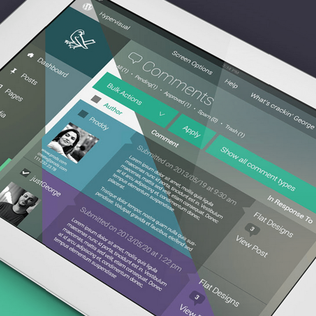
A responsive concept redesign of WordPress admin—featuring the dashboard, media gallery, iconography, widgets, and colors—has been posted by Melbourne-based UI Designer and Frond-End Developer George Kordas.
Imran Hunzai of iHunzai.com called it an “inspirational and out of the box design.” He explained:
The redesign gives the feeling of the new iOS7 design which is more flat with a glassy look.
On Advanced WordPress, a few people questioned the usability of George’s design. One member pointed out that the removal of shadows, bevels, and gradients makes it difficult to discern which parts are clickable, and which aren’t. Overwhelmingly though, people described the design as “beautiful.”
This is what George had to say about his work:
Created in 2011, this design was designed to the current HTML and CSS markup[.] I wanted to create a fresh new look at the WordPress admin panel to create a more current and engaging user experience.
George plans to release the redesign as a free plugin. Follow him on Twitter to get updates on the release date.
What are your thoughts on George Kordas’s concept redesign?
 Kirby Prickett is Torque’s Editorial Assistant. She hails from the Land Down Under, where she worked in economic consulting and government. You can find more of Kirby’s writing on her blog, where she writes about books, film, San Francisco, yoga and other topics that take her fancy.


6 Comments