One of the best ways to enhance the polish and professionalism of your website’s design is to choose great fonts.
The process of choosing a font, or a combination of fonts, is often dismissed as an easy task. But the truth of the matter is—when editing a WordPress theme or trying to roll-your-own web design—deciding on typography is actually much more than a process. It’s an art, in and of itself, and there is a lot more to it than meets the eye.
Designers who went to art school, and font foundries filled with people talking about things like “ascenders,” “descenders,” “stems,” and “serifs,” understand what a lot of people may take for granted. When designing a font, typographers aren’t arbitrarily drawing letters in the alphabet. Instead they are combining all of their knowledge and experience in the fields of design, psychology, and anthropology to create typefaces that communicate something—beyond the words created—when their letters are put together on the page or screen.
In the last five years the job of the web designer (or amateur web designer) has gotten much harder. Not too long ago we were limited by what fonts we could safely use on our websites; we were forced to choose from web-safe fonts that were available on any operating system. Today, though, most browsers support some form of web font loading and services are popping up all the time that let you include special fonts in your code, all served up from their super-fast content delivery networks.
What this means is that it’s increasingly more difficult to choose the right font, or combination of fonts, for our designs. Luckily, there are rules and guidelines you can follow to help evoke the desired emotional response from your visitors.
Choosing Fonts for Emotion
When web designers are crafting site designs, we are trying to capture the emotional interest of users. Whether it’s graphic and visual design, user experience, or interaction design, any designer worth their salt is paying attention to how potential users will *feel* as they use the site.
Shapes
The shapes of the fonts we use and how we combine them are important to triggering that emotional response we want a visitor to have. Shape could include how thin or heavy a font is, whether it has serifs or not, how wide the individual characters are, and even the spacing set between those characters.
Classifications
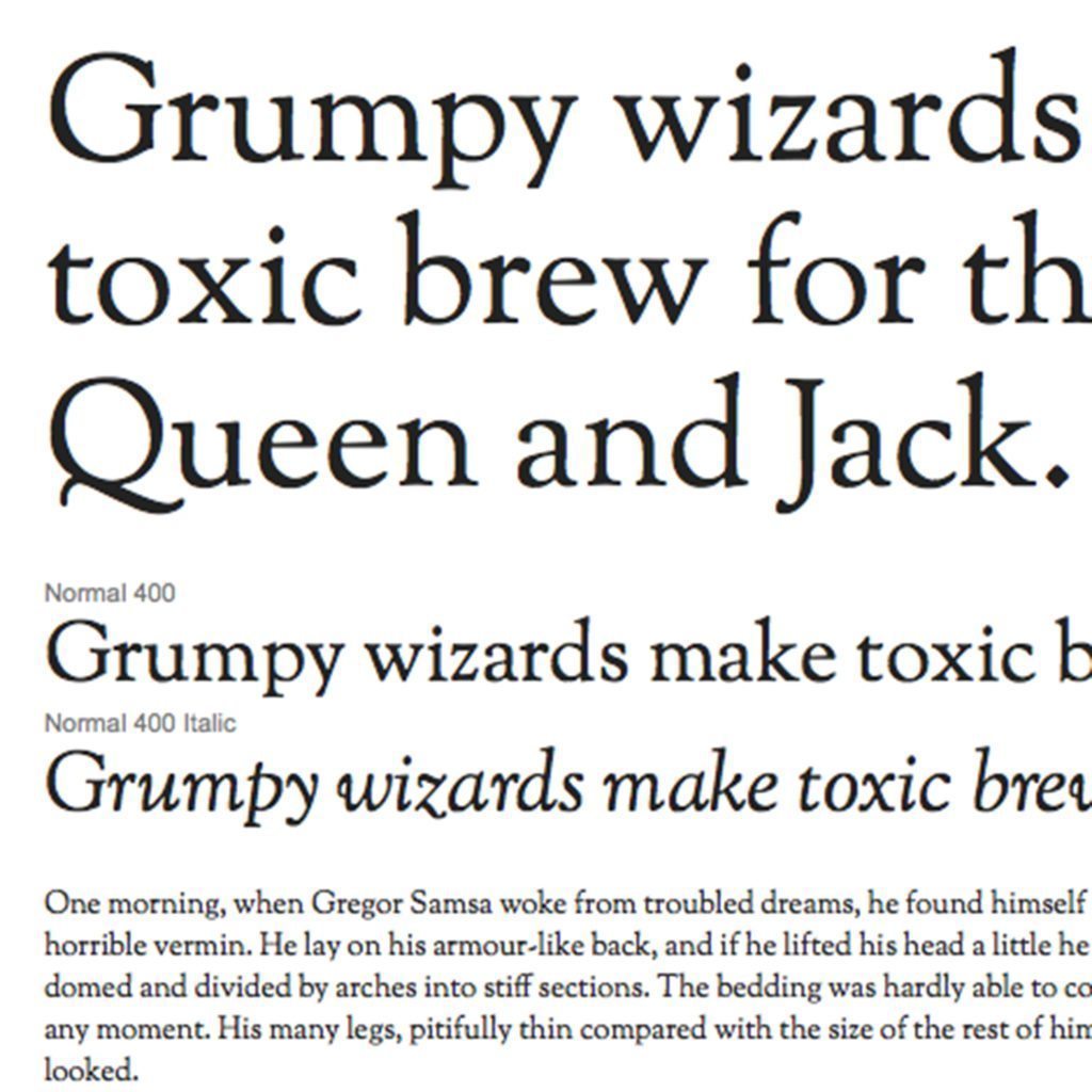
There are a few major classifications we can apply to typefaces: Serif, Sans Serif, Script, and Display. (There are a few others that are more aptly suited to print design.) Serif typefaces are so-called for the tails (also called serifs) that hang off of the edges of each character. Sans Serif typefaces have no tails. Script typefaces look like cursive writing. And finally, the Display classification holds all of the weird, decorative typefaces that you might come across.
Serif
Sans Serif
Script
Display
Within each of those major groups we have smaller subgroups of typefaces like Egyptian/Slab Serif fonts, and Geometric San Serif fonts. From here we can pull some basic guidelines for solid web design.
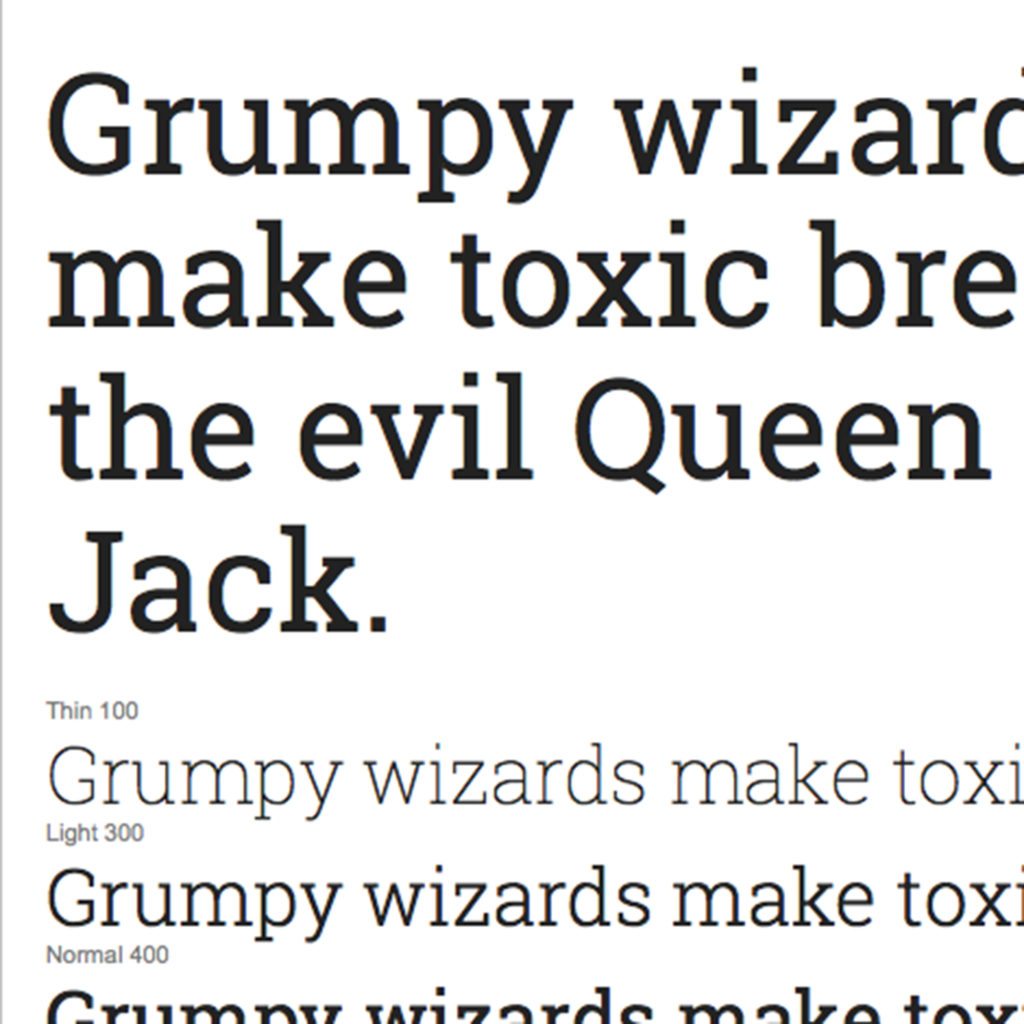
Slab Serif
Rules & Guidelines
1. Don’t mix more than two different fonts.
This is a ‘rule-of-thumb’ situation. It is hard enough to match two different fonts together and make things look balanced, professional, and cohesive. Add any more typefaces to the mix and you’re setting yourself up for visual trouble.
2. If you’re mixing two fonts, don’t choose them from the same classification group.
In other words, don’t mix two different serif fonts on the same page. And don’t mix two different sans-serif fonts. Or two different script fonts. It looks awkward. Your visitors’ brains will subconsciously (or if they’re a designer like I am, full-consciously) register that something is off-balance.
That brings us to number three.
3. You can get a lot of mileage out of one font family.
If you choose a typeface that includes a range of different weights and styles, you’ll be surprised at how dynamic that single font can be. I often use fonts likes Source Sans Pro or Open Sans because they provide a wide range of weights—from super-thin to ultra-heavy—and that allows for great flexibility.
4. Some fonts are better for titles and some are better for copy. Don’t mix them up!
I’m sure you’ve visited a site that uses some crazy font for its main content. Maybe it’s a script font or maybe it’s (horror!) Comic Sans. It makes your desire to read that copy infinitely smaller, right? It’s bad enough to see a gigantic block of copy on the screen, but throw in a difficult-to-read typeface and they’ve completely lost you.
Headings exist for a couple of reasons. The practical reason is to label the content of the text that follows. The unspoken reason is to make an impact and draw attention so that you’ll read that copy. Consider a condensed version of your font (Open Sans has a great condensed variant) in a bold weight for a title, but don’t use it for your body text! Or maybe a slab-serif like Roboto Slab for a title.
Body copy, then, needs to be easy to read. In most cases you’ll want to go with something a bit more vanilla. Try a normal weight of Source Sans Pro or Open Sans. Or maybe go for a serif font like Georgia or Merriweather. But, please, think about your readers. We don’t want to read a whole block of text set in Papyrus. Honestly, we’d be happy to never see Papyrus again.
5. Pay attention to licensing
There are a lot of good fonts out there. And most of the great ones cost a lot of money. They generally do not come with a license for you to put them on your website. And if you do, you’re asking for a world of hurt.
Don’t guess at whether a font is okay to use in your site. There are plenty of web font services to choose from. If you happen to have an Adobe Creative Cloud subscription, you get a free account to Typekit and access to hundreds of fonts created by and licensed from professional font foundries. Or license individual fonts from MyFonts.com. If you’re fine sifting through some terrible typefaces, Google Fonts has collected a range of free and open source fonts for use on the web.
Layout
Additionally, you’ll want to pay attention to things like line-height (also known as leading), letter-spacing (also known as tracking), and font-size. If your type is small and crammed together, it doesn’t matter what font you’re using.
Judge the balance of your page by keeping a consistent hierarchy of font sizes.
Hierarchy
Hierarchy is used to decide what has the most importance on your webpage and that flows down into your type. Make sure section headings (h1, h2, h3, h4, h5 in HTML-speak) decrease in size evenly and that the space between them and the following body copy is consistent.
Consistency
Consistency is half the battle in getting typography right. If your line spacing, margins, font sizes, and font usage are consistent, you’ve pretty much won the game.
Resources
There’s a load of great typography advice and direction on the web. Here are some of my favorite resources:
• Thinking With Type
• Butterick’s Practical Typography
• I Love Typography
• FontBook
• Typekit
• Adobe Edge Web Fonts
• Google Fonts
 Joel G Goodman is a jack-of-all-trades marketer, designer, and front-end developer at his creative media agency, Bravery Transmedia. He has been designing and developing websites for bands, universities, bakeries, bloggers, professionals, and startups since 2007 and holds a master of arts degree in Media Studies from The New School for Public Engagement. Joel lives in Austin, TX where the sun shines warmly and the tacos never run out.


1 Comment