Do you use WordPress? If so, your world is about to change—and you’re not alone. Recent statistics show WordPress now powers close to 20% of the web and controls close to 60% of the Content Management System market. So when big changes are rolling out, there’s a lot at stake.
This week’s release of WordPress 3.8 named “Parker” after jazz legend Charlie Parker shows that the platform (and its developers) take this responsibility seriously and aim to further simplify web publishing for everyone. You can download it right now from WordPress.org or upgrade your existing WordPress site directly from the dashboard.
Let’s dive in and take a closer look at the WordPress 3.8 release:
New User Interface Design
New versions of WordPress follow a general pattern: odd numbered releases are mostly back-end upgrades, and even numbered releases carry with them feature additions, front-end upgrades, and changes. So it should come as no surprise that 3.8 has some new features.
But unless you’ve been paying close attention to the beta releases and general talk in the community, the extent of these new features may surprise you. Version 3.8 is not just a feature upgrade: It’s a long awaited—some might even say overdue—facelift.
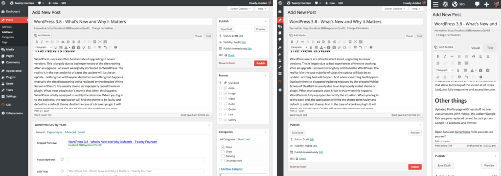
Farewell to the skeuomorphic, low contrast rounded corner UI of old. Hello to a responsive, modern, touch-friendly, typographically-rich user interface.
Over the past year a team of developers headed by WordPress co-creator Matt Mullenweg have been working on a new user interface, codenamed “MP6”. The MP6 UI aimed to solve a series of issues from responsiveness to high-resolution graphics, among many other concerns.
Originally developed as stand-alone plugins, MP6 and its cohorts DASH (simplified dashboard), THX38 (new theme experience), and the Widget Area Chooser are now baked into the WordPress core code, providing a whole new administrative experience that is simpler, more accessible, and works beautifully across all screen sizes.
The only real way to get the full story on the new UI is to try it for yourself—so as you dig in, let me direct your attention to some of the finer and less obvious points:
As mentioned previously, the MP6 admin UI is fully responsive—meaning as screen sizes change, the layout resizes and reformats to provide the best possible user experience. This provides tablet and smartphone users—and also Windows 8 users utilizing Snap–a much improved user experience, and makes WordPress administration truly mobile out of the box. As part of this move to responsiveness, the WordPress Toolbar has been subtly changed to be touch friendly by making the bar and its buttons bigger as screen sizes get smaller.
On the font side, the new admin UI swaps out Arial for the Google font Open Sans which has looser kerning (more space between the letters) for increased readability. Just as important but less obvious, the new UI also replaces its image-based icons for the custom Dashicon icon font to ensure crisp, sharp icons–regardless of screen resolution.
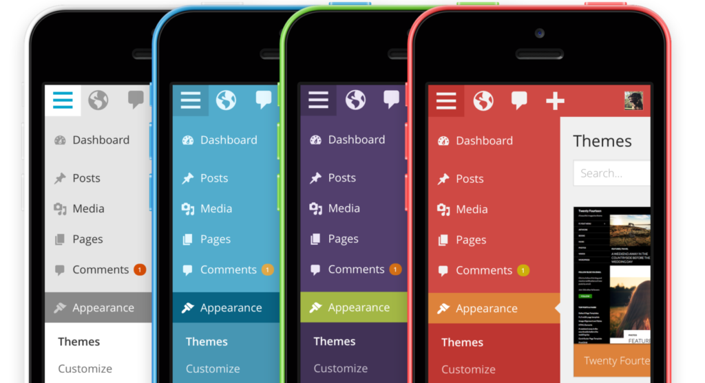
And if you don’t like the default charcoal-and-blue color scheme, you now have seven other versions to choose from: Default, Light, Blue, Coffee, Ectoplasm, Midnight, Ocean, and Sunrise. These new color schemes allow the user to pick an interface that fits more with their personality and mood and allows a more personalized experience.
Improved Theme and Widget Management
In tandem with the new admin user interface, the Theme and Widget Managers have been updated to provide better user experiences.
The Theme Manager has been reworked with the same minimalist approach as the overall UI, and now provides a more intuitive and less cluttered interface. Gone is the vertical separation between your active theme and the themes available to you, and theme info is moved to modal windows allowing for a quicker overview of available themes and a more in-depth inspection of theme info.
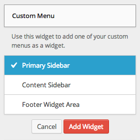
In addition to an overall redesign, widget management has been improved to alleviate an enduring frustration for anyone with a widget heavy site: simpler widget selection. Hidden below the traditional drag-and-drop behavior—which can be a sub-optimal experience when vertical scrolling is involved—the new Widgets UI allows the user to click on an available widget and select what widgetized (sidebar) area that widget should appear in. This is a very elegant solution that will save users time and frustration.
The Customizer has been updated with the new design, making it less obtrusive while also making it snappy and easier to use. Also, your theme’s info can be more easily read with a larger area of the screen now devoted to it.
Twenty Fourteen: A “Magazine Style” Default Theme
Since 2010, WordPress has shipped with a new default theme every year. Unfortunately these themes, named after their release year, have usually been released towards the end of their year. Not so with Twenty Fourteen, the new default theme that ships with version 3.8, which (to paraphrase Matt Mullenweg himself) follows a release schedule more like those of automotive manufacturers.
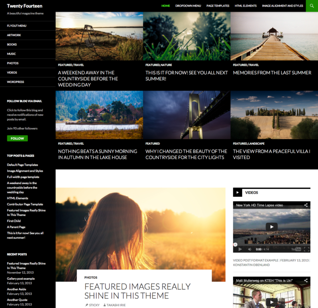
Twenty Fourteen is a magazine-style theme with a heavy focus on featured content sliders and tiles, as well as large images. These types of themes have proven exceedingly popular amongst WordPress users, and Twenty Fourteen aims to answer the need for visual options aside from plain old blog themes. In actuality, 3.8 ships with three default themes: The magazine-style Twenty Fourteen, the blog-centric Twenty Thirteen, and the CMS-focused Twenty Twelve.
Where Twenty Twelve and Twenty Thirteen were all about simplicity and singular focus, Twenty Fourteen is more of a massive-content-overload type of theme with plenty of options: The header allows for a large banner image or logo, there is an optional featured content area that displays sticky or tab-based posts in a carousel or tiled view, and the main content is boxed between two widgetized areas on the left and the right that disappear on smaller screens.
Concerns have been raised that this theme may be too content heavy and prone to clutter, but I recommend holding any reservations until we see how the WordPress community as a whole puts it to use. My two cents: always keep the widgets in your theme to a minimum. For an in-depth walkthrough of Twenty Fourteen and all it has to offer stay tuned for my upcoming course Start with a Theme: Twenty Fourteen over at lynda.com.
Other Updates of Note
WordPress 3.8 (and in some cases 3.7 and 3.7.1) also introduce some other, less talked about updates including:
- Auto-updating for point releases (which was actually introduced in 3.7.1)
- A smarter password strength indicator for more robust security
- Many other core code updates to give developers new power and capabilities
The New is Now
Now that you have a clear understanding of what WordPress 3.8 is all about, go forth and download it or update your own site (after making a backup of course). WordPress has always been on the cutting edge of current web trends, and 3.8 will put you and your site firmly at the forefront of modern web development best practices.
Now we turn it over to you. What do you think of the new user interface design and the new features? Are you going to use the Twenty Fourteen theme? Are you excited about being able to use the WordPress dashboard on your mobile devices? Share your thoughts and start a discussion in the comments below!
Author note: Under Other Updates of note the Auto-updating feature and smart password strength indicator should correctly be attributed to 3.7. See comments below.
 Morten Rand-Hendriksen is a lynda.com author focusing on WordPress training, and a web designer and developer–with a passion for clean design, standards-based code, and open-source software. He has published several books, articles, and videos on these topics and is a popular speaker at conferences. Running a small boutique-style digital media company, he divides his time evenly between building web solutions and teaching others how to do things right and get the most out of the web. Morten grew up in Norway and made Canada his home in 2002.


16 Comments