Gone are the days when designers had to rely entirely on web-safe fonts and web typography meant simply a combination of Verdana and Georgia. Nowadays, with the advent of various web-optimized font formats, as well as the ever-popular Google Web Fonts, the task of picking the ideal typeface for your web design projects can indeed be difficult and confusing.
In this article, we’ll be discussing some of the simplest measures to take while picking the ideal web font for your design projects.
Introduction
Web typefaces serve two major purposes:
- To set the tone
- To guide users through the content
With those things considered, you wouldn’t want to use a font like Comic Sans MS in a scientific article (yeah that has actually happened), for example.
While choosing a font, you need to consider the tone of your page and the requirements of the users. For example, older users might not be happy with low contrast or ultra thin fonts.
The Appropriateness
Typefaces that are expressive and stylish need to be distinguished from those that are utilitarian and simple. While neither is technically more important than the other, each serves a specific purpose.
Certain typefaces are just like comfortable clothing—they can blend in with most occasions; we can afford to use them more often than others. But others, on the contrary, are more like your lavish partywear—not fit for everyday usage.
If you are someone who often works with web typefaces, you are probably already aware of font families. When it comes to working with multiple font families, we need to decide when and whether to mix and match. The importance of visual appeal comes into play. When working with typefaces from different font families, the best thing to do is to either keep them exactly the same, or change them a lot. Excess variance or no variance creates an easy relationship in terms of visual appeal.
That said, there is more to web fonts that just needs and necessity.
Readability
A good font is perfect in terms of readability. In fact, when it comes to font rendering, several designers rely entirely on browser defaults, simply on account of the fact that browser defaults come with guaranteed legibility. Aesthetics are not a substitute for readability by any means.
There are many factors that can ensure readability, but the one most important to consider is simplicity. Complicated and intricate typefaces are hard to read—that’s common knowledge. Of course, headings can be creative, but the body typeface needs to be simple. Similarly, unless you absolutely have to, it makes no sense to use more than three font families on the same web page.
The Message
As already mentioned, fonts have a role to play in setting the tone of the page. In fact, typefaces are equally as important as color and graphics in this regard. For example, decorative fonts can add whim, whereas heavier fonts can showcase strength and reliability. Along similar lines, bold headlines can come across as confident and strong—it is hard to overlook or miss a headline in bold.

On the other hand, a headline in a lighter font can be used to convey freedom and movement, because light fonts do not hijack attention as compared to stronger fonts. Furthermore, when working with font weights, it is a good choice to make use of varying contrast to highlight specific elements of your content that you would want your visitors to focus on.
Thus, coupled with the right color scheme and other design elements, judicious selection of fonts can be a useful tool when it comes to conveying the right message to your readers.
Specifications
As far as I have noticed, designers generally enjoy more flexibility in terms of font metric in the case of print mediums, as compared to the web or on-screen mediums. In print mediums, it is easier to control the size of specific elements, spacing, and other related details.
But in mediums such as the web, if your font suffers from horribly poor kerning or disregards factors such as x-heights and cap heights (that is, the heights of the middle and top of the font glyph), you just cannot work with it, simply because there is not much level of control or room for experimentation to begin with.
In general, when working with fonts for the web, I tend to look at three factors:
- Reader-friendly letter spacing
- Comfortable line height
- Consistent rendering between glyphs.
Of course, these are just broad guidelines, and when it comes to font metrics, there exists no concrete rule per se.
Conclusion
All said and done, picking the perfect font can be a complicated process. So far, I have refrained from openly naming fonts or citing font examples in this article, simply because I am biased in favor of open source and free web fonts. Even more so, picking the right font is more of a matter of personal requirements and preferences, and one can, at best, offer certain guidelines.
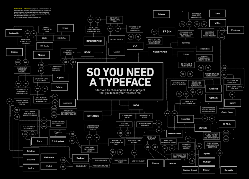
Yet, just in case you do need a handy guide to help you out with font selection, Danish designer Julian Hansen has got you covered, in the flowchart below (click to enlarge):
When used and implemented properly, fonts can greatly enhance the aesthetics and overall appeal of the web page. Best typography is one which is simple enough to be read and elegant enough to be aesthetic. However, unlike sidebar graphics and banner images, typefaces serve the dual purpose of readability and aesthetics, and the former should, by all means, be preferred over the latter. Good visual appeal can never eliminate good readability.
What are your thoughts when it comes to web typefaces? Share them with us using the comments below!
Image Credits: ksimari | Steven Wood | Dan Reynolds | romanlily
 Sufyan bin Uzayr is a freelance writer and Linux enthusiast. He writes for several print magazines as well as technology blogs, and has also authored a book named Sufism: A Brief History. His primary areas of interest include open source, mobile development and web CMS. He is also the Editor of an e-journal named Brave New World. You can visit his website, follow him on Twitter or friend him on Facebook and Google+.


1 Comment