When you’re trying to inspire engagement on your site, you want to implement the best practices to encourage further interaction, right? Right. Because if that’s not what you’re doing, then you should probably keep your thoughts in a private Hello Kitty journal on your nightstand instead of on the interwebs.
And the best way to inspire a response is a well-crafted Call to Action (CTA).
So, how does one go about crafting the perfect CTA?
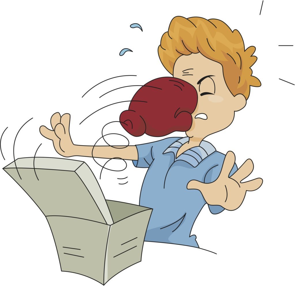
Well, think about your CTA like a good pick-up line; if executed correctly, you’ll get the reaction you’re hoping for. However, if poorly executed, you could end up getting a few teeth knocked out. (You know . . . getting punched in the face for being inappropriate, or slamming your head into your computer out of frustration)
Look Your Best
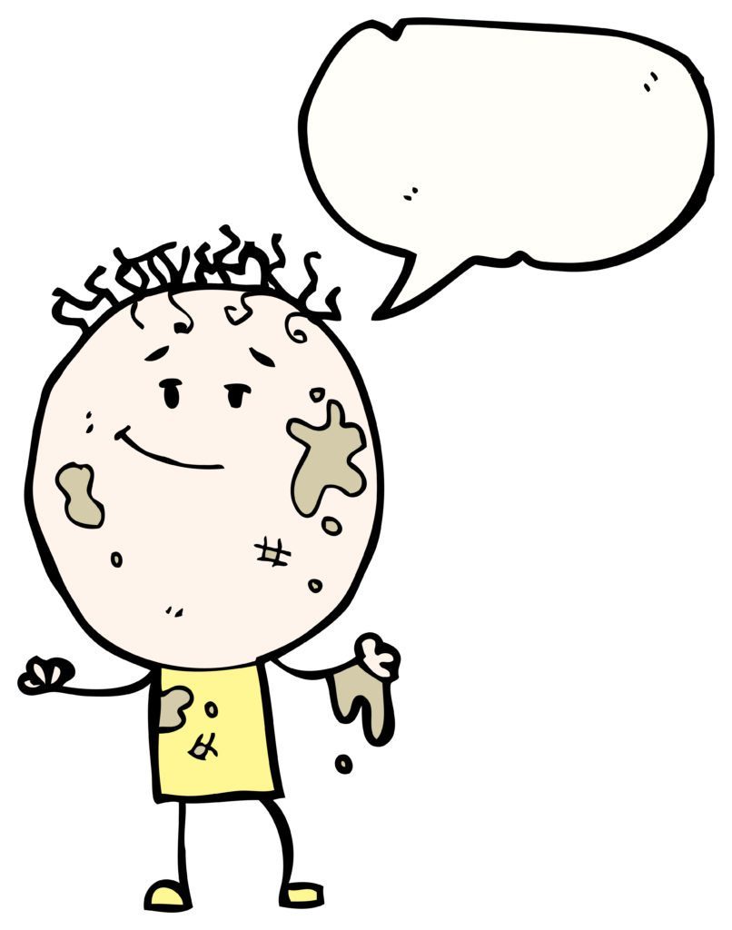
Just like you probably wouldn’t get the best reception by asking someone out when you have spinach in your teeth, or the barn door open—the same holds true for your CTA. You don’t want to approach your readers with your fly down. You want to look your best.
Make sure your CTA looks clean.
If your CTA comes in the form of a request to go to another page, consider using a button.
Whether your CTA is to add an item to a shopping cart, instructions to download a program, or to take a virtual tour—make sure your instructions are concise, clear, and easy to read.
Sure, there are those who go for the guys who look like they haven’t showered in days and smell like patchouli.
But, if your hipster look is verging (and smelling) a little closer to homeless than most people prefer, consider some personal editing.
The same holds true for your CTA.
If your CTA is a request for readers to sign up for your mailing list, instead of a giant button that says, “CLICK ON THIS GIANT BUTTON TO SIGN UP FOR OUR MAILING LIST” consider a traditional rectangular button that simply says, “SIGN UP.” If the button looks like a button, people will know to click on it . . . it’s a button.
White space is your friend.
“White space” is a concept and, in fact, it doesn’t even have to be white. It’s about using the uncluttered part of your page to your advantage in order to highlight important information. If the background of your page is blue, your “SIGN UP” button should not be blue. It should contrast, not clash . . . don’t go all paisley shirt and polka dot pants on me here. And, it should be surrounded by white space so it POPS!
And no matter what you hear, size DOES matter.
Make sure your CTA is larger than the font in the rest of the post. Not excessively so, Dirk Diggler, just enough to get noticed.
Keep Things Interesting
If your CTA is not something that can be fulfilled with a simple click of the button, remember to keep your request interesting.
When someone approaches you in a bar and they ask if they can buy you a drink, maybe you’ll say yes. But, might you be more apt to say yes if the requester asked if you wanted another 7 and 7, because that’s what you’ve been drinking? (Okay, that might feel stalker-ish, but you’re trying to get a reaction, right?)
Or what if they passed you piece of paper with a hangman game on it. (Okay, insinuating murder might not be the way to go either). But doing something fun and engaging will keep the conversation going.
So, if you are looking for comments on your blog. Don’t just say. “LEAVE A COMMENT,” at the end of your piece.
Tie your request to the piece itself. If you just posted a blog about your favorite fonts ask your readers to tell you if they’re a Helvetica or a Cambria user. If you don’t want to go tongue and cheek, just ask, “What’s YOUR favorite font? Tell us in the comments section below.” People love to give their opinions. Even if you think it’s on something as innocuous as favorite fonts. Just wait . . . someone will throw out Comic Sans and the conversation will really start brewing.
Compliments are Complimentary
I’m sure your mother always told you that if you don’t have anything nice to say, don’t say anything at all, right?
Well she should have also said, make sure you FIND something nice to say or don’t say anything at all.
Everyone loves a compliment. And the best part? They’re free! Before you shell out twenty bucks plus tip for a schmancy top shelf beverage, toss your intended some niceties.
If you’re approaching someone, you can always go with the standards of how beautiful they are, and you really love their eyes. And if you heard them tell a joke, tell them how funny they are—that’s the way to my heart . . . witty banter all the way.
If you’re the kind of person who would compliment someone’s aura, go for it. (I would personally laugh in your face, but I know there are many people who are far less cynical than myself).
So how can you compliment someone in a CTA? Your readers would love to know how smart or creative or insightful you think they are. Tell them so!
For example, if you have written an article about the best new apps of 2014 and you want to know if your members have any they would like to add to the list . . . try this:
No one is more tech savvy than our members; what new apps can’t YOU live without?
Flattery will get you everywhere . . . including on the path to further engagement.
Create a Sense of Urgency
I’m not saying you should tell your intended date that you have three days to live, or that you deploy for a war zone tomorrow and you just need one night with the most beautiful person in the room to feel like you have truly lived!
I mean, if it works . . . more power to you I guess.
Whether you’re picking someone up or trying to encourage engagement on your site, if you do it with clear instructions to respond immediately, you’ll probably get a reaction.
You want to give people less time to reject you. Don’t give them a chance to say, “no.”
If you walk over to someone with a drink already in hand, place it in front of the person you desire and say, “Drink this now, it’ll make me more interesting later.” You’ll coming across as a nice mix of confident, yet self-deprecating, and that you don’t take yourself too seriously. All while giving the person clear, immediate instructions.
Now, on your site, if you want your members to make a purchase, make it a “limited time offer,” or simply add the word, “now.”
To keep your members engaged, approach them with the understanding that you know they’re intelligent, but will be quick to reject—and that you know they want to hear something interesting.
Cleverly craft your CTA. You want to make sure you don’t end up with—the equivalent of a drink poured on your head—a shrinking membership.
Now, we know you have some awesome CTA engagement secrets of your own. Tell us about them now in the comments below!


No Comments