There’s a new design trend in the house, it’s called Ghost buttons. And in terms of design trends, these near-translucent buttons are rising in popularity every day.
In this post, I’ll take a look at some websites that have already started using Ghost buttons!
Ghost Buttons
It’s difficult to properly define a Ghost button. Simply put, they’re basic shapes with a transparent background that is (ideally) delineated with a solid border. As such, a Ghost button gives an empty or hollow appeal, and blends with the overall design composition. Thus, when coupled with delicate typography and/or contour-styled graphics or a solid backdrop, Ghost buttons are very effective for increasing the aesthetic appeal of your web page.
Now that the introduction is out of the way, let’s check out some websites use Ghost buttons:
Ghost Buttons in Action
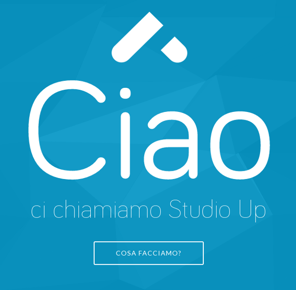
1. Studio Up
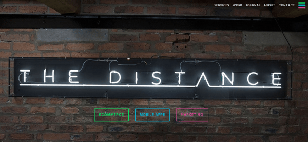
2. The Distance UK
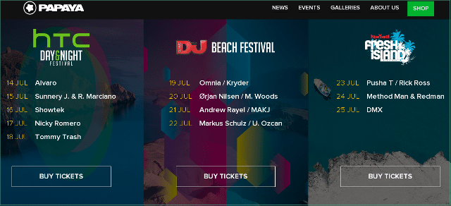
3. Papaya Club
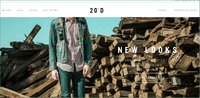
4. 20 Jeans
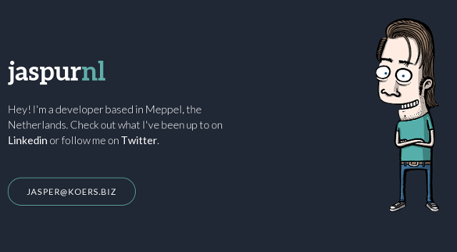
5. Jaspur
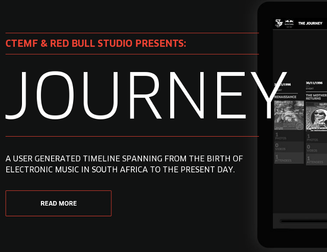
6. CTEMF
7. iuvo.SI
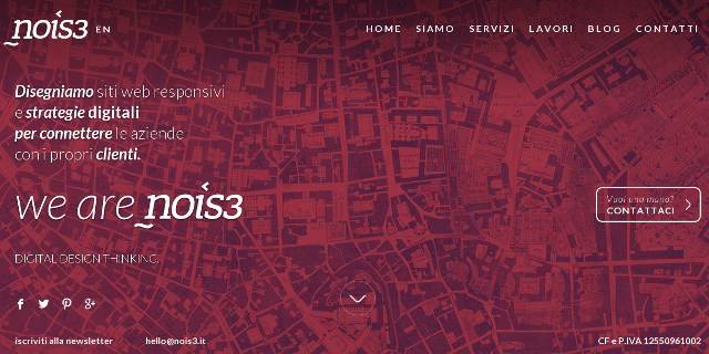
8. Nois3
9. Richard Outram
10. Union Roo
Conclusion
If used against a proper background, Ghost buttons can help grab the user’s attention, and even add a touch of elegance to the design. If you need more inspiring samples, check out this tumblog.
What do you think of Ghost buttons? Elegant and subtle piece of fine craft, or yet another design trend that will fade away within a few days? Share your thoughts in the comments below!
 Sufyan bin Uzayr is a freelance writer and Linux enthusiast. He writes for several print magazines as well as technology blogs, and has also authored a book named Sufism: A Brief History. His primary areas of interest include open source, mobile development and web CMS. He is also the Editor of an e-journal named Brave New World. You can visit his website, follow him on Twitter or friend him on Facebook and Google+.




No Comments