Web design means much more than aesthetic web pages and flamboyant features. In fact, good web design means that you focus on the requirements and needs of the end user. Thus, web design should, always, be done with user experience in mind.
User-centric web design strives to achieve two objectives:
- It should make the website in question more usable.
- It should make the website in question more useful.
There are many ways in which we can make our websites more useful and usable: being mobile-friendly, focusing on good navigation and typography, having a proper color scheme and layout, offering accessibility tweaks, and so on. In this article, I shall talk about user-centric web design and its importance from a designer’s perspective.
Being Accessible
Irrespective of the genre or nature of the website you’re working on, you should never omit the importance of accessibility. And speaking of accessibility, it can be implemented in various ways: the search bar, the prominent navigation menus, proper organization of content (especially if yours is a magazine website or blog), and so on.
Beyond that, proper typography also plays a key role in accessibility. Having a font that is reader-friendly, as well as organization of text into a layout that makes skimming through longer chunks of text easier all count. Web typefaces are obviously different from print typefaces, so one needs to adjust accordingly.
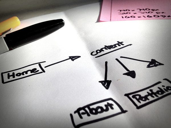
Another aspect to consider is the organization of your website. Look at your website’s sitemap (not the one you offer to Google, but the public-facing one that your readers are supposed to see). Helpful descriptions come handy when users are trying to understand which section or link leads to what part of the website.
Confusing your visitors is never a good thing when it comes to web design, and proper organization and accessibility can help you avoid that.
Proper Navigation
Everyone knows the importance of navigation aids, but not everyone understands the fact that it’s necessary to make your navigation aids highly visible to your users. No matter which device a user is employing — be it a mobile, tablet, or a desktop — navigation aids should be clearly visible at every page of your website to the said user, just so he or she can browse your website with ease and without any hindrance.
More importantly, be consistent with your navigation schemes. In fact, this principle applies to all the elements on the web page. Retain consistency and a sense of uniformity all throughout your web design, because it will enhance the user experience.
Visual Considerations
Now, the visual aspects of web design differ from one designer to another. Furthermore, these visual considerations are also subject to the whims and requirements of the client in question, so there’s no silver bullet suggestion for either.
However, as a rule of thumb, you should never sacrifice simplicity for beauty. Being user centric means you are putting user needs ahead of everything else, and for that matter, your design needs to be simple to understand, navigate, and comprehend.
Next, you should try to combine simplicity with aesthetics. Having a rather laid-back color scheme that allows you to make the most crucial elements of your website as more prominent than the rest is a good start. Try to use color sparingly, and have a typography or font that is not too loud. In this manner, you can enhance the aesthetic appeal of your web design and at the same time retain simplicity and ease of use.
Another thing that you can do is to ensure that your website reacts and responds to user actions in an instant (this should be visible in even minor elements such as clicking of radio buttons and checkboxes).
Mobile-Friendly
Your design can never offer a good user experience if it doesn’t cater to mobile users equally as well as it caters to the needs of desktop users.
Responsive design is by far the most popular and well known solution for this purpose. If you want, you can also consider using different themes for mobile users and non-mobile users. Alternatively, you can go the adaptive design route, and offer a separate mobile version of your main website optimized for users browsing via portable devices. For a detailed comparison of responsive design and adaptive design, check out this article I wrote for Torque back in September 2013.
Conclusion
User-centric web design is not just a fancy buzzword. Instead, it refers to the process of actually making your design helpful and important for the user. Like I once observed in an article of mine written elsewhere, the biggest difference between good and great web design is the fact that the latter is accomplished with the user in mind.
What are your thoughts on user-centric web design? Share it with us using the comments below!
Image Credits: David Michalczuk | Juhan Sonin | Max Mollon | Canned Tuna
 Sufyan bin Uzayr is a freelance writer and Linux enthusiast. He writes for several print magazines as well as technology blogs, and has also authored a book named Sufism: A Brief History. His primary areas of interest include open source, mobile development and web CMS. He is also the Editor of an e-journal named Brave New World. You can visit his website, follow him on Twitter or friend him on Facebook and Google+.


1 Comment