Happy New Year, everyone! Ah, what a glorious year 2014 was. Full of highlights for WordPressers, web designer, and developers everywhere: Several major releases, tons of new plugins and themes, as well as thousands of fresh WordPress websites. A good time to be alive, isn’t it?
However, now we need to take off the party hat, brush the confetti from our shoulders, and turn our eyes forward. “Tempus fugit” as they say. So brew yourself a fresh cup of coffee, sit down at your laptop and get ready for. . .what exactly?
Good question. How will websites look in 2015? Are sparkly stickers á la Myspace back on the menu? Will we see the revival of Comic Sans?
(Please, no)
To find an answer, let’s take a look at web design trends that emerged in 2014 and make some bold predictions about developments we will see in the next 12 months as well as how WordPress users can get ready for them.
1. Flat design is here to stay (and Google takes it to another level)
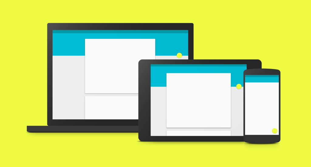
Go to your website, open style.css and delete everything that adds drop shadows, gradients, textures, or depth of any kind. The days of 3D on the web are over. Flat design continued to rule in 2014, with minimal, no-frills websites everywhere.
Ok, maybe some depth will be allowed in 2015 if Google has any say in it (which they usually do). The search giant recently revealed “material design” as their new directive. While the concept adheres to principles of flat design in general, it does contain subtle layering and even some shadows. The end result is a hommage to real-life materials, reminiscent of paper and ink.
With Google going this direction, look out for others to follow in 2015.
How to introduce material design to WordPress:
First themes that go into Google’s direction are already available. An excellent example is MaterialWP by Brad Williams. Alex Patin is also working on a theme called MaterialPress. The latter is based on the Materialize framework where additional use cases in the same style can be found.
2. Responsive will no longer be optional
Since Google introduced markers for mobile-friendliness and revealed them as a ranking factor is it obvious that serving your mobile audience has become a must-do. With more than a third of traffic now coming from mobile devices, responsive design is now the de-facto standard and it’s highly unlikely to be any different in 2015.
Making WordPress responsive:
Responsive themes are available a-plenty, be it in the WordPress theme directory or at vendors of premium themes (e.g. Theme Forest). For those not willing to change their theme, dedicated mobile themes and other solutions are available as well.
3. Scrolling is the new clicking
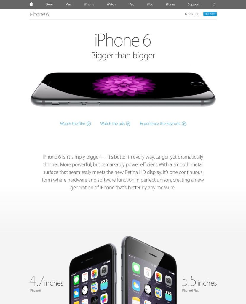
More and more websites force their users to move their fingers from the mouse buttons to the wheel. Instead of clicking themselves through a bunch of menus, they now get to scroll down sheer endless elegant web pages.
Using scrolling as opposed to clicking as a navigation technique is a good idea of many levels: Less pages to load, smoother transitions between blocks of information and longer visitor engagement are just a few of them. This insight gave rise to the one-page website.
The most impressive trend in this area, which is taking the web by storm, is Parallax. Images and elements moving in different speeds and directions create stunning visual effects. One of the most awesome examples of this technique is the home of the Seattle Space Needle. With websites like this paving the way, it is probable we will see more of it in 2015.
Endless scrolling for WordPress:
Single-page themes for WordPress are available at all corners of the Internet. Even if you don’t want to switch your theme entirely or if you are running a blog, there are alternatives such as Jetpack’s Infinite Scroll module. WordPress themes using Parallax are also out there, some of them even for free. And if that isn’t enough, you can also parallize your website via plugin.
4. Modular design instead of pages

Since we were talking about the death of multiple pages per website: Prepare for the modularization of content. Another thing we can look forward to in 2015 is the increased compartmentalization of websites into singular elements with their own behavior and interactions. No more jumping from page to page. Instead visitors will stay put while everything around them changes.
How to get modular design for WordPress:
The first themes that work in this way are already up for grabs. A good example is the Status Theme. If you use Firebug on the main slider at the top, you will see that it has more than one h1 tag in the same page. Unthinkable in earlier times.
5. Pinteresque card design for everyone
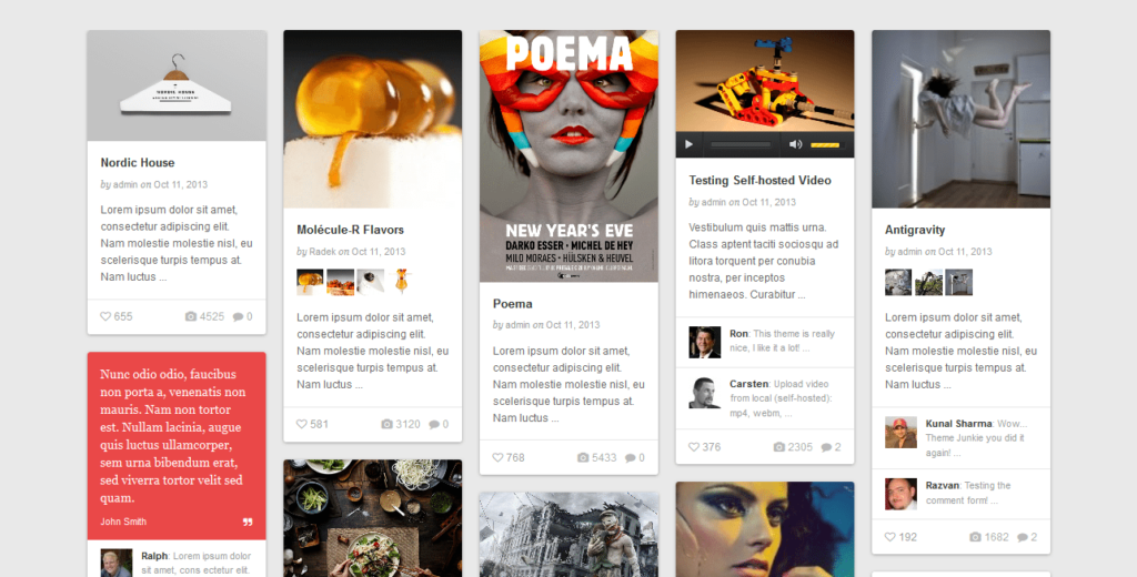
If you are listening to the online marketing chatter, it appears that 2015 will be the year of Pinterest. In the same way Google pushes Material Design, so does this platform for its signature card-like content boxes. Besides merely looking good, this design trend provides an excellent solution for responsive websites as it rearranges easily. With more and more websites hopping on the Pinterest train, prepare to see it frequently in the coming year.
Card design on WordPress:
Pinterest-style WordPress themes can be found easily via Google. But if you only want to ‘pinterize’ your galleries, there are plugins for that.
6. Scalable vector graphics (SVG) instead of raster images
With the ever increasing pixel density of modern screens, web designers run into the problem of rasterized images looking ugly on new generations of devices. SVG are a way to address this problem and another big thing coming in 2015.
As the word “scalable” suggests, these images are able to adjust to any resolution whilst maintaining their quality. Since IE9 there is also finally cross-browser compatibility with all modern browsers supporting the format. Plus, unlike Flash, which was used to perform many of the tasks SVGs can take over, this image type can also be indexed by search engines.
Use SVGs with WordPress:
As of this moment, scalable vector graphics are not natively supported by WordPress core. However, that is not to say that there aren’t any plugins to remedy this shortcoming:
Plus, there is this piece of code for making the WordPress’ media uploader accept the svg file type.
7. Webgraphics for packaging information
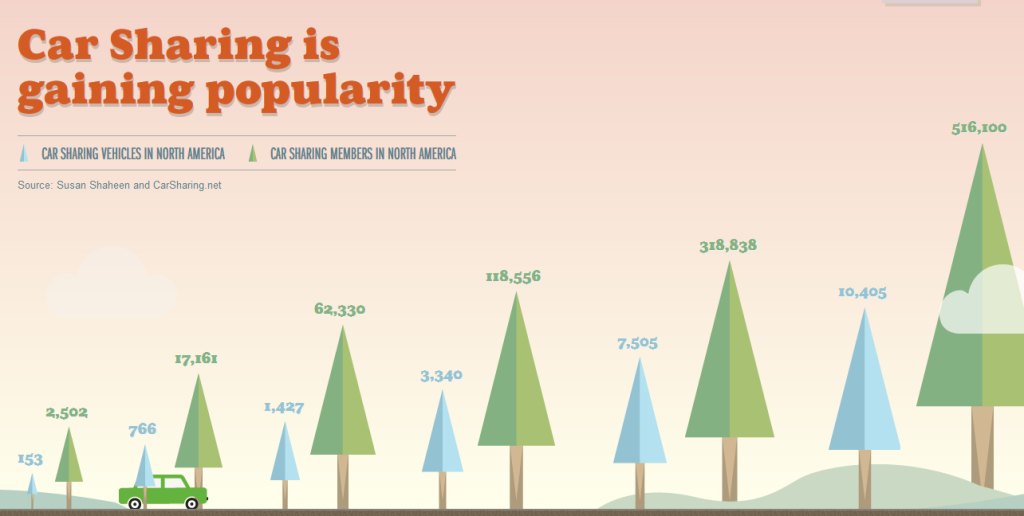
Since we are talking about visuals: Watch out for the rise of webgraphics in 2015! In the blogging world, infographics are a favorite way of packaging lots of information into little space. The same is coming to websites in general, however, in interactive rather than static form.
An example that does this can be seen in The Future of Car Sharing, or in this infographic on the psychology of infographics (too meta?).
Web graphics for WordPress:
While there are WordPress plugins to generate charts as well as themes that come with infographics, putting together interactive web graphics requires a lot of work. A good place to start is this list of CSS transitions, transforms, animations, filters and more and familiarizing yourself with the D3 javascript framework.
8. Look out for large, moving background images
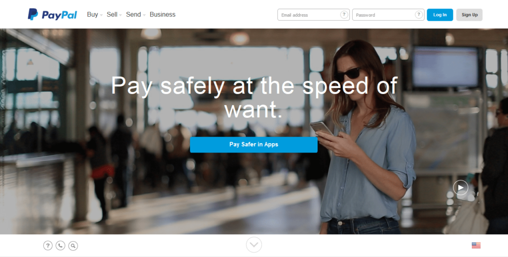
And more good news for the visually inclined: Large images are here to stay. Already a staple of many single-page themes, beautiful full-screen imagery will continue to delight our eyes. Plus, even though Flash is dead, that doesn’t mean movement and animation in web design are. Paypal is just one of many sites that use large-scale videos and gifs to dazzle their visitors.
How to get your background to move in WordPress:
Implementing large visuals for WordPress websites is not a problem in this day and age. There are many themes available that offer image display across the entire screen. Fans of moving pictures can also find variants with beautiful full-screen video backgrounds. If you would like to stay with your own theme, you might want to try out these plugins:
9. Storytelling with web design
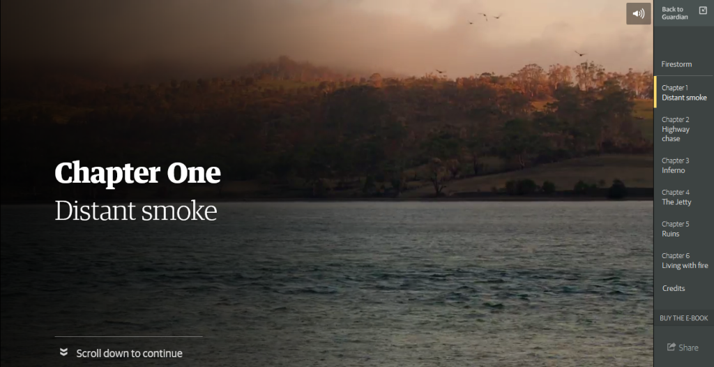
The ability to use more sophisticated imagery and animation also paves the way for another coming web phenomenon, that of storytelling. Using different design elements and movement allows websites to be more than just hubs of information, enabling them to evoke emotions, construct a narrative, and take visitors on a journey. The symbiosis of text, pictures, video, and sound sees to that.
Storytelling with WordPress:
Since creating a compelling narrative in website form involves a lot of different elements, you would think that there isn’t one storytelling plugin out there. However, the Aesop Story Engine attempts to be exactly that: An open-source framework allowing users to create stories on the web from thirteen different modules. It’s good to know you can still be amazed by what the WordPress community puts together.
10. Microinteractions for visitor engagement
The term microinteractions denotes contained experiences or moments of interaction with websites that are aimed to accomplish a single task. Think along the lines of liking a Facebook post — that email pop-up sliding in from the side or visual elements moving into place as your scroll down a page. The goal is to increase user engagement and draw our eyes toward important parts of the site. We will likely see more pages like Google Inbox’s in the year to come.
Microinteractions and WordPress:
Though microinteractions will in all probability become more important in 2015, that doesn’t mean that it is not already employed today and that there aren’t tools available out there. Whether plugins for promoting your content or beautiful lightbox popup boxes, there are dozens of ways to interact with your visitors. A special mention should also go to the SumoMe plugin stack, which provides a range of subtle and free list-building tools.
11. Fly-out menus not just for mobile
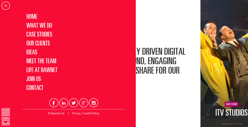
Not many design elements in the past have been as throughly discussed as the infamous “hamburger icon.” The three lines indicating access to a collapsible menu has as many friends as it has sworn enemies. Driven by UI design for apps and through thorough conditioning by Facebook, hidden menus are now becoming ubiquitous as a space saver, especially for mobile websites. No matter if you love or hate the hamburger, prepare to click it more often 2015.
Fly-out menus for your WordPress site:
A lot of themes have already adapted fly-out menus. Especially many single-page themes employ them as their weapons of choice. Plugins to bring them to other WordPress sites are also available:
- Responsive Menu
- WP Responsive Menu
- Genesis Club Lite (for those using the Genesis theme)
12. Booh! Ghost buttons
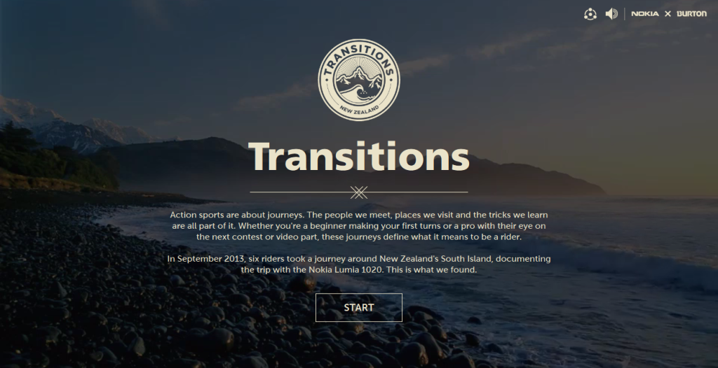
Relax, there is no need to be scared or call Bill Murray and his comrades. Nothing supernatural going on here despite the name. In fact, you have probably seen ghost buttons everywhere as of lately. What the name describes are the transparent rectangular button shapes which keep the background visible. These subtle click-baits are a favorite for landings pages and themes with large images (see #8). Prepare to be spooked by them more frequently in 2015.
How to implement Ghost Buttons in WordPress:
Buttons of this kind are easy to come by. Lots of themes already use them (e.g. Divi by Elegant Themes). If you are not afraid of a little CSS, you can also make your own. Plenty of tutorial are on this topic are out there:
- Six Revisions: How to Create CSS Ghost Buttons
- Developer Drive: How to make Ghost Buttons in CSS3
- Kanishk Kunal: Super simple Ghost Buttons
13. (Extra large) typography will draw your eyes
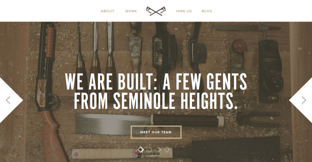
Thanks to Google Fonts and the general emergence of affordable typekits, beautiful typography is more available than ever. As a consequence designers have begun using fonts as an important part of the web design. While this takes on many different forms, a trend that can not be ignored is that of supersizing titles and headings. Get ready for more in-your-face writing, especially in combination with full-screen images and ghost buttons.
Typography in WordPress:
If you want to spice up our WordPress site with some beautiful typography, you can either do so by applying a respective theme or adding any of the great number of typography plugins.
14. Site performance and speed are part of web design
While it has nothing to do with the visual side of design, page loading speed has become an important factor in recent years that will only continue to grow in significance in 2015. Not only is site performance decisive for user experience but by now is also a ranking factor in on-site SEO. Maintaining speedy loading across devices should of course be a given. As a consequence, designers and developers will increasingly have to enhance their skill set to ensure rapid display on visitor’s screens.
Which trends in web design do you see in the coming year? What are you looking forward to what would you rather avoid? Let us know in the comments.

30 Comments