Welcome to the big finale in our series on WordPress eCommerce. If you’ve been with us from the beginning, you have learned about the different types of eCommerce, some of the different shopping cart plugins available, and you’ve walked through all of the settings involved in launching an online store. In this final post we are going to learn all about how to add products to your online store. After all, what good is a store with no products?
Types of products
When it comes to eCommerce products, there’s thousands of different types of products, but when you look at it from a high level, they all break down into two types: downloadable and physical. We are ignoring service-based eCommerce sites for the time being because that is an entire article in itself.
Downloadable Products
As the name suggests, these are products that customers can download after purchase. These items include e-books, music, software, etc.—basically anything that resides on a electronic device is considered a downloadable product.
Physical Products
This is where the rubber hits the road in eCommerce. Physical products are just as the name implies: something physical that you can hold or touch. These are products that can be available locally, like ordering your groceries to be delivered via a website, or something much larger. I once bought a motorcycle from a dealer website that was 200 miles away and didn’t actually see the bike until they rolled it off the trailer in my driveway (I was buying from a reputable dealer so I had lots of warranty).
For this article, we are going to focus primarily on adding physical products, as that represents the larger segment in the eCommerce world.
In order to start adding new products to our store, we need to do some prep work beforehand so that we can quickly add multiple products.
Product Images
The first thing I teach when it comes to adding products is the importance of the product image. The reason this is so important is because this is the visual representation of your product and your store as a whole.
We’ve all heard the saying you eat with your eyes first, well the same can be said for buying online, as just like eating we buy with our eyes first. This applies not only to our products, but to the overall aesthetics of the site itself. If you look like a modern professional retailer, people will be more likely to trust you. This applies equally to your product images, so let’s make sure you know what you need to do to make them look professional.
Speaking of professional, if you can afford it, I always recommend having a professional photographer take product images whenever possible; and yes, there are photographers who specialize in product imagery. If you can’t afford a photographer, however, here are some helpful tips:
- Make sure all your images are the same size. This seems obvious, but too many times I have seen online stores with images of different sizes. By having your images all the same size, you will get a nice clean grid when it comes time to display your images.
- Make sure your images have the same orientation. Again this seems like a no brainer but it’s still worth noting. Having the orientation of your images all the same (either landscape or portrait) is another way to make sure that your display is clean and crisp.
- Make sure your backgrounds are consistent. If possible, you want to have a clean white background for your product shots. You can buy a white photographers background from most photography stores these days, and they are pretty reasonably priced. This saves your customer from seeing what your dining room table or your kitchen backsplash looks like.
If you follow these common sense tips you’ll have great looking product images to show off.
Product Categories

As with post categories, you can break product categories down as far as you’d like—something that definitely comes in handy at times. For example, if I owned an online clothing retail store, I might want to have categories and subcategories such as Mens> Apparel> Shirts > Long Sleeved. This not only helps organize things for the store owner, but it also makes it easier for customers to find what they are looking for.
One last note on product categories: you can upload an image to identify each category—which, depending on how you layout your site, will help make your products page much more appealing. If you don’t have images for your categories, all you will see is a list of links to each category.
Once we have our images ready and our product categories added, we are now (finally) ready to start adding products.
Adding a Single Product
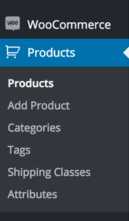
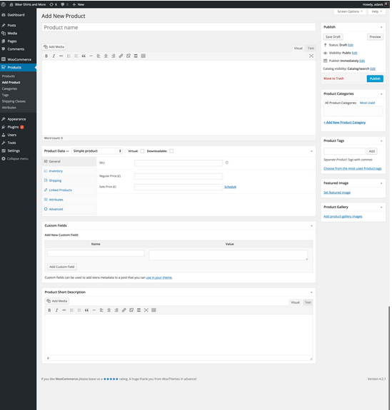
We start by navigating to Products > Add Product in our navigation bar; and, once you have done that, you will be greeted by the below screen.
The first thing you should notice is the similarity between this screen and the add new post screen. Adding a product is similar to creating a post that has a custom post type applied to it. There are a few extra features, however, and some tricks to adding it; but then that’s why you’re here, isn’t it?
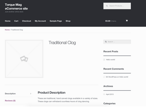
Starting from the top, add the name of your product. For this example I am going to use different types of clogs as my products. I have three products: a traditional clog, a leather clog, and a women’s clog. I am going to use a short, descriptive headline such as ‘Traditional Clog,” and then where I would normally add my post content I am going to enter in my product description. When you look at the preview for your page, at this point it should look similar to this:
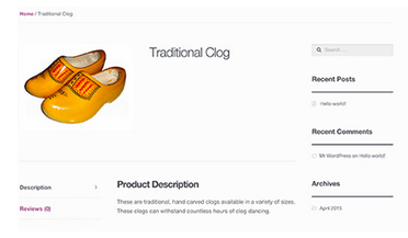
While the description and the title look good, there is still a blank image holder that needs to be looked after. People tend to want to add the product image into the main content area; but this would be incorrect, as what you want to do is add your product image as a featured image. Once you’ve added your featured image to your product, it should look something like this:
That looks much better. Notice how having a clean white background allows the image to blend in smoothly with the rest of the page? Now that we have set the title and description, and added the image, we can move on to the product data section.
Product Data
In this section we are able to add more information about our product. Details like price shipping and inventory management are looked after here.
First up is price; and as the screen above indicates, this is very straightforward. Not only can you add a regular price for your item, you can also add a sale price and schedule the sale if applicable, as well as add a SKU number.
The next section is where you do your inventory management and again it’s pretty straightforward as you have the option to let the software manage your inventory (highly recommended).
Once you’ve checked the inventory management box, you are presented with the options available to let the site look after your inventory. You can add how much stock you have as well as whether or not you allow backorders. Additionally, there is a checkbox to allow only one single item to be bought in a single order. This comes in handy when you have a product that requires a specific accessory. An example of this might be if I offered a wooden clog cleaning kit to accompany my wooden clogs, I could limit sales to one per order.

That covers the basics of adding a simple product and now it’s time to touch on product variations.
What are product variations, you ask? Quite simply, they are the different options you have for each product. In my example, I have different sizes of clogs available, as clogs aren’t a one-size-fits-all product. My clogs have the options of small, medium, large, and extra-large. This can easily be added by switching the dropdown beside Product Data from Simple Product to Variable Product. Once you’ve done that, you’ll see a new section call Variations in your tabs. Clicking on this allows us to set the variables for our products. Before we can set the variable we need to add an attribute, which is right above the variations tab.
Here we can enter in our sizes as an attribute of the product and have them applied to the different variations of the product. When you add an attribute you can also determine whether or not to allow it to be visible on the product page (pro tip: you should do this).
When you take a look at the product page preview you will see your product proudly displayed along with any variations you may have setup.
This covers the basic information required to add a new product to your store, but what happens if you have a whole bunch of products to add? Do you need to add each individually? Of course not, that would be extremely tedious. Instead you can add a plugin to your plugin that allows you to bulk upload a CSV file with all your product information. There’s a number of these plugins out there, so make sure you find one that works with your shopping cart and carefully follow the documentation on how to proceed with the upload.
That wraps up our series on eCommerce with WordPress. Please leave any thoughts or questions in the comments below!


No Comments