As of lately, eCommerce has grown at a very rapid pace, with more and more users shopping for their favorite products online. In fact, what began as a trend meant mostly for purchasing books and that occasional gadget online, has now evolved to a tradition, with almost every other buyer browsing for products on the internet, and new eCommerce stores coming up with each passing day.
Beyond that, it has been quite a while since mobile devices have overtaken the desktop, and smartphones and tablets are now our preferred medium for browsing the internet. As such, most websites are turning towards mobile apps, and a mobile-friendly app is available for most eCommerce stores as well.
So, what makes the perfect eCommerce app? Are there any considerations that you should bear in mind when building an eCommerce mobile app? What about some tips for designing mobile eCommerce apps? In this post, I will attempt to answer these questions.
Tips For Designing Mobile eCommerce Apps
The Checkout Process
It is beyond obvious that the checkout process should be simple and short. A long or confusing checkout process will only turn your visitors or users away. Therefore, things like multi-page sign-ups, especially in a mobile app, are something you should strictly avoid.
However, the checkout process does not just include the part where the user enters shipping and payment details. In fact, it is called “process” for a reason, because it entails multiple steps.
First up, make sure your “Add to Cart” button is visible on all pages in the app, and is prominent enough to be seen by the users. As soon as the users come across a product they wish to purchase, they look for the Add to Cart button, Make it very easy to find.
Next, when using a mobile eCommerce app, do not always insist that the user login via an account on your site. Allow them to sign in via social networks of their choice, and even more so, allow them to continue the checkout process as a guest. People using mobile apps have less patience, and the ability to continue without signing up really helps in this case.
Be User-Friendly!
Most mobile apps tend to pay great attention to User Interface, and some also show good importance to User Experience. However, a good mobile app needs to combine UI and UX and bring the two on the same pedestal, in order to be truly user-friendly.
For instance, UI demands that the images on your page should be clearly visible whereas UX demands that the page should be easy to browse. A good idea will be to add special “mobile-friendly” images, and also to rely on images that do not slow down your app.
More importantly, pay attention to minor details. Everyone is impatient nowadays — this is obvious. And check out processes can take some time — this is obvious as well. So, what’s next?
Give users something that satiates their impatience. Show a progress bar, or a “Step X of Y” type counter during the checkout process, so that they are aware of roughly how long a given checkout process will take. Human minds tend to react better when they are aware of how long they need to wait, as compared to something abstract like “almost there.”
Similarly, do not just have an “Add to Cart” feature. Allow users to short-list products. But, do not simply scream out “Short-list” on the app; let them add the given product to a wishlist, or a list of favorites, and so on.
Lastly, even though it is obvious that you will take every step to ensure that user data is secure, make sure your app talks about safety. People need assurance, and for that matter, do not send them to the website. Instead, mention that you are employing encryption and security measures, and mention it frequently both in on-app pages as well as in the settings section of the app.
Remember, it is “Mobile.”
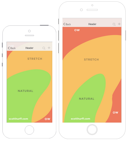
A good idea is to study the Thumb-friendly zone, as shown below (read this for detailed info).
Basically, the concept here is to keep the key buttons, such as Add to Cart within the easy reach of the right-hand’s thumb. As much as 70-90% of the world’s population is right-handed, so yeah, exhibiting a slight bias in favor of right-handed folks is well worth forgiving.
Be warned though: since the crazy trend nowadays is to increase the screen size of smartphones and tablets, the thumb-friendly zone is likely to decrease.
Beyond that, keep your navigation menu highly consistent all throughout the app. Utilizing a slide-out mechanism for basic features such as view cart, settings, etc. is the ideal choice. But within the pages of the app, keep the menu consistent, and highly condensed. Unlike a desktop site, mobile apps do not give you the luxury of placing several products within the menu, so a consistent layout can help users in navigating back and forth within the app.
Conclusion
Studies suggest that as many as 85% of users tend to prefer using a mobile app over a website. Quite obviously, having a mobile app for your eCommerce business is a very sound and logical decision, especially bearing into consideration that the mobile user base is definitely expected to keep expanding.
What do you think of the above tips for designing mobile eCommerce apps? Share your views in the comments below!


No Comments