Running your own website can be disappointing. You invest a lot of time, money and effort — only to be met with mediocre results. Maybe the surge of visitors you were hoping for is a mere trickle. Maybe those who do come to your site leave without taking any action.
What to do?
In that situation, most people would look at their content, SEO, or marketing strategy. However, another piece of the puzzle that is just as important but often neglected is your site’s web design.
Website design mistakes can hurt your efforts. To avoid that situation, in today’s post we will not only have a look at why web design matters but also go over nine common web design blunders and how to avoid them.
Ready to overhaul your site design? Then let’s wait no longer.
The Importance Of Good Web Design
Before we get to our examples of ineffective web design, let’s first look at why investing in good web design is important in the first place.
First Impressions Matter
You know how they say that you never get a second chance to make a first impression? That sentiment is also true for websites.
Visitors decide very quickly whether or not to stay on your site. Therefore, you want to make sure your first impression is as positive and clear as possible. Whoever comes to your site should quickly be able to figure out what it is about and what they can do there. Otherwise, your visitors are out of there quicker than you can google “high bounce rate effect on search rankings” (hint: it’s not a good one).
Plus, once visitors have formed an unfavorable opinion of your site, they are less likely to return.
Quality Web Design Builds Trust
How quickly do visitors form a first impression from your design? Well before they get to the first line of content. That means they have already made a decision about whether or not they can trust your information before they have read it. I know, crazy right?
However, it only underscores the importance of proper web design, especially in industries like health and medicine where trust matters most. It also extends to other business areas as well. So, if you want your visitors to stick around, make sure the face you turn to them is a trustworthy one.
Web Design Provides Guidance
Most of us run websites not merely to show off or for the heck of it but because we have a goal in mind. It may be getting people to join on our email list, buy our product or something else.
This is another area where web design plays an instrumental role because it provides guidance. Good design will move visitors along to the desired destination, bad design will leave them clueless as to what they are supposed to do on your site.
Web Design = Aesthetics + Usability
Web design is not just about how your site looks but also about how users interact with it. In fact, it influences everything else.
Take loading speed and search engine optimization for example. If your site is filled with large images and needs to load five custom fonts in order to render, it will be considerably slower. Not only does this have an impact on your visitor bounce rate but it will influence your site’s search rankings.
Because of that, web design lies at the basis of the overall success (or lack thereof) of any WordPress website. That’s why the next part of this article deals with how you can make sure it does a good job.
9 Web Design Mistakes To Avoid (And Their Solutions)
Ok, now that we know the overall importance of quality web design, let’s look at a number of examples for how not to do it and alternative strategies.
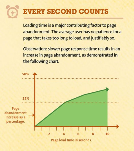
A Slow-Loading Website

We have already mentioned the importance of web design for site speed.
While it can be nice to have a lot of fancy JavaScript animations, the latest technology and gimmicks on your site, if it comes at the cost of performance, it won’t do you much good. In that case, a large number of people might not even see your website design since they won’t wait for it to be done loading.
Not good.
What to Do Instead
- Treat performance as part of design — We already mentioned in the beginning that web design is not only looks but also usability. In fact, visitor’s think that a website’s performance is it’s most important marker of quality so plan your performance budget accordingly. We also have an entire article on how to speed up WordPress.
Too Much Clutter And Inconsistent Web Design
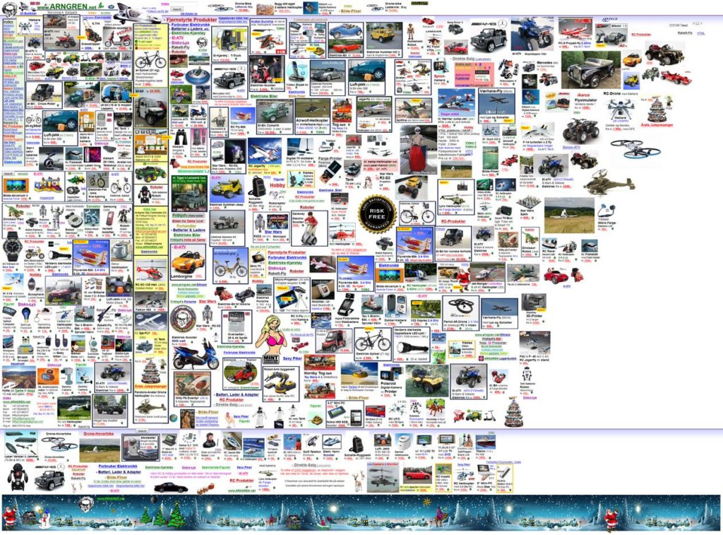
As in many things in life, less is more is an important rule in web design. The goal of good design is to provide guidance, focus, and a content hierarchy. A page that is cluttered with dozens of elements vying for the attention of the viewer is exactly the opposite.
According to Hubspot, 76% of users value usability over fancy design. Therefore, when visitors don’t know what to click on or look at, your web design has effectively failed and you have lost a visitor to the competition.
The same applies to pop-ups, presentations, videos and other hoops visitors have to jump through before getting to the actual content. If the effort is too great they might simply decide it’s not worth it and leave.
What to Do Instead
- Keep it simple — Rather than thinking about what you can add to your site, consider what can be eliminated. Define the goal of each page and check every element for whether it adds to the achievement of that goal.
- Stay consistent — Avoid sudden changes in color scheme, layout, or sidebar positions. While variation is possible and encouraged to some degree, people should not feel like they went to another website when merely changing a page. Consistency is also important for your branding.
- Leave lots of space — Sufficient whitespace around design elements is also important. It lets the design breathe, guides user focus and creates relations and a hierarchy between elements.
- Divide content — Should you cover many different topics on your site, don’t cram them all in one place. Give each their own section in the form of subpages or archives, group related pages by topics and eliminate what’s not necessary.
Large, Uninterrupted Blocks Of Text
Most visitors today are looking to scan content quickly to get an overview and decide whether or not to read it in its entirety. Having one big chunk of text will make that difficult.
Websites aren’t books and should therefore not come with the same layout. It’s hard to read, offers no rest for the eyes, and immediately makes your site look low quality. Even if the information you provide is literally worth gold, most visitors will not bother finding out.
What to Do Instead
- Use different fonts, font sizes, and colors — The first step in making the text more appealing is to give it some formatting. That means adding distinct design to links and other text elements that stand out as well as playing with font sizes and colors to make the visual experience more exciting.
- Add paragraphs — Secondly, it helps to break up large chunks of text into smaller paragraphs. This makes text easier to consume, adds space inside your content, and breathing room for the eyes. Quick tip: Be sure to include only one idea per paragraph. You can find more info in Team Yoast’s presentation on copywriting from WordCamp Europe 2016.
- Include headings — In addition to dividing your text into smaller parts, you can also create topical divisions by using WordPress headings. That way you can make the text scannable and give readers an overview without forcing them to read the entire content. Headings are also useful for on-page SEO.
- Use images and other elements — Also, nobody likes an all-text experience. For that reason supplement your design with visual elements. Images are a first choice here and there are lots of free stock photos available for this purpose. However, don’t forget about quotes, links and other elements that can break up text blocks.
Bad Calls To Action
As we said in the beginning, websites have a purpose and a goal they should move visitors toward. The epitome of this is the call to action, which is the focal point of most websites. However for some reason many make it too hard to find.
Often the call to action is hidden too far down the page or too unremarkable to notice. Or there are competing calls to action on one page so visitors get confused.
That’s not the goal at all. Instead, web design should enable visitors to understand easily what the objective of your site is and/or what they can get out of it.
What To Do Instead
- Display calls to action prominently — Getting to the CTA should not be a game of hide and seek. Instead, your CTA needs to be clearly visible and also specific. Don’t make visitors guess, tell them exactly what you would like them to do and what they will get in return.
- Make it easy to say yes — The more barriers you put up, the less likely visitors are to reach the end goal. Therefore, if you give them a form to fill out, only ask for the information you actually need such as a name and email for a newsletter sign-up. If you ask for more, you make it harder for them to say yes.
- Be careful with popups — Popups and other calls to action can be very effective, however, they are also a balancing act between being productive and annoying your readers. Tools like SumoMe provide a number of different and effective ways to show calls to action. Highly recommended!
Lack Of Responsive Design
Unless you have been living under a rock for the past few years, you will know that responsive design has become a de facto standard. Two out of three minutes online are now spent on mobile devices.
Considering that, it’s very surprising that 28 percent of new WordPress websites don’t choose a mobile responsive theme. Say what!?
When this figure was revealed at WordCamp Europe, it prompted a call from Matt Mullenweg to make responsiveness a requirement for all new themes. The reason is simple. Without responsive design, you are not only alienating a large number of users who don’t use a desktop computer to surf the web but also risk being penalized by Google.
Thus, if your web design is not yet adaptive, it’s time to make some changes.
What To Do Instead
- Make your site look good on all devices — There really is no excuse not to have a mobile-friendly website, especially if you are using WordPress. You can choose from a wide range of responsive themes and use plugins for mobile optimization. For the DIYers we even have instructions on how to make your existing theme responsive.
Out-of-Date Design
On the web, new trends come and go and you don’t have to jump on every train. In fact, you probably shouldn’t, at least not for the sake of it.
However, at the same time, it’s important to pay attention to things that become an expected standard. The aforementioned responsive design is such an example. If you completely disregard all modern developments, you risk having your site look completely out of date.
Visitors have a keen feeling for when your site is outmoded and will judge you for it. That’s especially true if you are a technology company or have another reason to be expected to keep up to date.
What To Do Instead
- Stay on top of things — As we said, you don’t have to be a feature chaser but it’s important to keep your finger on the pulse. Read relevant blogs, sign up to tech newsletters and compare your site to modern websites around the web. No need to overhaul your entire design every few months but make sure important things are incorporated.
All Gimmicks, No Substance
On the other hand, the opposite case to the above is just as bad. A website can also have all the latest tech and features (parallax scrolling, sliders, animations — you name it) but be otherwise empty.
Style isn’t everything. If your site lacks substance, visitors will figure it out quickly and turn to websites that might be less shiny but that can deliver what they need. Even if your content is ok, overdone features can be too distracting and ruin the user experience.
What to Do Instead
- Focus on content — Yes, this is an article about web design, however, the heart of any website is still the content. Even if you don’t have a blog. Design should only try to make things pretty around it and not be the main attraction. Keep the focus on the content whether that’s writing, products or something else.
Bad Site Navigation
The menu is the primary way for visitors to get around your site. For that reason, it’s important to keep it usable and easy to understand. WordPress gives us a great many options for that.
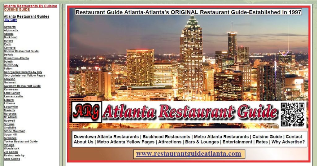
However, some people leave it to the CMS to take care of the navigation automatically by adding all top-level pages directly. The result: A cluttered menu that is difficult to navigate.
What to Do Instead
- Take advantage of WordPress’ options — Under Appearance > Menus you can change literally anything about your site’s menus. Make good use of all options to create a logical and hierarchical menu structure.
Missing Sharing Options
Social media networks have become alternative search engines that can bring in thousands of visitors. However, only if your content actually gets spread on there.
You know what would make that easier? Sharing options, of course.
While some people will go through the effort of copying and pasting your site link to their favorite social network manually, most prefer a simple button click. Neglecting to give them that option is a failure in your web design.
What To Do Instead
- Add sharing options in important locations — Not everyone will get the idea to spread your content all by themselves. For that reason, be sure to add buttons and calls to action to all important places (such as at the end of your posts) and make them prominent and easily reachable. There are plenty of plugins for this.
Which Web Design Fails Are You Guilty of?
Good web design is one of the main ingredients for the success of any website. It is the first thing visitors notice and responsible for building trust, providing guidance and increasing usability.
That also means that bad web design can make your site unappealing and hard to use. It’s a balancing act between aesthetics and functionality that is not always easy to master.
By looking at the web design mistakes above you can at least avoid some of the most obvious blunders. At the same time don’t forget to experiment because that’s half the fun.
What web design mistakes do you often see online? Which have you made yourself? Let us know in the comment section!


10 Comments