Landing pages are single web pages designed to persuade a viewer to do one thing, and one thing only.
What that “one thing” is can vary quite a bit, but two of the most common purposes include persuading a visitor to opt-in to an email list or sign up for a free trial of a product or service.
If you’re ready to incorporate landing pages into your content marketing mix but don’t know where to start, this article is for you.
Let’s begin!
1. Study Effective Landing Pages And Learn What Makes Them Work
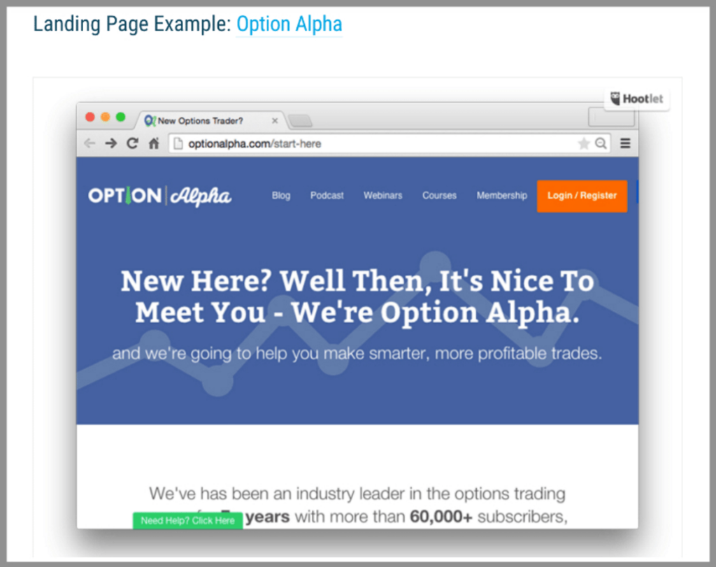
One of the best things you can do for yourself before you create your own landing page is to analyze other landing pages. This will help you pinpoint what works and what doesn’t, and figure out what you want your page to look like.
Start seeking out landing pages as you browse the web. Facebook ads, pop-ups, webinar marketing copy, social media updates, and paid Google ads are all good sources for landing pages to review.
Pay special attention to landing pages from any of your competitors. The more successful that competitor, the better. After all, if something’s working in your industry or niche, wouldn’t you want to know what that is?
The WPMUDev blog rounded up 10 examples with links and information on how each page was created. If one contains the elements you’d like to incorporate into your landing page, that method should also work for you.
2. Learn The Principles Of Conversion-Oriented Landing Page Design
We’re all different from each other, with varying reactions to different events or circumstances. But as a group, we do tend to respond in similar ways to certain specific triggers.
You can use those response trends to enhance your conversion rate.
First, embrace the concept of simplicity. A good landing page excludes all extraneous elements. That means no sidebar, no footer, a minimal header, and if you do have a logo, don’t make it clickable. You don’t want to give the user anywhere else to go.
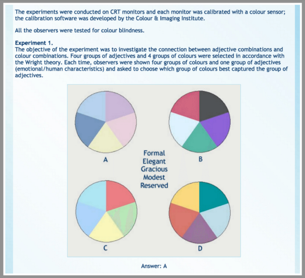
Color affects us in similar ways — red fires us up, blue cools us down. However, more isn’t necessarily better. Keep your color scheme simple.
Good landing pages incorporate lots of white space to focus the viewer’s attention towards more important elements, such as the call to action button.
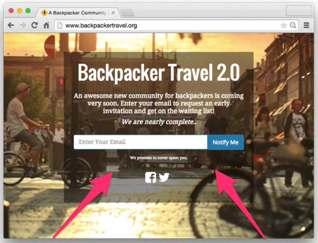
Use directional cues such as arrows, depictions of roadways/paths, eye movement/glance direction of human/animal subjects, etc. to draw attention to copy and call to action elements.
For instance, in the screenshot below of a Backpacker Travel landing page (taken from the WPMUDev blog post linked above), there’s the suggestion of a cobblestone street in the background image, its angles leading directly to the copy.
3. Understand Your WordPress-Based Options
Now that you understand the basic design principles behind a high-converting landing page, and you’ve seen several examples in action, it’s time to tackle the big question: How exactly do you build a landing page in WordPress?
Essentially, you have three different methods to choose from: themes, plugins, and third-party tools.
WordPress Themes That Support Landing Pages
Many themes are made specifically for landing pages. They can include elements like feature boxes, local scrolling, and more.
Other themes might contain pre-built landing page templates that you can use via the add-page function in your dashboard.
Premium themes include:
- Total WordPress Theme (includes a page builder)
- Freelancer Single Page WordPress Theme
- myParallax Minimal WordPress Theme
- WP Singular One Page WordPress Theme
The best place to begin looking for free themes is a search for recently-published list posts from reputable WordPress blogs, such as this one of over 30 one-page themes by CodeinWP. Don’t forget to do your due diligence by reading independent reviews.
You can also create a new landing page template from a blank page template inside any theme, if you know a little CSS and are willing to do the work yourself. WPExplorer walks you through the process of creating a blank landing page template in the TwentyThirteen theme here.
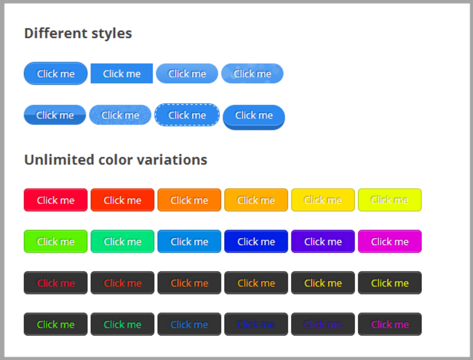
If you want to add elements such as buttons and call-outs, try the plugin Shortcodes Ultimate. It’s easier and faster than creating them from scratch in Photoshop.
This plugin will give you access to flat buttons, three-dimensional buttons, varying colors, animations, accordions, and many other site elements, all through shortcodes which are simple to master, even for non-coders.
WordPress Plugins For Landing Page Construction
Plugins that help you create landing pages also help simplify the process. Premium plugins such as Thrive Content Builder and OptimizerPress are well worth the money for many devoted users.
Free plugins are also available, but be very cautious here. It seems to be an area where you get what you pay for, to a large extent. Use Google to look for independent reviews of each plugin you’re considering, before you install it on your own site.
Third-Party Tools That Integrate With WordPress
Finally, you can use tools that help you create landing pages.
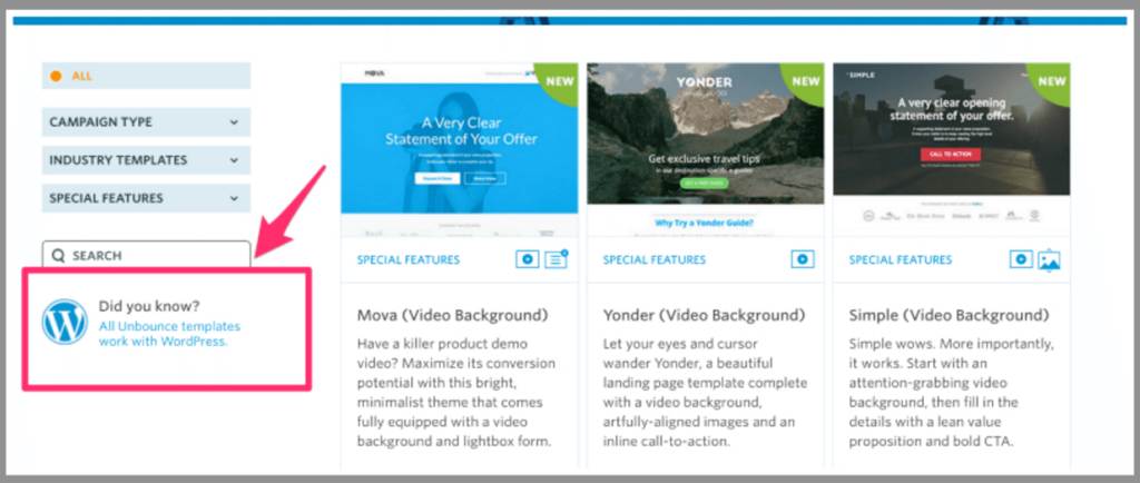
Two of the most popular are Unbounce, which offers a 30-day free trial and a variety of paid plans, and LeadPages, which has similar billing options and a money-back guarantee (though no free trial, apparently).
4. Sketch Out Your Landing Page Cycle On Paper.
Even if you’re a Photoshop pro, or have access to digital rendering tools, it’s good to sketch out your page using paper and pencil. This lets you play around with elements on the page quickly and visually compare versions to make a better decision.
Include the following elements in your sketch:
- Copy placeholders
- Calls to action (there will probably be more than one instance, though they should all refer to the same action)
- Design elements
- Traffic drivers (that is, how people will find your page, including ads, social media shares, content on other sites or your own, etc.)
- Post-conversion actions (that is, what happens after the visitor takes the action — do they get sent to a thank you page? Do they receive an email or a sequence of emails? How will what your offer —the PDF files, the software, etc. — be delivered to them?)
Conclusion
No matter what kind of landing page you’re building — and no matter how many you’ve built in the past — it’s always a good idea to get others to review your page for any issues you may have missed.
We’re all human, and prone to errors, especially in our own creations. We get blinded to mistakes and problems, and that’s why an objective viewpoint is a good idea.
Did we miss your favorite trick or technique in building WordPress landing pages? Let us know in the comments below!

1 Comment