As a photographer, the theme you choose can help you display your work in its best light. Given this, there are a number of features you’ll need to look for when choosing one that’s suitable. Unfortunately, many non-photography themes lack what you need to showcase your images.
Of course, a dedicated WordPress photography theme can incorporate the features you’re looking for, and more! While much of your desired wish list will be centered around your images, it’s also important to consider functionality that will help enhance the rest of your content too.
In this post, we’ll briefly introduce you to the importance of choosing the right theme for your photography site. Then, we’ll discuss five must-have features you should look for in a WordPress photography theme. Let’s get started!
Why You Should Choose Your WordPress Photography Theme Carefully
As we explained, the WordPress photography theme you choose plays a key role in how your work is displayed. Photography is (of course) a visually-heavy medium, so getting this right is a key factor.
Taking the time to consider all of the options available to you may cost you some time initially, but will see you gain this back in the long run as you’ll have the right functionality close to hand. After all, the more relevant the included features, the less you’ll have to rely on third-party plugins.
What’s more, making the effort to choose a suitable theme means you can align your business’ branding with your website’s design. This is crucial, as a website that connects visually with your other branding elements will help with your customer recognition.
5 Must-Have Features to Look For in a WordPress Photography Theme
The features we’ve chosen are ones that photographers of all stripes can look to when selecting a theme. While this list isn’t all-inclusive, it will at least get you off to a solid start. Let’s take a look!
1. Custom Gallery Styles
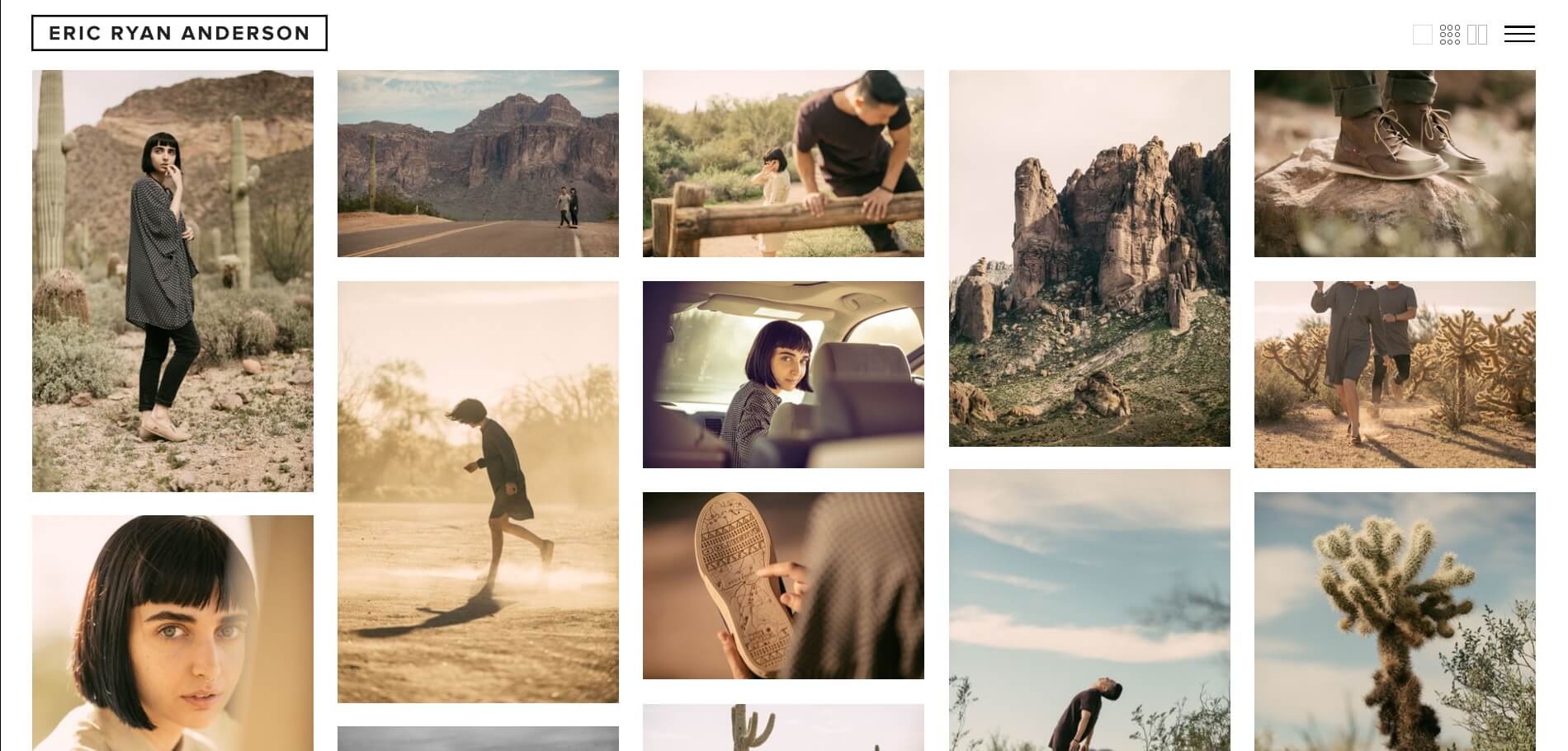
As the main way of displaying your photography work, custom gallery styles are a feature that should offer you flexibility. They enable you to design a website that showcases your work as per your initial vision. What’s more, you could even change the layout when you need to carry out a redesign. The Blush theme (by Imagely) incorporates this feature well.
However, implementing custom gallery styles effectively takes some thought. There are two ways you can do so initially:
- Know the different gallery styles available to you. These include grid, slideshow, and carousel styles. Understanding which ones work best in different situations is key. For example, a slideshow is ideal for an album-style display (such as wedding photography), while a masonry style will suit portfolios.
- Incorporate various styles throughout your site. While you may feel compelled to stick to a ‘main’ style, mixing and matching them will keep your site interesting. You can do this by providing switchable styles, or by setting different ones for each of your gallery pages.
Finally, it’s important to remember that galleries are a way to enhance your viewers’ experience. Keeping this in mind will enable you to choose the right style for you.
2. Large Image Backgrounds
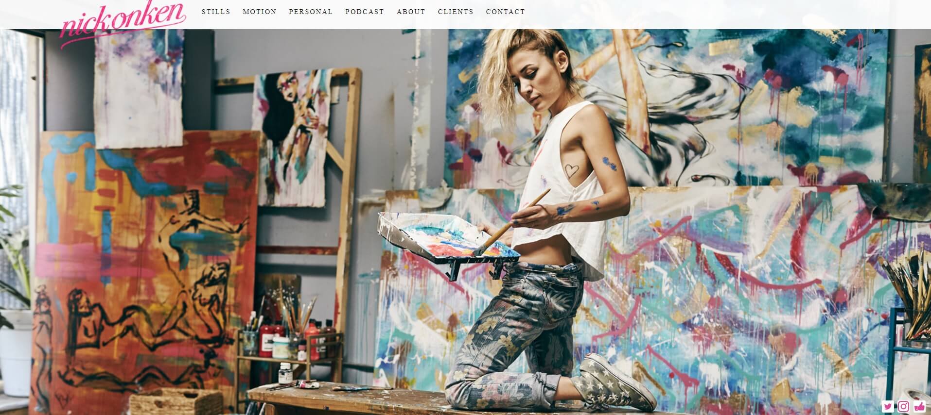
Large image backgrounds are just as they sound. They enable you to display your photography as the background to your site. While they can be used on more than just photography websites, they’re an excellent way to display your latest works. For example, the Fearless theme builds its design around this feature.
As such, your photography is woven into the very fabric of your design. It’s the ultimate in showcasing your work! It’s also a great way to display high-resolution images – downsizing them can often reduce clarity and quality, both of which should be avoided at all costs.
To get the most from this feature, you’ll need to use the right images for your background. This can be subjective, so let’s look at a few key elements of the ‘right’ image:
- It draws the eye. If nothing else, the image you choose should attract the reader to your website. This means using images that are bright and bold, but not too busy or distracting. It’s important to strike a balance here.
- It sends a message. Whether you want to tell a story, or you simply want to stun viewers, the image should have a purpose.
- It incorporates your style. This doesn’t just mean your photography style, but your personality too. Choose something that speaks to you, and it will give your readers a little glimpse into your worldview.
To take things further, we recommend optimizing your images, and employing a suitable caching plugin. Both of these will help to speed up your website and improve the quality of any displayed images.
3. Beautiful Captioning Options
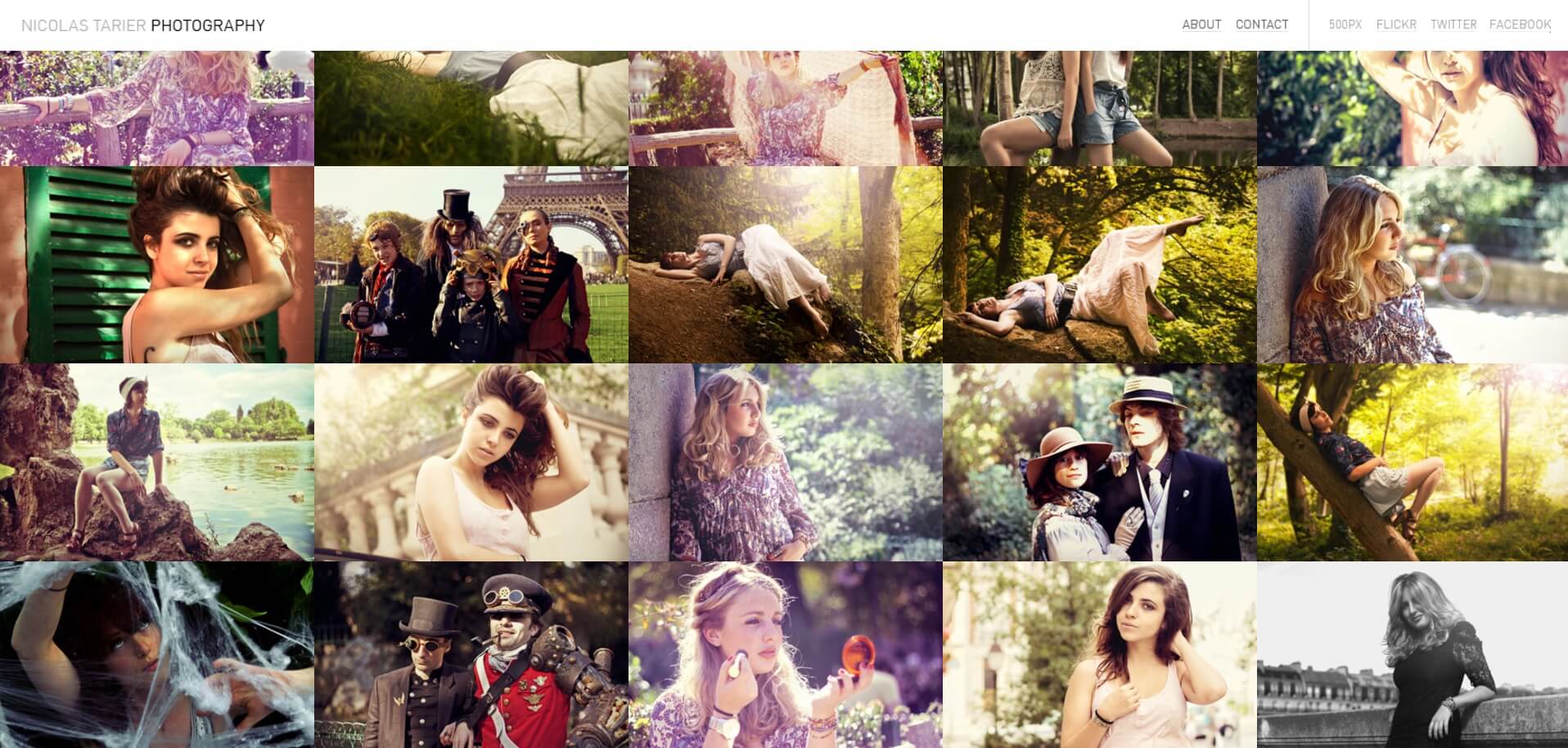
As we mentioned earlier, not all features are directly related to your images. Captions are a way to add further depth and context. As such, the captioning options your theme offers should be beautiful and varied. Fortunately, many photography-specific themes (such as Imagely’s Rebel) recognize the importance of this feature.
Captions can be used as a storytelling tool, and as a way to connect with your visitors. A variety of captioning options opens you up to endless possibilities, and to get the most from this feature, there are a few considerations to keep in mind:
- Use captions only when necessary. This keeps the focus on your images, and lets your work do the talking.
- Be descriptive. The captions you provide can help your photographs to stand out more. They can also add depth to the image, and help create a compelling story that will stick with readers.
Be aware that the gallery display or photo format you use can limit your captioning options. For example, you don’t want to add a lengthy caption if it ends up covering the majority of the image. Of course, to get around this, you can incorporate multiple photo formats into your posts and gallery pages.
4. Multiple Photo Formats Within Posts
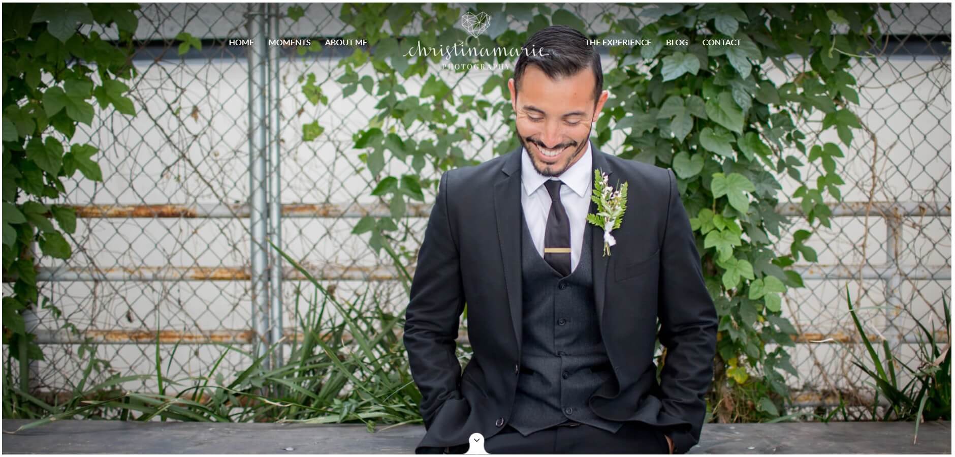
If you also host a blog on your website, it’s a good idea to use a theme that lets you use multiple photo formats within posts. You can do this seamlessly with the Journal theme, but many photography themes incorporate this element too.
In short, you want to display your images in the best way possible – and multiple photo formats can help. In addition, multiple formats throughout your posts keep them versatile and engaging. This keeps the attention of your site’s visitors. Here are some tips for getting it right:
- Match your chosen photo format to the image style. For example, landscape images should be incorporated into posts horizontally, and portrait images should be incorporated vertically. By keeping the original orientation and format, you enhance the viewing experience.
- Attempt to vary formats within each post. This keeps your readers engaged, and it’s a great way to break up longer blog posts or pages.
Even if you don’t have a blog on your photography website, you can still benefit from multiple photo formats wherever you display galleries – it’s a great way to keep your website engaging.
5. Lightbox Viewing Options
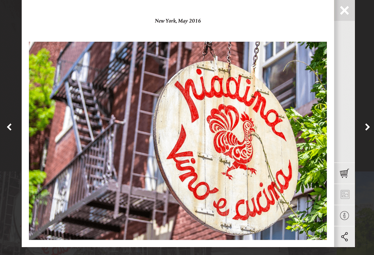
Given the likely high number of images to view on your website, it’s important to choose a theme that incorporates a variety of lightbox viewing options. The Imagely theme Gridly does this quite nicely.
While underappreciated by many, this feature has many benefits. Most importantly, it provides you with distraction-free viewing. However, it also enlarges images to provide further depth and clarity. To use this feature most effectively, consider these two pointers:
- Use it when you’ve resized a larger image. It may be necessary to reduce the image size to fit it onto your site, but this can affect the quality. With a lightbox option, you can display it appropriately but also enable viewers to see the high-resolution image as it was meant to be seen.
- Consider it when the image contains text that visitors need to see. If the photograph contains text, such as when taking photos of books or documents, offering a larger version in a lightbox helps visitors to read the content within them.
While enabling lightbox functionality can work for all of your images – and it certainly does no harm to do so – picking and choosing where it’s implemented can also offer you some variation in your design.
Conclusion
If you want to display your photography in the best way possible, we recommend you use a dedicated WordPress photography theme. Many other themes may not contain features specific to displaying images, and a solution tailored to your needs will see your website take on a more focused design. What’s more, you’ll improve your workflow as you’ll rely less on third-party plugins to add features.
In this post, we’ve introduced you to five must-have features for your photography theme. To quickly recap, they are:
- Custom gallery styles.
- Large image backgrounds.
- Beautiful captioning options.
- Multiple photo formats within posts.
- Lightbox viewing options.
Do you have any questions about choosing the right theme for your photography website, or any of the features mentioned above? Let us know in the comments section below!
Image credit: Pixabay.

2 Comments