
Attention spans are notoriously short on the web.
Having experienced poorly designed pages in the past, online users are naturally skeptical of new sites. So they’ll behave accordingly to minimize wasting time before moving on. Regardless of the industry, the challenges are the same—There’s an extremely limited window to capture a user’s attention.
First impressions matter as illustrated here:
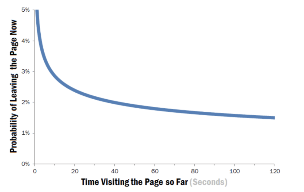
What does this mean? Simply put that bounce rates are highest within the first 10 seconds. That means you only have a few moments to make a great impression on your visitors.
So how can you reduce the high probability of visitors leaving and actually get them to check out your content? It starts with a compelling design that engages visitors the moment they land on your site.
The homepage offers a great starting point—it’s often the first point of contact that visitors have with a business and it also tends to receive the most traffic. Here we look at how you can design a more compelling homepage for your business.
- Establish Your Brand Identity
Think of your homepage as a virtual storefront. If it’s not obvious what your business does, visitors will simply walk by without taking notice.
If should be immediately clear what your unique value proposition (UVP) is. A UVP is a statement that describes what your business offers and why visitors should care. If these details aren’t apparent in the first 10 seconds, potential prospects are more likely to bounce. This may sound obvious but too often homepages are designed with too many distracting elements or lose sight of the bigger picture.
Here is what you can do to establish a strong brand identity:
Feature Your Logo and a Relevant Image
A great logo tells a story about a brand but more importantly, it allows for easy recognition. Prominently display your logo and also include a relevant image that reflects your brand. The goal here is to establish your brand identity right from the start.
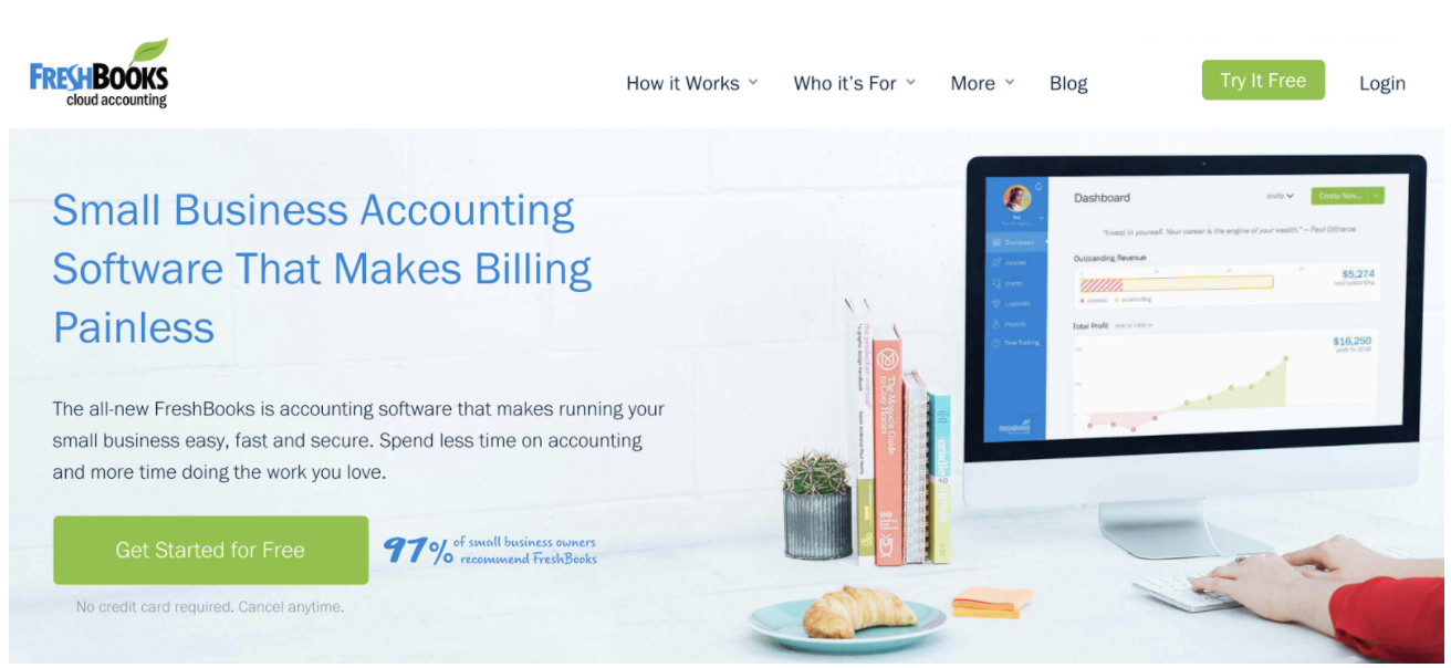
FreshBooks offers an excellent example of communicating its value proposition with its target audience:
Lead With a Strong Headline
Headlines are a critical component of any home page. It can mean the difference between visitors reading the rest of your offer or clicking out.
A case study from VWO found that direct headlines that plainly represented a service generated the highest conversions. Start with a strong headline that clearly states your value proposition and use customer-centric copy (e.g. “you” instead of “we”) to connect with your target audience.
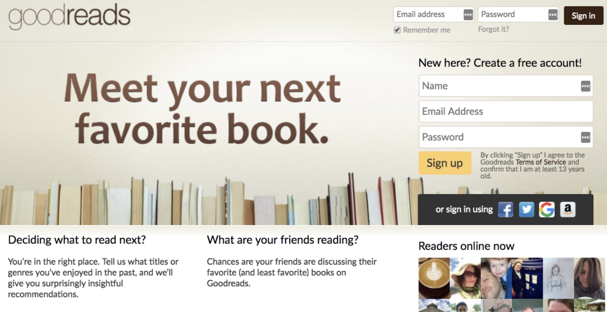
Goodreads communicates its value proposition with a clear, yet powerful message:
Pay Attention to Color
Color is an important element to establish brand identity. In a peer-reviewed article on the impact of color, the author notes that it takes just 90 seconds for consumers to form opinions about a product. About 62-90% of that initial assessment is based on colors alone.
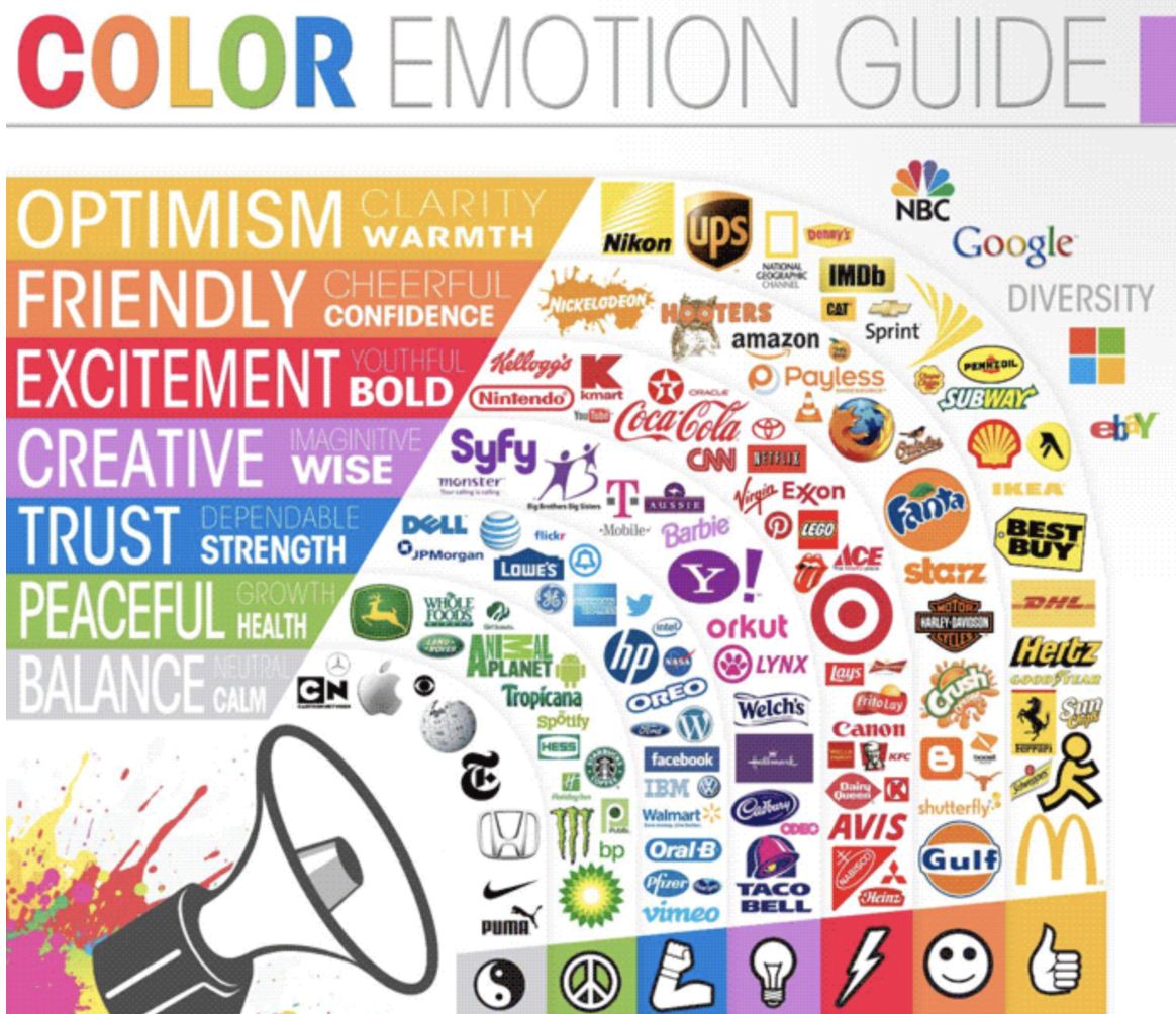
This infographic illustrates emotions that are conveyed with certain colors and the brands that use them:
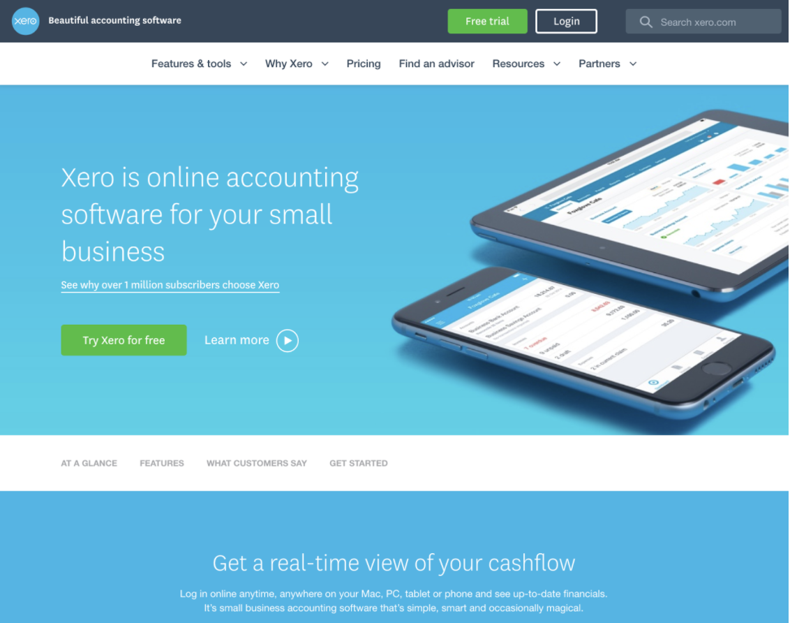
Blue is often used to elicit feelings of trust and confidence. Xero does a good job of incorporating this color scheme to convey that message on its homepage:
Think about the type of personality you want your brand to convey and choose an appropriate color. The point of your homepage is to provide a clear sense of your brand. Implement each of these to establish a strong brand identity with your visitors.
- Keep It Simple
First impressions are formed in fractions of a second.
Research from Google found that it takes less than 50 milliseconds for users to develop a “gut feeling” about a website. Users were asked to rate the aesthetics of existing websites. The results found that websites with simple designs were rated more positively than those with visually complex layouts.
The data confirms what we already know—Aesthetics have a large impact on how users judge a website. But the study also plainly points out that users vastly prefer simpler designs.
Here is what you can do to engage more of your visitors:
Make It Scannable
A busy layout that is crammed with excessive clutter is distracting and overwhelming. It makes it harder for visitors to find the information they’re looking for. Most will simply click out rather than waste time digging through the clutter.
Online users tend to scan web pages rather than read every single word. Heatmaps from eye tracking studies show that users typically follow an “F” pattern:
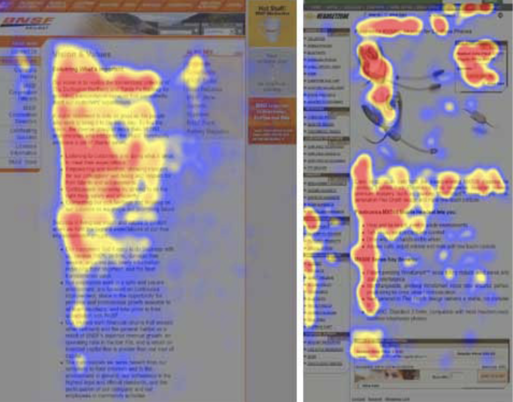
The red parts indicate the areas that users focus their attention on as they browse through a web page. The implications are clear—Your pages need to be easily scannable.
Here is what you can do to improve the readability of your homepage:
- Bold keywords and phrases to make them more noticeable
- Use subheadings with clearly labeled sections
- Use bullet points or numbered lists
- Make your content more concise
Aim to make your content scannable to make it easier for visitors to find what they’re looking for.
Use Plenty of White Space
White space refers to the empty space between elements on a page such as the text and images. It gives your content more breathing more and minimises distraction. The minimal layout lends to much more elegant designs and helps draw attention to only a few elements at a time. It all comes together to create a much more sophisticated layout that your users will appreciate.
White space is crucial then as it makes your website more user-friendly. In fact, research from Human Factors International found that the use of white space increased comprehension by almost 20%.
Look at the following example from Dropbox:
The page makes ample use of white space to minimise distractions and draw focus to the important areas of the page—The headline and call to action. Empty space isn’t necessarily wasted space. So think of how you can use white space in your page design.
- Build Credibility With Your Visitors
If visitors have any doubts as to your business’s trustworthiness, most will simply bounce out rather than take the risk. When online users interact with a brand for the first time they want to know that it’s reputable and legitimate. They also want to feel confident with their purchase and that their orders will be delivered in a timely manner.
Building credibility is a key component then to create a compelling homepage design. And that starts with utilizing social proof—The psychological phenomenon where people look to their immediate surroundings to guide their own behavior.
Imagine that you’re comparing two different products, one has received glowing reviews while the other has mostly negative ratings. Chances are you would be more inclined to purchase the first one. This is just one example of social proof but it’s a powerful marketing technique that can be utilized to establish trust.
Here are some ways to utilize social proof on your homepage:
Include Testimonials
Your job is to ease any doubts that visitors may have. One way to do that is with testimonials from previous customers. Testimonials are an excellent form of social as it helps to establish credibility by showing that others have used and recommended your products or services.
Square features a testimonial on its homepage which includes a short testimonial from a business owner and shows the product in action:
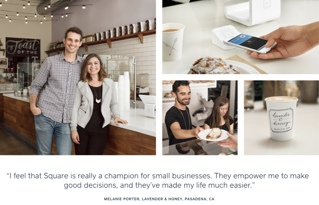
On your own homepage, include a photo of the individual who contributed the testimonial for added authenticity. You could also even take it a step further by linking that testimonial to a case study.
Showcase Company Logos
Another powerful way to utilize social proof is to showcase company logos of those brands that your business works with. Just like with testimonials, it illustrates that your brand is trusted and recommended not only by individuals but also by entire organizations.
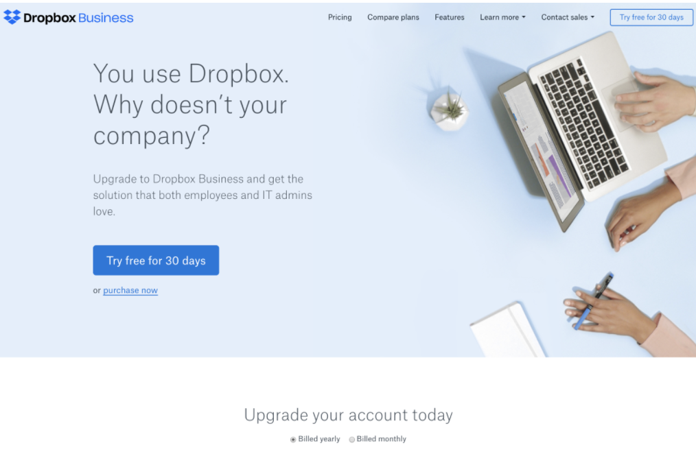
Here’s an example from the Dropbox Business page:
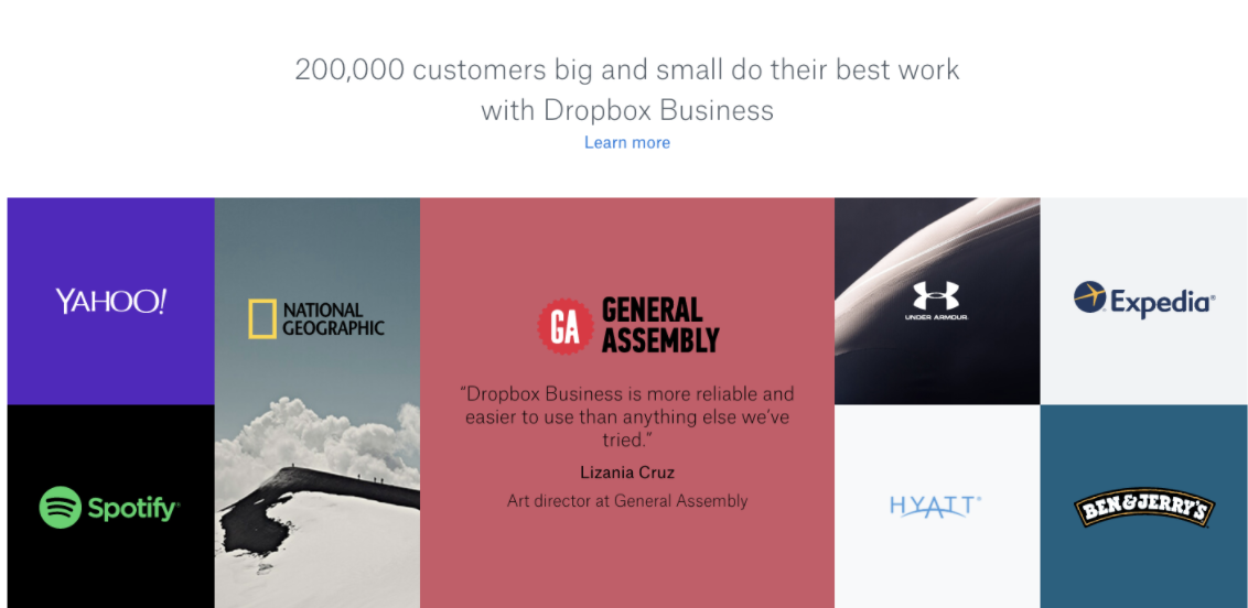
Those landing on this page can see that the company works with other reputable brands. If your company has been featured in major news outlets, those are also worth including on your homepage.
Include Security Seals
Before visitors pull out their wallets, they want assurances that your site is secure and that their data isn’t vulnerable. Security seals indicate to visitors that your site has been verified by a third party and that there is a secure transmission for customers.
Newegg displays these icons at the bottom of its homepage:
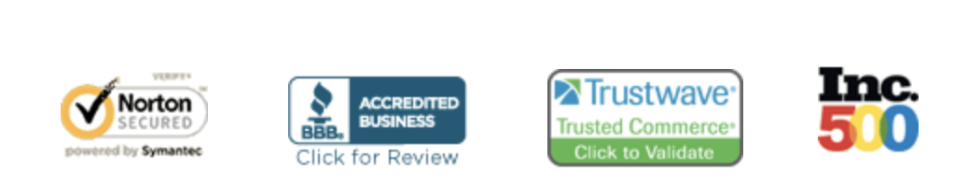
These icons tell visitors that they’re shopping from a legitimate business and that any transactions made online are secure. Note that you’ll need to purchase these certificates before you can display the appropriate seal.
Showcasing testimonials and including security seals are effective ways to establish credibility. You’ll also want to make sure your contact details are clearly visible as these are indicators that visitors look for to determine the trustworthiness of a business.
Final Thoughts
It’s no exaggeration to say that your homepage is one of the most important pages on your site. Fail to make an impression and new visitors likely won’t stick around for long. But get the details right and you can expect a more positive impact on your bottom line.
Most importantly, look at your homepage as a constant work in progress. Don’t be afraid to experiment with its design as even a small tweak can ultimately mean more sales.
No Comments