When creating a WordPress page, you think of its usability and visual components. You want more people to visit it and say “Wow!”
But let’s face it, you want to convert, as well. Design and copywriting techniques do wonders, but sometimes you don’t see any logic behind users’ reactions to your website. You’ve put a lot of work into making your site easy to follow and interesting to visit, but visitors still aren’t turning into customers.
What the heck?
The problem is, you forget about human psychology and emotions while crafting your site. It’s important to try to understand how people react to certain stimuli, and then tailor your WordPress websites accordingly.
These five psychological tricks will help.
1) Your WordPress Template Color
Do your best to answer this question:
What principles do you follow when choosing a WordPress theme for your page? Price, features, usability, the freedom to customize it? And what about the target audience? When choosing a color scheme, do you think about the psychology behind colors?
People are 90 percent visual beings, and that is why colors you choose for a WordPress page matter so much. Considering both positive and negative properties of primary colors, you will be able to find a stellar combination for your site to stand out.
For instance, violet evokes a sense of quality, luxury, and authenticity. It enhances trust, so it’s not surprising that purple WordPress themes are so popular. This also holds true for many websites: Elementor.com, PlagiarismCheck.org, WPTeamSupport.com – all have violet as the main color to provoke a positive response from visitors.
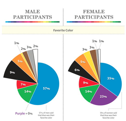
Also, consider the gender of your target audience when crafting a WordPress page: men and women react to different colors differently. Despite its luxury, purple doesn’t seem a favorite for men; with blue ruling the perception of both genders, many websites (and Torque’s not an exception) feature it heavily.
2) Fonts: Psychology Behind Size and Shape
Typography matters, and it plays a huge role in creating the first impression of your website. It’s a proven fact that fonts convey different messages:
- Serif expresses tradition and respect,
- Sans-serif is universal and modern at the same time,
- Slab serif demonstrates power and trustworthiness,
- Script is elegant and creative,
- Modern is stylish and intelligent.
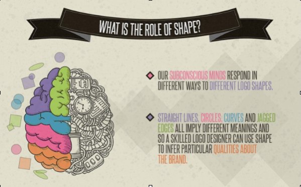
And given that a person needs about two-tenths of a second to form an opinion about a web page, you should decide on the right font for your WordPress page to elicit particular associations from visitors. Also, remember that shapes influence a human perception too.
3) Visuals on Your WordPress Page
Numbers speak volumes.
People are 80 percent more likely to like your site and 85 percent more likely to become a customer if you publish great visual and multimedia content. A suitable image completes your page, tells a story, and motivates visitors to scroll and take some action.
Have you ever considered your WordPress image hero? It’s an element with a strong emotional and persuasive connotation, able to express your brand goal and help visitors acquire your marketing message right.
What visuals will work best for your site?
- Relevant to your message and keywords.
- Express desired emotions to motivate visitors and make them keep on reading.
- Trustworthy and of a high quality.
- Those in contrast with your web design.
4) Words You Use
To wow visitors to your site, make sure it has a strong information scent and surplus value.
Given that people don’t read but scan content to decide whether to continue examining it, visual clues such as CTA buttons, comfortable navigation, personalization, and right text structure allow them to decide whether or not your page is worth staying on.
Avoid content usability blunders, which are:
- Right alignment
- Wrong color-contrast ratio
- Hard-to-see subheads
- Wrong spacing
- Complex text structure
- Large text fields
- No paragraphs
And remember: in the age of information overflow, people don’t trust one single source anymore. Your site should answer a “So what?” question for visitors to choose it. Clear, concise, and consistent information, told with powerful words is the way to do this. Also, consider the readability of your page before publishing: cliches, long words, and awkward sentences.
5) Persuasion Principles You Consider
According to Dr. Robert B. Cialdini, there are six principles you should consider when designing a site:
- Reciprocation- When you “oblige” someone to respond.
- Commitment and consistency- When you engage someone and make them commit to your brand.
- Social proof- When you provide visitors with reviews, testimonials, or awards you’ve received to prove your business is legit.
- Liking- When you imitate tones and visual preferences of your target audience, so they could feel you’re a sociable fellow when visiting your WordPress page.
- Authority- When you demonstrate expertise in the niche, so visitors would trust your website.
- Scarcity- When you highlight the exclusivity of your offer so people would be “afraid” of losing it.
All of them are actively used by social media marketers, but you are welcome to choose any for your site so it would look and sound more persuasive. It’s a powerful weapon for users attraction and lead generation. Creating a page with psychology in mind, you will have better success converting visitors into customers.
Tailor your site to spark, capture attention, and correlate with your visitors’ needs and internal biases.


2 Comments