One-page sites are becoming popular in 2018, mainly due to the rise in mobile device browsing and the subsequent need for short, impactful information. They’re also perfect for developers who need to offer a summary of their services to potential clients. However, knowing what to include on a one-page site isn’t always easy.
One-page sites are similar in many respects to landing pages, in that they both feature a prominent Call To Action (CTA) and straightforward contact information. When implemented correctly, a one-page design can turn your sprawling website into a streamlined conversion machine.
In this piece, we’ll provide some examples of one-page websites, look at their key elements – such as a linear hierarchy and an effective CTA – and explain how to build them effectively. Let’s get started!
The Rise of One-Page Websites (And Why You Should Take Notice)
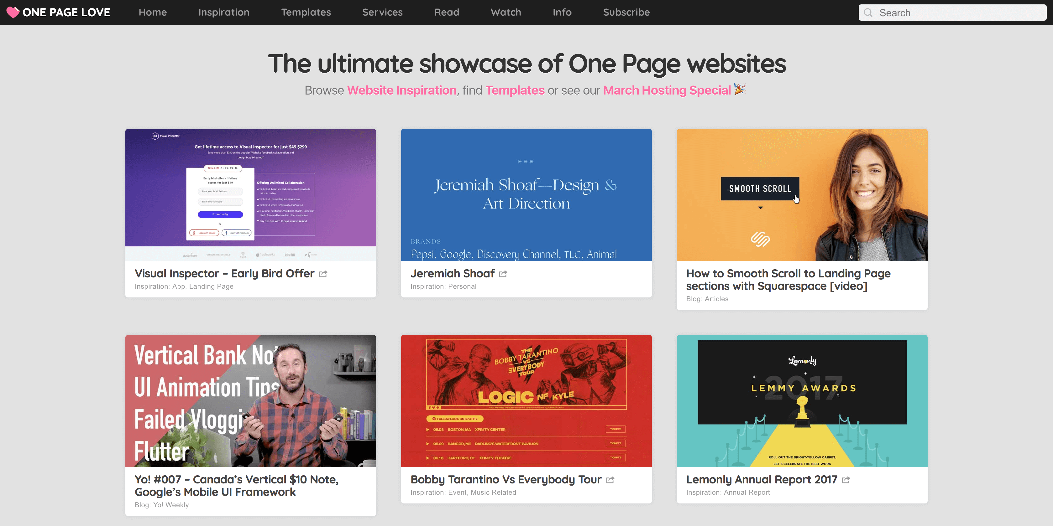
As you’re no doubt aware, the traditional approach to structuring a website is to include many pages, each full of specific content relating to a particular topic. This has always been a solid approach, and can be used to develop a site with a strong structure and hierarchy.
However, mobile browsing among consumers is increasing. For this reason, ease of navigability, speed, and data usage are now prime considerations for improving a site’s User Experience (UX). Having lots of links relating to navigation (and reloading pages whenever the user wants fresh information) can impact traffic negatively. These, of course, are issues that don’t occur on a one-page site.
There are many other benefits of one-page sites that are worth considering. These sites:
- Take writing for the web to its natural conclusion, given the need for brevity and directness.
- Are usually lean if created correctly (cramming in too much information will naturally have a bloating effect).
- Can be useful for funneling readers towards a goal (just like a landing page should be) so they can help you achieve greater conversion rates.
The one-page approach is likely going to appeal to those needing their website to pull ‘double duty’ as a conversion machine. It’s also a good approach for those wanting to create a quick and informative primer for a business venture. That’s why web developers, designers, and other creatives should take notice of this trend.
5 Key Elements of a One-Page Website
Let’s take a look at five elements we consider vital to a compelling, highly converting one-page website. Plus, we’ll explain how each can be used most effectively on your own site.
1. A Linear Structure That Guides the Visitor
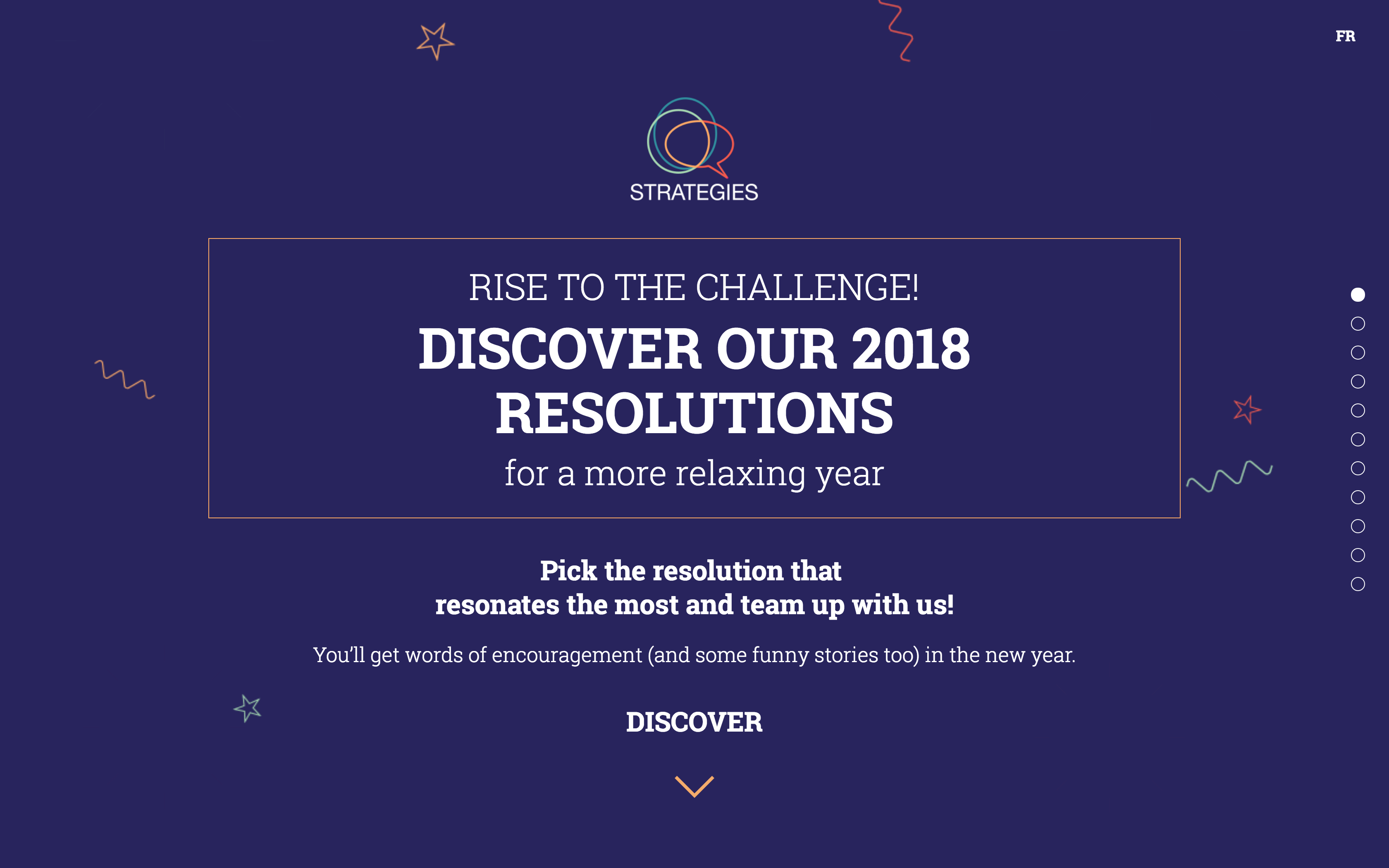
The structure and hierarchy for any site plays a crucial role in its ability to succeed. This is doubly true for one-page sites. Without a linear structure focused on keeping the reader scrolling down the page, a one-page site is completely redundant. As such, structure constitutes the most important element of its design.
Fortunately, achieving the optimal structure in WordPress is simply a matter of choosing the right theme from the start. There are plenty of available options, meaning you’ll likely find something that fits the bill. Coupling this with a quality page builder plugin can help both you and your clients create pages faster.
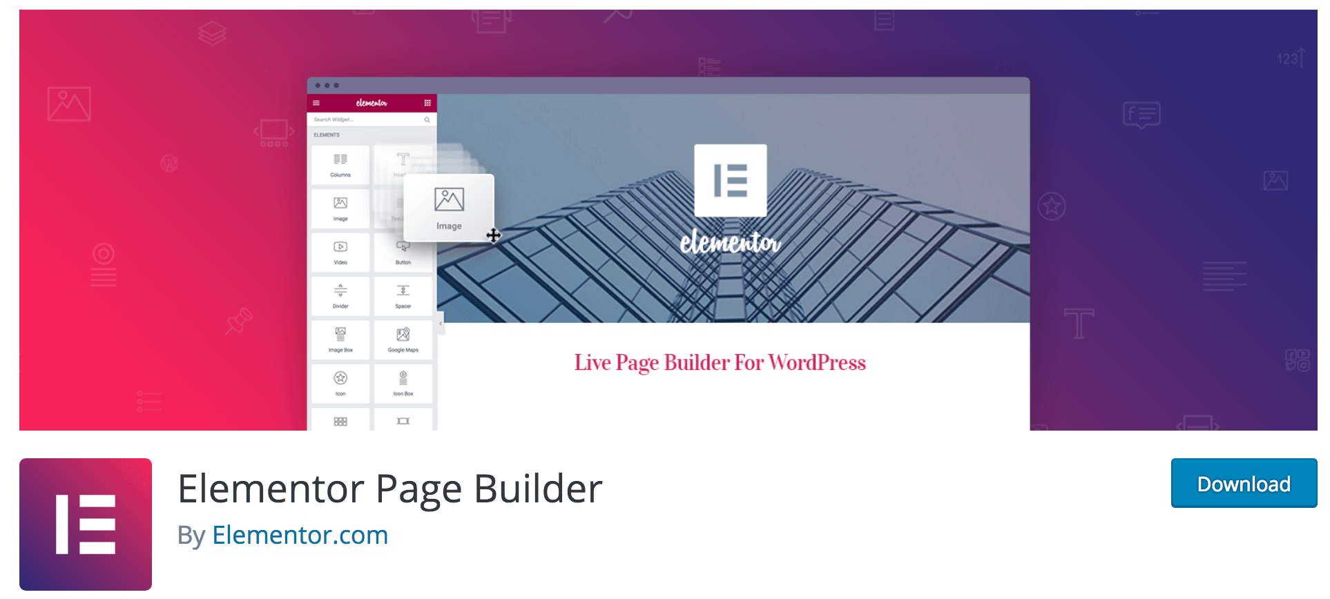
We’re partial to Elementor, and it’s a solution we’ve mentioned previously here on Torque. Being able to drag and drop elements will supercharge your ability to develop effective one-page websites.
2. A Prominent Primary Call To Action
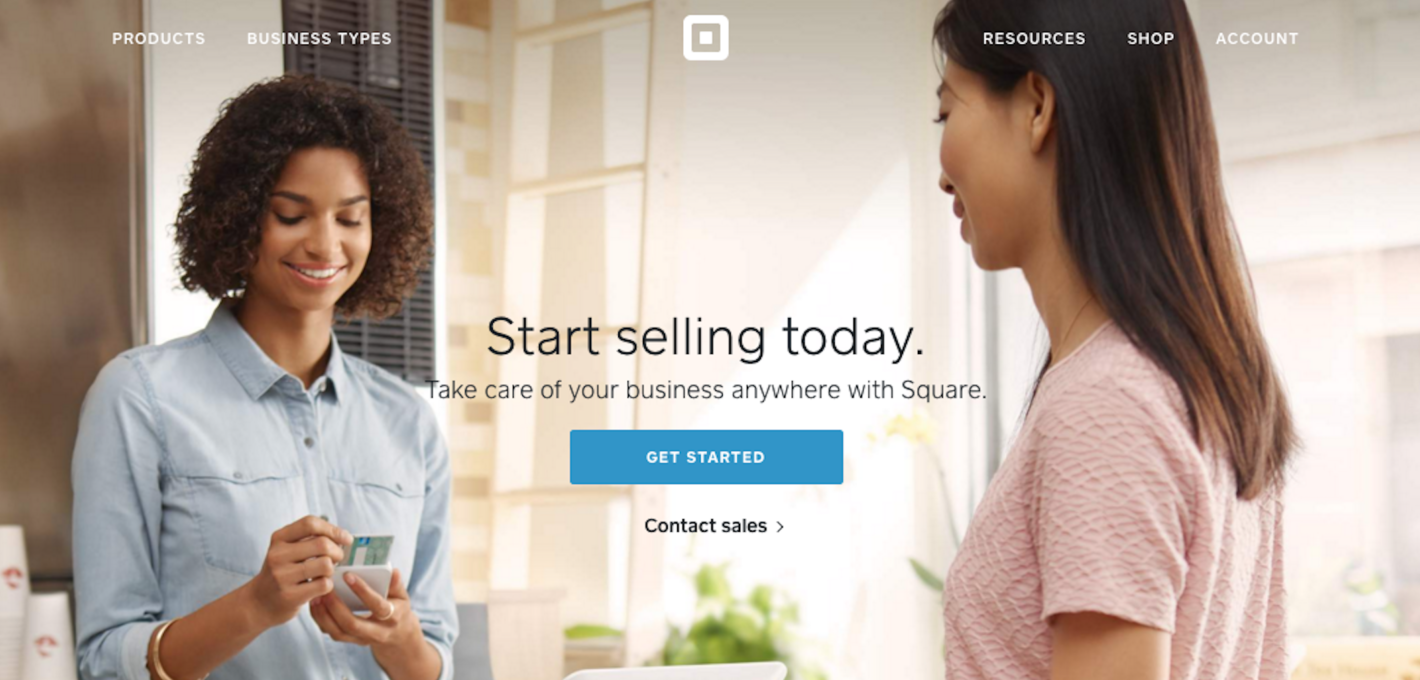
While the structure of your site has more to do with its ‘feel’ (in an abstract sense), your Call To Action (CTA) represents the first ‘touch’ element. For the uninitiated, your CTA is essentially what you’d like the visitor to do on your site. This could be to sign up for an email list, make a purchase, or anything else that will further your site’s goals:
Not including a CTA front and center will sap your one-page site of its effectiveness (especially when it comes to conversions). This is why they are frequently used on landing pages, generally accompanied by a ‘hero image’ to further encourage action.
For more information on how to implement stellar CTAs on your site, we recommend checking out Neil Patel’s blog post on the subject. The Kissmetrics posts covering the psychology behind CTAs and how to write them are also worth your time.
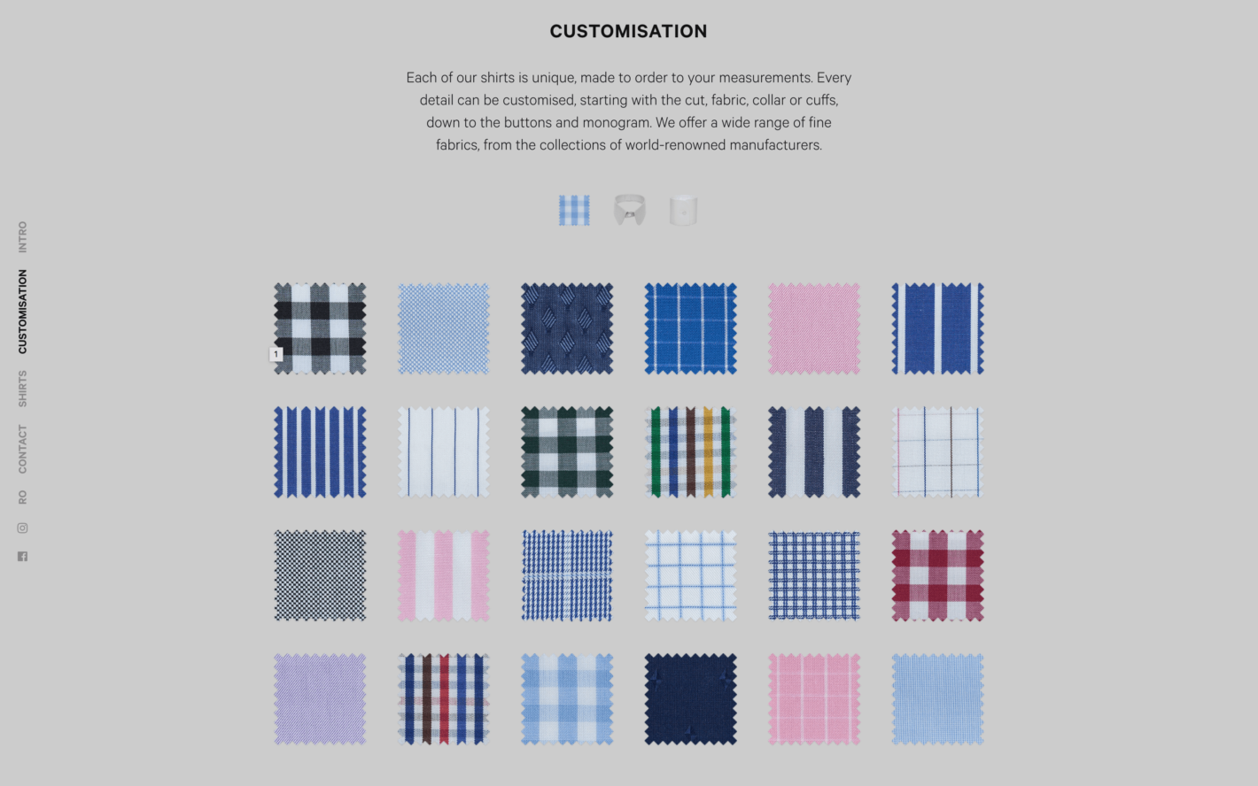
3. Concise Descriptions of Your Core Products and Services
It may seem counter-intuitive to put a CTA at the top of your page before leading onto other content, but the sections underneath can provide the backstory of what you’re offering, and explain why you’re in business. Each subsequent section, if implemented correctly, can further add to that story. Your core products and services play an important role here, as they further enhance your site’s ‘scrollability’:
It goes without saying that without descriptions of what you’re offering, visitors will have no meaningful reason to convert. You should be able to see how this relates to your initial CTA, and to how the rest of your site is structured.
Of course, you’ll want to keep descriptions concise, designed to match the available space and the overall goal. You’ll also want to focus on the reader’s needs, rather than simply “We do X, Y, and Z…”. For more information on this topic, we recommend Kissmetrics’ excellent piece on how to write product descriptions. ThriveHive also offers more specific advice on writing product and service page content for your site.
4. ‘Humanity’ and Social Proof Markers
Social proof markers inform visitors as to what your business is all about, and how your products impact your already-converted customers. This is a significant leveraging element for many sites, and gives you a way to showcase your business philosophies in a less direct way. It’s also an efficient method for adding a more personable and ‘human’ touch to your site:
Unlike a landing page (which typically would not include company information), your one-page site should offer a brief overview of your business, the team, and your overall company ethos. However, when it comes to social proof, there’s much more to consider. Testimonials are the most common example, since they provide an unbiased ‘thumbs up’ from a customer.
You can also include badges and seals related to the security, trustworthiness, reputation, and standing of your website and business. This is especially relevant if you use payment gateways on your site. In fact, this is such an important consideration that we recommend reading a comprehensive article on the subject, such as this one from ConversionXL. It’s well worth taking the time to learn the ins and outs of this powerful, lead-generating technique.
5. Clear and Easy-to-Use Contact Information
After implementing the above steps, your site should be configured for optimal customer appeal. The final step is to give potential customers a way to contact you. Too often these days, we see social media icons in place of a proper contact form. This is not recommended, as it’s a less direct method of communication. If you think about it, visitors are being told to leave your site, head to another location, and send a potentially public message to get in touch. This isn’t ideal from a customer service standpoint.
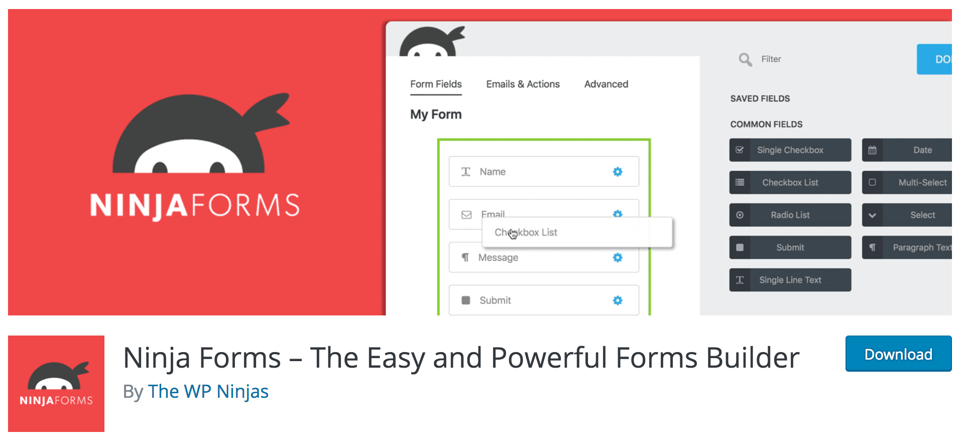
Instead, implementing an easy-to-use contact form keeps the potential customer on your website. Plus, it gives them a streamlined way to reach you. The simplest way to do this (especially if you’re a WordPress user) is to install a dedicated plugin. Given the wealth of choice available, it can be hard to settle on the right tool. Our recommendation is to try out either Jetpack’s dedicated module, or a plugin such as Ninja Forms:
When creating your contact form, you’ll want to research some of the most high-converting techniques out there, and then refine and optimize your form accordingly. Since the contact form represents one of the last points in your conversion funnel, it’s important to invest the time needed to optimize it.
Conclusion
Your website is a vital cog in the machine that is your conversion funnel. Simply maintaining a passive ‘calling card’ type of site isn’t going to cut it – at least, not as far as consistent income is concerned. With that in mind, you’ll need to make sure each element of your one-page site is outstanding, as they all play a part in winning new clients.
This post looked at five key elements you’ll need to include on your one-page website. Let’s recap them quickly:
- A clear structure that takes readers on a journey from A to Z.
- Prominent CTAs that focus the reader’s attention on what you want them to do.
- Concise, clear descriptions of your products and services (targeted towards your visitors’ needs).
- A human element, and proof from previous customers or clients that you can provide real value.
- Easy-to-find contact information that will help visitors transition from potential to paying customers.
Is there an element you think we’ve missed from our list? Let us know about it in the comments section below!
Featured image: skyangel.


No Comments