For a long time, the one flaw in CSS was that there was no straightforward way to create layouts. Doing so always relied on using properties like floats and absolute positioning, which had their own flaws and challenges. Thankfully, this CSS Grid tutorial is going to change that.
The CSS Grid property finally allows web designers to make two-dimensional layouts that are not only easy to implement but also responsive. It is the first CSS module developed specifically to solve the problem of making layouts with CSS.
In this tutorial on CSS Grid, we’ll go over its basics and give you the resources you’ll need to master it. We’ll explain what CSS Grid is, why you should use it, how to create a basic grid layout, and where you can learn more.
What is CSS Grid (And Why Should You Be Using It)?
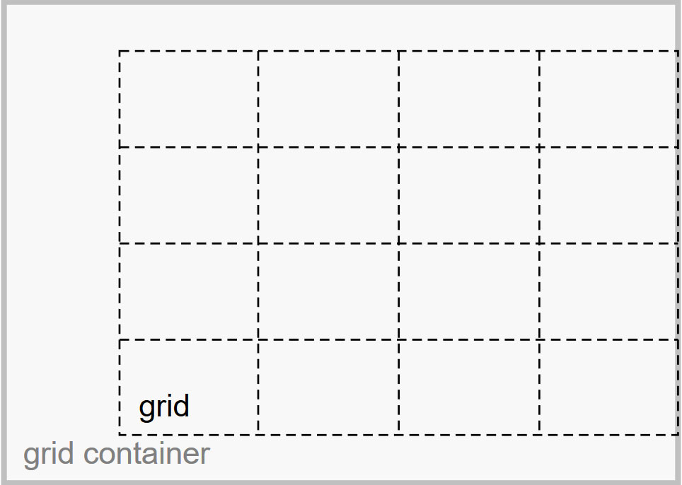
CSS Grid is a CSS module that allows you to define two-dimensional grid-based layout systems. At its basis, it consists of a container element and its children, with the latter arranged into columns and rows.

CSS Grid also controls the order of the items via CSS, independent from the underlying HTML. This provides great options to rearrange your layouts for mobile designs. To make things even better, grids can overlap which allows you to create more advanced page structures.
As a consequence, this module makes it simple to natively design layouts with CSS. You no longer have to rely on tables, floats, or other awkward solutions.
CSS Grid is flexible enough to be used as part of a page or to build an entire page layout on its own. It also has good browser support so there is nothing stopping you from using it in your design projects.

CSS Grid vs. Flexbox
No CSS Grid tutorial is complete without a comparison between this module and Flexbox. While their methodology is similar and both are used to create layouts, they have a very different purpose.
In simple terms, Flexbox is used for one-dimensional layouts (either rows or columns) while CSS Grid works in two-dimensions, both horizontally and vertically. This gives you more control over the alignment of page elements.
It’s also important to remember that Flexbox uses a content-first approach while the CSS grid uses a layout-first approach. With the former, you define rules on how your content is going to arrange itself in a layout. CSS Grid, on the other hand, defines a layout and then places content inside of it.
In short, use Flexbox for linear layouts where you only need to define one dimension and let the rest take care of itself. If you need full control over the alignment both ways, CSS Grid is the way to go.
CSS Grid vs. CSS Frameworks
Another question that arises is whether you should use CSS Grid instead of a framework like Bootstrap. Again, the answer here is that although both help you layout a website, they’re not really interchangeable.
CSS frameworks are easy to learn and use if you’re a complete beginner. They allow you to create complete website layouts without having to write the entire CSS code from scratch. They also come with different UI components like buttons, accordions, sliders, and more.
However, because they offer so much, frameworks can be restrictive in that they force you to design in a certain way. You cannot use your own classes or add your own elements. CSS frameworks are also decried as being bloated due to the sheer amount of code they contain.
CSS Grid, on the other hand, is more lightweight than a framework. You can build any type of layout relying solely on native CSS features and there is no need to introduce or use special classes in your HTML. As such, CSS Grid is even easier to master than a framework.
So, opt for CSS Grid for custom layouts with a leaner code base. For everything else, frameworks are a viable solution.
The Basics of CSS Grid
So now that we’ve properly defined what we are talking about, it’s time to dive into the meat and potatoes of this CSS Grid tutorial. In the following, we will cover the basic terminology of this module as well as show you how to create your first grid.
Important Terminology
As you will see, there aren’t many terms to remember. However, it’s important to know them and understand the underlying concept to be able to manipulate your design.

Grid Container
This is the basic element that will hold your CSS grid. It will contain all the grid items and is defined via display: grid. In the example below, the div with the class container is the grid container.
<div class="container">
	<div class="item"></div>
	<div class="another-item"></div>
</div>
Grid Item
This is the term for all the children (direct descendants) of the grid container. Using the same example as before, the divs with the classes item and another-item are grid items. However, their children (or sub-items) are not.
<div class="container">
	<div class="item"></div>
	<div class="another-item">
		<p class="sub-item"></p>
	</div>
</div>
Grid Line
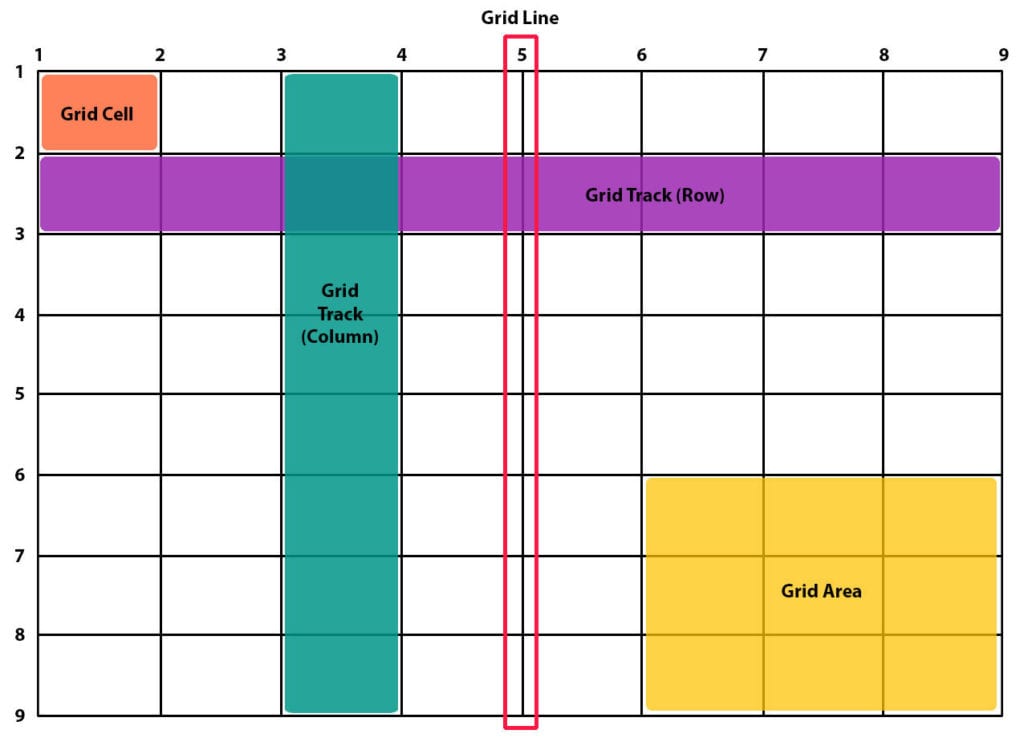
The term Grid line refers to the border between each grid item and makes up the structure of the grid. Depending on whether they are vertical or horizontal, you can refer to them as either column grid lines or row grid lines.
Grid Track
This is what we call the space between two grid lines. In essence, the grid track is what makes up a column or row of the grid.
Grid Cell
A Grid cell is the single unit of space between two neighboring row and column grid lines.
Grid Area
Lastly, we have the Grid area which is a space surrounded by four grid lines. It can contain any desired number of grid cells.
Creating Your First Grid
With that out of the way, let’s create our first CSS Grid. We’ll start off by creating a container element first:
<section class="grid">

</section>
Then, we’ll add seven child elements:
<section class="grid">
	<div class="item-1">First</div>
	<div class="item-2">Second</div>
	<div class="item-3">Third</div>
	<div class="item-4">Fourth</div>
	<div class="item-5">Fifth</div>
	<div class="item-6">Sixth</div>
	<div class="item-7">Seventh</div>
</section>
Now that we have the basics in place, the next step is to declare that our container element is a grid and then define it by stating how many tracks (rows or columns) it will have. We’ll do this in our style sheet like so:
.grid{
	display: grid;
	grid-template-columns: 200px 200px;
	grid-template-rows: auto auto;
}
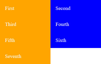
As you see from the code above, we’ve introduced two new CSS rules: the grid-template-columns and grid-template-rows. These two rules state that there should be two columns, each with a width of 200px, and two rows, each with their height set to auto.
If we add some basic styling to make it easier to differentiate each item, we end up with this:

If you wanted to add two more columns, you could simply do so by changing the code above to grid-template-columns: 200px 100px 100px 200px;. Here is the result:

Note that you can use px or vw to define the width or the height of each track. The new fractional unit fr is another option. For example, grid-template-columns: 1fr 2fr;, creates two columns where the second one is twice the size of the first.

Finally, you’ll notice that there is no gap between the columns or rows. You can fix this by adding the grid-column-gap and grid-row-gap, or the shorthand grid-gap. For example, by adding grid-gap: 10px; to .grid, you get this result:

And that’s it! Now you have your very own CSS grid. It’s very basic but once you understand this much, you can move on to learning more complex applications.
Available Properties
CSS Grid comes with a lot of available properties that we can not completely cover in this CSS Grid tutorial. However, here is the short version so that you have a good overview.
Grid Container Properties
display— This is what defines a container as a grid container. Takes eithergridorinline-grid.grid-template-columns,grid-template-rows— Defines the number and size of columns and rows.grid-template-areas— Allows you to arrange grid areas by name. You need to assign names to items viagrid-areafirst.grid-template— A shorthand for settinggrid-template-rows,grid-template-columns, andgrid-template-areas.grid-column-gap,grid-row-gap— Controls the size of the gaps between columns and rows. Thegrid-prefix will soon not be necessary anymore.grid-gap— Short version ofgrid-row-gapandgrid-column-gap.justify-items— Aligns all grid items in a container along the horizontal axis. Can align them at the start, end, center, or stretch to fit.align-items— The same asjustify-itemsbut along the vertical axis.place-items— Setsalign-itemsandjustify-itemsin a single declaration.justify-content— Controls the alignment of the entire grid inside its container along the horizontal axis with several options.align-content— Same asjustify-contentbut for the vertical axis.place-content— Sets both of the last two properties in one declaration.grid-auto-columns,grid-auto-rows— Specifies the size of any automatically generated grid tracks. This happens, for example, when there are more grid items than cells.grid-auto-flow— If there are grid items that are not explicitly placed on the grid, the auto-placement algorithm takes over to place them. This property controls how it does so.grid— A shorthand for settinggrid-template-rows,grid-template-columns,grid-template-areas,grid-auto-rows,grid-auto-columns, andgrid-auto-flowall at once.
Grid Items Properties
grid-column-start,grid-column-end,grid-row-start,grid-row-end— Determines the position of a grid item within the grid based on specific grid lines.grid-column-start/grid-row-startsets the line where the item begins,grid-column-end/grid-row-endis the line where it ends.grid-column,grid-row— Shorthand forgrid-column-startandgrid-column-endas well asgrid-row-startandgrid-row-endrespectively.grid-area— Gives an item a name so that it can be manipulated with thegrid-template-areasproperty. It’s also an even shorter shorthand forgrid-row-start,grid-column-start,grid-row-endandgrid-column-end.justify-self— Aligns a single grid item inside its cell along the horizontal axis.align-self— The equivalent ofjustify-selfbut for the vertical axis.place-self— Sets bothalign-selfandjustify-selfin one declaration.
Resources to Continue Learning
As mentioned above, the basics outlined here will get you started on your journey to learning CSS Grid. If you want to master it, be sure to check out the following resources:
- CSS Grid Layout by Mozilla Developer Network — This guide has an in-depth explanation of CSS Grid as well as how to use it and all the terminology associated with it.
- Grid By Example — If you want to see visual examples the CSS module and the code behind them, be sure to check out this website. It has several showcases along with codepens and explanations for each layout.
- Learn CSS Grid — As the title suggests, this is a comprehensive guide to mastering CSS Grid. You’ll learn everything from the basics to advanced positioning and creating implicit and explicit grids.
- Grid Garden – A game for learning CSS Grid — Learn with gamification. In this game, you’ll use CSS Grid to plant your own carrot garden.
CSS Grid Examples and Projects
Before we wrap up this article, we’ll leave you with a few cool examples of CSS Grid experiments and examples in action.
- Template Areas – A basic layout example.
- Dashboard Concept – Cool dashboard concept built with CSS Grid.
- Grid Experiment No. 1 – Example of an explicit grid that would work well in an online magazine.
- Isometric eCommerce CSS Grid – An eCommerce example based on Grid.
- Style Guide – Get creative with CSS Grid and create style guides for your client’s brand and applications or websites.
- Grid calendar – A beautiful and elegant calendar.
- Pure CSS Crossword – Another example that uses Grid to create a crossword puzzle.
- Card Variations – Learn how to make card variations with CSS Grid in this creative and cute example
CSS Grid Tutorial: Final Thoughts
Building layouts with CSS has always been difficult, but thanks to CSS Grid, that’s no longer the case. Whenever you need to build a two-dimensional layout with both columns and rows, CSS Grid will get the job done.
With the tips in this article, you’ll be well on your way to knowing how to build a basic grid and where to go to learn more about CSS Grid and master this layout system so you can use it in your design projects.
What workaround were you using to build layouts before the advent of CSS Grid?

2 Comments