It’s no secret that mobile traffic is a force to be reckoned with. Over the past several years, the number of mobile Internet users has surpassed that of people surfing on desktop machines. By now, more than half of Internet consumption happens via phones, tablets, and other mobile devices. This has also made using mobile testing tools for web development mandatory.

Mobile capabilities of websites have become a ranking factor in Google. Consequently, as a WordPress developer or owner of a WordPress website, you will not get around optimizing your site for mobile devices. And that usually involves a lot of testing.
With the sheer number of phones and tablets on the market, it is tough to make sure your website looks stellar on all of them or even most of them. As if adhering to browser compatibility wasn’t hard enough.
Lucky for us, a number of mobile testing tools out there have made it their mission to make our lives easier. So before you invest your hard-earned cash in the entire Apple and Android product line, let’s see what these can do for you. We’re covering 12 options here today, which should hopefully cover the majority of device types currently on the market.
Browser Developer Tools for Mobile Testing
If you think desktop browsers are the wrong place to start when it comes to optimizing for mobile, think again. All major browsers come with their own line of developer tools that also include instruments for mobile testing.
Not only can you use them to inspect your site’s HTML and CSS, but also get a live impression of what it will look like on different mobile devices. We’ll be covering Chrome, Firefox, and Safari here.
1. Chrome Device Mode
To get to the Device Mode, you first need to activate the developer tools. You can get there via View > Developer > Developer Tools. Alternatively just press Ctrl+Shift+I.
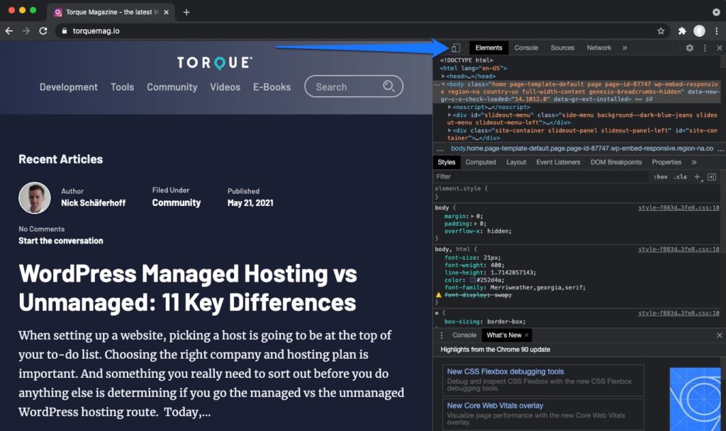
Any of these will open the developer console on the right-hand side of the screen. If you direct your eyes to the upper left portion of the console, you will find a little icon that looks like a smartphone and tablet stacked on top of one another. Upon click this activates Device Mode.
How to Use Device Mode
In this mode, the website you are currently on is shown in a smaller frame which reflects the confines of a mobile device (you can pull the developer tools to the side to have a little more space, if need be).
Shrink and expand the frame to make the screen fit your personal needs. Alternatively, use the numbers in the upper left corner to type in a custom screen size. Be aware that you might have to reload the site in order for the content to fit properly
Yet, the best thing about the Device Mode are the device presets found at the top. Here you can choose some of the most common mobile devices: Different models of the iPhone and Samsung’s Galaxy as well as less common ones like the Amazon Kindle Fire.
As an example, here’s what Chrome Developer Tools shows our website looks like on an iPhone X:

When you choose something from the list, an additional button appears that allows you to change between portrait and landscape view.
The cool thing is that this is not an emulation but just a different view of your browser window. That means you can still surf to any website you want and view it, including local development sites.
Chrome’s Device Mode also simulates browsing by finger instead of via mouse. Consequently, there are no highlights or color changes when you hover the cursor over anything. You get the real mobile experience.
Simulate Poor Connections
An even more sophisticated feature is the network throttling simulation. To understand this, you need to keep in mind that mobile visitors will often have slower network connections when they are not on WiFi.
Chrome’s mobile testing tool can simulate this. In another drop-down menu at the top next to Network, you can select any network speed from GPRS over 2G/3G/4G all the way to a WiFi connection.
That way, you can further understand the user experience of mobile visitors, whose speed might be hindered. It lets you understand bottlenecks like large images or other elements that are slow to load on less powerful connections.
What’s even better is that these presets are only valid for your active tab. You can still browse normally in the rest of Chrome.
Overall the Chrome Device Mode is a pretty amazing tool for mobile testing, especially when you keep in mind that it is a built-in feature of a free browser. For a more detailed introduction and additional features, you can also watch this video:
2. Firefox Responsive Design View
Firefox offers a similar tool to Chrome. While it does not have as many functions as its competitor, it’s still quite useful for testing the mobile capabilities of your WordPress website.
You can activate it either by clicking on the menu and then Developer > Responsive Design View or by clicking the respective icon in the developer toolbar when it is toggled on.
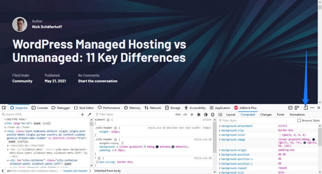
Alternatively use Ctrl-Shift+M.
The interface of the Responsive Design View is quite familiar. Just like in Chrome, you have a drop-down menu for common preset dimensions and their associated devices.
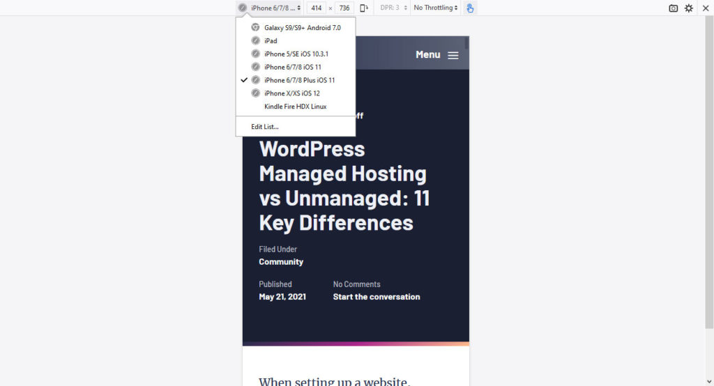
If the available options don’t fit your needs, you can also set custom dimensions and save them as your own preset. Besides that, it is also possible to manually shrink and expand the viewing frame.
As before, the Responsive Design View is part of your browser, which means you can surf to any web address you want. It can also emulate tap control instead of browsing via mouse. Network throttling simulation is also available.
Another thing that Firefox has got going for itself is that you can close the developer toolbar at the bottom and still use the mobile testing tool. That’s something that vexed me with Chrome.
Also, you are able to switch between landscape and portrait regardless of size and take screenshots of the current view that automatically land in your download folder.
3. Safari Responsive Design Mode
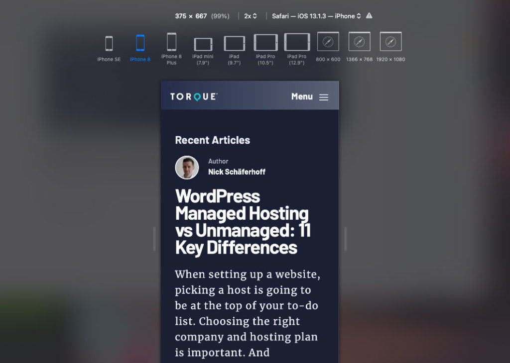
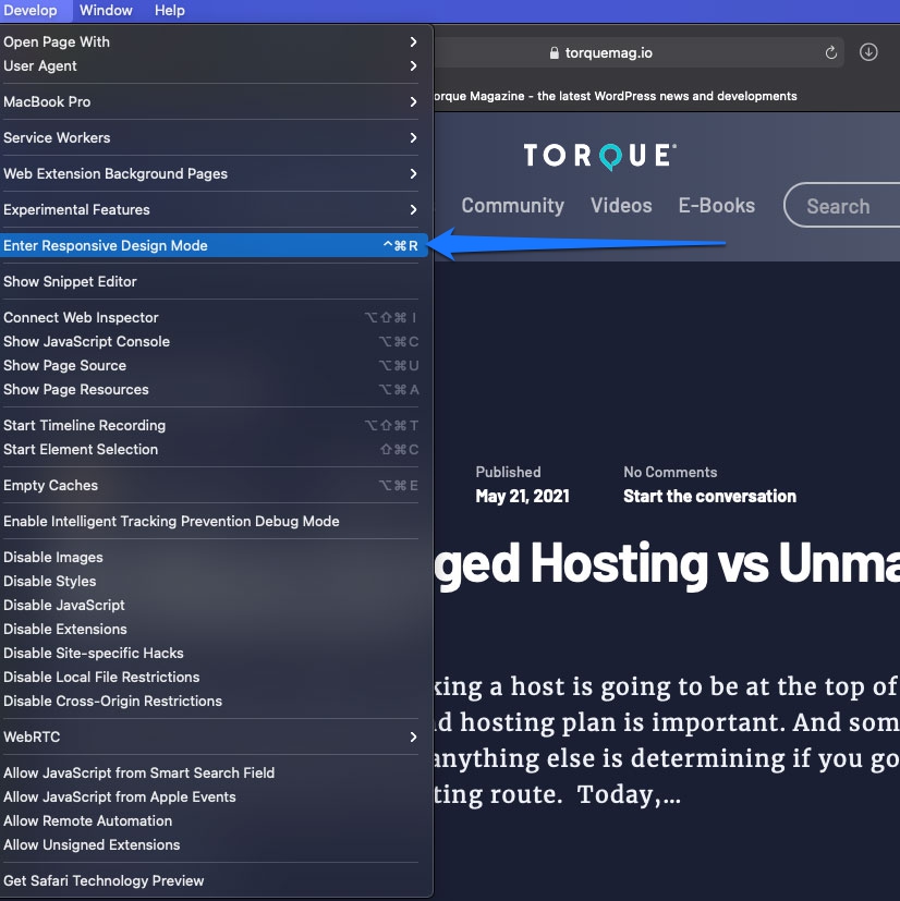
If you’re working primarily on a Mac, you can make use of the Responsive Design Mode built into the native browser, Safari. To get started using it, simply go to Safari > Preferences > Advanced. Then, make sure the box next to Show Develop menu in menu bar is checked.
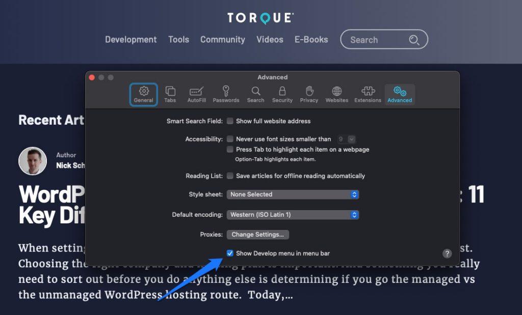
The Develop menu should now appear in the menu bar. Click it and select Enter Responsive Design Mode.
You should now see your website within a responsive view with a variety of options listed across the top. You can manually change the dimensions, select a browser view to simulate, or a device. However, all of the device presets are Apple products. So, if you want to check the view of devices that run Android, you’ll need to input the dimensions manually.
4. Android SDK
Next on our list of mobile testing tools: Android SDK (Google’s equivalent to XCode). It works for both Windows and MacOS X as well as other platforms. It is also free to use and you can download it here as part of Android Studio.
The slightly bad news is that it is a bit more complicated to set up. Plus, it’s pretty big in size. The download for the installer alone is more than 1GB, the standard install about 4GB — and there is more to come.
Once the download has finished, you need to run the installer. Mac users have to unzip. After that, start Android studio. Click on Configure and then SDK Manager. From here, you can install the latest Android version by scrolling down the list and making a tick mark in the check box next to it.
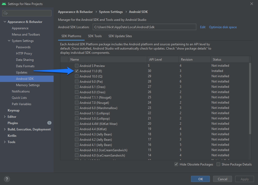
Click Install Packages to start the installation process. Now wait, this might take a while.
Set Up and Use Virtual Devices
After everything is done, it’s time to set up some virtual devices. To do so, open the AVD Manager (Configure > AVD Manager).
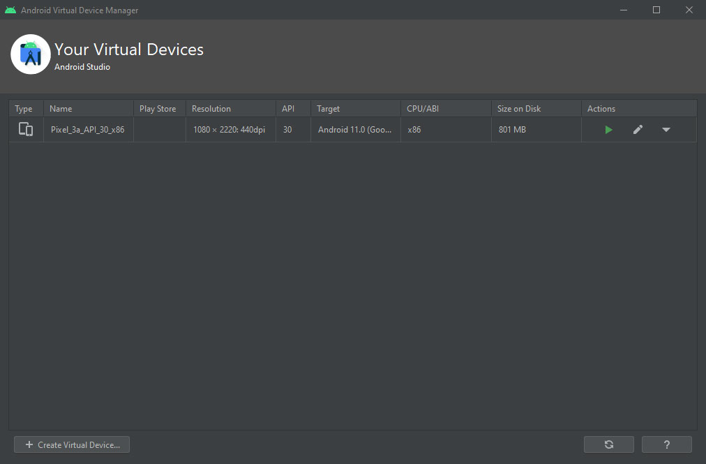
You have the choice to create a custom device or select a preset under Create Virtual Device. When you are done, click Next, configure the Android version and virtual hardware and confirm. The device should now be part of your list of Android Virtual Devices (AVD).
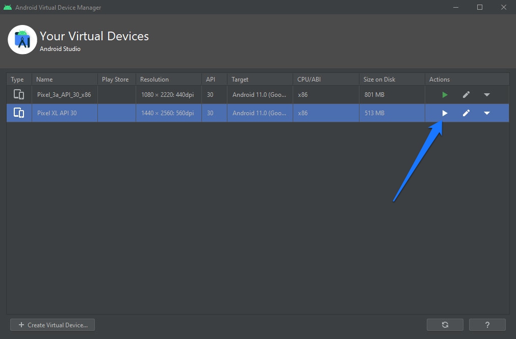
Highlight one and click on the play button to launch. Decide whether to scale the display to real size (which will likely be very small) and then click Launch. It can take a while for the simulator to get going as it first has to start up Android.
Next up, find the browser on your AVD and go to whichever site you want to check. Use the toolbar to switch between landscape and portrait mode.
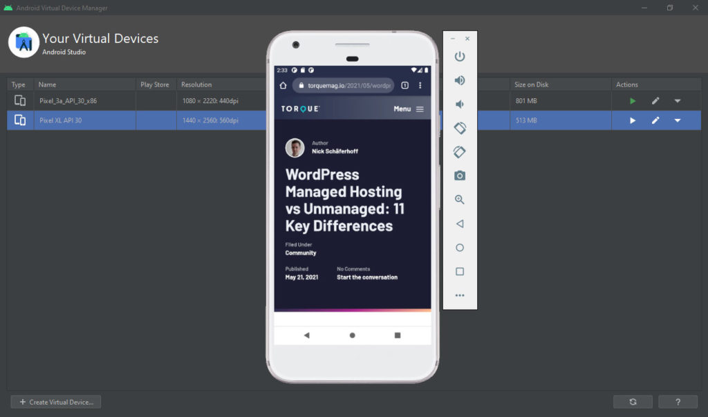
Though not the easiest setup process in the world, it’s definitely still within reach of most developers.
5. XCode
The best way to check websites for compatibility with Apple devices is the company’s very own iOS simulator. It is part of XCode, Apple’s development environment.
The upside is that it is free of charge. All you need is a developer ID. The downside, however, is that it only works on Apple devices. Windows and Linux users have to find other ways to fake having an iPhone or iPad.
If you do own a Mac and have set up an ID for yourself, you can get XCode here. Just search for its name and download the appropriate version.
Use the iOS Simulator
The iOS simulator is a standalone piece of software and you can use it as such. After the installation of XCode is finished, you can find it here:
- Browse to Applications, right-click on XCode and choose Show Package Contents.
- Then go to Contents > Developer > Applications.
- The iOS Simulator should appear in the list. You can create a shortcut in the dock for quick access.
Once opened, you can change devices via File > Open Simulator in the main menu.
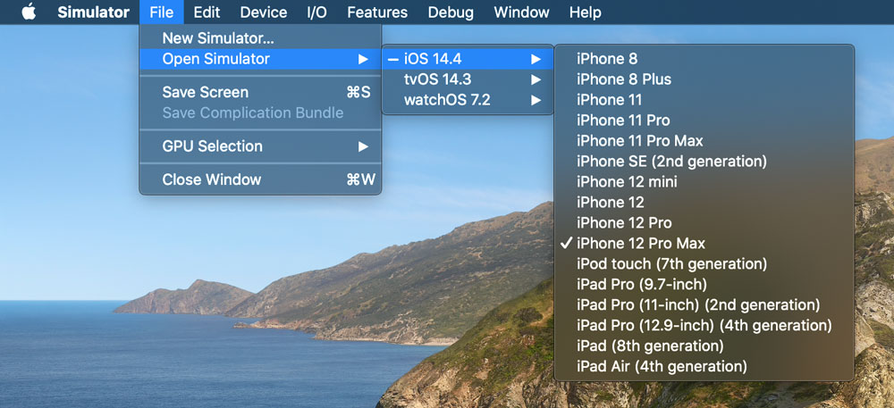
To test your site, open the browser on your virtual device and enter any web address. Be aware that this works in local development environments too, the simulated device can access any site that your Mac can access.
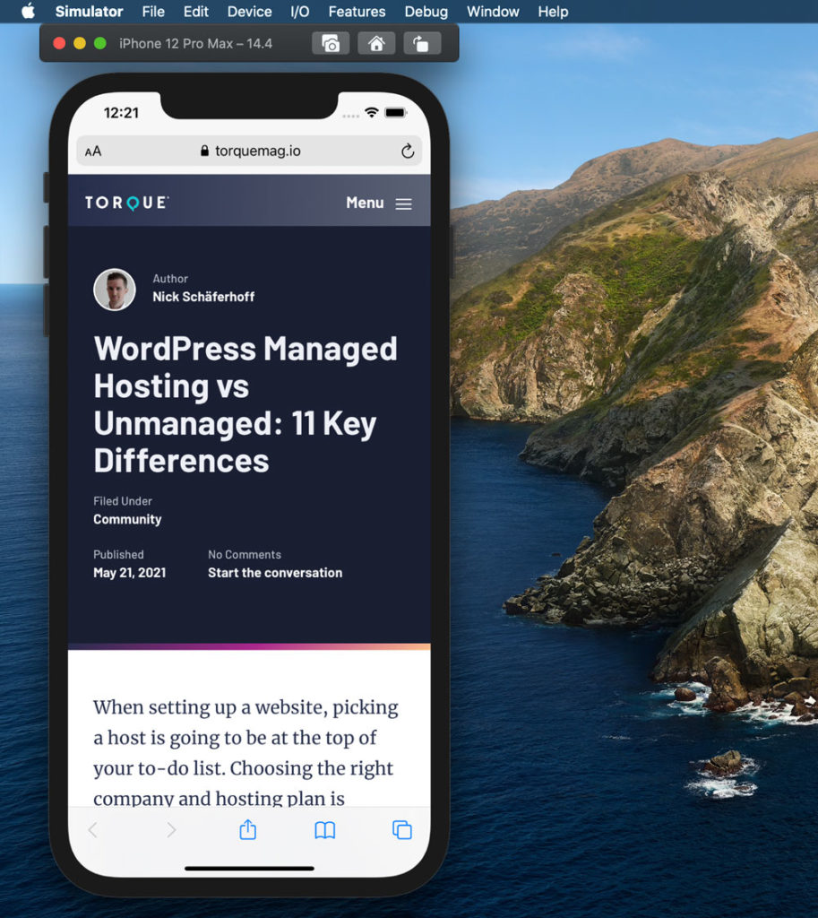
That’s it. Congrats, you now have all Apple devices virtually on your machine. Not too useful in terms of bragging rights, but quite handy as a mobile testing tool for your WordPress site.
Quick note for Windows users: There are ways to run XCode on Windows. However, they are quite convoluted and not the most practical. If you are looking for a more comfortable solution to check your site, either buy a Mac or use one of the other ways suggested in this article.
6. Opera Mini
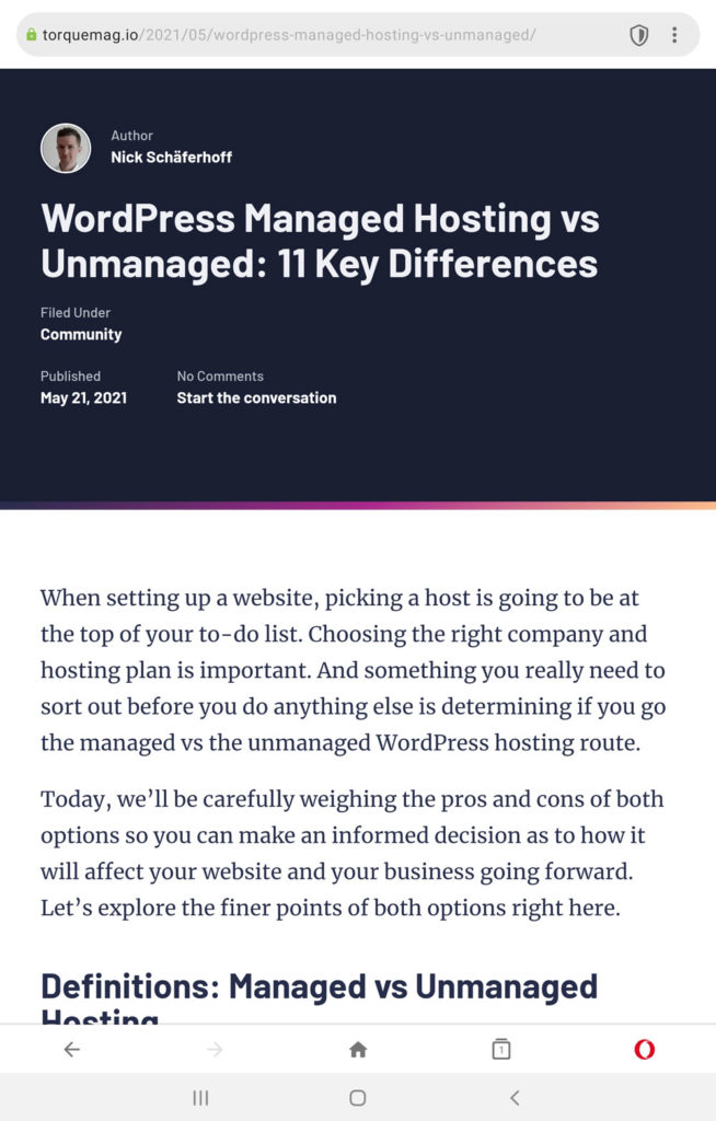
Though certainly not the trendiest of browsers, Opera is still used on a fair number of mobile devices, especially older models. Often, Opera is the best available browser option for these devices. Consequently, it would behoove you to test to see that your website loads properly within it.
Though the Opera Mobile Emulator is now defunct, you can still download the Opera Mini browser on Android devices. This can allow you to test how your website loads first-hand. It will at least give you a glimpse into what those running the Opera mobile classic browser experience when landing on your site.
7. BrowserStack
Browserstack is a web-based platform with tools for testing websites in different environments, operating systems, browsers, and mobile devices. It is a paid solution with access to more than 50 mobile devices on different operating systems. You can use it in a variety of ways.
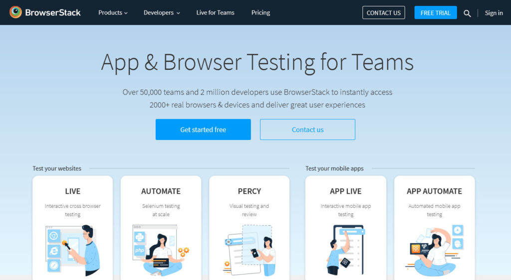
For instance, you can test websites with live cross-browser testing, perform automated testing for larger scale projects, or conduct visual testing. Or, if you need to test apps, you can use the App Live feature to put apps through live tests on simulated mobile devices or conduct automated testing. Pricing starts at $29/month, billed annually.
8. LambdaTest
Another browser-based way to test your WordPress website is LambdaTest. It’s a cloud-based automated browser testing tool that uses over 2,000 different browsers and operating systems. This number should allow you to make certain your site looks great no matter how it’s being accessed.
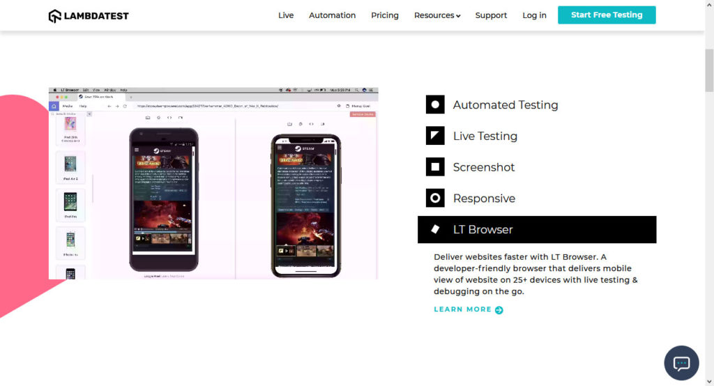
You can conduct Selenium test automation across simulated mobile browsers, test locally hosted sites, perform geo-location testing, and even conduct debugging.
9. Mobile-Friendly Test
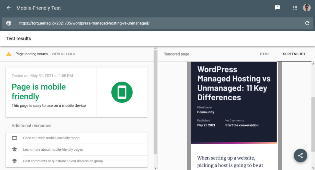
With Google’s continued emphasis on mobile-friendliness, it only makes sense that they provide a tool to analyze how well your site is performing. After typing in a URL, the mobile testing tool will check your site not only for responsiveness but other mobile-friendly markers such as page loading time.
10. MobileTest.me
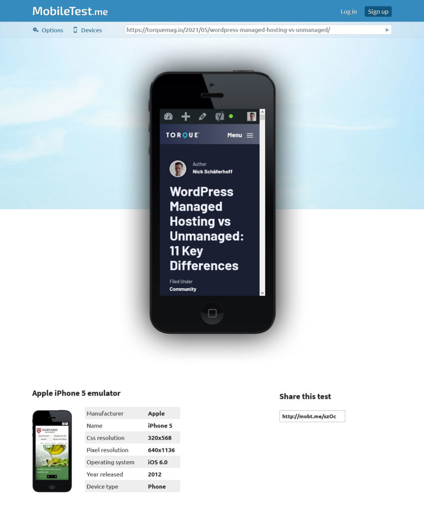
This service lets you test your site across six different popular devices, among them the HTC One, Google Nexus 7 and the Apple iPad Mini. All you need to do is click on one, type in a web address and you are good to go. It’s also free, which is nice. Granted, this isn’t the most up-to-date testing option but it’s certainly a quick and easy way to test compatibility across several older devices without having to open your wallet.
11. Responsinator
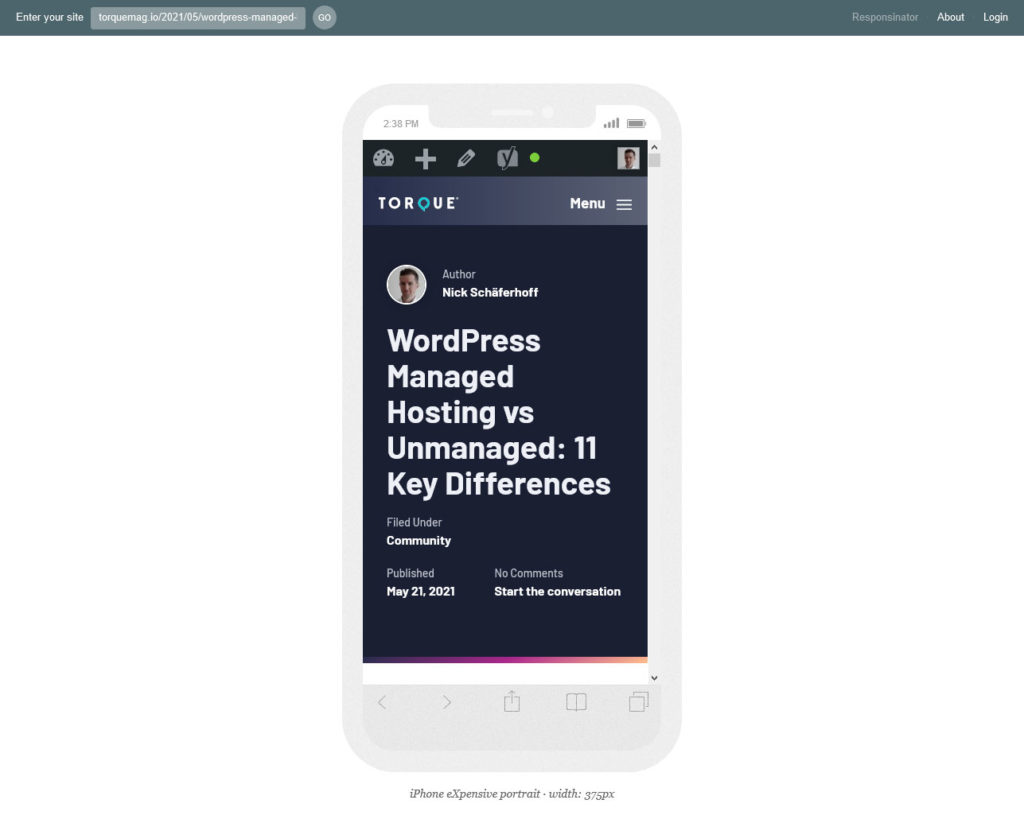
Next in line is Responsinator. It offers testing for several different Android and iOS devices, from the iPhone 5 over “crappy Android device” (sic!) to the Nexus 4. As usual, type in any address and the corresponding website will show up on the screen of the chosen device. It doesn’t have a flip option, but you can choose landscape views for each device as well.
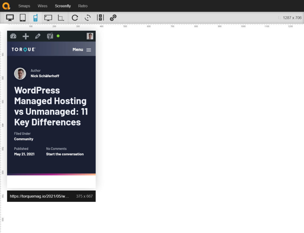
12. Screenfly
The last entry on our list of mobile testing tools is Screenfly offers a pretty nice range of devices including TVs and desktop computers. However, there are also plenty of tablets and phones in the list. It’s free to use and the interface is very intuitive. Highly recommended to do some quick checks!
Mobile Testing Tools are Available for All Needs
Traffic from users on mobile devices has become incredibly important for anyone running a website and will only continue to grow in significance. People dealing with websites professionally are therefore hard pressed to make sure they know how to make them look good and function properly on their visitors’ phones and tablets.
A number of mobile testing tools are available to check the capabilities of WordPress websites. From browser tools over iOS and Android emulators to third-party web solutions, developers and users don’t lack choices.
Each tool comes with its own strengths and weaknesses. Yet, what most of them have in common is that they are definitely cheaper than investing in real-life devices.
The above solutions should suffice to test for most use cases. Which one you choose is up to your own needs and preferences. In the end, all that counts is the result. Your mobile visitors will thank you.
How do you test your site for mobile capabilities? Any tools you can recommend? We would love to hear your input.

No Comments