Why does the box-shadow CSS property deserve its own tutorial? Because, as you will see below, it is one of the more complex properties that takes a number of values at the same time. This might make especially challenging for beginners.
If so far you have struggled with using box-shadow properly, you have come to the right place. In the guide below, we will go over everything there is to know about this CSS property. We will talk about what it does, how to use its syntax correctly, some cool CSS box-shadow examples, and finally some generator tools that make working with it easier.
What is CSS Box Shadow?
Even if you are not aware of the CSS box-shadow property until now, you have probably seen it in action on the web.

Above is a good example of what it looks like in the wild (even if I have increased it here slightly to make a point). box-shadow is basically what the name says: it allows you to add a drop shadow to the frame of almost any element. The shadow will also adhere to the shape of its anchor, whether it’s square, rectangular, round, or oval. This even holds true when you have set a border-radius property.

Around the web, people use it to create a number of different effects and we will see some interesting box-shadow examples below. For now, let’s talk about how it works on the most basic level.
Basic Box Shadow Syntax
When you look at an element with a box shadow using browser developer tools, you will find markup like this:
box-shadow: inset 0 25px 40px 0 rgba(0, 0, 0, 0.3);Looks a bit complicated, right?
But don’t worry, you don’t need all of these declarations all the time. Plus, once you understand how they work, it no longer seems as confusing as in the beginning.
As you can see above, box-shadow can take up to six values. Let’s go over them one by one.
offset-x
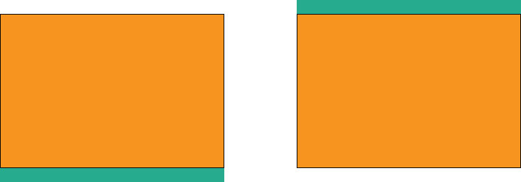
The first value is the horizontal distance of the drop shadow from the side of its anchor element. A positive value moves it to the right, a negative one to the left.
You can use all common CSS data types that denote length for this value, like px, em, vh, and more. The most commonly used are px and em.
offset-y
Same as the above but for the vertical axis. Positive value move the shadow below the element, negative ones above.
blur-radius
This defines the blur of the box shadow. The higher the value the more blurred it will be. blur-radius also takes all common CSS length denominations but no negative values.
spread-radius
This one controls the spread of the shadow beyond the height or width of its element. The higher the length, the bigger the spread. You can also use negative numbers to introduce shrinkage.
color
As you can probably guess, this allows you to define the color of the box shadow in all the usual ways. It’s most often denoted in hexadecimal (e.g. #ededed) or rgba (e.g. rgba(46, 182, 142, 0.9)) values. The latter also allows you to control opacity, which is commonly used for drop shadows.

Note, if you don’t set a color, the browser will use the currently used text color.
inset
Finally, you can optionally add inset in the beginning of the declaration. This changes the shadow from a drop shadow to a shadow inside the element. It appears inside the border, above the background, but below the content of the element, so it won’t cover any text for example.
Using the Values in Order
Here’s the order in which the values of the box-shadow property appear.
box-shadow: offset-x offset-y blur-radius spread-radius color inset;To assign a box shadow, you need at least two length values. The browser will automatically use those for offset-x and offset-y. If you add a third, it will be interpreted as blur-radius, a fourth as spread-radius. inset and color are optional and can appear at the end or the beginning and in any order. The CSS below will all have the same result.
box-shadow: 20px 20px 10px 0 inset rgba(0, 0, 0, 0.5);
box-shadow: 20px 20px 10px 0 rgba(0, 0, 0, 0.5) inset;
box-shadow: inset 20px 20px 10px 0 rgba(0, 0, 0, 0.5);
box-shadow: rgba(0, 0, 0, 0.5) 20px 20px 10px 0 inset;
box-shadow: rgba(0, 0, 0, 0.5) inset 20px 20px 10px 0;
box-shadow: inset rgba(0, 0, 0, 0.5) 20px 20px 10px 0;
Assigning Several Box Shadows
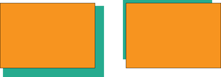
Something that not everyone is aware of is that you can set several box shadows for the same element. For that, simply provide more than one group of values and separate them by commas.
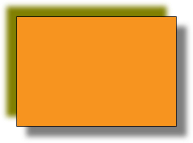
box-shadow: 20px 20px 10px 0 rgba(0, 0, 0, 0.5), -20px -20px 10px 0 olive;The code above comes out looking like this:
You can also use this to create lines around elements. For that, you simply need to add several shadows in different colors and set their offsets and blur to zero.
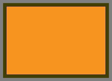
box-shadow: 0 0 0 20px rgba(0, 0, 0, 0.5), 0 0 0 10px olive;This results in outlines with different colors:
Take note thought that this does not affect box model dimensions, so box shadows do not add to the overall size of an element the way margin or border will.
Browser Compatibility
Browser compatibility for box-shadow is not really something you need to worry about. It’s a very established CSS property accepted by virtually every browser, including markup like inset and multiple shadows.
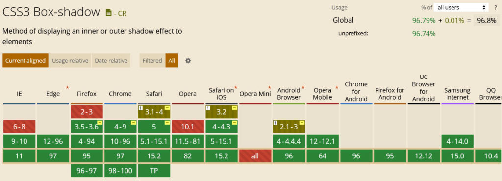
In order to support older versions of some browsers, it’s common to include the -webkit-box-shadow and -moz-box-shadow properties with the same values. However, for the latest versions of the most common browsers this not necessary anymore.
CSS Box Shadow Examples
Next up in this box-shadow tutorial, we want to go over some examples of CSS box shadows so you can see what is possible with this property. We will move from rather standard applications to more extraordinary ones because, as you will see, you can do some really exciting things with it.
Add a Shadow to a Button
Buttons are often an element that have a box shadow applied to them. That’s because it’s a good way to make them stand out on the page. After all, if you include a button, you usually want people to click on it. To prompt them to do so, here’s a simple example how can do that with a box shadow.
The accompanying markup looks like this:
box-shadow: 0px 11px 12px rgba(0, 0, 0, 0.2);Soft Box Shadow
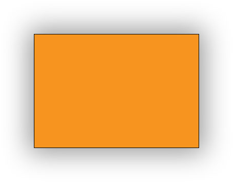
If you want to create a relatively soft CSS box shadow, you mostly work with blur and spread while setting offsets to 0. This way, the shadow does not get a distinct shape but just appears softly around the edges.
To achieve the effect above, you can use the following markup:
box-shadow: 0 0 50px 10px #999;This is also a great way to create a box shadow on all sides of an element. If you want to make it more distinct, simply crank up the spread, tone down the blur, and use a darker color.
Multiple Box Shadows
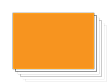
The final box-shadow examples are for using multiple shadows at once. This offers different possibilities. For one, you can introduce a cool fading, several-step box shadow.
It’s surprisingly simple: you just need to stack box shadows on top of each other with evenly increasing offsets while turning down the opacity at the same time. By the way, when using many box shadows, it helps to write the declarations in separate lines rather than as one long declaration. Makes it a lot easier to understand.
box-shadow:
10px 10px rgba(0, 0, 0, 0.4),
20px 20px rgba(0, 0, 0, 0.3),
30px 30px rgba(0, 0, 0, 0.2),
40px 40px rgba(0, 0, 0, 0.1),
50px 50px rgba(0, 0, 0, 0.05);
You can also take this further by introducing white box shadows with a negative spread-radius value in between, resulting in the illusion of several elements on top of each other.
Why the negative spread value? Because otherwise the white box shadows would cover the ones below them. The negative value shrinks them so that the color behind can shine through. Below is the markup you need if you want to introduce a similar effect on your own website:
box-shadow:
10px 10px 0px -3px rgba(255, 255, 255),
10px 10px rgba(0, 0, 0, 0.4),
20px 20px 0px -3px rgba(255, 255, 255),
20px 20px rgba(0, 0, 0, 0.3),
30px 30px 0px -3px rgba(255, 255, 255),
30px 30px rgba(0, 0, 0, 0.2),
40px 40px 0px -3px rgba(255, 255, 255),
40px 40px rgba(0, 0, 0, 0.1),
50px 50px 0px -3px rgba(255, 255, 255),
50px 50px rgba(0, 0, 0, 0.05);
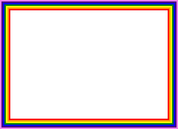
The final example for several CSS box shadows is the aforementioned method of setting offsets and blur to 0. As we have seen above, it results in element having several outlines, colorful ones in this case. However, this only works because the spread-radius value increases for each box shadow.
If you want to try this out for yourself, you can get started with this:
box-shadow:
0px 0px 0px 3px red,
0px 0px 0px 6px orange,
0px 0px 0px 9px yellow,
0px 0px 0px 12px green,
0px 0px 0px 15px blue,
0px 0px 0px 18px indigo,
0px 0px 0px 21px violet;
Best Box Shadow Generators
As we have covered, box-shadow takes a whole lot of values. Therefore, it can take a bit of trial and error until you arrive at the kind of shadow you want.
To make it easier, there are a whole lot of box-shadow generator tools out there that allow you to play with their controls, see the results right away, and then simply copy the markup once satisfied.
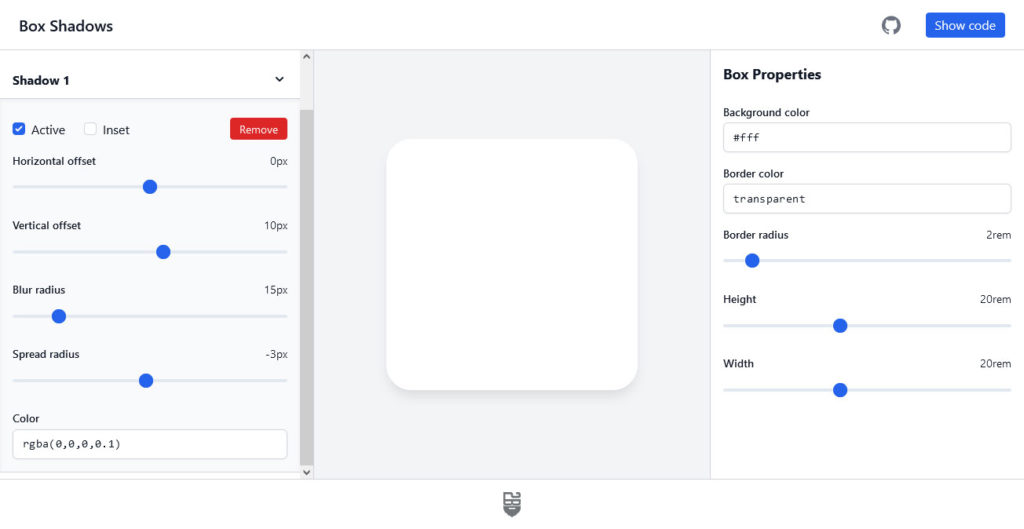
Here are the best options for box shadow generators:
- box-shadow.dev — This single-purpose tool has all the functionality you need and the best user interface of the bunch. You can use
inset, create several box shadows, control the offsets, blur, and spread via sliders, and input colors manually. When satisfied, click Show code to copy the CSS markup. The only downside is that it does not provide code for older browsers. - CSSmatic Box Shadow CSS Generator — Similar to the above. Allows you to control the
box-shadowproperties via sliders and also enter numbers manually. Has its own control for opacity, which is nice. On the other hand, it is missing functionality for multiple shadows. The code markup you get includes older browsers. - Box Shadow CSS Generator — A solid option that also has a color picking ability and gives you code for older browser as well. You can copy it with a simple click. It has opacity control but can only create one drop shadow.
- CSS3gen CSS3 Box Shadow Generator — Another drop-shadow generator. A cool feature here is that, instead of x and y offsets, you can select the shadow angle and distance and the tool will do the rest automatically. For some reason
spread-radiusandinsethave their own menu. The CSS you can simply copy and paste also includes markup for older browser generations.
Final Thoughts: CSS Box Shadow
The box-shadow property can be overwhelming at first. It’s one of those properties that takes a lot of values so it might look more complicated than it actually is. Hopefully, this CSS box-shadow tutorial has put that feeling to rest.
Above, we have gone over what CSS box-shadow is and how it works. We have explained the syntax, values, and how they work together. In addition, we went over a number of examples for how to use CSS box shadows in real life, including markup you can use right away. Finally, for those that want a little help, we listed a number of CSS box-shadow generators that can do a lot of the heavy lifting for you.
By now, you should feel able to use this CSS feature on your website. We look forward to seeing what you do with it.
How are you using CSS box shadow on your website? Any exciting use cases we have not covered above? Let us know in the comments below!






No Comments