Gutenberg has been out for quite a while, but you’ll find that there are still plenty of new skills to learn and features to discover. Plus, the editor receives updates pretty frequently, which means there might be an abundance of details you aren’t even aware of.
Though Gutenberg promotes itself as an easier way to build websites than the classic WordPress editor, there’s still a learning curve to it. Discover all these hidden features, though, and you’ll be well on your way to mastering the tool.
Let’s lift the veil on the mysteries of Gutenberg. Here are 10 Gutenberg features you might not yet know about and how to start using them. Be aware that you might have to have the Gutenberg plugin installed to take advantage of some of these.
1. Slash Commands
Starting off, we have a cheat that’s super easy to miss, but will revolutionize your writing experience. Ever been working on something in the post editor and had to completely ruin your flow to go hunt down the block you needed?
No longer! Just type / and a drop-down menu with Gutenberg blocks should instantly appear. Want to add an image? Try /image. A heading? /heading has got you covered. It’s that easy.
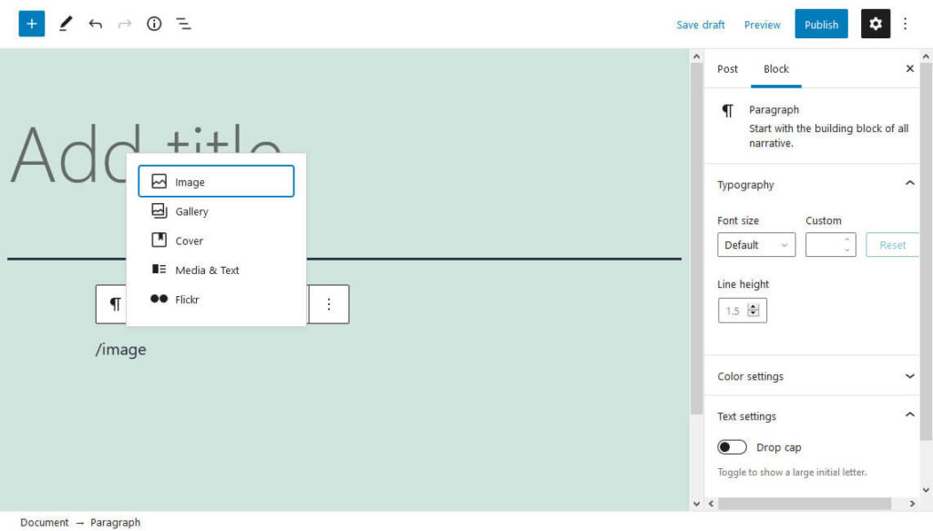
No more having to stop your writing to deal with a clunky interface. Just type a slash and you’re saving precious seconds. Plus, it’s usually enough to input the first few letters of the block you are looking to be able to choose it from the list.
2. Spotlight and Fullscreen Mode
If you’re finding the Gutenberg workspace a bit too distracting, the Spotlight and Fullscreen mode features will likely come as a blessing. You can enable and disable both of these by tapping the three dots in the top right of the screen.
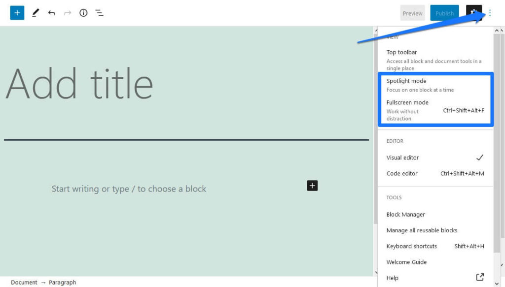
In Spotlight mode, all blocks other than the one you’re working on are grayed out, and visual cues from other blocks are disabled as well. If you find the interface overwhelming, definitely turn this one on.
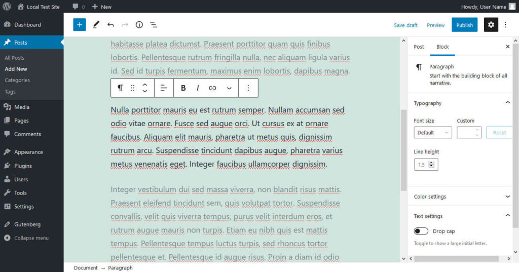
Fullscreen mode disables both the top and left-side admin toolbars (you can also disable the right one manually), leaving you alone with your content. It really keeps you focused on your work.
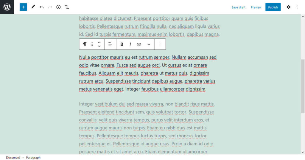
You can enable either or both of these at the same time.
3. Document Outline
Long posts can be hard to navigate in the editor. Luckily, Gutenberg comes with an outline feature.
Look for a circled i in the top left corner that’s marked as Content Structure. Click it and along with basic information such as word and paragraph count, you’ll see the Document Outline. This shows your headings, properly structured.
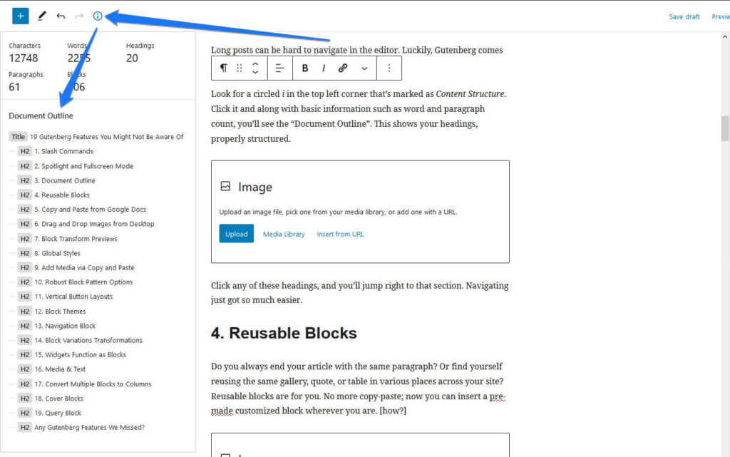
Click any of these headings, and you’ll jump right to that section. Navigating just got so much easier.
4. Reusable Blocks
Do you always end your article with the same paragraph? Or find yourself reusing the same gallery, quote, or table in various places across your site? Reusable blocks are for you. No more copy-paste; now you can insert a pre-made customized block wherever you are.
To save a single block, click it, tap the three dots on the bar above it, and add it to your custom blocks.
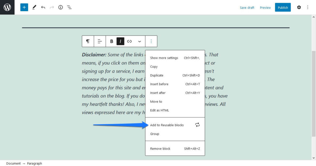
Give it a name and you’re good to go. This is perfect if you always include a disclaimer, social media plugs, or anything like that at the end of your post. You can find reusable blocks in the block menu (the plus button in the upper left corner) under Reusable.
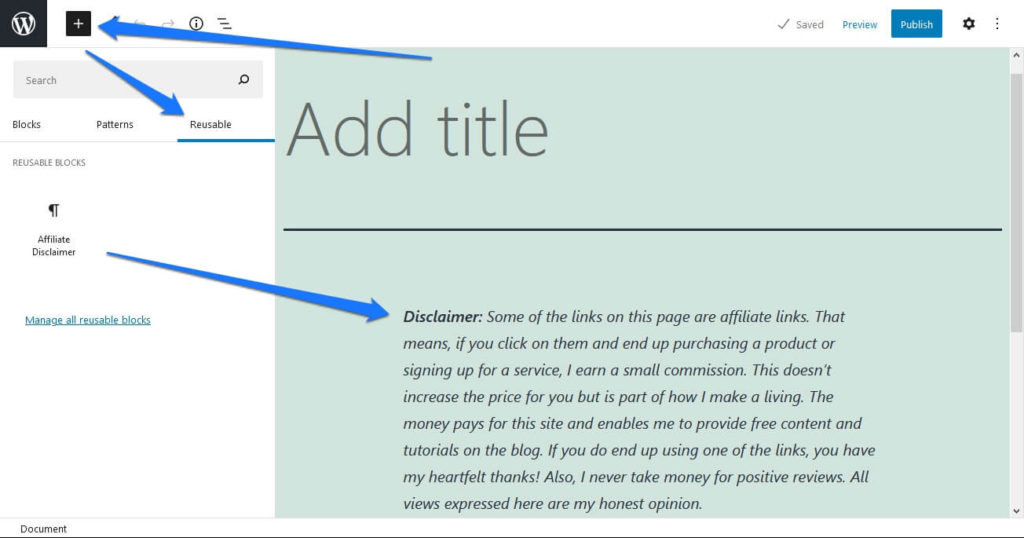
What if you want multiple blocks at once? No problem. You can save a paragraph and an image, a divider, or whatever else.
To do this, select multiple blocks by either clicking and dragging or holding shift and clicking the blocks you want to save. Then you can save your reusable block in the three-dot menu like normal.
5. Copy and Paste from Google Docs
This is one of the Gutenberg features that’s easy to miss because it’s not even an option. If you’ve ever tried to copy and paste content across different platforms (from Word to a website’s text editor, for instance), you know that more often than not it turns into a mess.
Not if you’re writing in Google Docs. Just paste your content in, and everything arranges itself nicely into its own block. The paragraphs, images, and everything else should all appear correctly. I know it works, because I actually copied this very article over from Google as well.
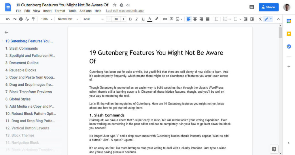
In the old editor, pasting from Google Docs was usually not so pretty. Now for users of one of the most popular text processors, moving your content is no longer a headache.
6. Drag and Drop Images from Desktop
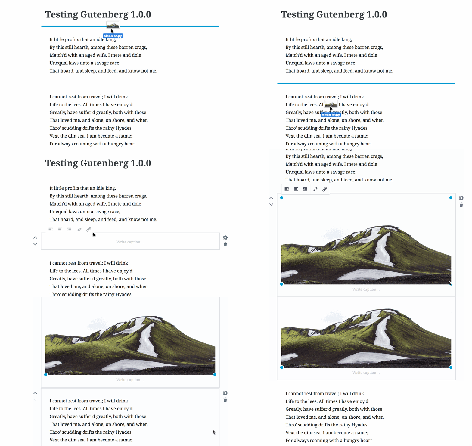
Did you know that you can drag and drop images right into Gutenberg, and they’ll automatically make it to your media library? There’s no need to deal with the slow process of image uploading anymore.
All you need to do is grab an image on your desktop or in Windows Explorer, then drag it from there right into the Gutenberg window. You’ll see a little box showing you the image placement, and when you let go it will automatically turn into an image block.
7. Block Transform Previews
Gutenberg comes with the ability to transform one block into another. For instance, you could turn a paragraph into a quote, an image into a carousel, or anything else compatible. To do this, select a block and click on the icon showing its block type on the left to see the transform menu.
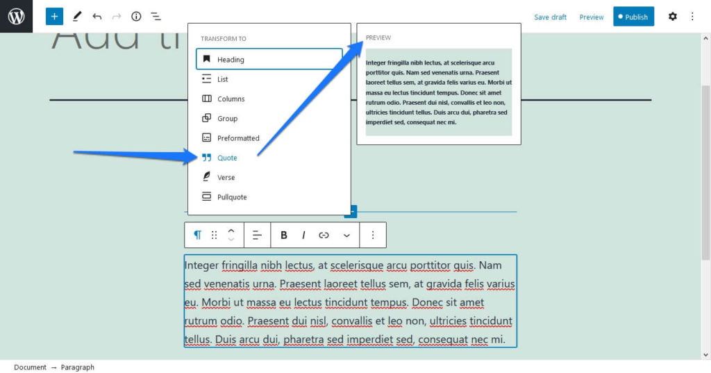
For a long time this feature did not have any sort of preview, so it was very clunky to use. But now you can finally preview the transform by simply hovering over the option you want.
8. Global Styles
Want to try something a little experimental? Global styles is an experimental feature, part of the Full Site Editing initiative. Soon Gutenberg can be used not just to edit posts and pages, but to design entire sites and themes.
Global styles enables you to change visual aspects of your site right in the Gutenberg editor. These show in both the front and back end, and are universal except for blocks with individual styling applied to them.
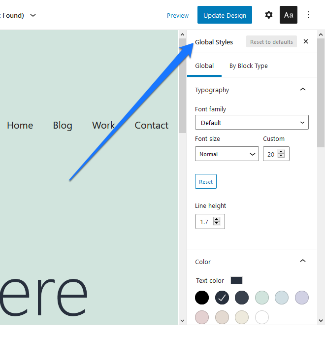
It’s a lot easier than having to mess with a theme options panel, since you can access it without leaving the page you’re designing. Check out our Twenty Twenty-One review for details on how to test this feature.
9. Add Media via Copy and Paste
Besides images and Google Docs content, you can also easily copy and paste links into Gutenberg. These will be automatically embed as viewable content. For instance, social media posts show up as proper embeds, news articles display their image and sample text, and videos become playable.
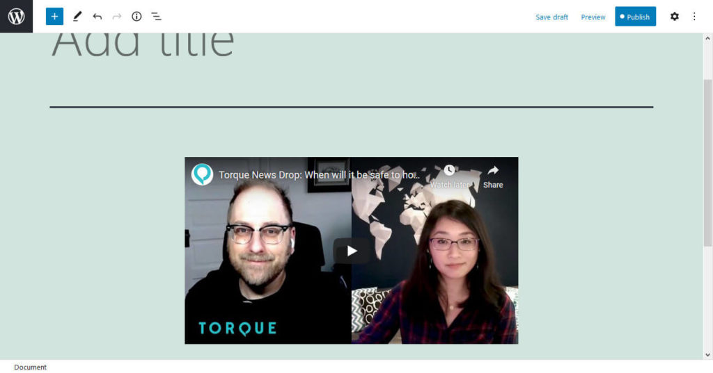
This is a real time saver when you’re writing articles. There’s no need to deal with embedding these manually.
10. Robust Block Pattern Options
Block patterns work very similarly to reusable blocks. The difference is that these come pre-installed with your theme or can be added as features by downloading Gutenberg plugins. Themes, such as Twenty Twenty-One, can also come with their own block patterns.
You can insert them into your content at any time via the plus symbol in the upper left corner and then choosing the Patterns rider.
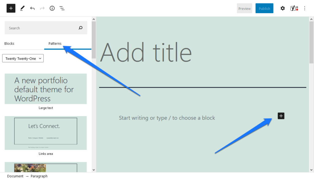
Click to insert the pattern of your choice in the current position or drag and drop it where you want your pattern to appear.
Block patterns allow you to create pages much faster, since you can just pop in an entire contact form, product list, or call to action with the touch of a button. They’re just like web page templates, but bite-sized.
They’ve been adding quite a few patterns into default Gutenberg as it is. But you can also install a plugin to get access to hundreds more Gutenberg templates.
11. Vertical Button Layouts
Previously the button block lacked much customization, especially if you wanted your buttons to be in a column rather than a row. It was quite annoying getting your layout to look the way you wanted.
Now all you need to do is select the button, click the Transform to variation drop-down, and select Vertical.
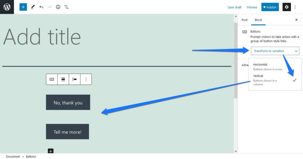
This is similar to how the Navigation block handles it, so it should feel familiar.
12. Block Themes
This one is for the theme editors out there. Block Themes are specialized WordPress themes designed entirely around the block system. Full site editing is still an experimental feature, but you can start playing with it right now.
You’ll need the theme experiments template, and you can also read about it in the documentation. You’ll also need to enable Full Site Editing under Gutenberg > Experiments. Be careful and make sure you do this on a testing server, not your actual site.
13. Navigation Block
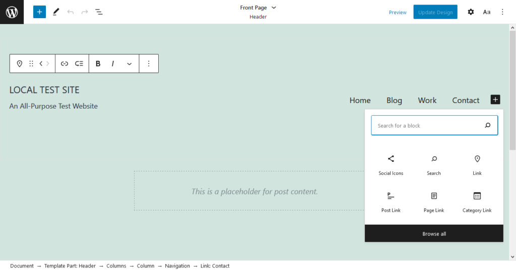
One of the Gutenberg features you may have missed is the Navigation block. This allows you to create a nav menu either based on the ones you’ve already configured, or filled with new links of your choosing.
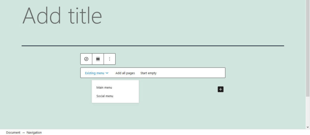
While this isn’t very useful within a typical blog post, when full site editing makes its full debut, this little block is going to be a big deal.
14. Block Variations
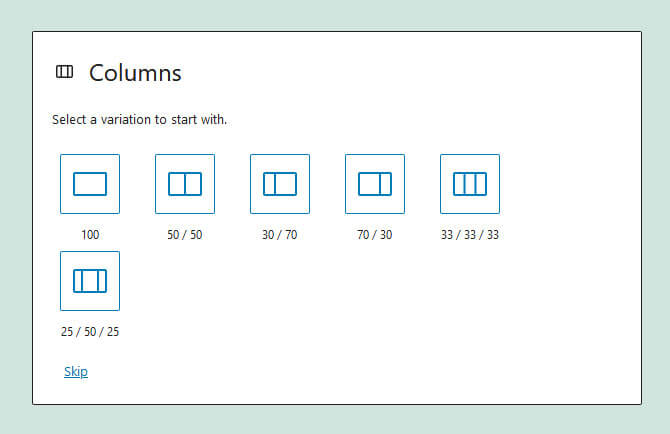
Block variations are basically preset settings you can easily switch between on any block. Only a few of the blocks, like the column blocks, have them. After you insert a column block, you have the option to choose between a few different styles.
Now you can transform between these variations easily. Before, it was impossible to change between them after choosing, as they were essentially considered separate blocks.
15. Widgets Function as Blocks
Remember Appearance > Widgets, where you manage areas like your sidebar and footer? It’s just gotten a big overhaul. Now instead of Widget Areas, you’re working with Block Areas.
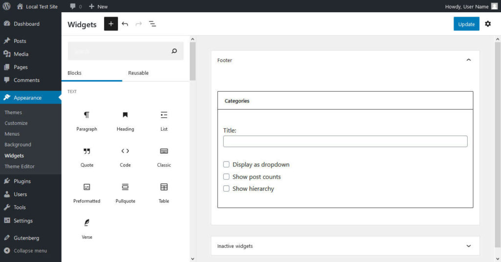
What this means is that areas like the sidebar are no longer excluded from the new block system. Everything works together now, so it’s easy to insert blocks into widgetized areas on your site. These are of course dependent on your theme.
If you’re familiar with both Gutenberg and the old widget editor, you should be able to pick up on this fairly easily. Just note that there is a bit of bugginess with older third-party widgets from certain plugins. Remember to report any bugs you encounter.
16. Media & Text
One often overlooked block is the Media & Text block. It’s a simple one that allows you to add media (such as an image or video) and text side by side. You can use this to spotlight media you want to draw extra attention to or to caption an image.
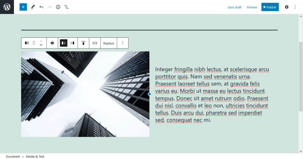
Find it under the Layout Elements section of the Add Blocks screen, or just type in “Media” and it should pop up. You could always try out slash commands to bring it up now!
17. Convert Multiple Blocks to Columns
So you have a bunch of content, but now you’ve decided that you want to display it in columns. Before you’d have to copy and paste your content into a new column block, but now it’s easy as a snap to just convert your blocks into columns.
All you need to do is highlight the blocks you want either with the mouse or by clicking with shift held down. Then bring up the menu and click to transform to a column block. They should evenly separate into the proper amount of columns.
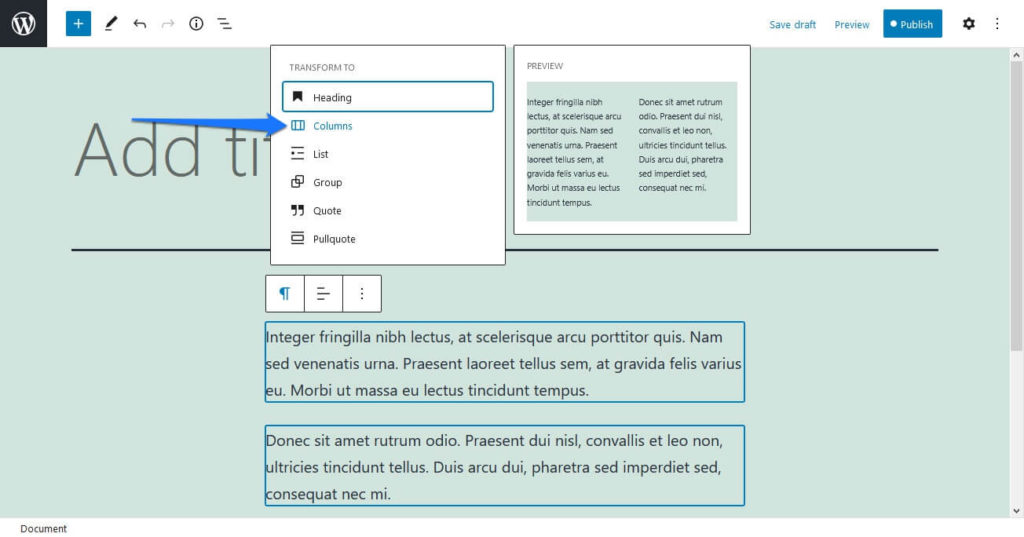
If you need to configure where the blocks end up, just click and drag to move them within each column, and use the block variations transform function to change how many rows there are.
18. Cover Blocks
The cover block is an underused but magnificent way to make your posts or pages pop. These function similarly to the cover image you assign blog posts, but with so much more customization. You can add text, insert unique styles, and even turn on a beautiful parallax effect.
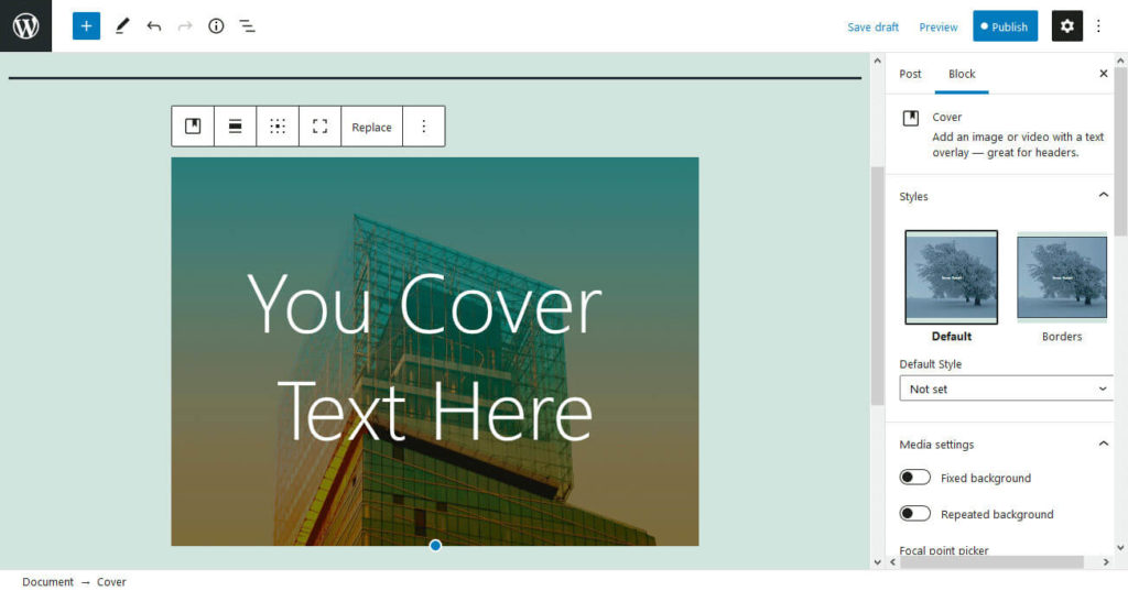
While you can use it as intended, as a cover image for a post, in practice it can do all sorts of things. Show off promotional art, combine multiple covers with the columns block for an interesting effect, or just spruce up your page a bit. The sky’s the limit.
One interesting thing you can do with this block is create a repeating background pattern. Upload an image you think will tile well and then tick the Repeated Background setting.
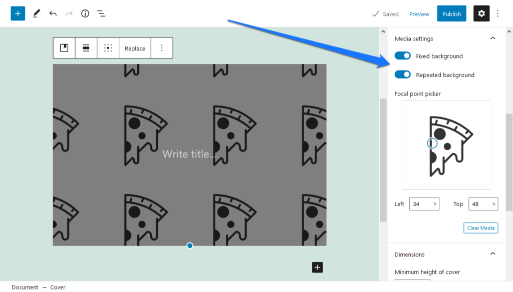
This is just one of many unique settings the Cover block has to offer. Experiment and see what you can do with it!
19. Query Block
Last but not least is the Query block. At first you might be confused about what this one does. It’s simple: it’s a block-based form of the post loop, or the code that displays a list of your latest blog posts.
Of course you can customize what posts show up; change the ordering, the amount of posts it shows, and how many columns it displays as.
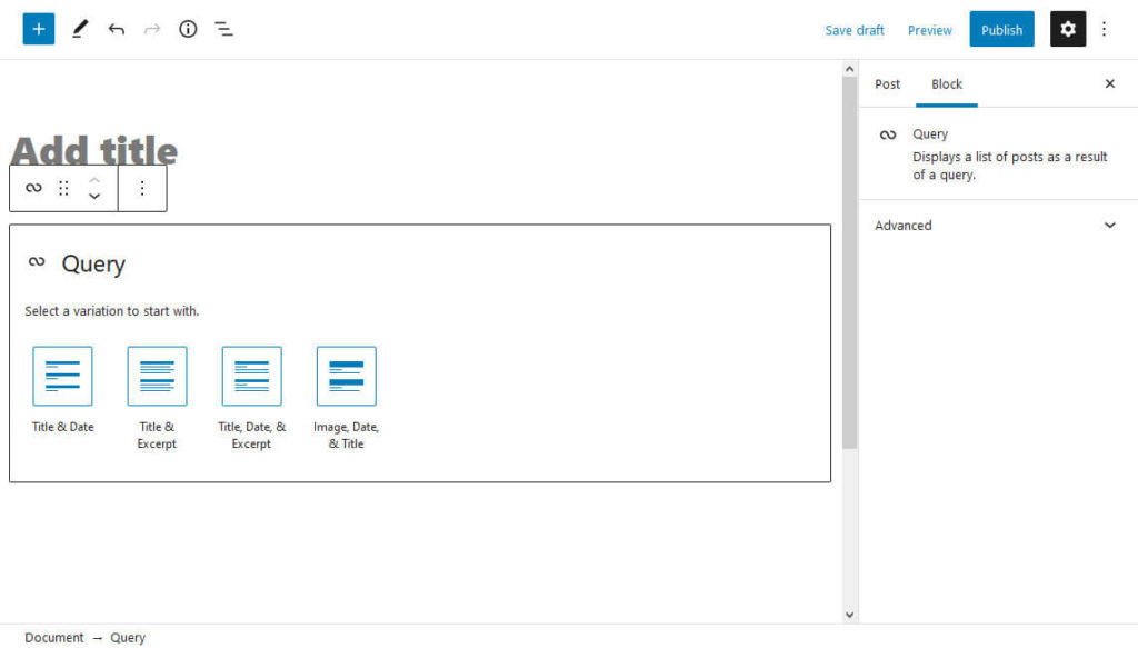
Finally you have a customizable list of your posts you can insert on any page you want, or even in widget areas like your sidebars. Be aware that currently you can only use this block with experimental themes like Twenty Twenty-One Blocks. When full site editing comes to Gutenberg, it will only become more useful.
Any Gutenberg Features We Missed?
Gutenberg strives to make editing your WordPress posts and pages (and soon, your entire site) a fully visual process. And while getting the hang of the builder itself is fairly intuitive, there’s just so many options that a few are likely to float under the radar.
Hopefully this article will have helped you gain an understanding of some Gutenberg features you might have still been in the dark about. Follow our pointers on how to make the most of them, and you’ll be Gutenberg master in no time.
Which of these Gutenberg features came as a surprise to you? Let us know which ones you’ll be using soon!

12 Comments