The WordPress editor is the central work hub for content creation. Once you have your site up and running, you’ll probably spend about 80% of your time there.
If you think about it, that’s pretty impressive. One part of your website that lets you take care of 80% of your work? Sounds like a powerful tool.
The WordPress editor is something we take for granted. Its look, behavior, the even its formatting options are so intuitive that even newbies will quickly become familiar with it.
This familiarity, however, is somewhat artificial. Just like the rest of the platform, you can customize the WordPress WYSIWYG editor. In fact, you can pretty much control every aspect of it. Almost anything can be changed and made to look like and behave the way you want it to.
How? Well, I was just getting to that.
Why Would You Want to Mess With The WordPress Editor?
While the editor is a great tool (I for one love working with it) there are few areas that could be improved. In particular, in this article I want to address the following issues:
- Aligning the content styling inside the editor with the theme design
- Activating additional buttons and formatting options inside the editor
- Implementing custom styles without the need to manually add HTML and CSS
You are probably well aware that your content’s appearance inside the back end vastly differs from how it is displayed the front end of your site.
Although WYSIWYG stands for “what you see is what you get,” to actually see what you will get you usually have to hit the preview button. When writing long-form content, this can result in a lot of back and forth.
That time can be better spent polishing up your content before it goes out to the world.
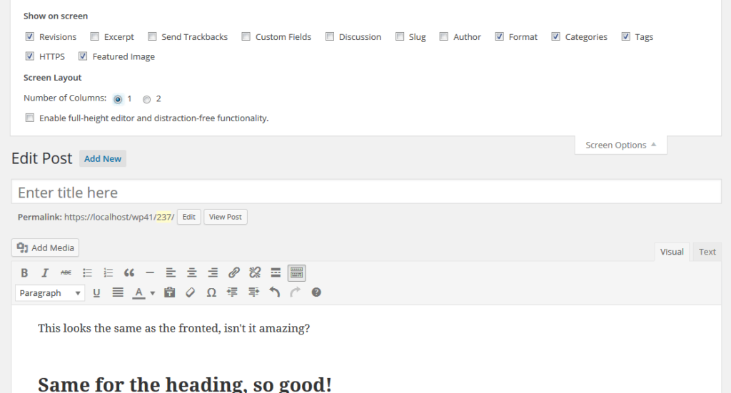
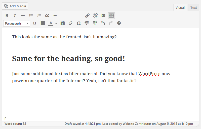
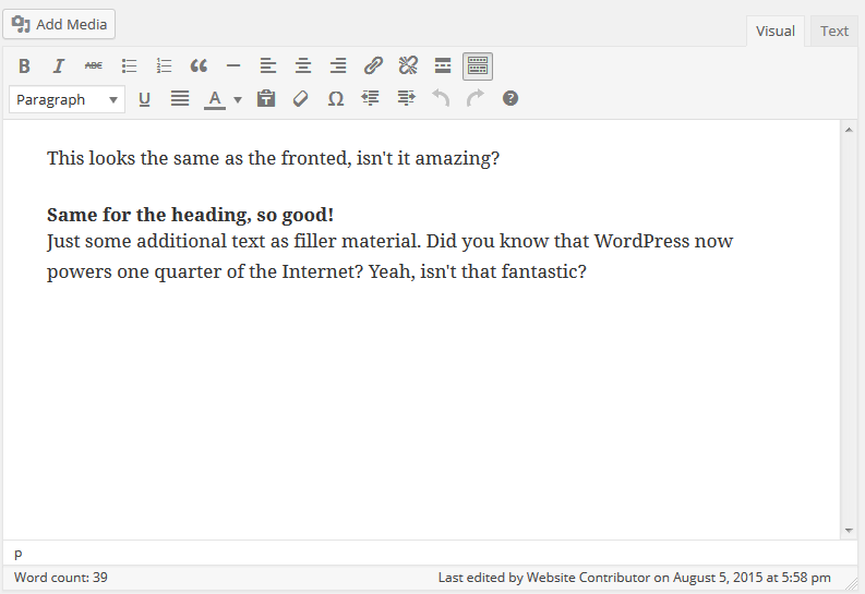
To address this issue, some themes have already started to implement using the same styles in the editor as in the front end. Twenty Fifteen is one such example:
Neat, right? Don’t worry, you will learn how to do the same further below.
Another thing worth mentioning is the styling options and buttons available in the editor. These change over time: some buttons vanish, others are added.
Not every user is happy with the choices made by the developers. Consequently, one part of the article will be spent on how to customize the styling options available in the editor.
Finally, if you like to implement all sorts of custom styles to your content (such as buttons, dividers etc.), you might be annoyed by manually adding custom HTML and CSS.
Fortunately, there is a way to make your own styles part of the WordPress editor. This lets you easily add whatever style you want to your content with just a few mouse clicks.
In short, the aim of this article is to customize the WordPress WYSIWYG editor in a way that lets you take complete control of your work environment.
Make Your Content Look Like Your Front End
In case you’re unaware, what you know as the WordPress editor is, in fact, a piece of standalone software called TinyMCE editor.
TinyMCE is an open-source, platform-independent, web-based editor built with Javascript and HTML. It is in itself highly customizable: look, options, formatting, and many other things can be changed.
Inside WordPress, the editor has its own style sheet. The good news is that means we can pretty much make it look however we want—if you know your way around CSS that is.
In addition to that, WordPress has a function called add_editor_style which allows you to call additional style sheets for TinyMCE. You can learn more about it in the WordPress Codex.
We will use this to our advantage and style the content in the editor any which way we want.
1. Create a Custom Style Sheet For The WordPress Editor
As a first step, we will check if there already is a file like that. As mentioned earlier, some themes have started aligning the look of the editor with the theme’s front end.
If nothing else is specified, add_editor_style will by default check for a file named editor-style.css. In Twenty Fifteen, you can find this file under wp-content/themes/twentyfifteen/css.
Of course, if your theme already provides it, you can just copy the file and use it as a base for your own customizations.
However, we will assume you don’t have any style sheet for the editor present. In that case you will simply have to create your own.
That is as simple as creating a new text file, naming it something like my-editor-styles.css, saving and then uploading it to your theme folder.
Side note: You should naturally do these kinds of customizations inside a WordPress child theme. That way you won’t lose your hard work to a theme update. In fact, if your parent theme comes with its own style sheet for the WordPress editor, you can simply overwrite it by placing a style sheet of the same name in the same location within your child theme folder.
2. Call The File Within Functions.php
Next up we need to make sure that WordPress actually uses our new style sheet. For that, we will add the following code to our (child) theme’s functions.php file:
[php]function custom_editor_styles() {
add_editor_style( ‘my-editor-styles.css’);
}
add_action( ‘admin_init’, ‘custom_editor_styles’ );[/php]
All done? Good. Now it’s time to get our customizations on.
3. Implement Custom Editor Styles
In the following we will go over a couple of examples how you can use your newly created file to make the TinyMCE editor look more like your website.
3.1. Set The Editor to Same Width as Your Content Area
Why would you give the content area in the WordPress editor the same width as your front end? Again, to make your work area closer toy your end result.
By limiting yourself to a certain width, you can see exactly where your lines break, when a paragraph is getting too long and or blocks of text too large to be appealing. Plus, it’s super easy.
You have two ways of targeting the content area: Either through the body tag (as it is done in Twenty Fifteen) or via its id which is #tinymce. In this example we will do both.
If we assume your content area is 640 pixels wide, the corresponding CSS in your editor’s style sheet would look a little something like this:
[css]body {
max-width: 640px;
}[/css]
As mentioned before, alternatively you can go with:
[css]#tinymce {
max-width: 640px;
}[/css]
Both should yield the same result. If successful, your content should break now at the exact same place in the editor as it does on the front end of your site.
Be aware that this only works as far as the editor stretches on your screen. If you have a super wide content area and want to use this technique, you might want to switch to one-column view in the Screen Option.
3.2. Underline H2 Title Tag
That wasn’t so difficult now, was it? Don’t worry, the next one isn’t either.
For this example we will assume that you have decided to underline your H2 headings.
Whether that’s a good idea or not is a whole other question, but it will gives us something to practice with.
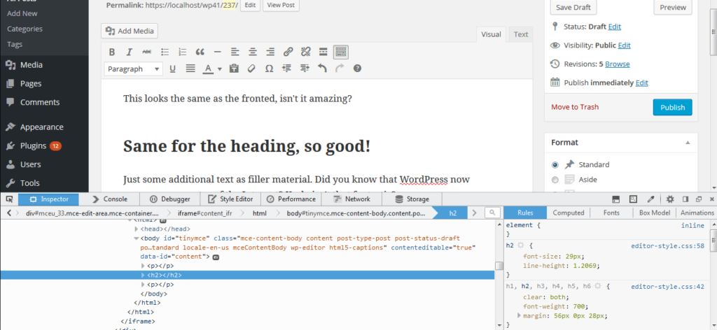
One of the easiest ways to find out which CSS we need to change is to simply write something in the WordPress editor, format it as H2, and then inspect it with the developer tools or Firebug.
This will quickly show us that the we can modify our heading tag very simply with the following code:
[css]h2 {
text-decoration: underline;
}[/css]
If you want to get a bit more specific with the operators, you can also achieve the same like this:
[css]#tinymce h2 {
text-decoration: underline;
}[/css]
Easy, wasn’t it? Told you.
3.3. Use The Front End Style Sheet As Your Basis
Even though it is quite simple to modify the styles within the WordPress editor, you will quickly become annoyed trying to implement all of them manually.
The good news is that you don’t have to. There is a better way.
With the help of the @import rule, you can simply import your front end style sheet. That way all formatting from your front page will also be used in the editor.
With a child theme for Twenty Fifteen, it works in the following way:
[css]@import url(‘../twentyfifteen/style.css’);[/css]
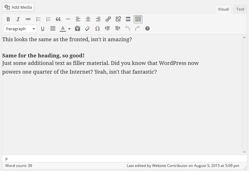
Of course, not all styles are useful for the editor. As a consequence, it might initially look somewhat unattractive:
Therefore you have to do some adjusting to make it more user friendly. For example, if you add the following lines to my-editor-styles.css:
[css]body {
background-color: #fff;
margin: 20px 40px;
max-width: 640px;
}[/css]
It looks much better than before, don’t you agree?
Alternatively, instead of importing your entire style sheet, you can also use the editor sheet from Twenty Fifteen as a blueprint. This is easier to make sure you catch all the important styles.
Add Additional Buttons To The WordPress Editor
As mentioned earlier, TinyMCE is a standalone product. The WordPress developers have set it up in a way they decided made sense, including all available formatting options.
However, what you don’t know is that the actual TinyMCE editor has many more buttons and formatting options available than you are used to. Don’t believe me? Here’s a list.
In fact, in WordPress 3.9 some buttons that were available in the WordPress editor have disappeared. Currently, the editor header looks like this:
So what if we want to include additional buttons? Nothing easier than that. I will quickly show you how to re-add two of the earlier buttons to a third row at the top of my editor.
[php]function add_editor_buttons($buttons) {
$buttons[] = ‘styleselect’;
$buttons[] = ‘hr’;
return $buttons;
}
add_filter(‘mce_buttons_3’, ‘add_editor_buttons’);[/php]
After you have added the code above to functions.php, your editor should now look like this:
Be aware that mce_buttons_3 is the filter for the third row. To add something to the second line, you would have to go with mce_buttons_2.
Creating Custom Styles
Not only can you add more buttons to the WordPress editor, but also populate them with custom content. That’s actually the reason I brought the “styleselect” menu up there.
It allows you to add your own styling options, which then lets you add custom HTML and CSS to your content from a drop-down list instead of having to write it manually.
The final part of the article will be devoted to how to achieve this.
1. Enable The Styleselect Menu
Huh, didn’t we just do that? Yes, we did. However if you are just planning on bringing back that one button, there is a slightly more elegant way to do so.
[php]function add_style_select_button($buttons) {
array_unshift($buttons, ‘styleselect’);
return $buttons;
}
add_filter(‘mce_buttons_2’, ‘add_style_select_button’);[/php]
As you can see below, this adds the button at the beginning of the second row. Looks much better, doesn’t it?
2. Register Custom Styles
With the button in place, it’s time to register a bunch of custom styles. In particular, what I want to do is add a highlighter to emphasize important text passages and a green button.
To add these styles, I paste this here in my functions.php:
[php]// add custom styles to the WordPress editor
function my_mce_before_init_insert_formats( $init_array ) {
$style_formats = array(
// These are the custom styles
array(
‘title’ => ‘Highlighter’,
‘inline’ => ‘span’,
‘classes’ => ‘highlighter’,
‘wrapper’ => true,
),
array(
‘title’ => ‘Green Button’,
‘block’ => ‘span’,
‘classes’ => ‘green-button’,
‘wrapper’ => true,
),
);
// Insert the array, JSON ENCODED, into ‘style_formats’
$init_array[‘style_formats’] = json_encode( $style_formats );
return $init_array;
}
// Attach callback to ‘tiny_mce_before_init’
add_filter( ‘tiny_mce_before_init’, ‘my_mce_before_init_insert_formats’ );[/php]
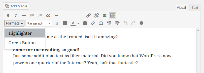
Now when I go to my editor, I will see these two under Formats.
A short explanation on the code: The title argument defines the title you will see in the editor, block and inline define whether a block or inline element is being used and what kind of element it should be wrapped into, classes are the CSS classes associated with the new element and wrapper tells whether the current format is a container for block elements. More information here.
3. Define Styles
My new styles are already usable. I can highlight any text in my editor, use the drop-down menu and assign them to the content.
However, as of yet this will have no effect since we haven’t assigned any CSS. Time to correct that. Thankfully, our newly-created CSS classes make this pretty easy. Add the following code to your theme’s style.css.
[css].green-button {
background-color:#00cc00;
-moz-border-radius:3px;
-webkit-border-radius:3px;
border-radius:3px;
border:none;
display:inline-block;
cursor:pointer;
padding: 10px 30px;
text-decoration:none;
}
.green-button a {
border: medium none;
color: #fff;
}
.green-button a:hover {
border: medium none;
color: #333;
}
.highlighter {
background-color:##ffff66;
}[/css]
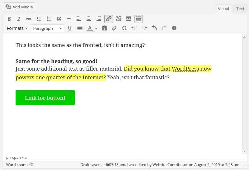
If we now preview our article, we can see the new styles at work.
4. Display Your New Styles in The Editor
However, while we are at it we don’t just want to see our custom styles on our website, but also in the editor itself. If you have been following along, all it takes is add the same styles to my-editor-styles.css and it will look the same as it does on you front page.
That’s it. Well done!
Plugins for Customizing the WordPress Editor
If you’re not so much the DIY type, there is also a number of plugins out there that let you customize the WordPress editor without touching any files. Let’s go over some of them real quick.
WP Edit
This plugin provides you with extra buttons and additional editor options. Among others, it allows you to insert images, video and other media as well as create tables. It also adds support for emoticons to the WordPress editor.
TinyMCE Advanced
Enhance the WordPress editor with the option to add, remove and rearrange buttons at will. You will also be able to create and edit tables, use search and replace inside your content as well as edit CSS and HTML.
Visual Editor Custom Buttons
The Custom Buttons plugin provides you with additional options for HTML and CSS styling. It also adds extra buttons to the editor as well as the possibility to create your own.
Plug-N-Edit
Plug-N-Edit turns the WordPress editor into a drag-and-drop page builder. You can layer elements on top of one another, create buttons, integrate Google fonts, use images as backgrounds and more.
Pods – Custom Content Types and Fields
Custom post types and fields are very useful. This plugin not only helps you create them but also gives you access to them directly from the WordPress editor.
Just Writing
While the distraction-free writing mode in WordPress is a great idea, some people bemoan the lack of formatting options. Just Writing remedies this by adding additional buttons to the otherwise peaceful writing environment.
Tabify Edit Screen
If you ever think the WordPress editor is a tad too overloaded, this might be the plugin for you. Instead of the usual design, with Tabify the different meta boxes are displayed stacked on top of each other via tabs. Makes for a much tidier work environment.
Summing Up
As you have hopefully seen from this tutorial, nothing in WordPress, not even the central work hub that is the WordPress editor is truly set in stone. Every single part is customizable to fit your needs exactly.
Configuring the editor to represent what your front end is going to look like is a good way to get a direct feedback without using the preview button. All it takes is a custom style sheet.
Additional styling options and custom styling are also readily available. With just a little bit of coding you can add buttons, highlighters, content blocks, and more.
Finally, for those not too keen on working with php and WordPress functions, theress also number of plugins that let you implement customization with just a few clicks.
What’s most important is that you end up with a working environment that enhances your workflow and addresses your personal needs. Luckily, you now have the tools to achieve this.
Any other suggestions for customizing the WordPress editor? More plugins? Additional code? Let us know in the comments.







4 Comments