Oh boy. I love sneak peeks!
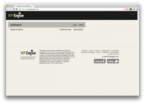
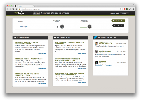
I had the chance to test drive the new and improved back admin dashboard for WP Engine service and it definitely is a significant design change.
This won’t be a long post, but check it out after the jump:
Before above, after below.
As you can see, the first thing you see right after login is very different.
Now take a jump in further and you can see even more style changes and arrangement of information:
Before above, after below.
To be honest, I dislike the colors – on both iterations, but the newest version is definitely an improvement over the older one. How much of an improvement? Well, I’ll let you decide.
Click the above links for bigger view or if you have any account you can view the old and new here:
For some reason my password is different on each one, so I was locked out for a while but I recovered.
Thoughts? Vote with your comments! Official announce post here.


6 Comments