Like SEO or WordPress back-ups, optimizing images for your blog is one of those things that you hear about all of the time, but few people actually bother to do.
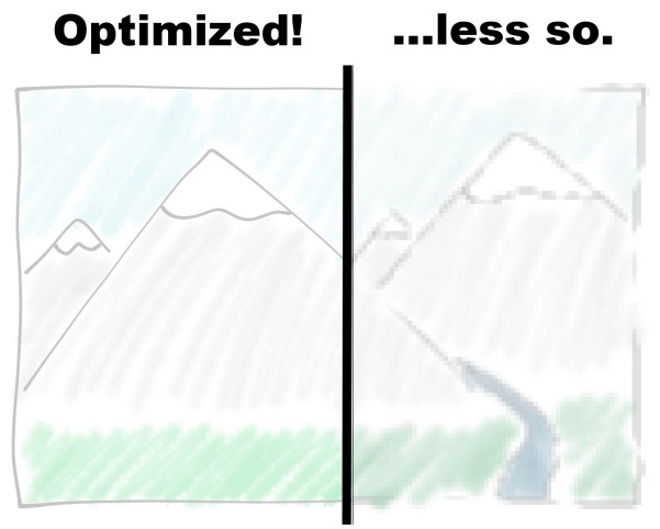
Why should you care about image optimization? Using the proper image format and resolution can not only make your website load drastically faster, but can actually improve the quality of images as well.
In this post, I’m going to give you 3 tips on optimizing images that every WordPress blogger should know.

Tip 1. Use Good Image Editing Software
If you’re going to optimize your images, you’ll need to do some basic editing, and for that you’ll need software. Fortunately, there are plenty of great free options out there:
- WordPress – Since v2.9, WordPress has had basic image editing built-in. It can’t convert file types (yet), but you can use it to re-size, crop, and rotate images that you’ve uploaded.
- GIMP – Support for Windows, Linux, and Mac, and a very powerful editor if you know how to use it. Probably your best option for image editing.
- Paint.NET – Windows-only, however I find it to be a little more intuitive that GIMP, and just as powerful.
Of course, if you have Adobe Photoshop (or similar), use it!
The only functions you really need to know are how to re-size an image and the “Save As…” function for saving as a different file type. However, learning the more advanced features of your software can be well worth the time invested.
Tip 2. Choose The Right File Type
By saving your image as the appropriate file type, you’ll reduce it’s file size, which leads to faster page loads on your website.
The right file type can also enhance the quality of your image.

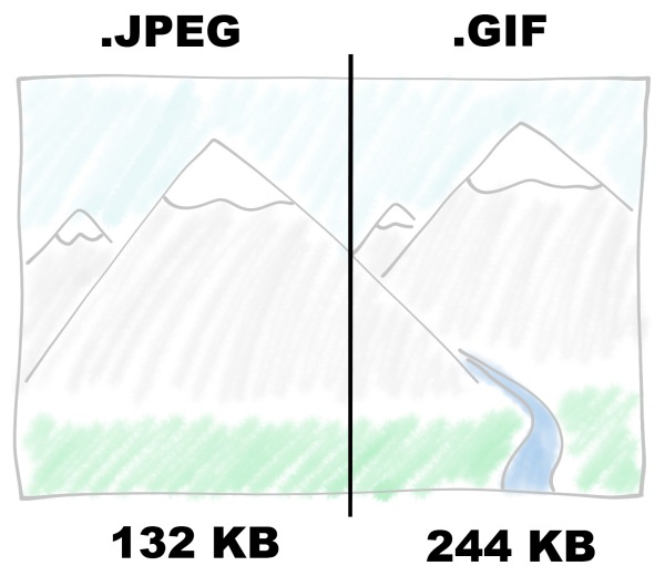
In the above example, the GIF version of this illustration was almost twice as large as the JPEG. 100 kilobytes here, 100 kilobytes there… added up, it can make a big difference on a site with lots of images.
There are many different image file types, but for the web, there are only 3 file types that are supported by all the major browsers: GIF, JPEG, and PNG
Don’t make the rookie mistake of assuming that JPEG is the right choice for all web images. While it is right in many instances, there are also situations where PNG and GIF are better choices.
- GIF (Graphics Interchange Format) is your best choice for animated images, but given it’s paltry color range, not much else. PNG has largely replaced it.
- PNG (Portable Network Graphics) is best for logos, text, computer graphics, and line art. It also supports transparency, if you need it.
- JPEG (Joint Photographic Experts Group) was created to save photos. It is best for photographs, artwork, and scanned images. It does not support transparency.
Note that JPEG uses lossy compression, meaning that some data is lost every time it’s encoded (there is a lossless JPEG format, but it lacks widespread browser support). This reduces file size, but you should save your original graphics in a lossless format. JPEG does not support transparency, meaning all images must be rectangular.
Tip 3. Choose The Right Size
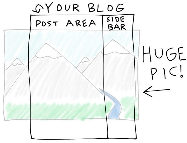
On most WordPress blogs (including WP Daily), the post display area is 600 to 700 pixels wide. What happens if you use an image wider than that?

When someone views that post, their browser still loads the full size image, but since it’s too wide for the post display area, the user only sees a scaled-down version of it.
Even though the user has to wait for a huge image to load, they only see a scaled-down version.
The solution? Figure out how wide your post displays (700 pixels is a safe bet), and scale your images down to that size. You can even do this with WordPress’ built-in editor!
But I want high quality images!
If you’re running a photography blog or uploading your original artwork, 700 pixels may not cut it for you. You want people to see your hard work in all of it’s high-resolution glory.
You can get the best of both worlds (quick loading, high-resolution) with a hybrid approach. Use a low-resolution version in your posts, and have it link to a high-resolution original, for those who want it.
Retina Display?
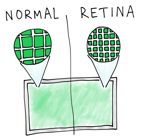
The newest MacBook Pro is now implementing a “Retina Display”. Although the screen remains the same size, the individual pixels are much smaller, allowing 4 times more pixels to be packed into the display.

To look good on a Retina Display, your images need to be four times bigger than what they’re displayed at (twice as wide, twice as tall). This can obviously slow down page load times.
It doesn’t make sense to slow down the entire site for a tiny fraction of users, but there’s also no easy way to target Retina Display users specifically. Scripts can detect (and server higher-resolution images) to Safari users, but even most Safari users aren’t using Retina Displays.
In the future, this problem will likely be addressed, especially as responsive web design matures as a field. For now, you’re probably okay not worrying about it.
Optimizing Images – You’re A Pro Now
Congratulations! You now know everything you need to know to optimize your blog’s images. Go forth, and optimize.
If you’re curious, I used MyPaint to create the illustrations for this article, drawing on a Wacom tablet.
Do you have a suggestion for how to improve this post, or a question about it? Feel free to leave a comment below.

15 Comments