It seems to be a growing trend for creative individuals to undertake the work of re-imagining, redesigning, re-branding larger companies websites and properties either for a personal project, a portfolio piece, or even as an attempt to get hired.
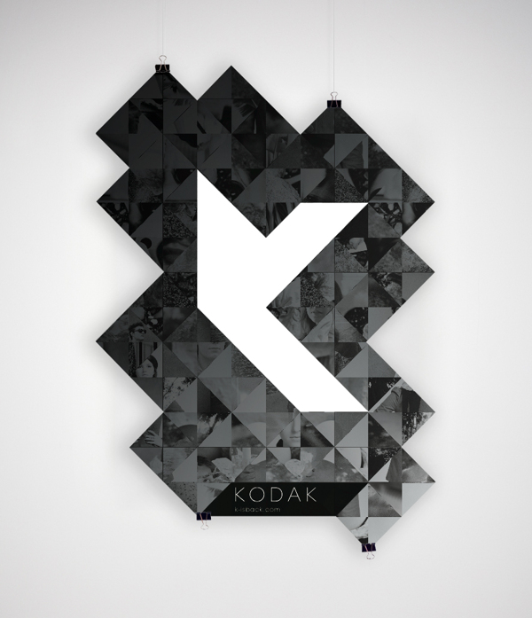
It’s not that this is a bad thing – I actually love seeing the creative alternatives to long-standing brands. Take for example a recent Kodak redesign or even the very famous Microsoft re-brand that eventually led to a job offer for the designer, Andrew Kim.
Powerful stuff this is!

Well, someone has gone ahead and made an attempt a redesigning, at least conceptually, many of the Automattic properties and Stéphane Thomas‘ work even caught the attention of Matt Mullenweg who dropped a comment late yesterday:
Howdy, I’m Matt the founder of Automattic. I just wanted to say thank you for this thoughtful look through our services.
You’re 100% correct that this is one of our weaker areas, and some more shared UI elements would make things a lot easier for folks, especially as we start to unify more of our brands around Jetpack and WordPress.com.
Would you agree with Matt’s admission that there really isn’t a “unified experience” that really ties all the brand sites together?
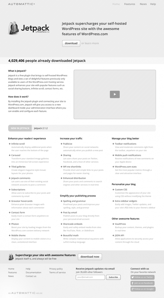
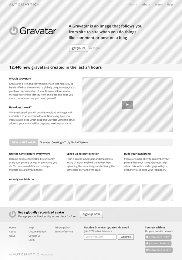
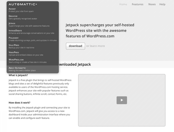
Check out what Thomas has created for a number of the properties:


As you can definitely see, Thomas has created a systematic approach to a consistent presentation layer for Automattic properties, and I am really digging the conceptual work – and it is that, just concepts and wires:
You might have the feeling that these websites look too similar now, but keep in mind that they are just wireframes. Each project should have its own visual identity.
They should not use the same template with just a different color scheme, but should definitely follow the same design style.
However, each website should have its own theme or universe (e.g. the current cloud design of Jetpack).
In the very least, Automattic should inquire further for some more thoughts from Thomas and even contract him to do a small bit of consulting, even if they eventually bring the work in-house. It’s so interesting to think that I’ve gotten so used to seeing the properties as they stand I haven’t thought with fresh eyes about the inconsistency that is created with the overall brand identity.
A great attempt and much praise goes to Stéphane in taking the time to do it!
What are your thoughts about the attempt? When was the last time you thought that the Automattic properties needed a design overhaul?

1 Comment