
Why We Decided to Rebrand
Original Branding:
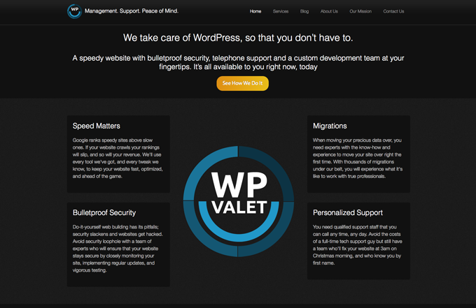
When we launched in May of 2012 (and up until a few weeks ago), our original branding consisted of a darker color scheme, as you can see above.
This was intentional.
Our main reasoning was to convey the feelings of sophistication, security, and efficiency that the color black provides to ensure our potential customers felt safe.
Specifically:
- Sophistication
- Glamor
- Security
- Emotional safety
- Efficiency
- Substance
Our main goal was to separate WP Valet from other services with similar offerings, and to specifically target Enterprise-level customers.
Our New Branding:
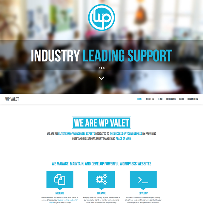
One of the most obvious reasons for choosing a lighter color scheme was simply because it’s much easier on the eyes. This became especially critical as we ramped up our blog content publishing efforts.
It came down to the Psychological Properties Of Colors and how that fit with our revised service offerings and our message to potential customers. We chose to pair a lighter blue with our cleaner white space for it’s calming effect.
Specifically:
- Intelligence
- Communication
- Trust
- Efficiency
- Serenity
- Duty
- Logic
- Calmness
It is said that the color blue affects us mentally, rather than the physical reaction we have to more bold colors like red. Soft blues convey the feelings of serenity, clear communication and have a calming effect on the mind.
Each one of those feelings above are in line with the end result of the services we provide our customers. Often during our initial contact with potential customers, they have been frustrated and stressed over managing their own site migrations and core, theme, and plugin updates.
It’s our job to take those stresses away so they can focus on growing their online businesses and not getting overwhelmed and distracted by the responsibilities of the day-to-day maintenance needed to run a successful WordPress-powered website.
Main Page Functionality (Parallax)
We chose to add Parallax functionality to our main page, where it didn’t exist previously. If you’re not familiar with Parallax design for websites, it offers several interesting features that we feel help our brand message.
The main reason we chose a Parallax approach was to lessen the number of clicks a user needs to take in order to see our company message.
Some additional features include:
- Giving visitors the feeling of depth within the page
- It allows a storytelling approach in order to help guide visitors through the site
- It’s been proven to make page visits last longer by encouraging visitors to scroll through the entire page
- It can provoke curiosity
- Aids in driving visitors to calls to action
Invite Only Removed
After our initial launch, we had so much interest that we had to institute an invite only approach. It seems a bit counterintuitive, but it was necessary.
Part marketing technique, but mostly a way to throttle our growth, the invite only contact method allowed us to ensure we had the proper infrastructure and processes in place to service our existing customer base and to on-board our new customers in a streamlined and pain-free way.
Segmented Contact Forms
With this redesign also came a bit of content restructuring. We offer three distinct services: Migrations, Maintenance, and Development. We found that having only one contact method wasn’t allowing us proper segmentation of our leads. An important factor for responding properly to customer needs, and also for planning and implementing ongoing follow up marketing efforts.
We now have separate contact forms, each with their own hidden fields we utilize in the backend of our marketing and internal customer management process.
Shorter Forms
Related to the above, was the implementation of shorter contact forms. We’re still testing this approach, but the goal was to make our initial contact as easy as possible for the (potential) customer.
As an example, a customer interested in our Migration service would previously have had to to complete a very detailed form including details about their current host, FTP details, and more.
Although we did have many contacts using this method who had already made the decision to move forward with our migration service, we had many more who simply wanted questions answered before they made the decision to become a WP Valet customer.
Early Results
Since our redesign launch, our contact form has seen a substantial increase in submissions from interested customers covering all of our service offerings.
It’s still a bit too early to assume that the redesign and restructuring have been the single driving force for this increase as we also enacted a large social marketing push at the same time, but early indicators make us increasingly confident that our redesign has been a success in driving more conversions.
We’ll definitely be keeping an eye on the data metrics in the weeks and months to come.
What considerations dictated your design decision-making?
 Adam W. Warner is the Brand Ambassador for the WP Valet and Co-founder of FooPlugins.
2 Comments
Join the conversation