On September 4, 2014, WordPress 4.0 was released to the world, named “Benny” after much-loved jazz musician Benny Goodman.
Now that the dust has settled, I’ve been able to spend some time with the new WordPress 4.0 to get a feel for the new features, and I’m ready to give my verdict.
For those of you expecting huge leaps forward as we jump from WordPress version 3 to version 4, you might be a little disappointed. There doesn’t seem to be any more new features than you would find in a typical WordPress update, like, for example, the jump from WordPress 3.8 to 3.9.
In fact, I’ve heard a number of WordPress experts refer to the update as WordPress 3.10 rather than 4.0.
While there have undoubtedly been some nice additions to the WordPress platform in this new release, it hasn’t taken the huge strides forward that many, including myself, were hoping for.
But let’s leave the negative aside and focus on some of the shiny new features the update has given us. Every one of the new features is completely logical and a definite upgrade on the existing infrastructure. And with a strong focus on enhancing the content creation process, this upgrade suits me just fine!
Let’s take a closer look at, in my opinion, the major new features.
Improvements to the Editor
As a freelancer writer, most of my time is spent in the WordPress text editor Any changes made will have a significant impact on the way I work.
The first change I noticed was the way the editor was sized/resized. Before the update, you had the option to manually adjust the size of the editor. If you exceeded the boundaries, a scrollbar would be added to the editor, allowing you to move up and down your text.
This was a frequent source of (minor!) frustration for me, as when I tried to scroll within the dashboard I would often end up scrolling my text, rather than the dashboard. This is quite hard to explain in writing, but anyone who regularly writes long posts will know what I’m talking about.
In 4.0, there is no option to resize the text editor manually — it simply expands automatically the more you write. This is a nice touch, and it has finally put an end to my scroll-within-a-scroll issues.
The update also includes a “floating” sidebar alongside the text editor, much like the floating sidebars you often see on WordPress websites. This means that when you write a long post, the right-sided toolbar will hover in view, even as you move down the page – no matter where you are on the page, you will always be able to see and click on the publish button, or choose from the formatting options available.
As well as this, the latest changes to the editor also includes a “sticky” formatting toolbar, which will now always sit above the text editor – similar to freezing panes in Microsoft Excel – which is another great way to keep scrolling to a minimum.
Overall, I was very pleased with the changes to the text editor. They aren’t ground-breaking, but they definitely make the content creation process less stressful, as everything you need is on screen at all times.
Seamless Media Embedding
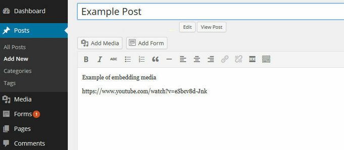
Embedding media has never been a difficult task in WordPress. However, in the past, to ensure it was embedded correctly you would have to click to preview your post, or publish it to view it on your live site – in other words, there was no way to check you had embedded the media correctly, directly in the text editor.
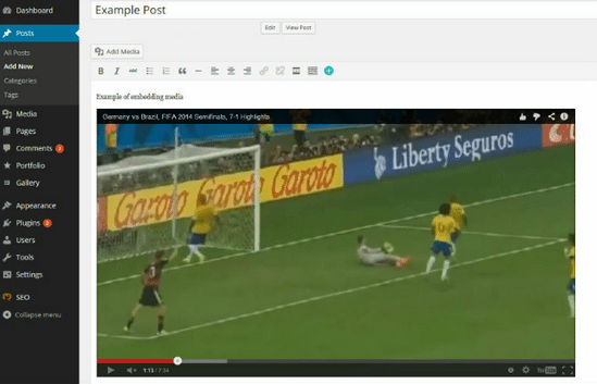
All this changed with WordPress 4.0, as any media you attempt to embed is instantly visible in the text editor – whether that’s a YouTube video, a tweet, or any other embeddable media.
This is a great little feature, and it’s quite surprising that this feature was not implemented sooner. Again, it’s nothing ground-breaking, but it does reassure you that your media is embedded correctly, so you can focus on producing great content.
Stylish Media Library
The WordPress media library has received a long overdue facelift, significantly improving the way you browse and interact with your uploaded media.
In the pre-4.0 world, your media was crammed into an awkward-looking list format. By default, the thumbnails were too small, making it difficult to pick out the media file you were looking for. After finding and clicking on your file, you would be taken to a new page, where you would be able to see details of your image, and have the option to click through to the image editor.
The list view was finite, too, meaning if the media file you were searching for wasn’t on the first page, you’d have to click through to a different page to try to find it.
This was a nuisance, and the changes to the media library have been warmly received.
Instead of the frustrating list view, your media files are now displayed in a stylish looking grid layout. Each thumbnail is larger, therefore clearer, making it easier to find what you are looking for. This grid function comes with infinite-scroll, meaning you won’t have to click through to different pages to find your image.
Clicking the title of a media file brings up an Attachment Details lightbox, rather than whisking you away to a new page – this is far more convenient. This means you can view every uploaded image, see the details for each, and even edit the image, all from one page.
Without doubt, this is one of the biggest improvement in WordPress 4.0, and judging by the reaction, the most warmly received. The feature can save you substantial amounts of time when it comes to finding and editing your media files.
Browsing for Plugins
The directory of free plugins is, without doubt, one of WordPress’ biggest strengths. Even if you have limited technical skills, by installing a simple plugin you can add a wide array of impressive functionality to your website.
Now, many of you will take the same approach to plugin hunting as me: First, I’ll search for the best plugin for a specific task on the search engines, like Google; then, I’ll go back to the WordPress dashboard, and find my plugin through the Search Plugins function – of course, you could download the plugin directly from the WordPress repository, but then you have to upload it again, which can be quite time-consuming.
The problem with this approach is that it can be quite difficult to find the plugin you’re looking for from an endless list of similarly-named plugins.
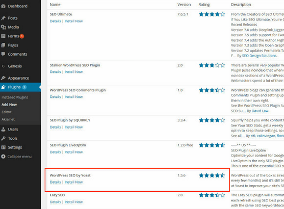
One of the better improvements made in 4.0 is the new WordPress plugin browser. This new, intuitive way of finding plugins is a marked improvement on the old format: the new layout is easier to understand, and the added images and description makes it easier to find the plugin you want from the list.
This feature will also benefit those of you who aren’t as bothered with time-consuming plugin research, and would rather make a snap decision on which plugin you install. Before 4.0, you had very little to work with: the plugin name, average rating, and a short description. Not only does the new layout in 4.0 make it easier to make quick comparisons, but you are also provided with additional useful information, including the number of reviews and downloads, when the last update was, and whether the plugin is compatible with the current version of WordPress.
You can also click on the name of each plugin, which will bring up a lightbox with all the information you’d find on the WordPress repository – that’s a real time-saver.
If you regularly test out different plugins, you’ll definitely appreciate this new feature. It just looks much better, and this makes it far easier to use than before.
The Verdict
Overall, I can’t fault the WordPress 4.0 update: without doubt, every new feature added is an improvement over what came before.
I think most users would agree with that point: WordPress 4.0 is definitely better.
Any criticism would have to be leveled at what the developers didn’t do – many WordPress users, including myself, would have liked a little more. The regular updates to each version – i.e. from version 3.5 to 3.6 to 3.7 – always add some nice new features, but I think we all were hoping for more significant steps forward from the brand new version 4.0, including a revolutionary new feature or two.
However, this is probably just WordPress users being greedy: The developers have improved the overall user experience of WordPress – what more can we ask for?
From the point of view of someone who regularly makes use of the text editor in particular, all the trivial little problems have been ironed out. For that, and all the other new features, the developers should be commended.
For that reason, I am definitely giving WordPress 4.0 a big thumbs up!
And, if you’re already bored of the new features, the next update, 4.1, is already due in December.
What are your first impressions of the new features available in WordPress 4.0? Let us know in the comments section below!
 Shaun Quarton is a freelance blogger from the UK, with a passion for online entrepreneurship, content marketing, and all things WordPress.


1 Comment