Content formatting is an important piece of the puzzle that is blogging and content marketing. While you would think that the information inside your posts is what matters most, it turns out that the presentation is just as important.
While the content is what gets people on your site, it’s format is what makes them stick around. And that’s important. The longer they stay, the higher the chances they will convert to subscribers or buyers. And that’s what it’s all about, isn’t it?
Plus, visitors staying on your site for a long time is a vote of confidence that Google takes into account. High bounce rates hurt your rankings. Consequently, longer time on page is also beneficial for your SEO.
So, how can content formatting help with that? That’s what we are about to find out. In this article, we will give you a number of content formatting tips for maximum reader retention. They will concentrate on anything from site design to structuring content and using visuals. Let’s get going.
Content Formatting Tips to Keep Visitors on Your Site Longer
Alright, in the following we will go over actionable tips for content formatting you can use to increase your time on page.
1. Optimize Content Width
Let’s start with the big picture. Content formatting starts with your website design, specifically the space available to your blog posts.
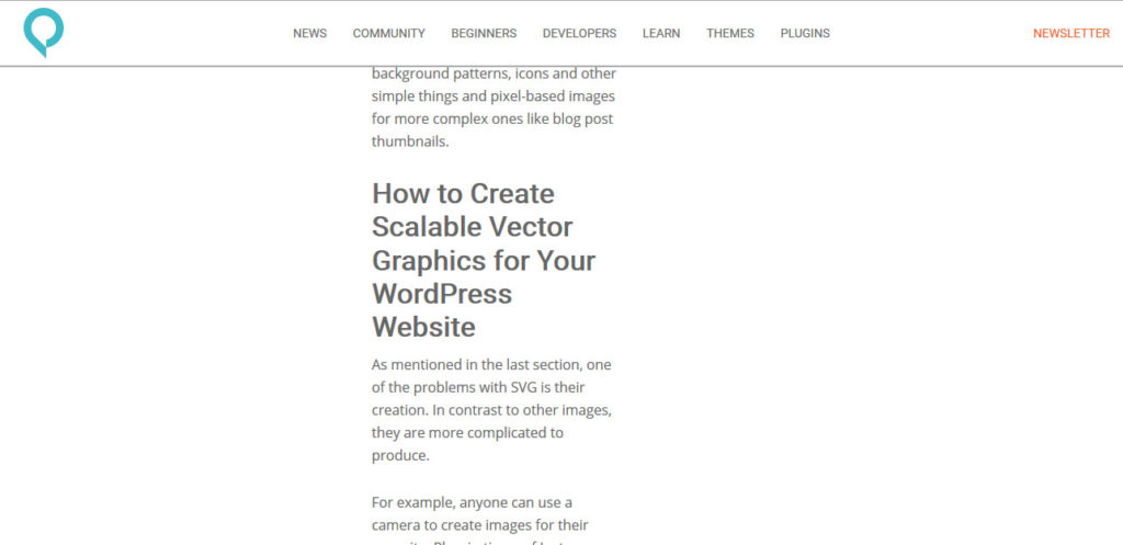
The width of your content column influences everything from line length to the size of your images and height of paragraphs. In short, it can either make reading article comfortable or not.
Imagine you had to go through a post that spanned the entire screen (especially if you have one of those really large monitors). You would constantly lose your line jumping back and forth.
On the other hand, if the content area is too narrow, you risk a numb middle from scrolling.
So, what’s the optimal content width? Well, according to research (here and here) it’s between 55 and 100 characters per line. This content length accommodates both slow readers (who are on the lower end) and skimmers (who make up the upper echelon).
Since the number of characters per line differs for every design, you need to test what that means for your site. After all, a lot of factors influence it, specifically font size and font type.
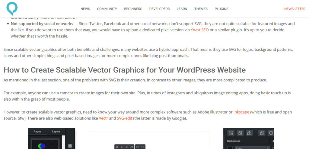
So, how can you figure out whether your site is within that margin? You can start off by copying a single line from an existing blog post and input it into Letter Count.
This will tell you whether your design is already in the desired range.
For Torque, I found the number to be somewhere around 80, which is excellent. If you are above 100 or below 55, you might want to tweak your design somewhat. This can take the form of shrinking or expanding your content area or optimizing your fonts. We have more information about this coming up.
2. Rethink That Sidebar
Sidebars are a staple of many website designs. They are useful to have, offer space for additional content such as newsletter sign-up forms, bios, and popular posts.
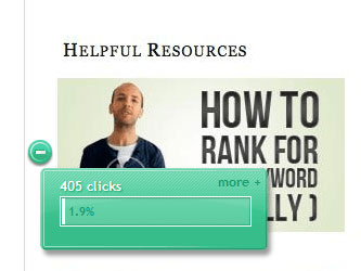
However, sidebars are notorious for having pretty low conversion rates. For example, Brian Dean from Backlinko states that the most important element of this sidebar has a conversion rate of just 1.9 percent. And that guy is on top of his game.
At the same time, sidebars distract readers from the main event. With attention chronically scarce, these are good arguments to remove it.
Plus, there are actually several examples of websites who did just that with great success. For example, Impactbnd increased their conversion rate by 71 percent after removing their sidebar. That’s not too shabby (to be wildly understating).
Videofruit ran a similar test on one landing page and saw their email signups jump by 26 percent. That was enough to convince them to test removing the sitewide.
Does removing the sidebar make sense for all sites or your website? You can’t really give a blanket statement like that. However, what you can do is run a split test to find out.
3. Pick and Format Fonts The Right Way
Fonts have a lot of influence on the readability of your site. The three most important factors: font size, type, and color.
When it comes to size, a while ago most people recommended at least 16px. However, today 18px is the new 16px. Subheadings (more on that below) should be a few pixels larger. Having a large enough font size will make sure your content is legible by readers of all kinds.
In addition, larger fonts encourage scrolling which makes for a more dynamic experience, especially on mobile (which we know is the most common way of consuming content these days). Of course, when selecting a font size, also take into account the number of characters per line that we talked about earlier.
When it comes to font type, services like Google Fonts offer a plethora of free fonts (learn how to get them on your site). However, it’s easy to go overboard with this.
A common strategy to achieve pleasant results is to use two different fonts, one serif, one sans-serif. That way you can contrast body copy and headings. If you are not a web designer, services like Font Pair help you pick candidates that fit together.
Finally, color can offer additional contrast and make content more enjoyable. Your web design should already come with a main color and an accent color, so make sure if you introduce new colors that they fit everything else.
4. Use the Inverted Pyramid Approach to Content
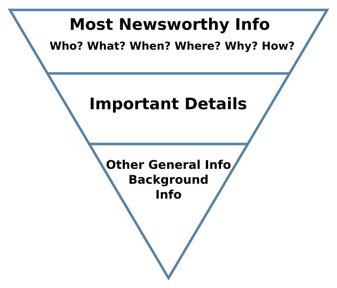
Inverted pyramid? What the heck is he talking about now!? Don’t worry if you haven’t heard the term, you are definitely familiar with it.
The inverted pyramid is the way newspapers structure their content. That means, they cover the most important information in the beginning, then get more specific throughout the rest of the article.
You can apply this not only to your overall piece but also at the micro level to paragraphs and sentences. That means:
- Work on the article title and introduction to pull in readers and clarify what the piece is about
- Summarize the core of a paragraph in the first sentence (see also Yoast’s tips further below)
- Use active voice to place the most important info at the front (like this very sentence)
5. Be Personal and Relatable
Humans are hardwired to connect with others. That includes the time they are reading the blog posts of some semi-anonymous person on the web. For that reason, to keep people around, try to connect with them through your words.
First of all, that means writing like you speak. When putting together a post, imagine you are talking to a friend. Be conversational, make jokes, use slang, and avoid being stiff and impersonal.
Also, address the reader directly by using “you”. You might have noticed that I speak directly to you instead of in general terms (“this is not how one attracts an audience”). Why? Because the latter would be horrible to read. Remember, you are not writing an essay or academic paper, you are speaking to other people.
Finally, being relatable also means you can drop something personal every now and then. For example, I like to tell anecdotes from the beginning of my career, funny things that happened to me or times I have been an idiot (which happens more often than not). This will keep people on your website, trust me.
6. Employ “Bucket Brigades”
Bucket Brigades are an old copywriting technique, made popular by the aforementioned Brian Dean. It basically means cliffhangers inside your content.
What does that look like?
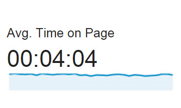
Exactly what I just did there. The question “what does that look like?” caused you to stop for a second, didn’t it? That’s an internal cliffhanger and a great way to break up large sections of text. They are also part of the reason why Brian’s average time on page is over four minutes.
Here are some of his favorites:
- Here’s the deal:
- Now:
- What’s the bottom line?
- This is crazy:
- But here’s the kicker:
Got it? I was sure you would. I also highly recommend reading Brian’s original take on them.
7. Make Content Readable
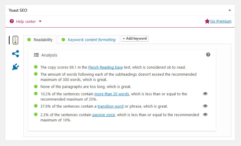
Readability has become more and more important in web writing. So much so that Yoast SEO, the biggest name in WordPress SEO, implemented their own readability analysis tool last year.
As one of the biggest authorities in SEO, if they say it matters, it really does matter.
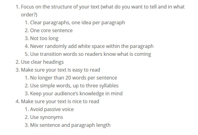
How do you increase readability? Here’s the summary from their talk at WordCamp Europe 2016:
There isn’t really much more to say. For more information, check our articles on subheadings. They make scanning content so much easier. You can also find additional tips on Smartblogger.
Also, use lists (bulleted and numbered). They break up the content and make information easy to consume.
8. Use Images the Right Way
Images and visuals are one of the best ways to support content and make it more appealing. They can also increase time on page if done correctly.
What does that mean?
Well, first of all, use the right kind of images. Neil Patel has a great article on which types of images perform the best. Here’s what he found:
- The more relevant, the better — Makes sense, doesn’t it. If you are using images on your posts that have nothing to do with the content, it will come off as confusing and thus low quality.
- Uniqueness — Hand-drawn and custom images perform particularly well. Graphs, charts, and infographics (or snippets of them) also belong to that category.
- Animated images — These achieved the best results. They were the most engaging and scored the most social shares.
A second factor is the number of images per post. The sweet spot seems to be at about one image every 350 words. That’s also the reason I used so many of them in this post.
When you do use images, don’t forget to optimize for speed. Also, check out our list of free stock photos.
9. Use Other Ways to Break Up Content
Images, lists, headings and everything else we mentioned are not the only ways to make content more digestible and engaging. Here are a few more elements that improve your content formatting:
- Videos — The big brother of images. Movement and sound make them even more engaging. If you can create videos yourself, awesome! If not, there’s usually high-quality stuff out there already on YouTube. Plus with WordPress, all you need to do is input the link and it embeds the video by itself.
- Social media updates — Talking about auto-embeds, social media updates are another option to update your blog posts. For example, you can simply post the link of a tweet and WordPress will automatically input into your post. Also works with Facebook, Instagram, and other social platforms.
- Tables — Tables are a great way to present data in an easily understandable way. They break up content as well. Plus, WordPress has the most excellent TablePress plugin to create them with, which I wholeheartedly recommend.
- Quotes — Quotes both format content as well as make it more credible. A good quote can lend social oomph from an authority to your post. They are also really easy to set up since the WordPress editor has a built-in blockquote feature.
Do You Have Additional Tips on Content Formatting?
Content formatting is one of those factors for online success that you only notice when it’s missing. However, presentation is just as important as what’s inside your content.
In this article, we have learned how to improve your content formatting. We had a look at content width and general site design, how to structure content and address readers as well as how to make content readable and engaging. With these tips, you are ready to make your content truly shine. Your readers and bounce rate will thank you.
Do you have additional content formatting tips? If so, please let us know in the comments section below.



2 Comments