How will websites change in the coming year? Those are important questions for website owners, designers, and developers.
In an environment as shifting as the Internet, it’s important to stay ahead of the curve. Being aware of upcoming developments and trends means you can get your own and your clients’ websites ready for them.
To help you out in this area, in this article we want to talk about the design and technological trends that will drive web design in the upcoming year. Having an idea about it will allow you to keep any website you are responsible for up to date.
Ready to look into the crystal ball of web design? Then let’s get cracking.
What Will Be the Web Design Trends 2018?
Below we will list design trends that are likely to dominate the upcoming year. Many are continuations or slight modifications of existing developments. Others are due to new emerging technology. However, all will influence the way we will build and maintain websites in the coming year.
A True “Mobile First” Design Approach
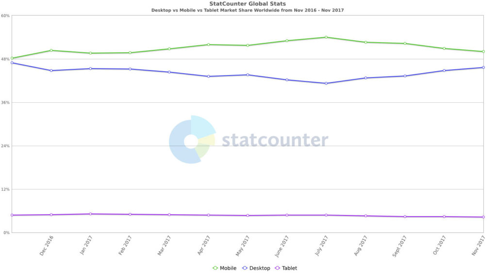
While mobile has been a web design trend for years, 2017 was the first year in which mobile traffic continuously beat desktop computers as the main Internet device worldwide.
It shows just how important this traffic avenue has become. Mobile devices have become an important and, for many, primary tool to interact with websites.
Plus, Google intends to roll out its mobile-first index, placing further importance on a good mobile site presence. For that reason, mobile design is no longer something that’s added as part of the web design process, but one of the first thing to figure out (about high time to read our guide on responsive design for WordPress).
In short, mobile design has matured. That’s also visible in the fact that design elements from mobile have made their way over to the desktop. Examples include large typography (learn to add custom fonts to WordPress), hamburger menus and the declining importance of “above the fold” (because scrolling has become second nature to most users).
This will continue in 2018. One thing you can get ready for is sticky elements at the bottom. Since mobile users are getting more and more used to them (hey, easier to reach), we will start to see these design elements everywhere.
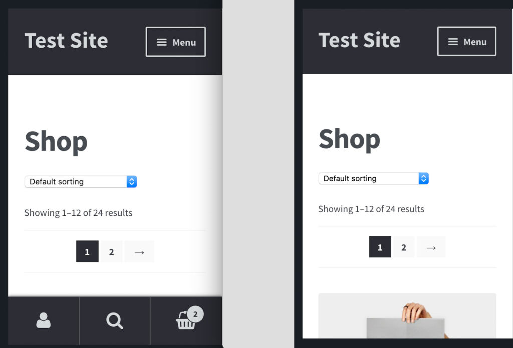
Also, when we are talking about mobile design, don’t forget AMP (Accelerated Mobile Pages)!
The Rise of Push Notifications
Push notifications are one of the most up and coming marketing channels. This year we could see more and more websites offering to send them to their users.
They have become so pervasive that it recently causes us to ask should you add push notifications to your WordPress website? There are many arguments for it:
- Good browser and device support
- High acceptance of mobile devices
- Click-through rates higher than email
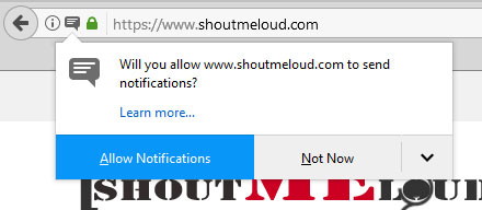
On the other hand, they can be intrusive. In fact, just the prompt asking for permission to send push notifications is a turn off for many users.
This will present a challenge for web designers. With push notifications becoming mainstream, they will have to find clever and appealing ways to integrate the prompt into their design.

Custom Graphics and Illustrations
Visuals are a key part of online content. They are engaging and able to convey things that words and text alone can not. In addition to that, images have SEO value if optimized right.
Though stock photos are still going strong, there is also a trend going the other direction. Instead of generic visuals, get ready for more custom, handmade stuff. One-of-a-kind graphics and unique illustrations are another one of the web design trends 2018.
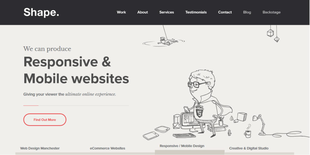
Their advantages: a distinguishable personality and tone that allows you to set your site apart in an ever-growing environment. Plus, illustrations are usually more lightweight than photos and other content-heavy images. In combination with scalable vector graphics and the need to speed up websites that’s good news. Time to break out the crayons!
Animations Everywhere
More advanced browser technologies allow web designers to move away from static visuals and embrace movement. Animations on websites have become readily available.
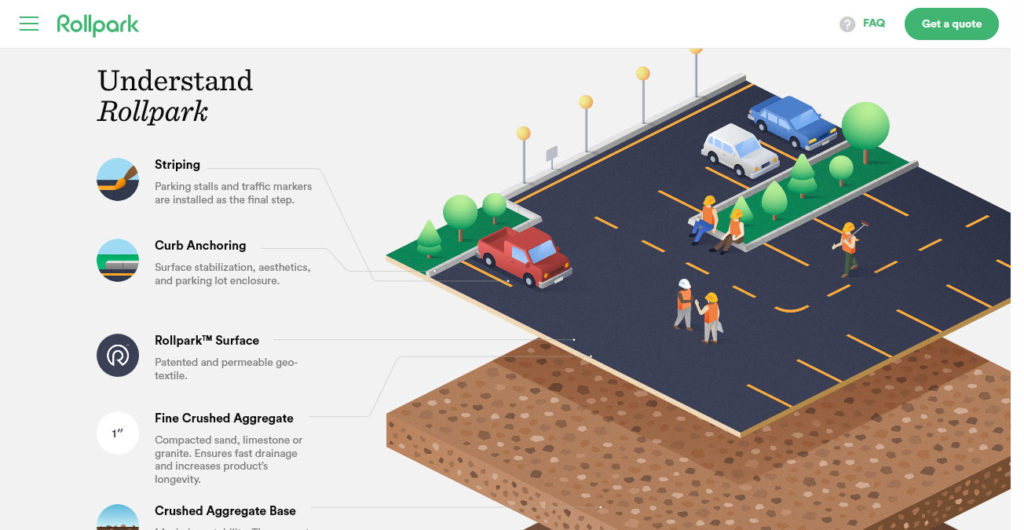
Using them can bring subtle life to formerly rigid pages. Especially in combination with micro-interactions (more on that below) it results in a more immersive and interactive user experience.
Potential applications for moving graphics include
- Logos — Animations make logos more memorable. Users no longer just recognize the logo but also the way it is presented to them. The logo can tell a story on its own. Look at these examples for a better idea.
- Loading animations — Animated loading icons are a staple of operating systems but also possible on the net. They bridge the time from accessing to actually seeing the website and convey activity. This makes it less likely users will feel bored and leave.
- Navigation — Thanks to mobile we are moving away from classic navigation menus. Hidden menus are en vogue. Slide-ins and other animations make their appearance less jarring.
- Hover effects — Mouse-over effects convey the possibility to interact with certain elements. They show users where they can take action and make them more likely to do so.
- Scroll triggered effects — Scroll effects that happen as users move down a page can create a narrative instead of just showing a static page moving by. They can also take the place of buttons and menus and educate the user on products like Apple does.
Find more ideas for website animations in this article.
Particle Backgrounds Replace Videos
Speaking of animations: we will be able to see more of them in the background of websites as well. Particle backgrounds are the answer to some problems video backgrounds pose, especially their size.

Since they are made with JavaScript particle animations are pretty lightweight. That way, they can introduce movement to the back of a website and grab user attention without bogging it down. There’s already a tutorial available for WordPress (including a plugin).
Vibrant Color Schemes and Gradients
In the past, web design had to stick to web-safe colors. However, thanks to better monitors and devices capable of showing them, you can now use myriads of colors on your website.
And designers are taking advantage of it. As one of the web design trends 2018 gets ready for saturated color schemes, contrasts and a lot more in-your-face hues.

This is especially true for gradients, which are making somewhat of a comeback, for example, as gradient filters over photos.
Asymmetry and Irregular Grids
Since websites now appear on anything from large television sets to small cell phone screens, it’s no longer necessary to adhere to the traditional “grid.” As a consequence, asymmetric layouts have started to be all the rage in 2017, something that will likely continue into the next year.
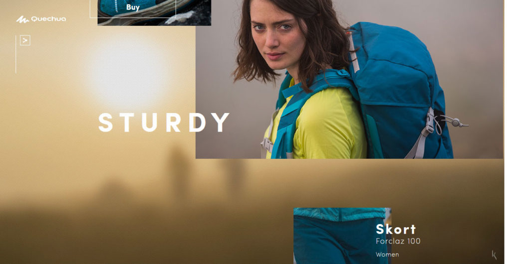
Though the traditional grid still rules content-heavy websites, more design-centric publications aim to set themselves apart by breaking the lines. Paired with parallax scrolling, this can create a many-layered experience with engaging depth and effects.
Bigger brands who look for out-of-the-box thinking will likely follow.
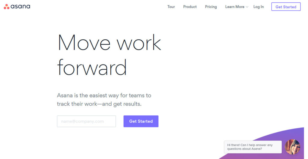
Bold Fonts and Large Typography
Big, bold typography has been a trend around the web for a while. We already talked about it in web design trends 2017.
Thanks to the increasing number of freely available custom fonts as well as improvements in device capabilities, websites can now get away with really large letters. Paired with ample whitespace, this makes for easy reading and skimming.
Plus, since pretty much all browsers now support TrueType/OpenType fonts, companies can use their own typefaces for their web presence and don’t have to rely on what is available elsewhere.
Expect web designers to take advantage of this even more in the upcoming year, especially to replace images. Since fonts are lightweight and scalable, they allow you to make a visual statement without forcing a browser to download large images.
An Increase in Micro-Interactions
Just in case not familiar with the term, micro-interactions are subtle effects for accomplishing tasks on websites. They are a staple of social networks like Facebook. On the platform, liking and other reactions are each paired with their own small animations.
Micro-interactions give users the ability to interact with content in different ways. The advantages:
- Visual feedback for user actions
- Interactivity without the need to reload the page
- Richer user experience, additional engagement
It’s already one of the upcoming web design trends 2018. For example, Medium recently introduced the ability to leave a “claps” for articles you like. Doing so shows support for the post and also works as a recommendation for other users.
We also have a number of WordPress plugins that allow you to do similar things. For example, Contact Form by WPForms allows you to set a loading text that will show up on the submit button once clicked. Plugins like Animate It! add hover effects to buttons and Quotable Tweet this! boxes to highlighted text.
Let’s Talk About Chatbots
Chatbots are making their way into websites big time. Since Facebook invited developers to start producing bots for their messenger, the number of existing bots has increased from 30,000 to 100,000 in just a year.
And that’s just one platform! Large companies like Sephora, The North Face and Whole Foods are already sourcing out some of their customer support to virtual staff. This will trickle down to websites and companies of smaller size.
We already have the first chatbot plugins available for WordPress. They can answer questions and offer basic customer support autonomously.

While bots are not so much a design matter, integrating them into websites is. It’s up to designers to figure out how to make the experience visually appealing. Plus, how to provide access to the bot in the first place.
Dealing with chatbots is definitely one of the web design trends 2018 both for people making websites and those using them.
AI, Internet of Things, VR and Other Future Technology
While the above will change web design on the surface, there are a number of technologies that will change the web as we know it. We have already talked about how AI will change the Internet and the Internet of Things.
While next year likely won’t be when these technologies become dominant (yet), one of the web design trends 2018 will be their ongoing development and proliferation. What can you expect besides the aforementioned chatbots?
- Personalization through AI and machine learning
- Experiments with virtual reality (especially product videos)
- Augmented reality and 360 photography
- Ways to connect websites with household appliances and wearables
- Voice search and voice interactivity on websites
How far the next year will take these possibilities is hard to predict. But I’m sure there will be a strong undercurrent of these future technologies.
Web Design Trends 2018 in a Nutshell
Predicting website trends is not an exact science. We will only understand which of the above will dominate 2018 when the year has ended.
However, that doesn’t mean there isn’t value in thinking about it in advance. As people working with or owning websites, it’s important to stay on top of developments. That way, you can understand where the road leads and what users will expect from your work in the future.
Much of what listed here is already visible to a certain extent today and will just become more dominant. However, we will also see some truly new things that haven’t been done before. With so much new technology flying around the ether, I would be surprised if something doesn’t wow us next year. Let’s see what that is, shall we?
What do you see as the web design trends 2018? Anything that is not on the list? Let us know in the comments section below!


18 Comments