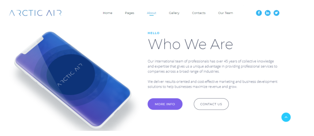
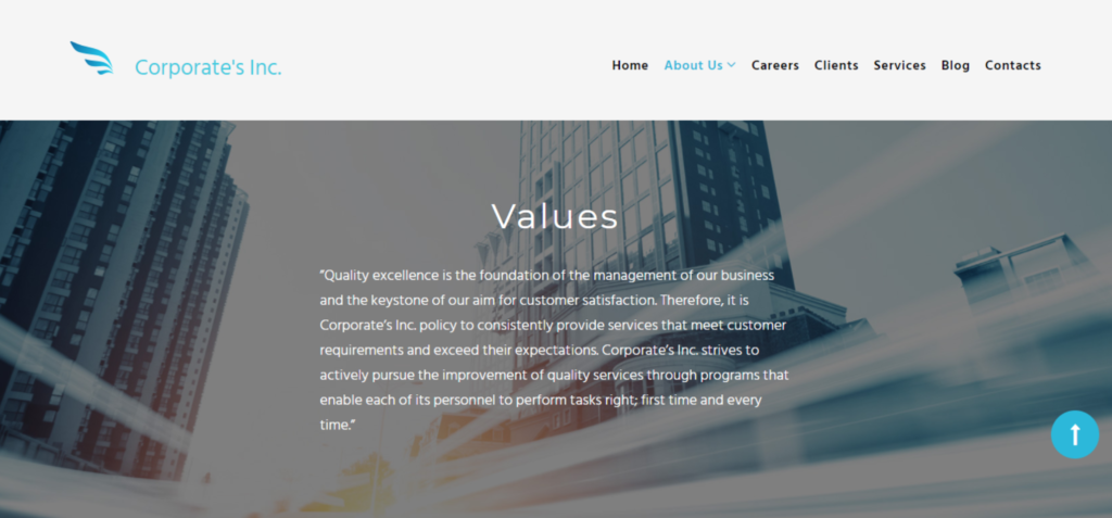
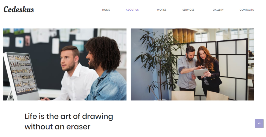
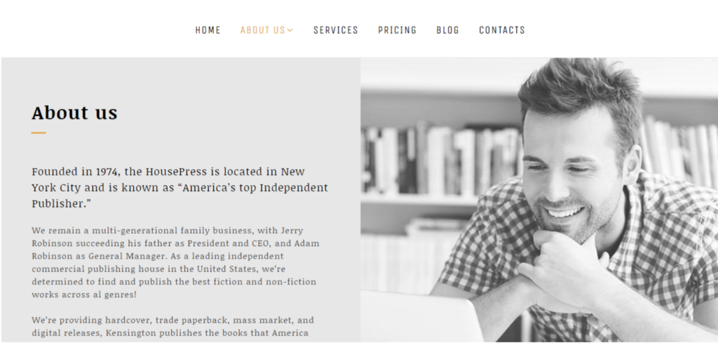
If you represent a business, you’ve got a chance to shake hands with your prospective customers, smile to them, and tell about your brand in person. Of course, it isn’t feasible to meet every potential customer so you have to be just as engaging through your website. If you want to effectively introduce your company to your visitors, you’ve got to do just one thing – get a catchy and all-encompassing About Us page design.
No doubt, it’s the compelling Homepage design that web professionals pay most attention to. However, the ‘About Us’ page is the second most important one after it. After all, it’s the page where prospects learn about your company.
The ‘About Us’ page plays a vital role in building trust online and in converting your site guests into clients. That’s why it’s worth your careful consideration and mindful effort.
Design vs Content: The Case of the ‘About Us’ Page
Frankly speaking, spotting an exemplary ‘About Us’ page on the web is a rarity. The reason for this is that many website creators fail to bridge the gap between webpage’s aesthetic appeal and content strategy. We bet you’ve see tons of ‘About Us’ pages, where great content is surrounded by lame page design elements. Well, such a page is not attractive.
Many users just fail to learn how skillfully and thoughtfully you talk about your company and services. Others such as web-design and creative industries websites are so obsessed with designing their website that they fail to present and logically structure all the information that new clients want to learn about the company.
The takeaway from this is that you should be concerned both about design and content when creating your strong ’About Us’ page. The design of it should highlight the strain on its content. The content of it should be well-written and well-structured. Most importantly, the two should play well together.
5 Tips to Follow To Create a Sizzling ‘About Us’ Page Design
Web design is not calculus. There’s no formula or one-size-fits-all solution for effectively designing your ‘About Us’ page. However, there are things that users like and other things that make them want to leave your website. Below, you’ll find the tips that let you avoid the pitfalls of non-professionalism and build an impressive ‘About Us’ page design that makes users fond of your company. What’s more, we’ll sprinkle the tips with some inspirational ‘About us’ page designs for you not to be bored on the way.
#1: Convey a Single Message
Surely you love what you do and could write an entire book about your business. You’ve seen its rises and downfalls, earned recognition, developed and evolved. But your future clients don’t need all the details. In fact, overcrowdedness proves disastrous for an ‘About Us’ page design. Clients want to see the main highlights that let them understand that you’re professional, proactive, and invested to the cause.
So, when creating the content of your ‘About us’ page, make sure that all of its blocks play well together. Moreover, they should create an image of what qualities your company has. A couple of qualities will be enough. However, you should root well for the qualities you mention and even go as far as provide real-life examples of you sticking to them.
#2: Cover Your Mission, Values and Priorities
Your ‘About Us’ page is not only about the location and success story of your company. It’s more about the unique value your company brings to its clients. It’s also about your mission as a company on the whole and the way you influence human life or some aspects of it.
To make your ‘About Us’ page design more impactful and memorable, rack your brain and formulate your company’s philosophy. This may include your mission statement, values, priorities, etc. Keep your mission statement short (1 – 2 sentences). Use bulleted lists for values and priorities. All in all, if you go for a more inspiring ‘About Us’ page design, you’ll get a chance to inspire others and support you by converting into your loyal customers.
#3 Stick to Clear, Logical Structure
Modern users are always on the run. They’ll stay to read the information you provide, only if they find it digestible and to-the-point. So, the more transparently and clearly you structure the ‘About Us’ page, the better.
Here’s a couple of things to consider. First of all, build the layout that breathes with negative space. Moreover, ensure that every page block stands as a unity in opposition to other blocks. Next, make sure that the blocks gradually unfold the story of your enterprise and drive users to a desired CTA. Finally, do not hesitate to use subheadings, create bulleted lists, highlight and underline focal points, appropriately adjust text weight, use Italics, etc. All this positively impacts your content readability and provides for its digestibility.
#4: Tell a Coherent Story
In addition to sticking to the clear structure, you should also ensure that you ‘About Us’ page tells a coherent story. A good story humanizes your brand, roots for building a lasting connection, and uncovers the unique value behind your products. When writing your story, make sure it’s relatable, informative, and motivating. These are the qualities that make customers eager to learn more about great things you offer.
#5: Make It Customer-oriented
When creating an ‘About Us’ page content, imagine that you’re a user who just found your company and wants to learn more about it. Is he/she interested in learning about your company just for fun? Perhaps, not. They’re eager to learn what the unique value that you bring to them is. They want to know in what way they’ll benefit from opting for your products over others.
The takeaway is that when creating your ‘About Us’ page, you should make it user-centered. Exclude the details you don’t need, highlight your unique traits and offers, speak plain and avoid professionalisms and jargon. As a result, reading your ‘About Us’ page will make sense to every client and encourage them to keep browsing.
#6 Wrap It Up With a Call-To-Action
Not all the customers click onto other pages of your website after they’re done with your ‘About Us’ section. To convert more visitors into your clients, make sure you wrap it up with a call-to-action that guides them to buying products/ordering services from you, subscribing to your newsletter, making an appointment with you, etc. You just can’t miss on pre-determining their next step after they’re done with and impressed by your well-done ‘About Us’ page design.
For more tips on optimizing your ‘About Us’ page, check out this insightful article on effective About Us page design.
Conclusions
Now you know all the tricks of creating a compelling ‘About Us’ page design. Make sure that you account for all of them when working on your best possible web presence. We wish you good luck in hooking visitors with a sizzling ‘About Us’ page design.


No Comments