It seems like everyone in the WordPress sphere is talking about headless WordPress (we are as well). Decoupling the back end from the front end is poised to be a big part of the future of WordPress and headless CMS in general are something that we will see more of.
In last few years WordPress has built the foundation for this development, especially with the adoption of the WP REST API. However, with all the hype, what can you actually accomplish with headless WordPress and, more importantly, what are people already using it for?
To answer these questions, in this post, we will go over a number of examples of headless WordPress in the wild. By doing so, we want to help you gain a better understanding of the technical possibilities this approach offers and of what you can expect more of in the future.
Ready to go ahead? Less go! (I am really, really sorry about that pun.)
Headless WordPress: Practical Examples
Here are a few websites that are blazing the trail to the future and are already using headless WordPress to power their websites.
1. TechCrunch

TechCrunch is often one of the most prominent examples of well-known sites using WordPress. It’s one of the biggest technology blogs on the Internet and is hosted on WordPress.com VIP.
In 2018, they completely re-built their website. Besides thinking about how to make the design more usable and accessible, they also wanted to take a best-in-technology approach.
We also knew from the start that we wanted to capitalize on advances in web development since our last overhaul. This would help us deliver that kind of experience, and make building on our work easier in the future.
The way they achieved it was to build a React/Redux app on top of a decoupled WordPress back end and connect them via the REST API.
The benefits they saw in that solution:
- Eliminates the need to fully load pages every time
- Easier to maintain
- Faster performance
- Website behaves more like a native app
The website is the work of Work & Co and Human Made. The latter have been at the forefront of headless WordPress for a while.
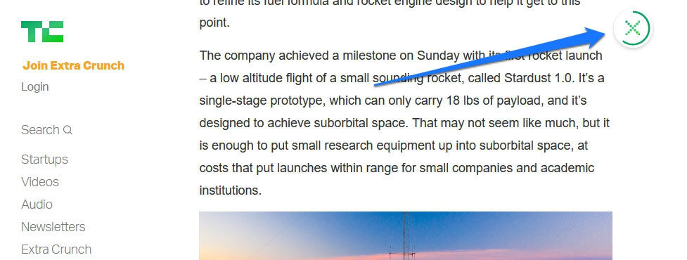
Overall, they have done a good job. The new TechCrunch has a very clean page design that flows well and loads beautifully. I especially like the back/closing icon, which also functions as a reading progress indicator.
2. The Guggenheim Museum
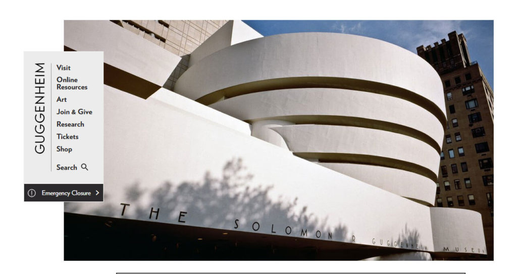
One of the most famous museums in the world, The Guggenheim chose to use WordPress as their content management system for their 2016 site redesign. Not only that but they also decided to go with a decoupled version of the CMS with an AngularJS front end.
The whole affair was realized by Alley Interactive who are taking advantage of the REST API as usual. To make everything work, they also used custom post types and Fieldmanager to create various required data objects.
One of the main advantages they found with this approach were decreased loading time and the flexibility to accommodate a complex site and information architecture. If you want to read about the thinking behind the site and the design process in detail, you can do so here and here.
3. Frontity
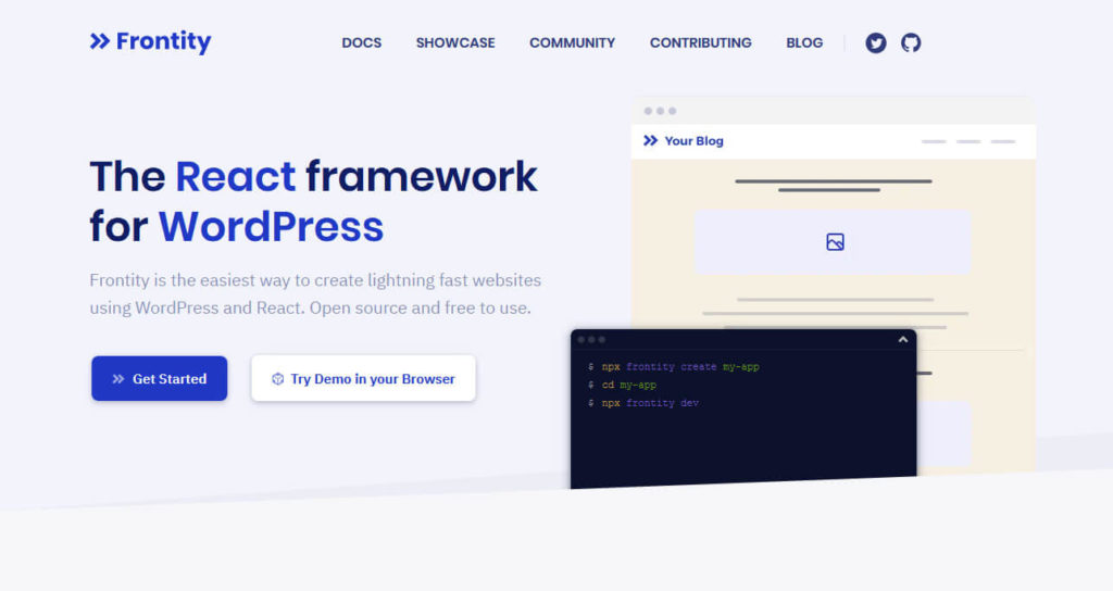
Frontity is a dynamic framework for using headless WordPress with a React.js front end. Co-founder and lead developer Luis Herranz actually gave a talk at online WordCamp Europe 2020 in which he discussed what headless WordPress is, why using it with React is a good idea, as well as remaining challenges of decoupled WordPress.
Naturally, the Frontity homepage itself is built in the way described and completely managed with the Gutenberg editor to boot! If you want to take a deep dive into this topic, you can watch the video replay below (it starts automatically at Luis’ presentation when you press play).
The website is super fast and slick. I encourage you to have a look around. If you like what you see, you can also create your own website with Frontity and test drive the setup yourself. A good place to start is the documentation.
4. ustwo
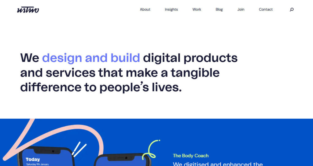
Another example of WordPress in the back and a single-page React app in the front. It seems like Human Made also provided help for that as you can read in their case study. For faster loading, it also comes with a Node.js server to enable rendering on both server and client side. Here’s an easy-to-read diagram:
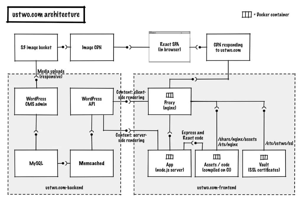
In addition, the site runs a custom page builder that lets authors enter content in a modular way. After that, it is delivered as JSON data to the front end via API endpoints.
The result is impressive. It’s an elegant site with lots of space and subtle animations. Everything loads fast and content appears smoothly on the page change without a complete reload. I, for one, am a big fan.
5. Beachbody on Demand

Our next headless WordPress example is Beachbody on Demand, a workout streaming platform. It comes with a slick user interface that appears to be a JavaScript interface built on top of WordPress, possibly React based.
When you look around, you discover lots of custom functionality, videos, courses, products, and recipes. There is also a well-designed blog:

The site was built by XWP, who have also published it as a case study. According to them, they mostly decided to use headless WordPress to streamline content management and automate the handling of assets like images. Decoupling WordPress allows them to connect it with many different endpoints and outlets that all need custom formats.
They even managed to configure everything to work with the WordPress Customizer so you can preview any changes before finalizing them. Basically, it has turned WordPress into a central nervous system from which all content flows where it needs to go. You can read more about it here.
6. Haruki Murakami

The website of famed author Haruki Murakami is also the result of a decoupled CMS build. You can even still see the WordPress logo as its favicon.
In this example of headless WordPress, it has a front end running on AngularJS. This setup allows for seamless navigation from one page to another. There are a lot of transitions and animations, including some cool scrolling effects on the main page.
As Mark Llobera of Bluecadet, the company behind the website, writes on A List Apart, they originally built the site with the help of the JSON API plugin in 2015. We can assume that, by now, it’s probably using the built-in endpoints of the merged API.
The website itself has a really nice user experience. It doesn’t actually seem like a website because of the lack of reloads. The site feels more like an interactive app. It encourages you to explore, which is good since there is a lot to discover. Fans of Murakami and great web design will both enjoy it.
7. Facebook Brand Resource Center

The final entry on our list is the Facebook brand resource center page. It’s a site the social network uses as a style guide for the use of their brand assets. It also happens to be an example of a website built with headless WordPress.
Like other entries, it comes with a very cool and open design that adjusts when you click through to any of their brand websites.
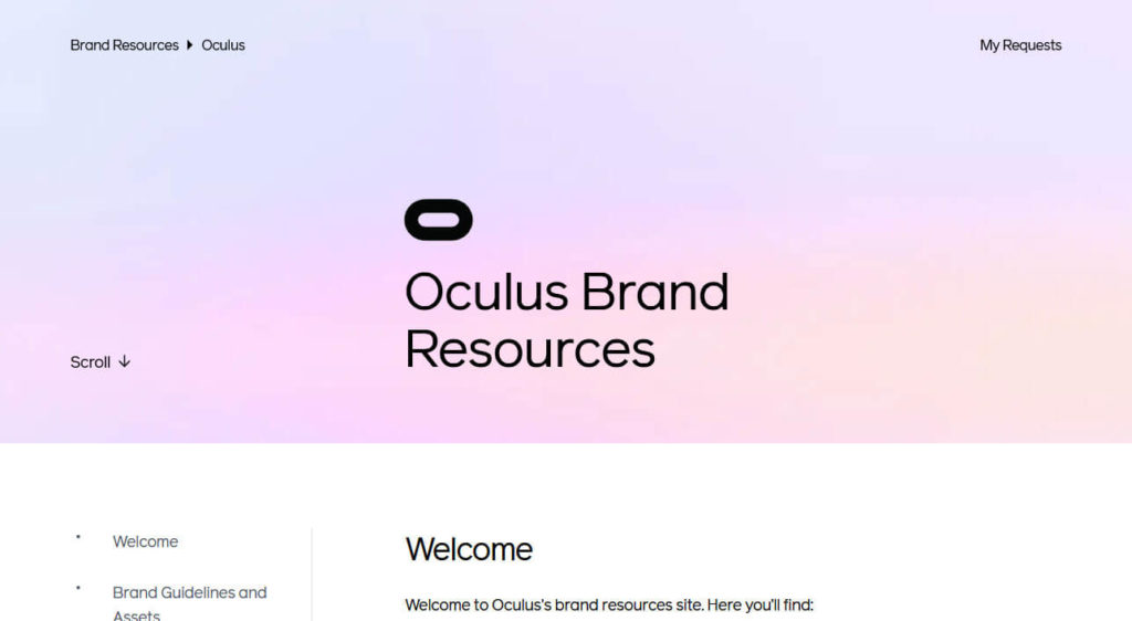
On the subpages, too, it is noticeable that only parts of the page load when you on click around. Static elements like the menu stay visible on screen. I also really like the smooth scrolling effects when using the left-side menus as well as the pleasant little animations such as when you hover over the Submit a request button.
Overall, it seems a lot more fluent and interactive than your usual PHP websites. This probably what the future of the modern web looks like.
What Are Your Favorite Examples of Headless WordPress?
Headless WordPress is a much talked about topic, yet hasn’t been adopted into the mainstream. It’s easy to feel like it isn’t relevant outside of developer circles and so far is only a technical play thing.
Yet, looking at examples of sites built with headless WordPress makes it clear that it’s already present in the real world and with great success.
Decoupled WordPress allows you to bring together the awesome power of WordPress as a CMS with slick, app-like user interfaces. This also makes content management and deployment through different channels easier. We are excited to see what other things will come out in the future.
Do you know any other examples of sites built with headless WordPress? Share your favorites in the comments below!


No Comments