I got access this morning to the Private Beta of Dunked, a project that we’ve covered historically by a few guys who have some serious experience with WordPress.
I was so excited that I moved a few things around to actually walk through the entire application (as best as I could) and make it my own, and I’d love to visually show you what the new portfolio service is all about and get you excited about how you might use it in the very near future.
Thanks again to Orman Clark , Gilbert Pellegrom and Mark Southard, the three-man team behind the venture – so far so good guys!

Got my invite so I decided to jump right in.
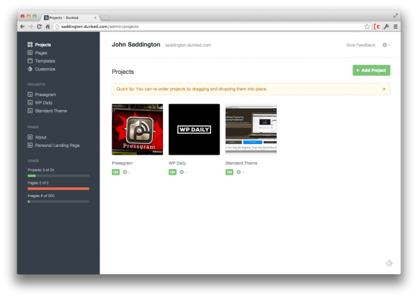
As you can see, I worked on it for a bit and this is what the main dashboard looks like. It’s obviously full at this point, but it’s a blank canvas when you first start.
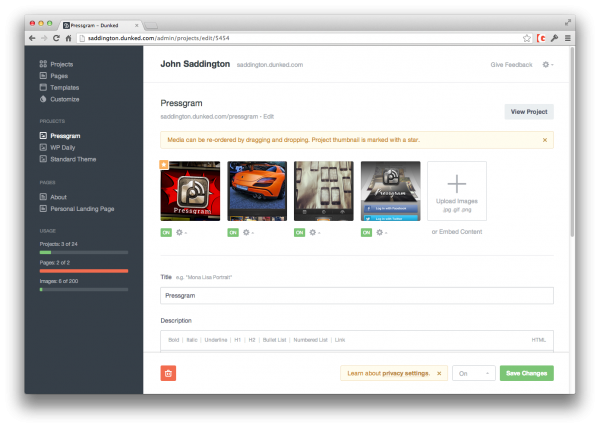
Adding projects is what it’s all about so you can show off your work, so that’s where I headed first:
Straight forward navigation and obvious options makes this system shine.
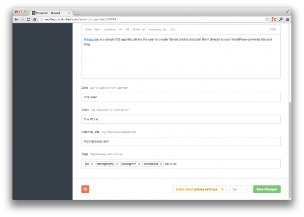
I added a short title with some text styling WYSIWYG editor, a date, the client, and then an external URL for linking with a final touch of tags for the users to sort my projects.
The final product above! Not too bad.
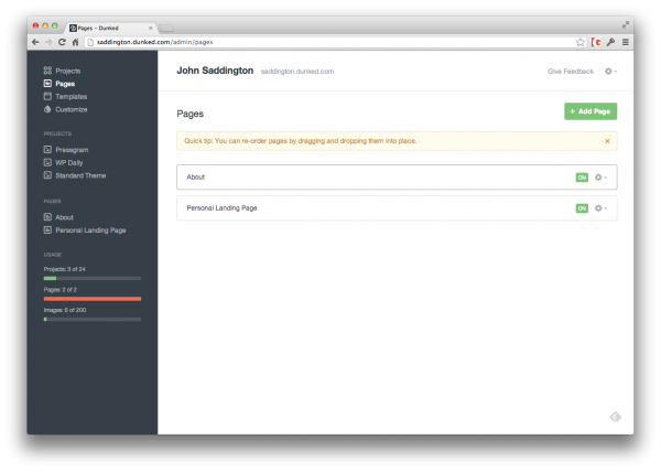
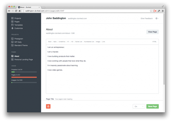
Now, let’s take a look at the Pages experience:
Currently I only can make 2 pages – perhaps I’ll get more as the platform matures and as they expand. It makes me wonder about the cost and sustainability model that they will entertain, probably on some subscription basis.
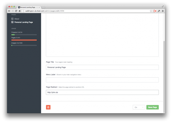
Editing the page was simple. Just like before. I added a second page that had an external URL as you see below:
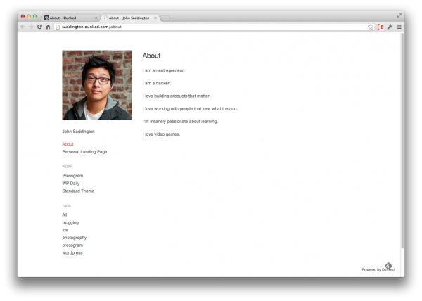
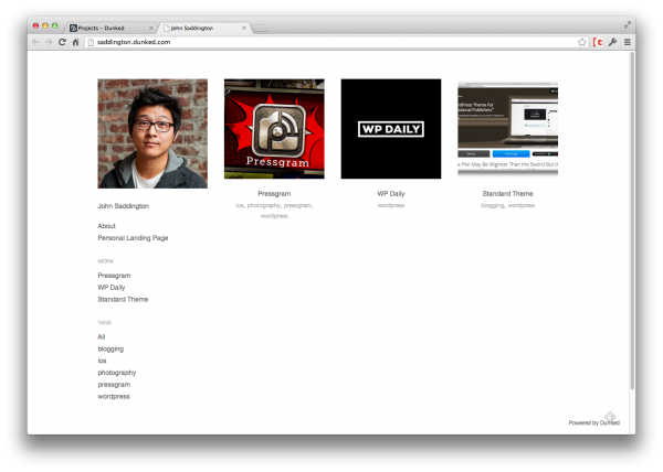
The page look is simple, based on my current template:
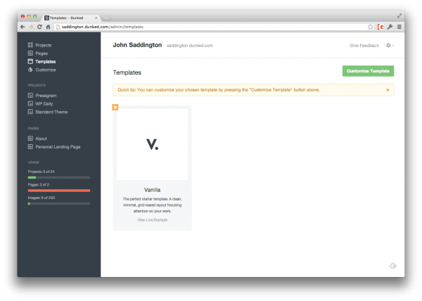
Next, let’s take a look at templating and options for the entire service, shall we?
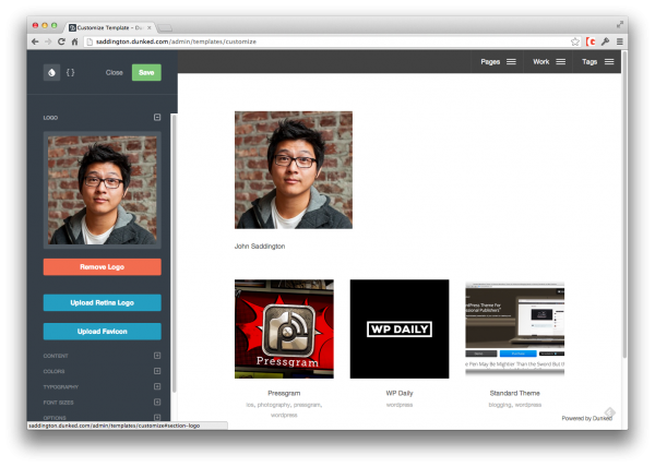
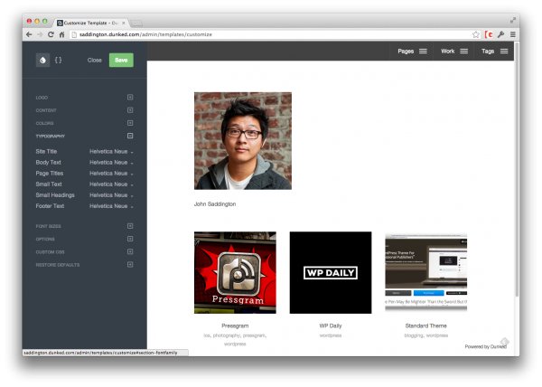
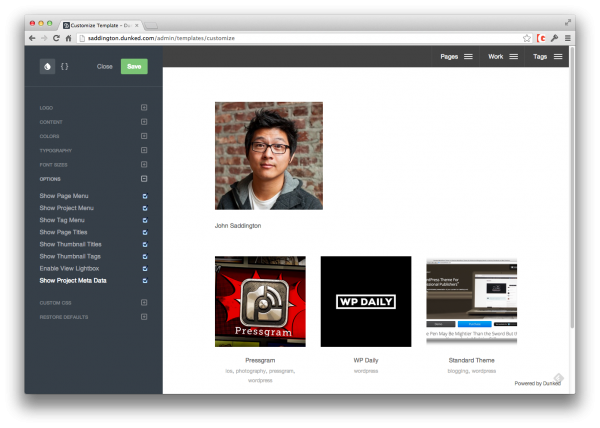
Right now there’s just one template available to me, called “Vanilla”. Options were available to customize it as follows:
Uploading logos, editing content, colors, and even typography:
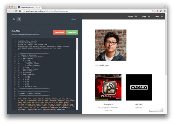
You can edit even more and add your custom CSS too:
And they have a full editor as well. I was surprised at this but I really love how powerful the options are right out of the box!
And that, my friends, is all that the Private Beta has to offer.
My final page can be found here: http://saddington.dunked.com/
Some final thoughts:
- The system is really fast. I love not waiting for anything to load and the response-time for editing is like lightning. I hope this never changes.
- The simplicity is refreshing. I’m sure more options will become available over time but I hope they don’t lose their overall aesthetic in the process.
- There are not “native” social features built-in yet, but I’m sure those are coming and would be a nice addition.
- There are no metrics or analytics that I saw or even integrating with Google Analytics. Not a bad thing right now but I’m sure it would be a great feature long-term.
- The overall template and design for the Vanilla theme was, well, quite vanilla in quality. I can’t wait to see the other templates they come up with!
Great work guys and thanks for letting me take a look. Impressed with what you guys have so far and I’m stoked to see it grow. Best of luck!



No Comments