With the release of WordPress 4.0, the plugin installation experience saw a bit of an upgrade to make it more user friendly. This means users will be turning to the WordPress.org repository and WordPress admin more and more to browse and discover new plugins. As a plugin developer, making sure that you have all of the proper assets, a banner, an icon, and screenshots is a great way to ensure that users will understand what your plugin does, and make it stand out in search results. Now is probably a good time to take stock of the image assets that should be included to make the browsing experience better for users.
The Assets Folder
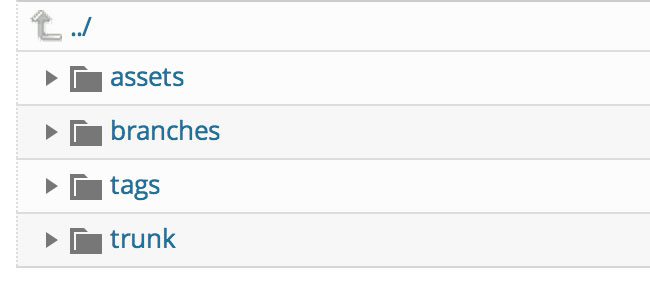
WordPress features a specific convention for storing any assets that you want to be viewable while users are browsing your plugin. This includes the screenshot images, banner images, and the new icon images. To start adding these to your plugin, you simply need to create an “assets” folder in your root SVN directory. Keep in mind, this folder should be created at the top level of your directory, alongside trunk and tags, not inside the “trunk” directory, where your main plugin files are stored.
Once you create this directory, it’s simple to start adding the proper assets.
Banner Image
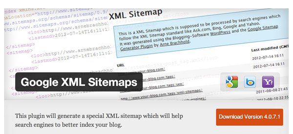
The banner image is used by WordPress in a couple of key places for users. The most noticeable is on the WordPress.org plugin repository, where banner images are shown at the top of every plugin page. This same image is also used when users click into a plugin in the WordPress 4.0 admin. Banner images should demonstrate what your plugin actually does, with a little bit of branding.
They don’t need to feature the title of your plugin, this will be included as text. Instead, use the space to show a quick, stylized version of what your plugin can do, and what functionality it addresses. Google XML Sitemaps, for instance, has an example of a sitemap right in the header image, so that users know what they are getting and how the plugin can help with SEO.

WordPress supports Hi-DPI images for banners, which are served to devices with retina displays. You should create the 1x version of your banner image, with dimensions 772px by 250px, and a 2x version of your image, with dimensions 1544px by 500px. These should be the same image, either PNG or JPG, but the latter is simply double the size to support retina displays. When you are finished, upload these two images to your assets folder, and name them:
banner-772×250.png
banner-1544×500.png
That’s it, your banner image will start showing up as users are browsing.
Screenshot Images
Screenshots are probably the best way to demonstrate the functionality of your plugin to a user efficiently. It’s important to include a couple of screenshots of your plugin in action so users can see what it does and what kind of options and features to expect. This includes a screenshot of your Settings screen, options it adds on the back-end, and a preview of what your plugin outputs on the front-end, if applicable.
Screenshots should also be uploaded to your assets directory as JPG or PNG files. Each screenshot should be numbered in the order you want to show them, with it’s number included in the filename. So, if you have three screenshots, you would name them:
screenshot-1.png
screenshot-2.png
screenshot-3.png
. . . and so on. Screenshots are referenced in your plugin’s readme.txt file. I won’t go into the details of how to set this up, but you can check out an older, but still relevant Smashing Magazine post to get caught up.
Screenshots should be added to “Screenshots” section of your readme file. Once your screenshots are added to the assets folder, you only need to reference them in a numbered list, with a short caption. So your screenshot section may look like this:
== Screenshots ==
- Settings Page.
- Toolbar Addition.
- How it looks on the front-end.
The first caption will reference “screenshot-1.png,” the second “screenshot-2.png,” etc. You can add as many as you like, but use just enough to convey the main point of your plugin.
Icon Images
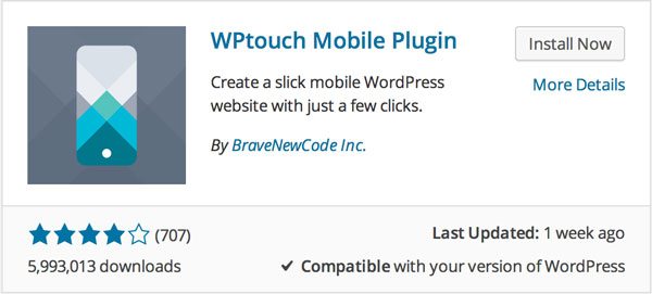
Icon images were added in WordPress 4.0 to accommodate the new plugin browsing experience, laid out in a grid. These are small, square images that are meant to catch the users’ eye. Like the banner images, these should be fairly demonstrative of your plugin’s value, but are probably going to be a lot simpler with just a logo image. WPTouch has a great example of a stylized mobile phone image. This lets users know exactly what the plugin does with a single image.

Like banner images, icons support Hi-DPI images, so you’ll want to create two sizes for your image. The default size is 128px by 128px, and retina display images are 256px by 256px. However, icons also support SVG so that images look sharp no matter where they are. If you are able, it’s probably a good idea to upload an SVG image to keep things future friendly.
Once again, upload your images to the assets folder, using the “icon-(size)” convention. SVG files should be uploaded with just the name “icon.”
icon-128×128.png
icon-256×256.png
icon.svg
Managing Your Assets
Proper assets for your plugin might seem like an afterthought, but they are extremely important for connecting users with your plugin’s functionality. The best way for you to promote your free plugin is to make sure all of your assets are included, so when users are browsing dozens of plugins with bland images, your plugin stands out. For just a little bit of time invested, that’s a huge win.
 Jay Hoffmann is a WordPress developer hailing from NYC. In the strictest sense of the word, he is a WordPress enthusiast with an eye for front-end development and design. He has been working with WordPress since 2006 and currently works for a popular children’s media company. This year, Jay started Tidy Repo, a curated list of the best and most reliable plugins from around the web. You can also follow Jay on Twitter.


5 Comments