It’s here: WordPress 4.0. As some of you know, my main passion in WordPress happens to be plugins, and above all, plugin discoverability. And WordPress 4.0 has made some great strides in this area, adding a completely new plugin installation experience that makes it easier to sort and find the plugin you are looking for.
To see what the new plugin installation interface looks like, you can visit Plugins -> Add New after you have updated to WordPress 4.0. You’ll notice some pretty big changes right away.
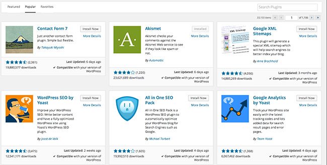
The most noticeable change is an upgraded UI, where installable plugins are arranged in a grid, with descriptions, images, ratings and downloads all clearly visible. You can also easily browse through familiar categories, like “Featured,” “Popular,” and “Favorites” (with a WordPress.org username) by switching between more visible tabs. All in all, it is much easier to evaluate and find plugins, and even to discover a few new ones without having to leave the WordPress admin.

What This Mean for Users
Apart from just an easier time finding and installing plugins, the upgrade has a few benefits for WordPress users.
One of the biggest problems I have with plugins listed on WordPress.org is that it’s too easy to download plugins that are old, or potentially harmful to your site. With the new interface, it’s much easier to simply take a look at when a plugin was last updated, and see if it’s compatible with your version of WordPress, the former being far more important.
But in addition, the new interface has an Apple App Store feel to it. The Featured section is going to be particularly important for surfacing plugins you may not have heard of. It’s now the default tab, instead of hidden behind a link like it was in the past. And Favorites, which is a feature I rarely use, is much easier to navigate, and useful for storing plugins you install over and over. With a few more refinements, we won’t have to go over to Google, search around for a plugin until we find something we like, then come back to the WordPress admin to search for it by name. This entire process can be accomplished right inside the admin, and you may be able to find a plugin you wouldn’t have found otherwise.
What This Mean for Developers
Plugin developers, keep running your plugins like you always do, but pay extra close attention to the details. It’s more important than ever that your plugin include a formatted header image and a solid description, as these are both visible when browsing. If users are going to use the admin as a discoverability tool, you have to make your plugin easier to discover.
Ratings and descriptions have always been available, but they weren’t necessarily utilized by users. Information like latest updates, compatibility, and downloads are much more visible. Treat your plugin with care, update often, and ensure compatibility. That should go a long way in the new interface.
What This Mean for WordPress
I hope I’m not reading too much into this, but I think this is a great indication of the future of WordPress. As I’ve written about in the past, I see WordPress growing, and becoming more compartmentalized and modular as it does. The features as plugins approach that was taken a few release cycles ago is a great example of segmenting out functionality as its own module.
As WordPress grows, the developer-user gap continues to widen. Hopefully, with tools like the new REST API, we’ll see more developers using WordPress as an application layer, building full, client, and server-side web apps on top of it. The forces behind WordPress have made it more than clear that they see this as the future.
But we can’t forget about the user who just wants a blog or a CMS for a content-driven site. This is still a huge market for WordPress, and a significant share of its user base. WordPress needs to become more lean and compact if it is to address the needs of a full-scale application. And that’s where plugins have always been a way to take on the excess load. Encouraging modularity in plugins is a great way to lessen this gap a bit, and let features that don’t need to be in core still be readily available. And giving the plugin install interface a store-like feel helps ensure that these modular plugins are found, and easy to piece together.
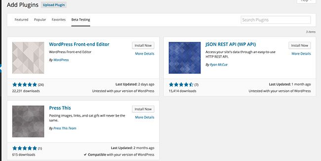
In the beta releases of WordPress 4.0, there was an extra tab for “Beta Testing” in the plugin install window, where users could find a list of features as plugins, like the REST API and front-end editor. This approach can certainly be extended. There can, for instance, be an “essential features” category. If the WordPress core team decides to roll a feature out of core and into a plugin, they need only to put it in this category to easily direct users to the familiar features.
I don’t think this will happen overnight. I don’t even know if it’s the directions the WordPress team is thinking. But it’s nice to know that they opened the avenue. And if WordPress 4.0 has shown us anything, it’s that the core team has certainly not forgotten about their users.
 Jay Hoffmann is a WordPress developer hailing from NYC. In the strictest sense of the word, he is a WordPress enthusiast with an eye for front-end development and design. He has been working with WordPress since 2006 and currently works for a popular children’s media company. This year, Jay started Tidy Repo, a curated list of the best and most reliable plugins from around the web. You can also follow Jay on Twitter.


No Comments