The rise of mobile devices has been one of the most decisive changes on the Internet. These days, no website can do without being mobile friendly or rather, no website that wants to be successful.
By now, mobile users represent more than half of all Internet traffic and also make up the majority of all search queries. For that reason, there is no way around catering to this user group.
Plus, Google now punishes you in the search results if you don’t have mobile-optimized version of your site. If that isn’t motivation enough, I don’t know what is.
However, what does it mean for a website to be mobile friendly? Do you just install responsive theme and you are done?
While that’s a good start, it’s not all. For that reason, in this article we want to break down exactly what it means to have a mobile friendly site today and how you can implement it on your WordPress website.
We will talk about elements of mobile friendliness on the web, how to test your site to see whether it fulfills Google’s demands and how to move even the administration of your WordPress site to mobile.
Ready to get your mobile on? Then let’s get cracking, shall we?
How to Make Your WordPress Website Mobile Friendly
Below, you will find detailed instructions on how to optimize your WordPress website for mobile devices. Follow them and your visitors surfing on phones and tablets will be grateful.
Implement a Mobile Version of Your Site
The very first step to make your WordPress site mobile friendly is to get it to adapt to different screen sizes. This is called responsive design.
The advantages of responsive design are numerous. The main thing it has going for itself is that you only have to take care of one site. With a responsive theme, every user can access the same website so there is no need to run and update a mobile version separately. This conserves your branding and eliminates a lot of hassle.
Thankfully, all modern WordPress themes in the directory come with responsive capabilities. So, if you are looking for a new theme for your site, chances are good you will find one that is already mobile friendly. However, even so, be sure to test it thoroughly.
If you have an existing theme that is not yet responsive, you have several choices. First of all, check to see if it’s up to date. Should you be running an outdated version, the developer may have added responsive functionality in the meantime.
If that’s not the case and you are hell bent on keeping your current theme, you have the option to make it responsive after the fact. For that, we have a primer on responsive design that goes over the main principles of this design approach and also an introduction to making any WordPress theme responsive.
Besides that, there are also other options. WordPress offers several plugins to create mobile versions of your site, including:
However, in contrast to responsive themes, these often come with boilerplate design and little customization options. So, overall I would always recommend a responsive theme.
Finally, if you have a lot of traffic, you might even think about building a mobile app for your site. The WP REST API can help with that as well.
Use Mobile-Optimized Plugins
Plugins are awesome additions to any WordPress websites. They can bring all sorts of new functionality and features and can make your site better.
However, if your plugins add stuff to the frontend, make sure it works well on mobile as well. Nothing is worse than discovering that your new widget, slider, or button doesn’t scale properly.
As with themes, check beforehand, read reviews and do a test run in a local testing environment. Or, just use plugins that are proven to work on mobile sites like:
Aside from that, pretty much all premium plugins should be ready for mobile by now. Anything else wouldn’t make any sense business wise. Check our list of premium WordPress plugins worth the money.
Optimize Images
Images often make up large parts of website data. For that reason, to make WordPress websites mobile friendly, it’s absolutely crucial to take care of images as well.
WordPress has already done a lot in that direction. Since version 4.4, the CMS automatically serves up the smallest possible image to users using the srcset HTML attribute. As a consequence, if your site is still running on a lower version than that, it’s high time to upgrade! If, for some reason, you don’t want to do that (hint, that’s a bad idea), at least install the RICG Responsive Image plugin.
However, image optimization doesn’t stop with your WordPress version. There are plenty of things you can do to improve their usability on mobile devices (read, make them smaller).
The most important thing in this regard is to optimize them before uploading. If you have Photoshop, you can use Save for web to create the smallest possible image size. Everyone else can use services like TinyPNG to shrink their image size.
Or, if you want to go the plugin route, consider WP Smush or EWWW Image Optimizer. Both will automatically compress your images when uploaded.
Make It Fast on Mobile
Speeding up your WordPress site is a good idea in general. Page loading time is a great indicator for usability, SEO and more.
That’s doubly true in mobile. While mobile Internet connections have become faster, they are still not as reliable as wifi. Plus, they are often capped and people find it annoying when you needlessly drain their data plan.
So, even on mobile phones, people still expect your site to load quickly. How quickly? Well, 40% of users will leave a site if it hasn’t loaded within three seconds. Speed is also a ranking factor, making it doubly important that your site loads quickly.
Besides our article in the beginning of this section plus our advanced techniques to make WordPress faster, you also have other sources of information on how to improve this metric.
The best way to start with is Google PageSpeed Insights. The will give you an overview over how the search engine giant sees your page speed both for mobile and desktop.
You can supplement these insights with information from Pingdom and GTmetrix. This will give you a great starting point for speeding up your site. For better ideas on how to do that, we also have a case study for you.
Aside from that, consider looking into Accelerated Mobile Pages. They are a special kind of HTML markup that makes your pages quick to load in Google’s search results. While there’s some criticism of AMP, it’s undeniably fast and I for one like to click on AMP links on my phone.
To implement AMP in WordPress, all you need to do is install the official AMP plugin. That’s it. For more control over the styling of your AMP articles, check out AMP for WP.
Don’t Use Full-Screen Popups
Popups or interstitials that cover the entire screen are annoying enough on desktop. However, they can be even more so on mobile, especially when we are talking about phones.
Touch control makes it extra hard to close them which puts an unnecessary burden on your visitors’ nerves. So much so that Google officially frowns upon popups that make the content hard to access, especially on the front page.
However, what is a person to do trying to grow their email list? Google’s recommended way is to use banners, text links and CTAs inside the content. Classic signup forms in the right places still work, too.
Take the Mobile-friendly Test
If you have implemented the above measures and are still not sure whether your site is mobile friendly, it’s time to take the test.
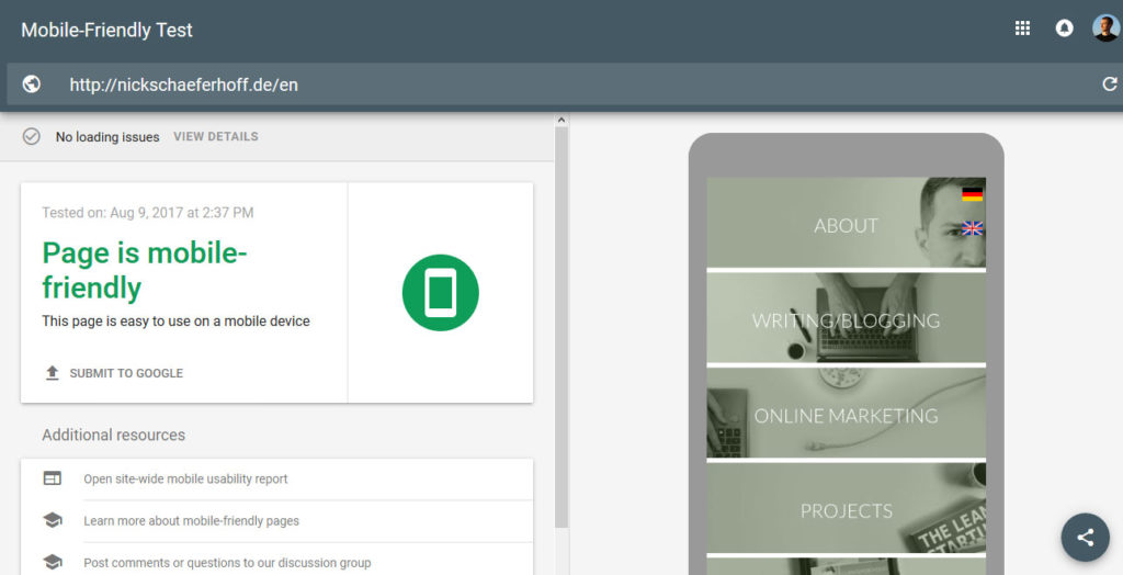
Since Google wants you to do you best job, they have created a nifty mobile friendliness testing tool. Here, you can simply input your site URL, hit the button and it tell you of there’s anything wrong with your site’s mobile optimization. That way, you can take remedial action.
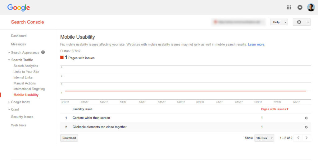
You can also find a section like that inside your Google Search Console. It’s called Mobile Usability and located under Search Traffic. Here you will learn whether your site elements are too close together, your font is too small and other issues.

Website Administration via Mobile
Mobile friendliness is not all about the frontend. For a truly mobile friendly website, the backend needs to work for mobile, too. That’s especially true if you implement sites to hand off to clients or have a membership site where people need access to parts of the backend.
Thankfully, WordPress already has your back in this. The WordPress backend is completely mobile responsive (at least since version 3.8) and lets you carry out all basic tasks. If you have a tablet, you might even consider writing long-form content on there (phones, not so much).
To go a step further, there are also the WordPress mobile apps that are available for both iOS and Android. They even allow you to take photos with your mobile devices and use them on your site right away. In addition to that, the apps let you access more than one site at a time and are touch optimized.
Making WordPress Mobile Friendly in a Nutshell
Mobile friendliness is a must-have feature for any website in today’s Internet. Your audience and search engines both demand it from modern sites. For that reason, it’s crucial that website owners and developers educate themselves on how to make their WordPress website mobile friendly.
On top, we have given you an overview over the most important factors for mobile friendliness. They include responsive design, mobile optimized plugins and optimized images, site speed, avoidance of full-screen popups and site administration via mobile.
The good news is also that WordPress itself is taking great strides in staying on top of mobile usability. From automatically serving the smallest image size to mobile browsers to a mobile-optimized backend, users can be sure that their favorite CMS has its head in the game. The rest is up to you.
Do you know any other ways to make WordPress websites mobile friendly? Let us know in the comments section below!


12 Comments