If you are not yet familiar with browser developer tools, they are one of the most useful things for anyone tinkering with websites – be it as an owner, enthusiast, ongoing developer, or else.
Developer tools or dev tools can tell you a lot about any website, such as CSS markup and JavaScript errors. In addition, they allow you to test drive front-end changes, check you site’s responsive design, and even optimize its performance.
Furthermore, they are completely free and built right into all major browsers. If you are ready to learn about their usefulness, this browser developer tools tutorial is the right place for you.
How to Open Browser Developer Tools
In order to take advantage of what the tool suite has to offer, you first need to know how to access it. Here is to do that in different browsers and operating systems:
- Chrome — Inside the menu, click More Tools > Developer Tools. You can also right click on the page and choose Inspect. Finally, there are the keyboard shortcuts Cmd+Opt+I on Mac and Ctrl+Shift+I on Windows systems.
- Safari — Enable web development tools in Preferences > Advanced > Show develop menu in menu bar. Then go to Develop > Show Web Inspector or press Cmd+Opt+I.
- Firefox — In the menu, access Web Developer > Toogle Tools. You can also inspect elements via right click, or Ctrl+Shift+I/Cmd+Opt+I.
In all cases, they will open a set of menus inside the browser window. They are usually at the bottom, but can also show up on the side, depending on your configuration. You are also able to move them to a new window.
What Do the Dev Tools Contain?
Here’s what you can expect to find as part of your browser development tools:
- An HTML tree with DOM elements and their properties like CSS styling
- A way to monitor incoming and outgoing HTTP requests of a web page
- The ability to inspect and debug files and scripts running on the page or resources it saves to the computer
- A way to view JavaScript logs and try out commands on the page
- Tools to monitor the performance of your website in order to increase loading speed
- The ability to switch to a mobile view of your website to test the responsive design
Note that not all developer tools are exactly the same, so some functions might be located elsewhere or missing.
How to Use Browser Developer Tools
Ok, now that you know the basics of how to get to your browser’s dev tools and what to expect, how does that help you? In the following, we will give you an in-depth look into what the different tool functions can do for you.
For this example, we will use the Chrome dev tools, since that is the browser with the largest market share. However, your experience should be similar using another browser.
1. Inspect the Page HTML
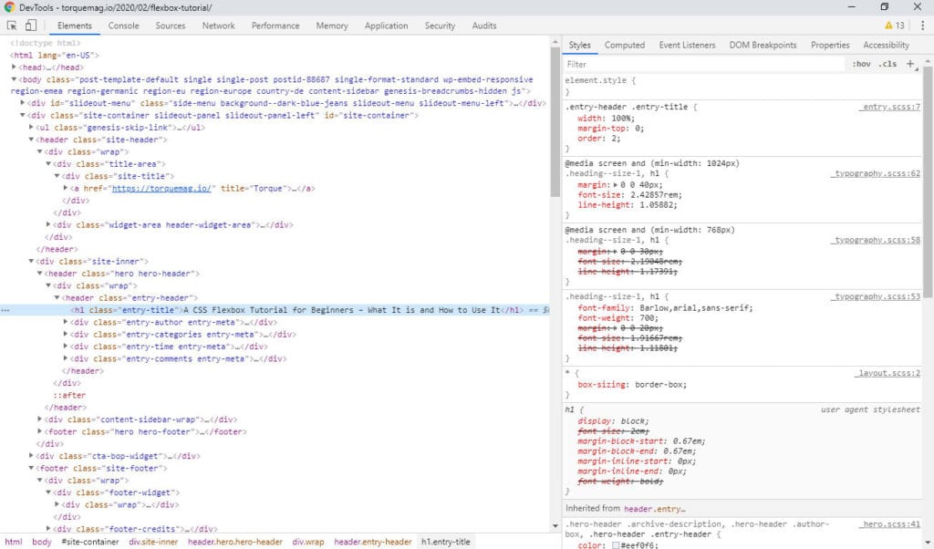
The first thing you will see when opening any dev tools is usually a representation of the page structure in HTML.
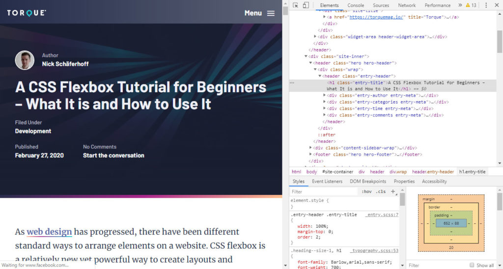
This allows you to see the elements of the page, their classes and ids, how they are nested into each other as well as scripts, style sheets, and other resources loaded in the head and footer section.
When you hover over any element, the browser will also highlight it on the page plus any CSS layout properties like margin or padding.
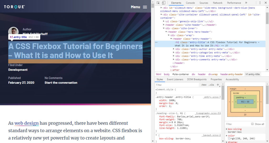
If it’s not currently visible, right-click any element and choose Scroll into view. You are also able to use the selector tool (in the upper left corner of the dev tools window or Ctrl+Shift+C) to pick any element on the page and see it in the site code. Right click > Inspect has the same effect.
You can also navigate the HTML tree with your keyboard. Move up and down and use left and right to collapse/uncollapse elements. Finally, a search field at the top lets you filter for strings, classes, and everything else.
2. Manipulate HTML Elements
In addition to looking at the page HTML, you are also able to make changes to it. Just double click almost any part of the code to modify it.
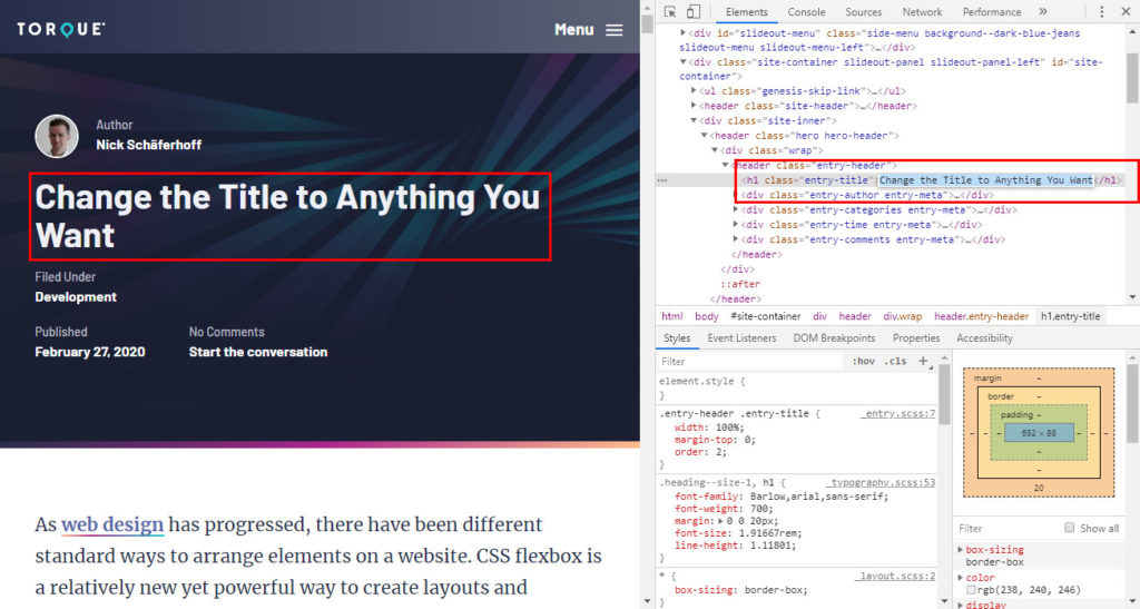
That way, you can change heading tags from H3 to H2, remove or modify class names, add inline styling, change text on the page, or hide and delete entire elements from the DOM. You may also drag and drop elements from one place to another with your mouse.
In addition, right-click > Force State allows you to permanently set elements to hover, focus, active, visited, etc. Your browser window will show you what it does to the page.
3. Experiment With CSS
The next thing you will notice is that the associated CSS of every element appears to the right of the HTML.
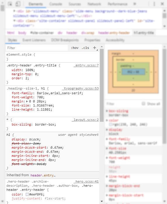
That way, you can understand their styling and layout markup. This is a great way to learn how a design that you may like on another website is achieved.
Furthermore, you can change it in real time in order to debug CSS that isn’t working or test drive design ideas you have. Simply click on the CSS property of any class or id on the right to modify it.
In the example below, we increase the font-size property. Here’s the effect on the page:
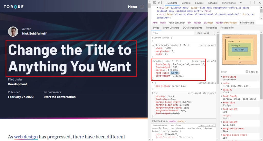
In the same way, you can remove CSS properties, add completely new ones, and modify or add selectors. Like HTML, it has a search bar at the top to help you look for anything specific.
You can also add new style rules via the plus icon on the top right (or right-click > New rule in some browsers). You are even able to add classes from here without messing with the HTML tree via .cls in the upper right corner. Enter a class name and it will automatically be applied to the element.
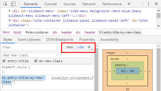
Finally, under :hov in the same place you are able to force different states on an element in order to make changes to their look. Note that all of this is only visible to you, not the public at large. To make changes permanent, simply mark and copy your modified CSS rules and paste them into your theme’s style sheet.
4. Use the Box Model
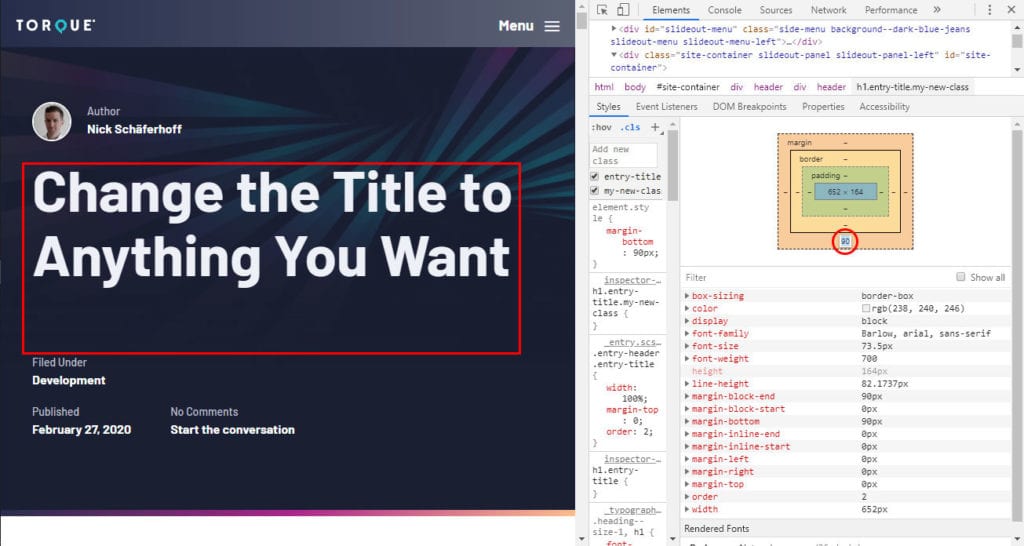
One last thing about CSS: As part of the Style section you find a representation of the box model.
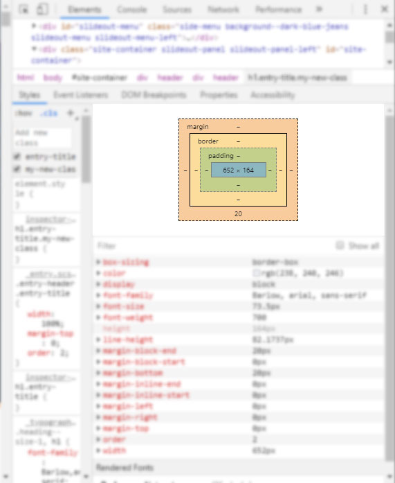
Here, you are able to see the height and width, padding, border thickness, and margin of the element at one glance. Hovering over any of the properties will also show them in the DOM.
In addition, you are able to change any of the properties by simply double clicking any part and typing in a number. So, if you wanted to change the bottom margin, you can simply do that and see the effects on the page.
5. Debug JavaScript
Besides HTML and CSS, JavaScript is another important programming language for site design. Luckily, the browser developer tools also have tools for that, the first of which you can find in the Sources panel.
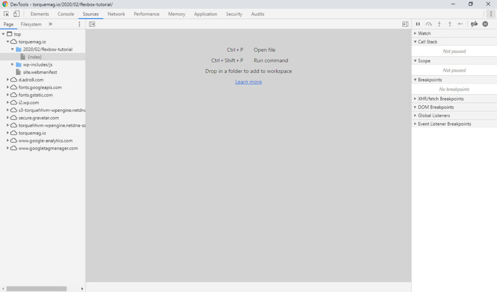
Here, you can browse site files, read and edit code, as well as use built-in debugging tools. Yet, one of the most important things you can do here is insert breakpoints. This, for example, allows you to pause the code execution during certain events to see if an error occurs.
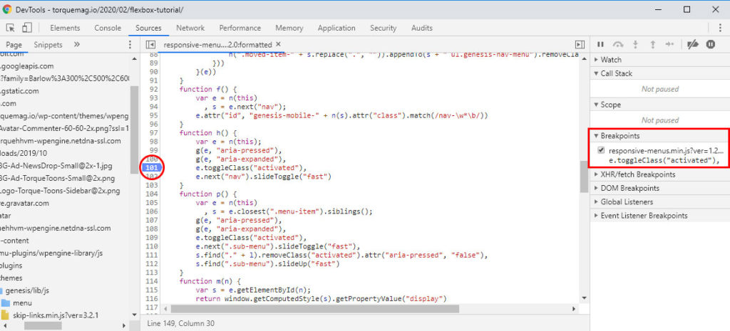
You can then step through the code one line at a time via the icons in the upper right corner until you find the issue. You are also able to change the code right inside the browser tools and then resume and/or reload the script to see if that fixed it. More on all of that here.
6. Log and Execute JavaScript
Another important tool for working with JavaScript is the console.
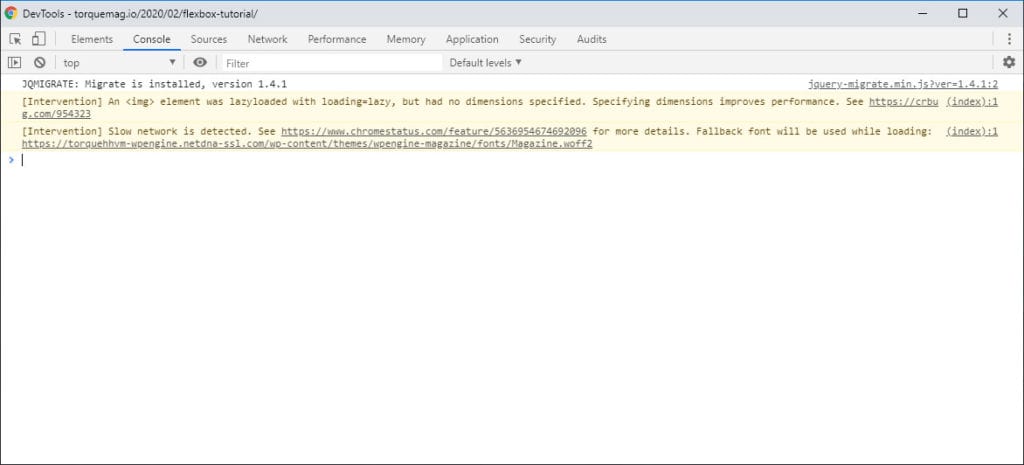
Here, you will find all the messages sent to the log with JavaScript on your site (via console.log). This enables you to see if the code is executing in the right order or throwing errors.
Also, similar to CSS, you are able to experiment with JavaScript inside the console. For example, you run statements to see how they work on your page. Make them permanent via copy and page if it makes sense.
In addition, the console also works as a playground to experiment with JavaScript that has nothing to do with your page and allows you to find unused JS and CSS.
7. Analyze Site Performance
Another thing you can do with Chrome browser tools is analyze website speed. We actually have a whole tutorial on speed testing that is all about third-party tools, yet, you are also able to do this inside the browser tools. For that, go to the Audit tab.
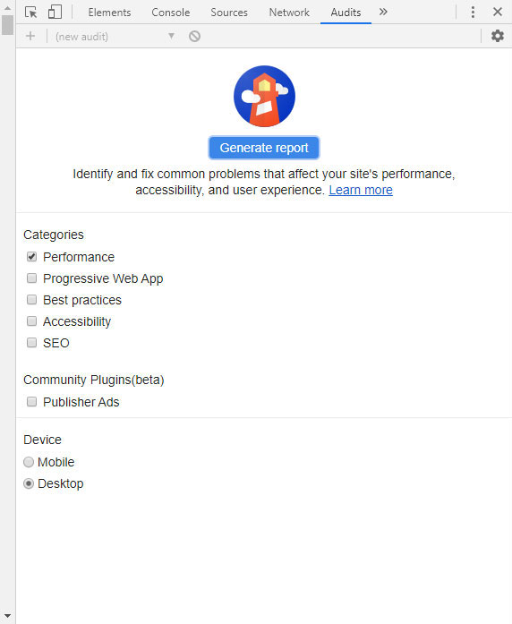
Here, you are can run all kinds of audits on your site. For now, we are just interested in the performance, so uncheck everything else.
After that, choose whether to measure site performance for mobile or desktop devices. Then, hit Generate report and wait until you see something similar to below.
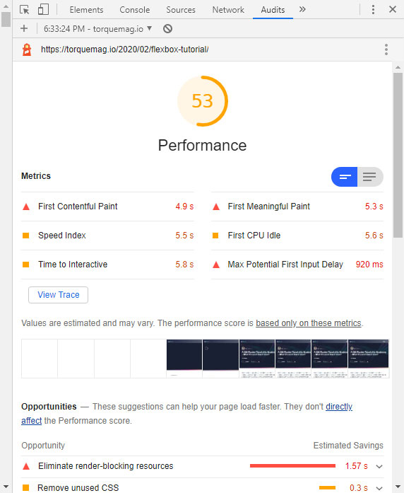
Veterans will know that this is the same data that you get when using Google PageSpeed Insights. It gives you lots of information on what is and isn’t optimized on your page as well as how to improve it. If you want to get details on how to work with these results, check our speed testing post mentioned above.
The cool thing is that, with the developer tools, you can also experiment with changes to your site such as finding and disabling render-blocking scripts to see what will make the biggest difference. However, that’s too much for this one tutorial so check the documentation for that.
8. Simulate Mobile Devices
I probably don’t have to tell you that mobile traffic has become hugely important and that more people surf the Internet on their phone than on desktop computers.
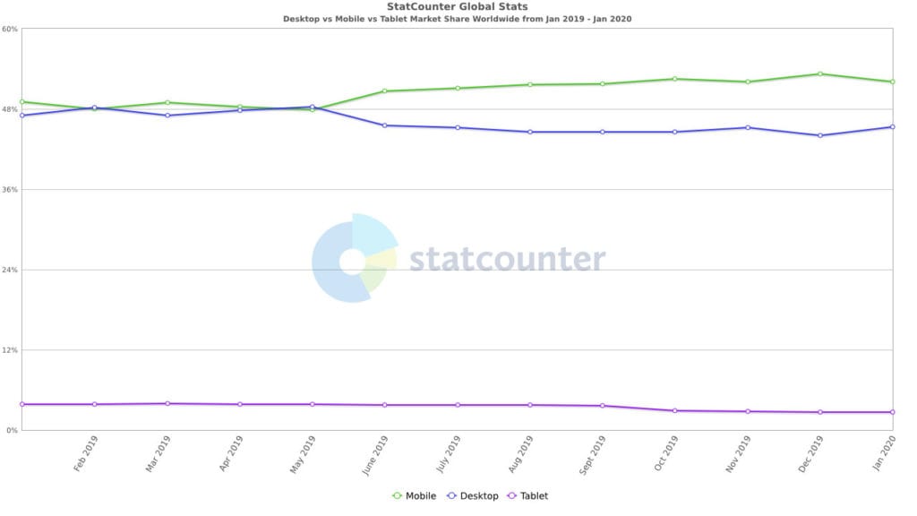
For that reason, it’s immensely important that you know how to make your website mobile friendly. This is another area that browser developer tools can help you with by allowing you to simulate the experience of looking at your site with a mobile device – right inside your browser.
You can access this via Ctrl+Shift+M with the dev tools open or the little mobile device icon in the upper left corner. It will leave your page looking like this:
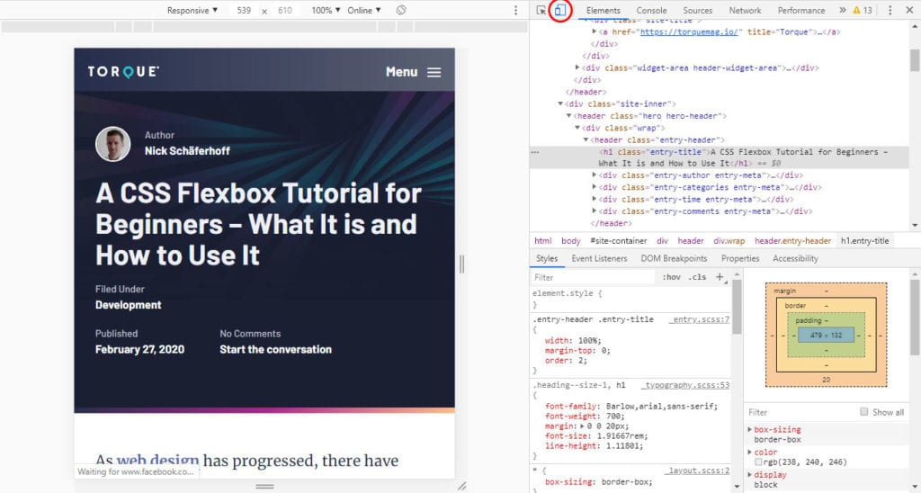
Drag and drop the sides of the frame to see what your site looks like on smaller screens. Alternatively, input dimensions numerically in the top bar. In the same place, You can also use the drop-down menu to choose particular devices to get their exact screen dimensions. Add more or input your own devices via the Edit button.
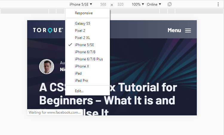
Use the icon on the right to switch between portrait and landscape mode. The percentage allows you to adjust the zoom level.
When you click the button with three dots, you can switch on Show media queries.
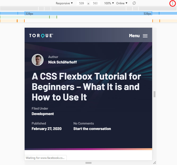
This will enable the breakpoints included in your CSS (more on that in our guide on making WordPress themes responsive). Click on them to automatically resize the viewport to that size.
Finally, the drop-down that says Online lets you simulate different connection speeds (since cellphones don’t always have wifi). This way, you get a better idea about what the experience is like for people on fast and slow 3G networks.
If location is important to your site, you can also override the geolocation if you switch it on in the settings. More information here.
10. Other Options
Above we have listed the most important things you can do in the browser developer tools, however, there’s more stuff for which we will give you a quick overview:
- Network — See if and how resources are being up- or downloaded. Check properties of individual resources and files, view a waterfall diagram, and simulate different network connection speeds.
- Inspect animations — If you have animations on your page, you can slow them down, inspect the source code, and more.
- Accessibility — Just like page speed, you can run an audit on accessibility. See how you fare similar to a DOM tre, see ARIA attributes, and examine the screen contrast.
For more tips on your favorite browser developer tools, check their documentation!
Last Thoughts on Browser Developer Tools
In the above browser developer tools tutorial, you have gotten a detailed glimpse at how they can help you improve your site and learn more about websites in general.
You now know the most basic applications such as how to inspect and manipulate HTML, CSS, and JavaScript, analyze site performance and check your mobile friendliness. Plus, there is more to discover.
While not everything in this guide will apply to your browser of choice, the basic functionality is always the same so take advantage of it!
What’s your favorite feature of browser developer tools? Anything to add to the above? Let us know in the comments section below!

1 Comment