Footers are often at the bottom of the totem pole when it comes to web design. Due to their placement, a lot of websites add footers almost as an afterthought. However, there are plenty of ways that you can customize your WordPress website footer and make it an effective part of your online presence.
For example, you can use your footer to share links that don’t fit into your primary navigation menu, link out to your social media profiles, build your newsletter subscriber list, and more. By design, footers can be highly versatile, which means that with the right approach, they can help improve almost any website.
In this article, we’ll talk about the role of footers in modern web design. Then we’ll discuss how WordPress handles footers and go over four tips to customize yours. Let’s get to it!
The Role of Footers in Web Design
Modern web design tends to be highly modular. Most websites have clearly defined sections, which makes them easier to navigate. Usually, you have a primary menu, hero sections, the main content of the page, sidebars, and the footer.
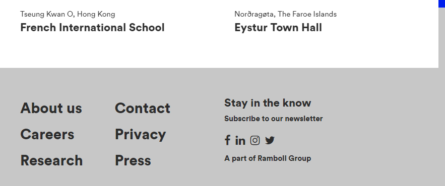
By definition, the footer is the section at the bottom of each page. The way that footers look can vary depending on the website and its purpose, but usually, they tend to be unassuming from a design perspective:
That’s not to say that footers are unimportant. Throughout the last few years, it’s become more and more common for websites to rely on footers for non-critical links and other key elements.
Seasoned web users will know to jump to a site’s footer if they want to find elements such as privacy policies, contact information, and more:
As far as usefulness goes, the more complex your website is, the more likely it is that it can benefit from a well-designed footer. However, before we discuss how you can customize your WordPress website footer, we need to talk about how the platform treats this element.
How WordPress Handles Footers
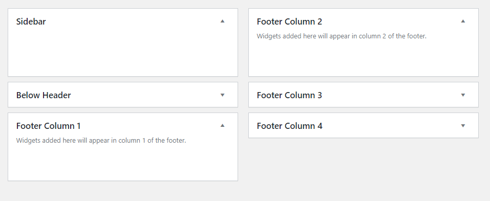
Each WordPress theme handles footers slightly differently. However, the usual approach is to include multiple ‘widgets’ at the bottom of the page:
The widget approach gives you a high degree of control over the elements that you want to include in your footer and their position. Moreover, it makes the process of designing a ‘universal’ footer for your website much easier.
WordPress footers also play an important role when it comes to adding custom code to your website. If you need to incorporate third-party scripts into WordPress, you usually want to place them within either your child theme’s header or its footer.
Adding that code to your WordPress footer is the preferred method if you don’t need it to load right away. Although you can do so manually by editing your theme’s functions.php file, you can also use plugins such as Header, Footer and Post Injections:
To sum it up, your WordPress footer isn’t there just to provide an additional layout section to add elements to. It can also fulfill a role as a container for non-critical scripts to improve loading times over adding them to your header.
4 Tips to Customize Your WordPress Website Footer
If you’re not sure how to customize your WordPress website footer to make the most of it, don’t worry. We’re about to show you some of the best options at your disposal. While we’re at it, we’ll also show you examples of excellent footer designs from other sites.
1. Use Your Footer to Include an Extended Navigation Menu
One of the most common uses for footers is to act as an extended navigation menu. Ideally, you want to keep your site’s primary navigation menu relatively uncluttered and use it for links to your main pages:
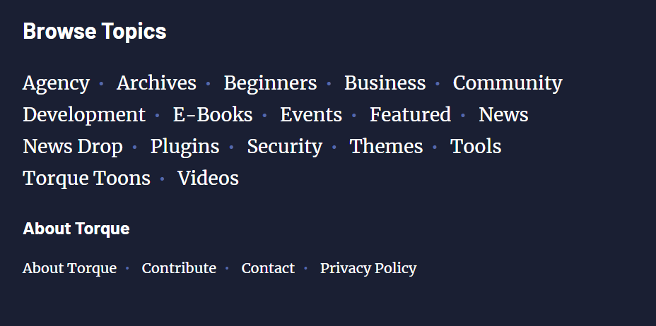
Your footer, however, is fair game for all the links to other pages you want users to find. For example, we use ours to link you to our archives, specific post categories, and our Privacy Policy:
Which links to include within your primary menu and which ones to move to your footer shouldn’t be a difficult decision. If a specific page is critical to your site’s user or customer journey, then it should have a front-row seat on your website.
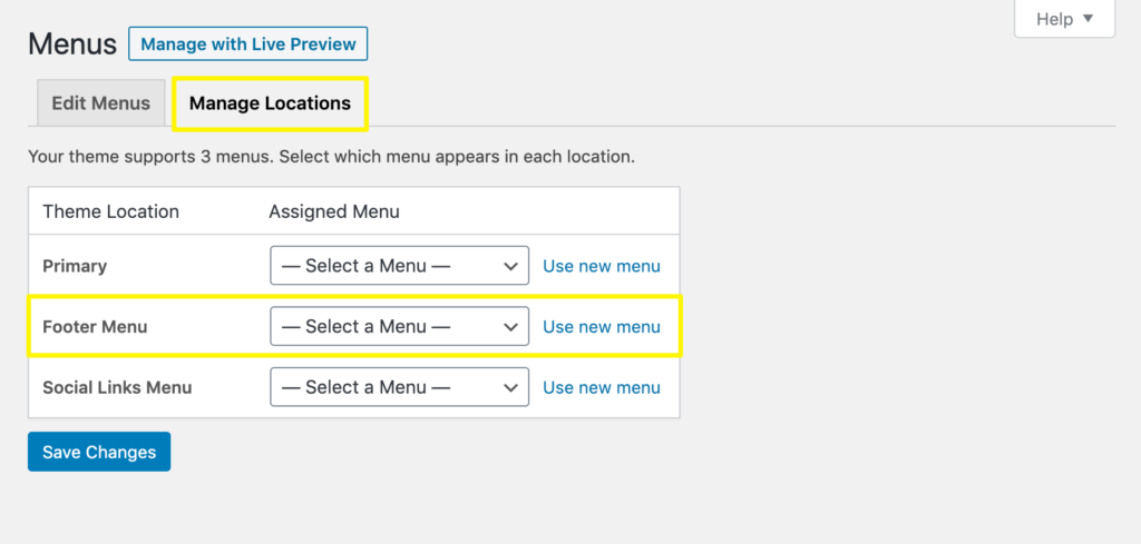
If your theme supports footer menus, you can create one using WordPress’ default menu builder (Appearance > Menus), then add it to your footer in the Menu Locations settings:
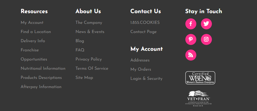
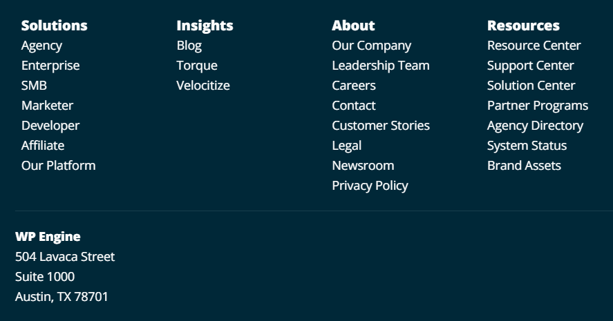
Depending on how many links you want to include, widget columns can come in handy:
If your website doesn’t have as many pages, there are plenty of other ways to use the footer section to your advantage.
2. Include Social Media Links In Your Footer
These days, it’s a necessity for most websites to have a social media presence. Without it, you miss out on engaging with your audience on additional platforms to build brand recognition and court new users.
If you have social media accounts for your website, then it’s best to link between them. So, the question becomes where to place those links on your website so they get the most clicks.
Modern web design conventions favor the use of social media icons as links since most users are familiar with each platform’s logo:
Some themes support social media icons out of the box. If yours doesn’t, you can easily add them by creating your own icons and links and inserting them in your footer as a widget, or with a plugin such as Social Icons Widget & Block by WPZOOM:
Other popular options for adding social media icons include your primary navigation menu or sidebar (if you have one). However, we only recommend adding social media links to your primary menu if they’re major sources of traffic.
For example, if you’re a blogger and you’re trying to build your brand, then you may want to place your social media icons front and center. For business sites, on the other hand, adding social media icons to your footer is often a better solution. Users will still be able to find them, but they won’t distract from other, more valuable internal links.
3. Add a Form or Call To Action (CTA) to Your Footer
In most cases, we create websites with vertical navigation in mind. That means that by the time visitors reach your footer, you want to convince them to take some kind of action. That action can take many forms, including:
- Signing up for your email newsletter
- Getting in touch with you via a contact form
- Clicking on a Call To Action (CTA) to start the conversion process
Although you can include multiple CTAs throughout a page, footers are perfectly positioned for both signup and contact forms:
Sidebars are also great options for placing both elements, but that depends on whether or not you use one in the first place. For signup forms, you can also opt to use popup messages, but in many cases that approach impacts the user experience negatively.
Using WordPress widgets, you should be able to place any of those three elements within your footer in a matter of minutes. For example, you could use the Text widget to create a CTA link, or the Custom HTML widget to code a clickable CTA button.
Most contact form plugins (including WPForms Lite) either provide a widget you can use to add a form to your footer or enable you to do so via a shortcode widget. Similarly, plugins such as MC4WP connect your site to your email marketing platform and include a signup form widget you can place in your footer.
4. Share Your Contact Information In Your Footer
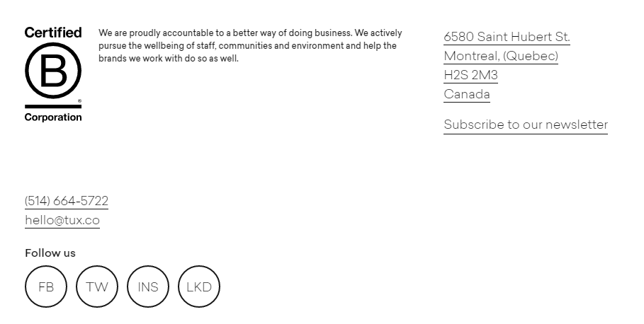
If you run a business website, then there’s no better place to include your contact information or address than within its footer:
Depending on what type of business your site is for, ‘contact information’ can refer to an email, support phone numbers, links to WhatsApp, and more.
Including contact information within a site’s footer is an incredibly popular approach among businesses. Doing helps to establish your brand’s credibility and make visitors feel more at ease on your site, as they have evidence that your business is real.
Other approaches include placing contact information within About Us or Contact Us pages. However, unless you plan to create fleshed-out content for these pages, adding these details to your footer can be a much simpler solution.
To achieve this, all you really need is the default WordPress text widget. Enter your contact information and add it to your site’s footer.
Conclusion
Footers are a fundamental element within modern web design. Designing yours as an afterthought is a wasted opportunity. That goes particularly for WordPress footers since they’re so easy to build and customize thanks to themes and the widget system.
If you want to make the most of your WordPress website footer, here are four approaches you can use:
- Use your footer to include an extended navigation menu.
- Include social media links in your footer.
- Add a contact form or CTA in your footer.
- Share your contact information in your footer.
Do you have any questions about how to customize your WordPress footer? Let’s go over them in the comments section below!






No Comments