In this post, we will have a look at the web design trends we can expect to see more of in 2022. Staying abreast of the latest trends helps to keep you up to date on what a modern website looks like. That way, you can make sure your site measures up and does not start looking outdated.
This isn’t the first time we try to make some predictions about what websites will look like in the new year. If you are interested, check out our thoughts on web design trends 2020 and 2021. However, if you’d rather like to know what the web will look like in 2022, just keep reading.
Prepare Yourself for These 2022 Web Design Trends
Here are 15 design trends that you should get ready for.
A Focus on Typography
This year many designers are foregoing the traditional approach to web design where colors and imagery are prevalent. Instead, we’re seeing a greater focus on typography, especially in the hero image area.
The hero image is usually the first element that visitors see. Typically, it consisted of a large background image, a pattern or a solid color background paired with some text and a call to action button.
But if you look at current designs, you’ll notice that typography is taking center stage. Large headings and bold fonts convey the main message and grab the visitors’ attention. The website below is the perfect example of strong typography.
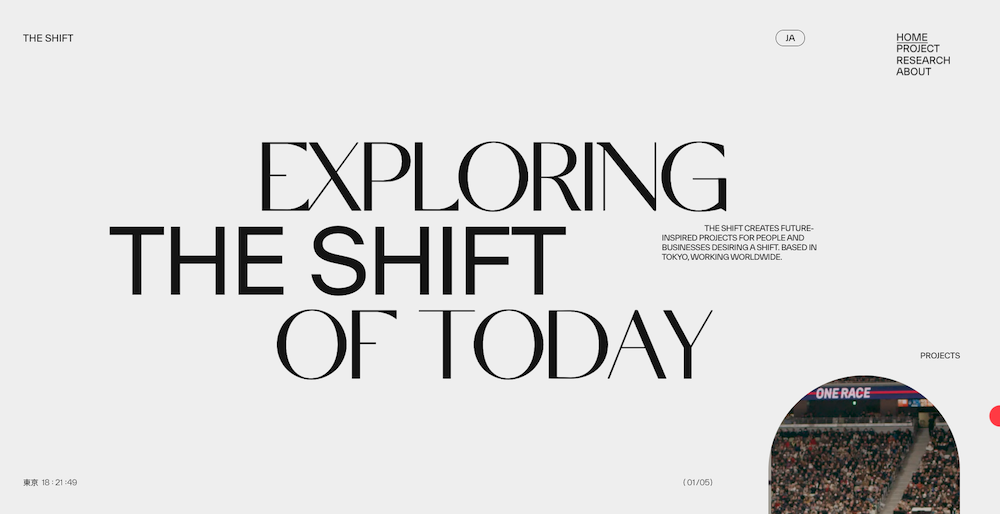
This not only makes it crystal clear what the brand does and stands for. It also creates a sense of mystery and encourages the visitor to scroll down and learn more.
Light and Dark Mode Toggle
Dark mode seems to be everywhere nowadays. Interestingly enough, in the early days computers had black screens where graphs and other content appeared as glowing traces.
But as technology advanced, computer monitors were able to display more and more colors. Eventually, a dark-on-light color scheme was originally introduced in WYSIWYG word processors to simulate the look of ink on paper. This soon became the norm.
Things changed again in 2018 when designer Sylvain Boyer extended the dark mode concept to the core interface of smartphones that had OLED screens. This happened in an effort to extend the battery life and save power consumption.
Shortly after that, Apple announced that a light-on-dark mode would be available in all native applications in iOS13 as well as iPadOS.
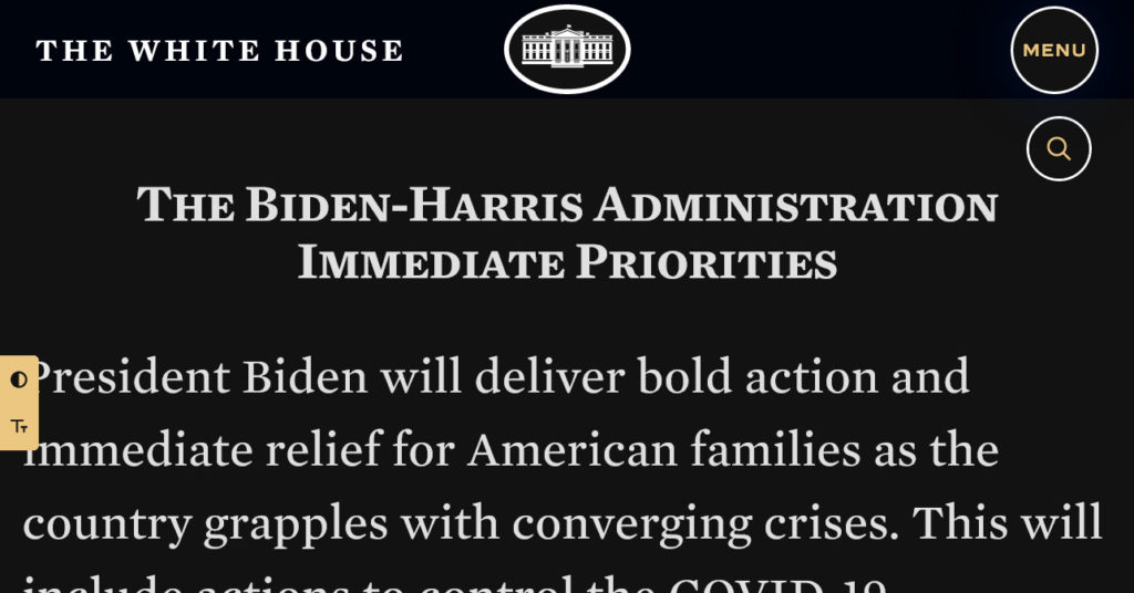
In 2019, a new CSS property become available that makes it easy for front-end developers to allow users to set their own preference for using either a light or a dark color theme. This choice seems to be gaining in popularity as evidenced by Leonid Kostetskyi’s website.
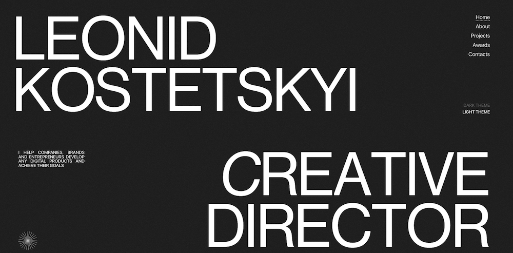
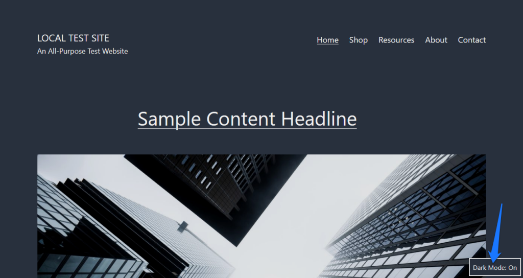
However, even in WordPress you can see this web design trend at play. The Twenty Twenty-One theme was the first default theme that introduced a native dark-mode toggle.
Grids
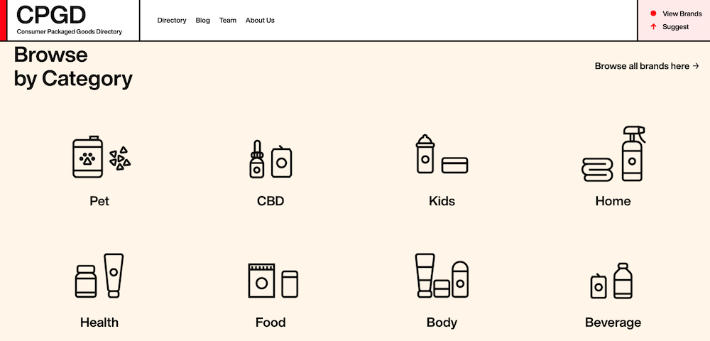
Grid systems have always been a mainstay of good web design. A website that follows a grid-based layout is more visually appealing. On top of that, it’s also better organized and makes it easy for visitors to follow along with the content.
When it comes to grid systems, there is no shortage of options. Even the most popular CSS framework, Bootstrap, uses a 12-grid system to ensure websites that rely on it have a well-organized, balanced layout. Plus, there are more and more CSS properties like grid or flexbox that make creating grid-based layouts easier and easier.
The website below is a wonderful example of how you can organize your content in a grid fashion to make it easier to find the desired content.
Split Screens
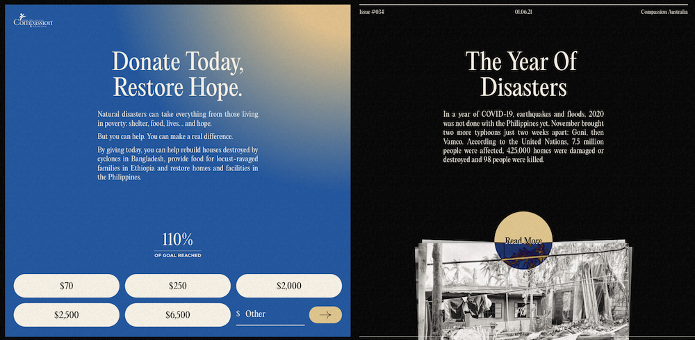
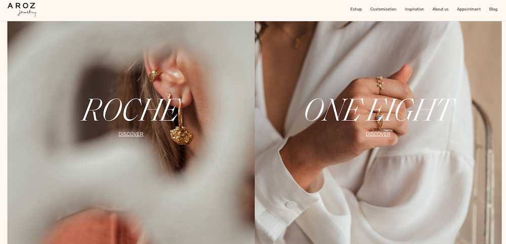
Split screens are a nice way to break up the content on your website. They can serve as entry points to different offers or to separate the visuals from the copy. Style each split section and you’ll bring contrast and visual interest to any section of your website.
Restore Hope’s website is a great example of effective use of split screens. The left side makes it easy to instantly make a donation while the right side provides more information about natural disasters they hope to relieve.
Aroz Jewelry, on the other hand, uses the split screen section to funnel visitors into two very distinct product pages.
Off Screen Elements to Give a Sense of Motion
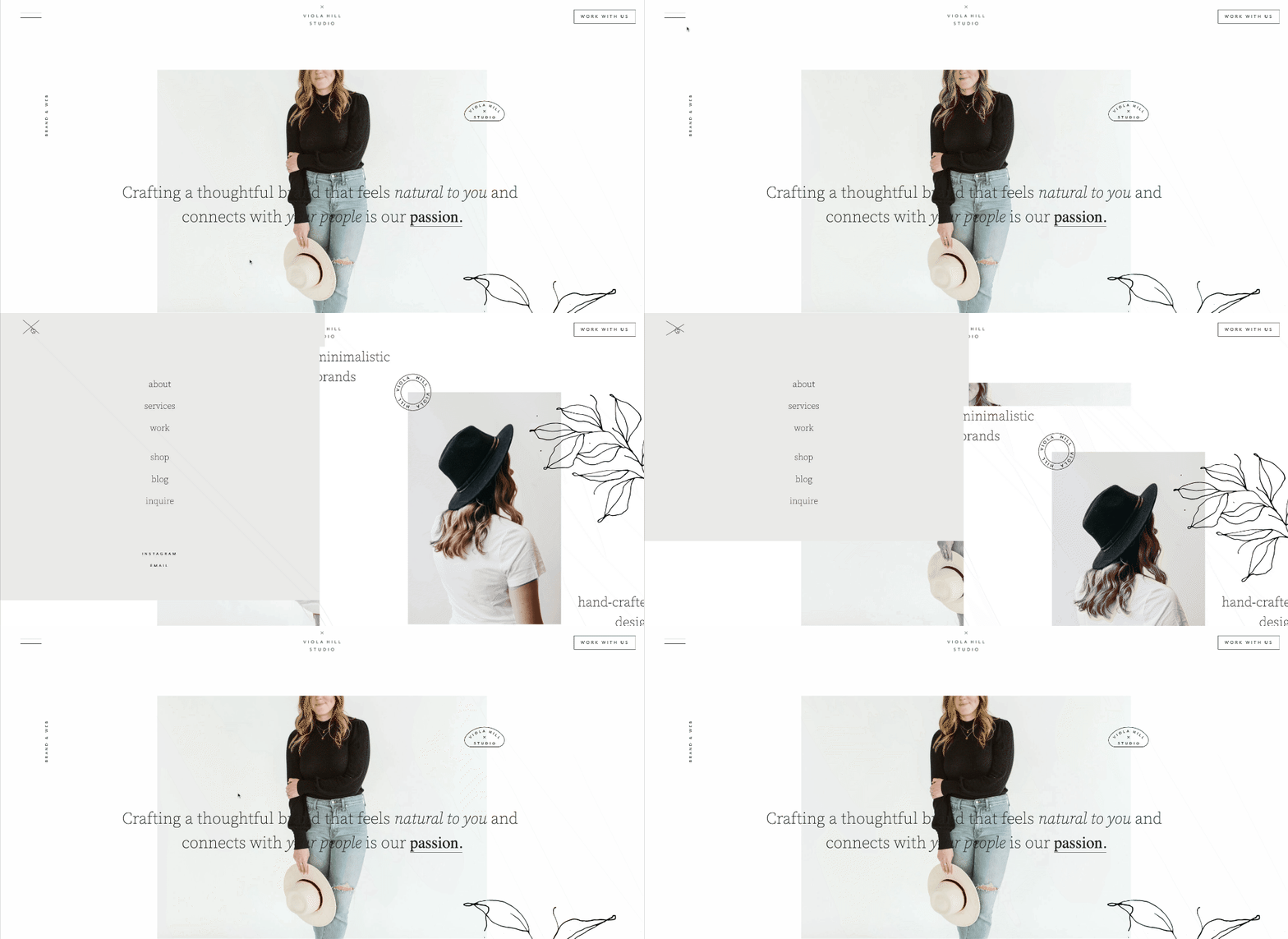
Many websites are turning to the use of off-screen elements to create a sense of motion. One example is the use of hamburger menus which typically appear on mobile devices. But with a little CSS magic, that hamburger menu brings the main menu into focus as in this site example.
Another application of typically off-screen elements are shopping carts used in online stores that briefly pop up when a new item has been added to them. (For related tips, read our post on eCommerce UI design.)
Unique Typefaces
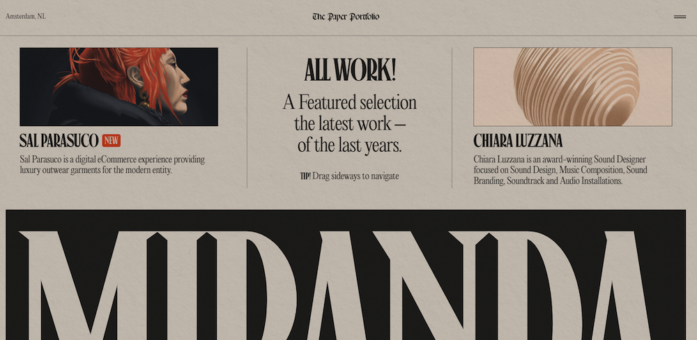
Aside from websites focusing on typography, there’s a very strong inclination towards using unique typefaces. Custom fonts can easily set you apart from your competition and emphasize your brand’s unique message.
Niccolo Miranda’s website does this well by using a distinct typeface for the headings throughout the website.
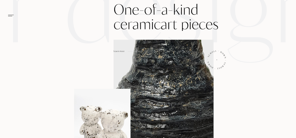
Overlapping and Collage-Style Elements
Overlapping elements in a collage style are reminiscent of scrapbooking. While they can certainly make for a memorable website, they also do more for your website’s overall look. For starters, they give your website a more tangible feel.
Secondly, they add more whitespace to your pages. Thirdly, you can incorporate more images into your design without having to create additional sections. What’s more, you aren’t limited to photos alone. You can mix and match photos with text, different shapes, photo filters, and overlays. This creates a unique look and feel for your website like in the example below.
The Savour website combines white space with overlapping text, rotating text banner, and two photos to create an interesting collage.
Abstract Illustrations
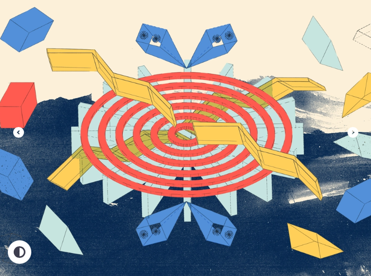
If you want your website to have a more natural, hand-made look and feel, why not opt for some abstract illustrations? Gone are the days of clean and cute, realistic illustrations. Nowadays, people are drawn to raw, natural experiences.
Abstract illustrations are a perfect way to give them what they want. You can add them as background patterns or use them as full-width background images. If you need inspiration, take cues from these abstract blog post illustrations.
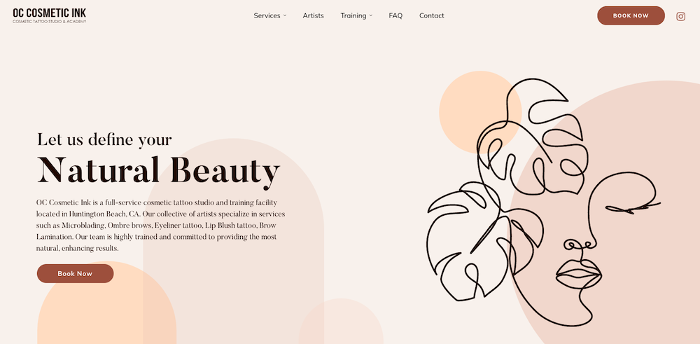
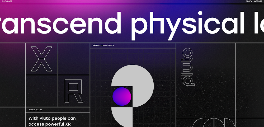
Line Work
Linework can be extremely delicate but it can also signify a delineation between different elements. It’s all in how you use it. Opt for delicate linework if you’re working on a design with a distinct feminine look and feel. Or, use lines to separate sections and create a unique grid for the website.
The OC Cosmetic Ink website has a slightly boho look and feel. It’s accentuated by delicate linework throughout the entire website.
On the other hand of the spectrum, we have Pluto’s website that uses linework to create a unique grid layout.
Exaggerated White Space
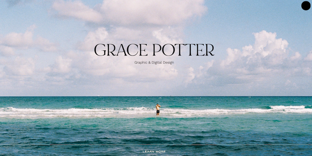
The next of the web design trends 2022 we want to look at concerns white space. It’s an important design element that gives the entire design a more airy feel. It brings balance to the design and makes it easier for visitors to focus on the message accompanying the design.
Take a look at Grace Potter’s website. She uses white space effectively to bring attention to what she does and the subtle call to action at the bottom of the hero area.
Serif Fonts Rising in Popularity
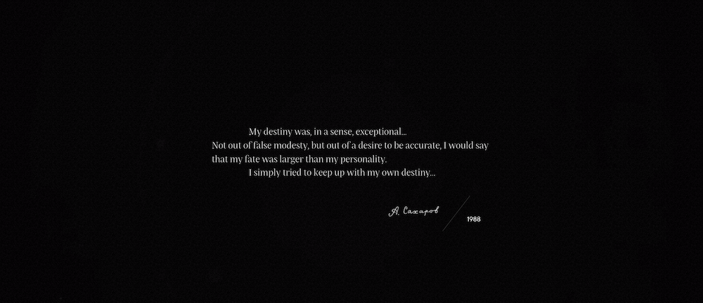
Serif fonts were predominantly used in print because they were easier to read. Sans-serif fonts have dominated the web since the early days. Now, with screens becoming bigger and offering higher resolution, serif fonts are just as easy to read as sans serif fonts.
As a consequence, serif fonts are gaining in popularity. They can elevate the design of any website and add a touch of class. Consider the site below as a great example of sophisticated serif typography in action.
Gender-Neutral Design
Another design trend that’s rising in popularity is focus on gender neutral design. The easiest way to do this is to disregard the obvious gendered details. For example, if you’re building a personal care site, you don’t have to opt for a pink color scheme.
Similarly, if you’re working on a store design that sells power tools, you don’t have to include overly masculine symbols.
If you have to design a form that asks for the user’s gender, make sure to offer multiple gender options. You might also want to allow users to specify their pronouns.
Or, leave them out completely if they are not crucial to the website’s overall form and function. Avoid making assumptions about your visitors’ gender and what they will be interested in or prefer to see.
Inclusive Copy
Along with gender-neutral design, many websites are looking for ways to make their copy more inclusive. It’s a way to try and make a website more welcoming and more accessible to everyone.
Consider including language guidelines to your website to ensure everyone is on the same page and to keep it in a place that’s easy to reference. Beyond what you say, ensure that the text on your website is styled in accordance to web accessibility guidelines.
Using alt text, increasing the font size, avoiding the use of text as image, and ensuring there is enough contrast between the text and the background are just some of the ways you can make your text more accessible.
Visible Borders
We’ve mentioned the use of grids to create a visually appealing layout. But often, the grid is not visible to the eye of the visitor. Unless you make it visible on purpose, like we’ve seen in a couple of website examples so far.
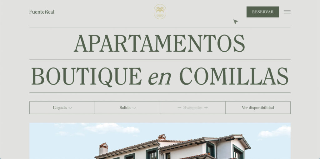
However, borders don’t always have to be used to create a grid. They can also bring more attention to text or separate individual elements on a page. The Fuente Real website uses borders creatively to accentuate the text and separate the headers from the rest of the content. In addition to that, the website uses custom illustrations for a completely unique look.
Creative Scrolling Experiences
Scrolling is crucial for any website. After all, scrolling determines how you interact with a website. We’re all used to the vertical scrolling where we scroll down a page to see more of the content.
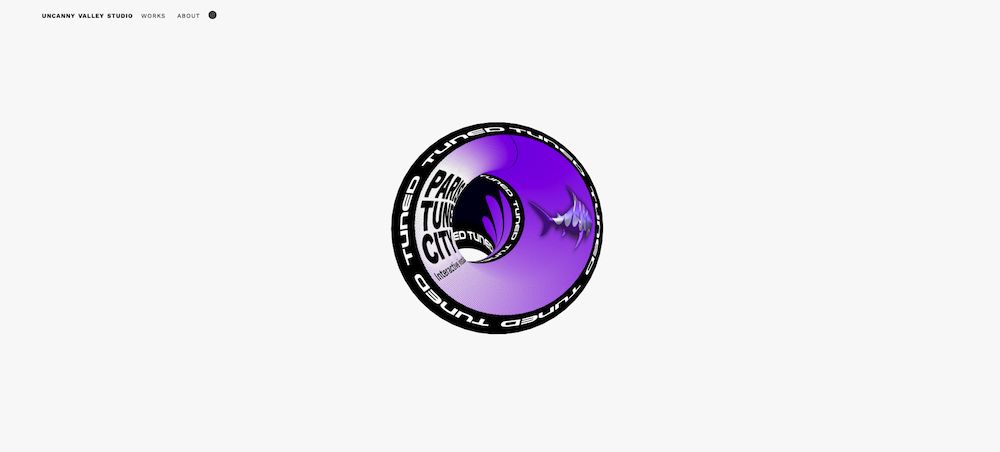
But in 2022, designers are opting for more creative scrolling experiences. It’s not unusual to see horizontal-scrolling websites. In addition to that, scrolling animations add a sense of dynamic and motion to engage the users. The UVS website has a truly unique scrolling experience that gives off almost a psychedelic vibe.
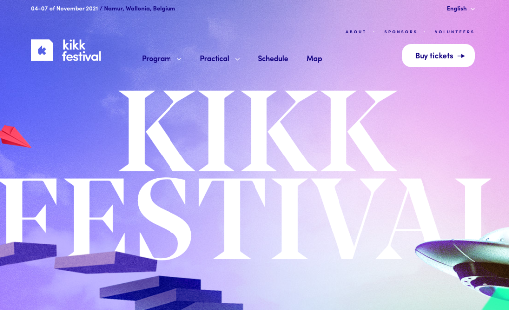
Contrary to that, the KIKK Festival website has a more subtle scrolling experience. Elements move along the page as you move the mouse around.
Last Thoughts: Web Design Trends 2022
As with any other year, web design trends move forward. For business owners, this means they can have a standout website that sets them apart from their competition. For designers, web design trends allow you to push your creative skills and develop them further.
2022 promises to bring about lots of new and exciting designs that will surprise and delight website owners and visitors alike.
What web design trends are you looking forward to in 2022? Please share what you hope to see more of in the comments below!

No Comments