Pseudo elements are an interesting part of CSS. They allow you to make a lot of small tweaks to your design. Yet, especially beginners might be confused by them at first.
For that reason, in this blog post, we want to talk about them in detail. In the following, we will give you a beginner’s guide to CSS pseudo elements. We will explain what they are, how they work, and what you can use them for. The post will conclude with examples of how to use the most common pseudo elements.
In the end, we want you to feel empowered and capable to make them part of your CSS repertoire.
What Are CSS Pseudo Elements?
In order to explain what pseudo elements are, it’s best to start with an example. Here’s a very simple HTML page with a link to a style sheet and a single paragraph element on it.
<!DOCTYPE html>
<html>
	<head>
		<link rel="stylesheet" href="style.css">
	</head>
	<body>
		<p>CSS pseudo-element test</p>
	</body>
</html>
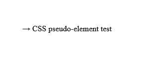
However, when we look at the page in a browser, it comes out like this:
You will probably notice the arrow in front of the paragraph that appears even though it’s not present in the HTML document. That’s because the linked style sheet contains the following markup:
p::before {
	content: "→ ";
}
Above is a rather standard looking CSS selector. However, what stands out are the double colon plus before behind it. That’s our pseudo element.
In this case, it does a very simple thing, it adds an element in front of the inner HTML of the target selector and places the content defined in its value. In this case that’s an arrow and the targeted element is every paragraph element on the page.
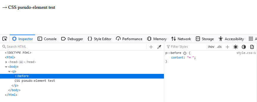
The interesting thing, however, is that the arrow does not show up in the HTML itself. Instead, you only see a pseudo element and can check its content. Here is what that looks like in the browser developer tools:
This tendency to behave like elements without being so is how pseudo elements get their name. It also has some bearing on their behavior as we will see in the examples below.
For now, just need to get familiar with the basic markup for using pseudo elements:
selector::pseudo-element {
	property: value;
}
We will get into more specifics below.
Available Pseudo Elements
Besides the above-mentioned ::before element, the other most popular pseudo element is ::after. As its name suggests, it does the same things as ::before but instead creates child elements at the end of its target.
Besides those two, there are also these elements:
::backdrop– Creates a box that is as large as the user viewport that allows you to style the background of any element that is turned to full-screen, such as videos.::cue– You can use this to style WebVTT cues, meaning things like subtitles and captions inside videos.::first-letter– Targets the first letter of the first line in a block-level element (e.g.p,h2,div). This can also mean inside a::beforeelement.::first-line– Same as::first-letterbut targeting the entire first line of a block element.::file-selector-button– Creates a button of an<input>element oftype="file".::marker– Enables you to style the markers of list items, such as in bulleted or numbered lists.::part()– Allows you to target specific HTML elements inside a shadow tree marked with"part="by name. Shadow-tree elements are added via JavaScript. More information here.::placeholder– Use this to style the placeholder text inside<input>and<textarea>elements.::selection– A CSS pseudo element that you can use to apply styling to text highlighted by users (e.g. via clicking and dragging the cursor across).::slotted()– Targets elements marked with<slot>for styling.
Experimental Pseudo Elements
Besides that, there are a few pseudo elements that are not fully supported by browsers yet (or, in some cases, not at all):
::cue-region– Also for styling subtitles and captions, however, targets all of them as a single unit and not individually.::grammar-error– Marks text that a browser has identified as grammatically incorrect in a specified way. Currently not supported by any browser.::spelling-error– Similar to::grammar-errorbut for spelling mistakes. Not currently supported by any browser either.::target-text– Allows you to style text that the browser scrolls to via link jumps. Browser support is still a bit spotty at the moment.
There are also often new elements coming out, so stay up to date on new CSS features.
Pseudo Elements vs Pseudo Classes
Something that you might come across when looking into this topic are pseudo classes. They are not the same as CSS pseudo element even if some of them do similar things.
The most well-known pseudo class is probably :hover. It allows you to change the styling of an element depending on whether the user hovers over it with their mouse cursor.
a:hover {
	color: #28303d;
	text-decoration-style: dotted;
}
And that’s also the main difference between pseudo classes and elements. Classes target existing elements in a certain state and give you similar possibilities as if you had added a custom HTML class to it. Pseudo elements, on the other hand, act like they added entirely new HTML elements to the markup.
The differences are a bit muddy sometimes, especially with something like ::first-line and ::first-letter, and also since you can also use them together.
p:hover::before {
	content: "→";
}
However, it’s easy to get the hang of it once you have used them a few times.
In general, you can recognize pseudo classes by a single colon in front, while pseudo elements have a double colon. Be aware, however, that the earliest pseudo elements (:before, :after, :first-letter, :first-line) also work with a single colon because that was the markup in earlier CSS specification.
Examples of How to Use CSS Pseudo Elements
After covering the theory, in the following, we want to go over a bunch of examples on how to use the most common pseudo elements. First, however, some important general rules.
For one, you can only use one pseudo element per selector. If you want to apply several of them to the same selector, you have to use separate declarations:
p::before {
	content: "→";
}

p::first-line {
	color: red;
	font-size: 130%;
}
Secondly, use double colons (::) instead of a single colon (:) to declare pseudo elements. This helps distinguish them from pseudo classes. As mentioned, most browsers support both syntaxes for the original pseudo elements but, in order to write proper, modern CSS, you should adhere to the double colon rule.
::before and ::after
Let’s start off with the easiest two. The ::before and ::after pseudo elements only work with elements that accept child elements, meaning that they can contain other HTML components.
For example, <img>, <video>, and <input> don’t and thus don’t accept pseudo elements either (an expectation being input[type=”checkbox”]). Typical applications are block elements like divs, headings, paragraphs, or lists .
Furthermore, ::before and ::after only show up if you define their content property. It can even be empty (content: "";) but you need to define it either way. content takes a string (meaning text) or a link to an image that you want to show up in that place.
You usually use them for styling. Here’s a typical example of ::before from the Twenty Twenty-One theme:
.wp-block-pullquote blockquote::before {
	color: currentColor;
	content: "“";
	display: block;
	position: relative;
	left: 0;
	font-size: 3rem;
	font-weight: 500;
	line-height: 1;
}
This part is responsible for showing the quotation marks when you input a blockquote block.
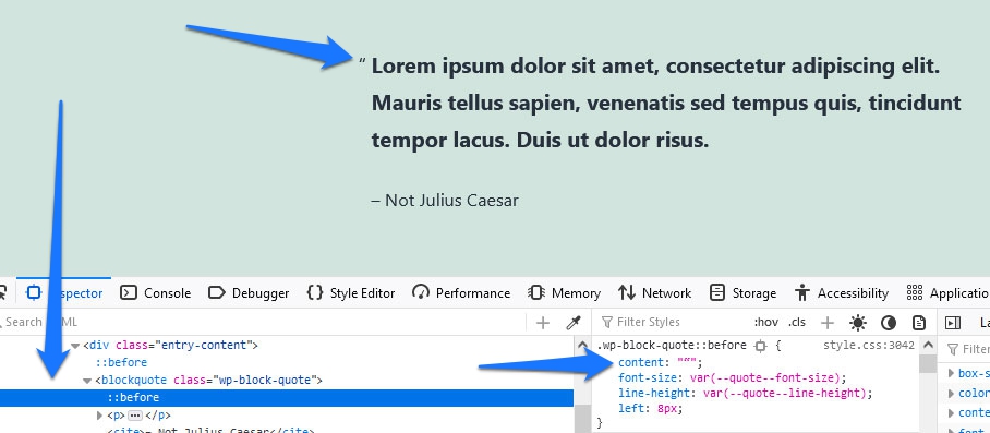
CSS-Tricks also has an example that places quotation marks both in front and after the quote using pseudo elements. They also teach you to use the open-quote, close-quote properties for extra brownie points.
A popular application for ::after is to use it to clear floats. In case you don’t know what that means, it’s a way to make sure that elements that have the float property applied to them stay within their container.
<div class="container">
	<div class="floated-element"></div>
	<div class="floated-element"></div>
	<div class="floated-element"></div>
</div>
To achieve that for the example above, you could use the following CSS markup:
.container::after {
	clear: both;
	content: "";
	display: block;
}
Browser support for these two CSS pseudo elements is excellent:

::first-letter
Next up is ::first-letter. Here, the first thing is that it only works on block containers, nothing that is set to display: inline;. You also need to be careful as it will also target punctuation, symbols like digraphs as the first letter, or whatever is contained in ::before.
Available properties for ::first-letter are those for fonts, color, background, margin, padding, border, text-decoration, vertical-align (but only if float is set to none), text-transform, line-height, float, and clear.
A classic example here is to use it for drop caps:
p::first-letter {
	color: grey;
	font-family: Tahoma;
	font-size: 160%;
}
This is what the markup above looks like when applied to some example text:
Finally, browser support for ::first-letter is great:

::first-line
We already mentioned that this is very similar to the above but for the first line of text inside an element. You also need to keep in mind that it only works with elements that have a display value of block, inline-block, list-item, table-caption, or table-cell. Applicable properties are similar to ::first-letter with the addition of word-spacing, and letter-spacing.
Here is the same example as above but using ::first-line:
p::first-line {
	color: grey;
	font-family: Tahoma;
	font-size: 160%;
}
And here is what it looks like:
::first-line is also accepted by virtually every browser in existence

::marker
This CSS pseudo element exists specifically to style list markers so that’s what we will use it for.
You have two basic options: introduce your own markers or style those available in HTML/CSS by default like bullet points and numbers. To achieve this, you have access to the color, content, white-space, font, animation, transition properties, and a few more.
Here’s what it looks like:
ul li::marker {
	content: "?";
}
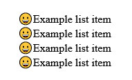
As you can imagine, that simply replaces the list marker with the emoji in question:
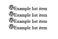
However, you can also use your own custom images:
ul li::marker {
	content: url("wordpress-logo.png");
}
In this case, we are using the WordPress logo:
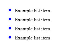
Styling existing markers works in the same way you would expect. You can change their color, change the size via font-size, etc.
Browser compatibility for this is great even if it’s not as wide as for other elements on this list.

::placeholder
Like its predecessor, this is a single-purpose pseudo element. You can only use it to style the placeholder text inside <input> and <textarea> elements. Because of that limitation, it only takes a few properties. Basically all those that have to do with styling text plus background properties.
Here’s an example of what that looks like. First the HTML:
<div class="signup-form">
	<input placeholder="Enter your name...">
	<input placeholder="Enter your email address...">
</div>
After that, you can use CSS markup like this:
div input::placeholder {
	background-color: #578ee6;
	color: #000;
	font-family: 'Brush Script MT', cursive;
	font-style: italic;
	text-align: center;
}
When you do, this is what it looks like on the page (I know, it’s not very pretty):
And that’s all there is to it. The only thing that’s left is to look at the browser compatibility of ::placeholder, which is very good.

::selection
Our last example of CSS pseudo elements concerns ::selection. Since this is about styling text when marked by the user, it accepts typical CSS properties for this kind of job. Think color, background-color, text-decoration, text-shadow, etc.
For example, this is how we can style a simple HTML paragraph:
p::selection {
	color: #bae64c;
	background-color: #e63c25;
}
It ends up looking like this:
You can also combine this with other selectors, for example to style different parts of text separately when selected:
p.second-paragraph::selection {
	background-color: #578ee6;
}
If you assign the custom class .second-paragraph to the second paragraph (thanks, Captain Obvious), you have this result.
::selection is also well tolerated by browsers:

Summary: CSS Pseudo Elements
CSS pseudo elements are a cool feature. As you can see above, many of them are very useful to add small touches to your web design. This can take it from great to extraordinary. Plus, some of them have a more functional role like the ability of ::after to clear floats.
Pseudo elements are not necessarily the first thing you should learn in CSS since they are all about putting that extra flourish on your website. However, you should definitely be aware of them, especially since more of them are coming out over time.
Plus, as we have hopefully demonstrated, their use is mostly pretty straightforward, so you can pick them up quickly.
What’s your favorite use for CSS pseudo classes? Please share your opinion in the comments!





No Comments