In this tutorial, we will talk about how to style web links via CSS. Links are a central part of any website. They allow you to move visitors on to other parts of it, refer to sources to underline the points you are making, help readers discover more relevant blog posts, and more.
Learning how to change their design allows you to make sure that are recognizable as links and fit the rest of your website. CSS offers many different ways and properties for that, so lets go over them one by one.
Link Standards and Default Link Styling
Before we get into how to make changes to your links’ design, let’s first understand their makeup. Here’s what a link element looks like in HTML:
<a href="https://torquemag.io/">TorqueMag</a>As you can see, it consists of several parts:
<a>– This is the operator for creating a link element. Whya? Because in HTML, links are also called anchor tags.href=""– Anything within the double quotation marks is where this link is pointing to. It’s the address someone who clicks on it will land on.TorqueMag– This is the link text that appears on the page, e.g. like this (don’t click it, this links leads nowhere).</a>– The parts that closes the link element and tells the browser that the link text ends here.
So far, so easy.
What Link Look Like By Default
Where it gets interesting is when you look at what this type of link looks like on the page. You have probably seen it before.
If you declare any old link in an HTML document and don’t provide any styling information, it will take on the default styling:
- The link text is blue and the link itself is underlined.
- When you hover over it with your mouse, the cursor changes to a little hand icon.
- When you click it, it turns red for a second.
- Once you have visited the link, its color will change to purple.
- When you navigate to the link via the tabulator key on your keyboard, it will have a blue outline around it.
These standards were established in the early days of the Internet and haven’t changed much since the 90s. The funny thing is, even if you have never thought about this consciously, on some level you were probably aware of most of the above just from surfing the web.
Learning About Link States
Something that also becomes obvious from the above is that links have different states that influence what they look like. You can target these with different CSS pseudo classes that allow you to influence their individual styling. These are:
a– This is the aforementioned anchor tag. It targets all links in all stages.a:link– For the normal, unvisited link. In technical terms,:linktargets all anchor tags that have anhrefattribute. In actuality, it’s not used that much. A lot of people simply usea, since anchor tags without anhrefattribute are rather rare so there is often no need for this type of differentiation.a:visited– Describes a link that the current user has visited before, meaning it exists in the browser’s history.a:hover– Targets styling that shows up when a user hovers their mouse cursor over a link.a:active– Briefly visible styling during the moment of a link click.a:focus– A link that is focused, e.g. that a user has navigated to using the tab key.hoverandfocusare often styled together.
What’s important to note is that, when changing the styling for several link states at once, you must do so in the following order.
aa:linka:visiteda:focusa:hovera:active
Styling for links states build on one another and cascade down. Therefore, the order matters to make sure they work as intended.
Fulfilling User Expectations
The final aside before we get into how you can make changes to link style via CSS, is to talk about user expectations. The reason why you most likely recognized the default links easily as links is because certain defaults have been ingrained into us as users for a very long time.
As a consequence, we – and everyone else – have very clear expectations for what links look like. Expectations that, if not fulfilled, can make it hard for people to recognize links for what they are. For that reason, when working on your website design, you’d do well to stay close to those expectations.
In practical terms that means:
- Make sure links are highlighted in some way. Colors or underlining are all fine as long as you make links stand out on the page. Avoid things like italics or bolding.
- Provide feedback by having links change when hovered and, to a lesser extent, clicked (
a:active, remember?). You should also not mess with the cursor turning into a hand symbol to signify an interactive element.
In the following, we will tell you how to change all of the above. However, keep in mind, that you should do so in moderation to avoid frustrating your users.
How to Change the Styling of Your Link Text via CSS
Let’s first talk about how to change the text part of the link as that’s what makes up the meat of it.
Modifying Link Text Color
Things we cover in this section are relatively similar to our article on how to declare colors via CSS. So, if you want to really get into the details, I advise that you also have a look at that post.
You can change the color of the link text in several different ways: color words and different color notation systems like HEX code, rgb()/rgba(), hsl()/hsla(), etc.
#link-one {
	color: red;
}

#link-two {
	color: #3af278;
}

#link-three {
	color: rgb(61, 76, 128);
}
Here’s what the above looks like on the page:
Most commonly, you will use something like HEX or rgb(). Using color names is extremely rare outside of simple test cases.
Which color system you use depends on different factors like browser compatibility or whether or not you need transparency. However, as you can see, assigning colors to links is pretty straightforward via the color property and it works the same way for all other link states. Consequently, you can easily change text color for :hover or :focus, too.
Adjust Background Color
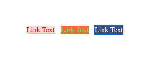
Besides changing the text color, you are also able to modify the background color of your links and their different states. This is as easy as using the background-color property.
Here’s the markup for the example above:
#link-one {
	background-color: #fadbd8;
	color: red;
}

#link-two {
	background-color: #f26c2e;
	color: #3af278;
}

#link-three {
	color: rgb(61, 76, 128);
}

#link-three:focus {
	background-color: rgb(61, 76, 128);
	color: #fff;
}
Other Text Styling Options
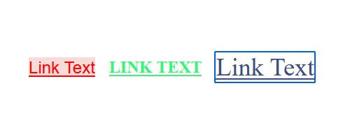
Since links are nothing but text, all other ways of styling text in CSS also apply to them. That means, you can assign other properties to links and their different states and have them change font size, font families, or other things when users hover over them.
This can make sense for certain designs, however, they are less common ways of styling links via CSS.
Here’s the markup to achieve the effects above:
#link-one {
	background-color: #fadbd8;
	color: red;
	font-family: Arial;
}

#link-two {
	color: #3af278;
	font-weight: 600;
	text-transform: uppercase;
}

#link-three {
	color: rgb(61, 76, 128);
}

#link-three:focus {
	font-size: 36px;
}
Work With Underlining
As we learned in the beginning, links are underlined by default. If you want to get rid of that, you can use text-decoration: none; (which is the most common use of the text-decoration property).
a {
	text-decoration: none;
}
Some people also prefer to add an underline only on hover but not for the normal link. This is also easy to do.
a {
	text-decoration: none;
}

a:hover {
	text-decoration: underline;
}
In addition, you can use border: bottom; instead of text-decoration: underline; to add a line under your links. People used to employ this because it offered better styling options. However, these days we have new properties for the standard underline method that allow for more customizations.
For example, text-underline-offset allows you to control the distance between the text and the line underneath when using text-decoration. text-decoration-thickness allows you to set a custom line breadth. So, going the border route is not as necessary as it used to be anymore.
Aside from that, there are really a lot of ways you can work with the line under links, including animation. You could probably write another article just about that.
Changing the Cursor Style on Hover
As we have already talked about, when you hover over a link, the mouse cursor changes from a little arrow to a tiny hand that is pointing.
By now, that is the universal sign that you are dealing with a clickable HTML element. However, you might not be aware that you can change the cursor to other things as well, from a crosshair over resize arrows to a loading indicator.
a {
	cursor: crosshair;
}

a {
	cursor: move;
}

a {
	cursor: wait;
}

a {
	cursor: n-resize;
}

a {
	cursor: grab;
}
If you are curious, try out the above in a local development environment to see their effect. There are a lot more options, which you can find here.
However, since the pointer is so universal, this is definitely what users expect and you should usually stick with it. If, for some reason, it isn’t working for your links, you can correct it with the following piece of code:
a {
	cursor: pointer;
}
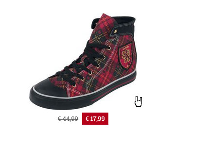
It’s even possible to use custom images if you want to use your own cursors on your website. For example, a German online shop for music merchandise uses their own, themed pointer cursor.
If you examine how they do it via your browser developer tools, you will find the following piece of code:
a {
  cursor: url(../images/hand.cur),pointer;
}
As you can see, you can simply use a custom cursor by providing the address to an image file.
Make Changes to a:focus
Styling for focus is an important accessibility aid, so make sure that it stays around. By default, the highlight happens via the outline property, which makes a box appear around it.
Why outline and not border you ask?
Because outline doesn’t take up space on the page. It sits on top of the element’s background instead. That way, focusing a link does not change the page layout jumps or similar.
So, what other styling options do you have for a focused link?
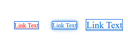
A lot of them. It takes everything from background-color to color, font-size, box-shadow, you name it.
Here’s how to achieve the above:
#link-one:focus {
	color: red;
}

#link-two:focus {
	box-shadow: 0 0 14px 0px;
}

#link-three:focus {
	font-size: 36px;
}
Using a:focus, you can do basically anything you want. One of the most interesting applications, however, might be that you can also simply customize the browser default using the outline property.
a:focus {
	outline: 3px dotted green;
}
Here’s what the above looks like on the page:
Link Buttons and Boxes
Of course, links are not just text links. In some places, they often appear as boxes, such as navigation menus, as parts of forms, or calls to action.
This isn’t too hard to achieve. Basically, you just have to find ways to add space around the link text and provide a background or border/outline in order to have it show up as a button or box. Aside from that, they are still the same link element that we were using before.
There are several ways to achieve this, from simply adding padding to systems like flexbox or grid. Below is just one example how you can do it, there are many more options.
a {
	background-color: #1a0dab;
	color: #fff;
	padding: 1.5rem;
}
In this case, the CSS contains both the styling for the link as well as the container that it resides in. Of course, you can use the same link states as before to include different behavior for different scenarios.
Include Icons in Your Links
A quick thing that deserves explanation is that you also have the possibility to include icons in your links. It’s what some people do in order to make it even clearer that something is an outlink that will take users away from the current page.
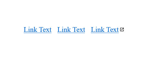
Here’s how to do that. First the HTML:
<a id=link-one href="#">Link Text</a>
<a id=link-two href="#">Link Text</a>
<a id=link-three href="https://wikipedia.org/">Link Text</a>
Then, the CSS:
a[href^="http"] {
	background: url('external-link-icon.png') no-repeat right center;
	background-size: 16px 16px;
	padding-right: 15px;
}
The a[href^="http"] targets only anchor tags that have an address starting with http in the href="". To those, the markup adds a background image, which is the icon, sets it to no-repeat, moves it all the way to the right, and centers it vertically. The rest of the markup defines the icon size and creates a bit of space between it and the text.
Final Thoughts: CSS Styling for Links
Changing the style of links via CSS is not that hard once you have the basics down. The most important part is understanding that they take on different states that are targeted by different operators and pseudo-classes. After that, it’s simply a matter of making use of common CSS properties to change their design to anything you want. You now have all the information you need to get started.
What’s your favorite way to style links via CSS? Any other tips to share? Please do so in the comments!






No Comments