The end of the year is in sight. 2016 has come and gone, and that means it is time to reflect on what this year has brought us. Two major WordPress releases so far with another one scheduled for the beginning of December, ten minor releases, the largest WordCamp to date, hundreds of new plugins and themes, and much more. However, it is not only time for reflection but also for looking ahead. 2017 is right around the corner and promises new developments.
In that vein, we thought it would be a good idea to try and make some predictions about how web design will change in the coming year. Two years ago we published a similar article for 2015 and because design is always changing, we thought it would be a good time to do it again.
So, to get yourself and your WordPress site ready for the next year, we will have a look at coming web design trends 2017 is likely to present to us. Some will sound familiar, many are a natural continuation of things that have been happening for years, yet others have crept up on us.
Ready to look into the crystal ball together? Then let’s get started.
Web Design Trends to Watch Out for in 2017
So, without further ado, here are a few things we can expect in the realm of web design and web development in the upcoming year.
Mobile-first and Responsive Design
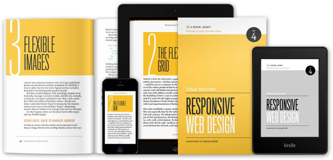
“What?! That’s nothing new!”, I hear you say. And yes, mobile-first and responsive design have been around for a couple years. However, with the way mobile web traffic is exploding, phones and tablets are well on their way to becoming many users’ primary devices.
As they take on a more central role, the established design approach will effectively be turned upside down. Before, designers would usually create the desktop version of a website first (especially to show to clients) and then adapt it for smaller screens.
In the future, this will be exactly the other way around. Web designers will start with the mobile site version and then expand from there. Like mobile devices becoming the primary devices for users, mobile websites are becoming the primary offer for publishers and companies.
A challenge posed by this approach is the need decide on the core content and message. Smaller screens have much less real estate to splurge on and mobile visitors need to get all the important information from the get go. Additional content can then find its way on the screen at larger sizes.
Responsive design has become the go-to approach for designing for different screen sizes. It is by now the de-facto standard and more and more people are jumping on board.
The benefit: You end up with one site that caters to all user groups instead of several websites sites for mobile and desktop visitors. Aside from that, Google is also a big friend of responsive sites and punishes anyone whose website is not mobile friendly.
For that reason, if you are a bit hazy on responsive design, don’t miss out on our primer on responsive design for WordPress as well as how to make any WordPress theme responsive.
You might also want to know that Google also has a new testing tool that can give you in-depth information about the mobile friendliness of any website and how to improve it.
Age-Responsive Design and Failure Mapping

As the name suggests, responsive design is all about adaptability. Yet, adapting to users’ devices is only the first step to cater to their needs. Adapting to the personal needs of the actual person is a much bigger challenge but a trend that is to come in the near future.
Get ready for age-adaptive content and site structure.
Targeting users by demographic markers is already prevalent in online advertising and websites will start doing the same. Not that advertisers always do a great job. My mother recently complained that just because she is turning 60, Facebook is bombarding her with product ads for the elderly.
How can websites adapt to user ages? For example by:
- Changing navigation menus depending on the competency of the visitor
- Adapting font sizes and spacing to increase legibility for those in need
- Changing color schemes for better contrast
Similar things are already visible in web accessibility. For more information, read our article on how to implement accessibility standards in WordPress.
Why does all of this matter? Because in 2017 over half the world’s population will be online, including many novices, children, the elderly, and users with different abilities.
For that reason, another important tool for web designers will be failure mapping, which helps anticipate potential problems of these user groups and provide solutions.
While classic client journey maps are very useful to predict how users interact with a website across their entire usage journey, they often only deal with ideal users and use cases. However, as we have learned, online user groups are getting more diverse and websites need to adapt to these conditions.
Failure mapping allows web designers and developers to better understand, anticipate and model non-ideal scenarios and take appropriate action.
Custom Imagery
When we are outside in the city, my wife and I like to point out this one woman who can be found in a lot of stock photography. She is everywhere. We have found her on the side of trucks and advertising pretty much anything from glasses to fitness clubs. (Just in case you are wondering, this is her.)
Obviously, she is in some of the most used stock images out there, so much that we have started noticing her around, which is a problem. Companies become very interchangeable. An issue that’s also prevalent on the Internet.
Together with the ever-increasing standardization of website design (full-screen image with ghost buttons anyone?) many sites lose their originality and branding. A problem that was also pointed out at WordCamp Berlin 2015.
Thankfully, current developments suggest that this will change in 2017. In order to stand out from the crowd, many brands and companies are now moving toward bespoke design elements. Here’s what can we look forward to.
Illustrations
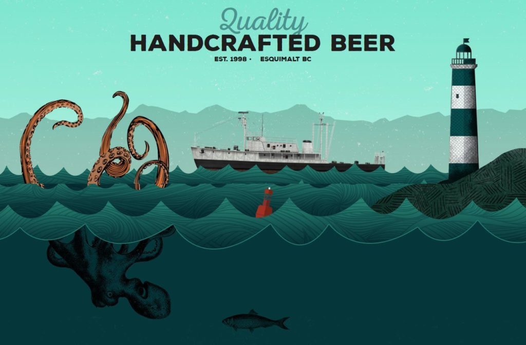
Illustrations are versatile, playful, friendly and can be used in many places. Companies and websites have loads of different style options to deliver a feel of authenticity, personality, and character, which can really help connect with their audience.
Large Typography
Custom imagery doesn’t have to mean images, it can also be web elements used as imagery. A great option for this is typography, something that Google Fonts and other providers have made available for free for the masses (learn how to add Google Fonts to WordPress). Especially with increased screen sizes and easier-to-read fonts, there will be a lot more going on in this direction.
Custom Photography
Photography will, of course, continue playing a role. However, instead of using some other person’s vision, brands and designers will (hopefully) move towards creating their own visuals (or have professionals do it for them). Sure, stock photography will still be a mainstay on the web, but it looks like in 2017 we will see a development in the other direction.
Videos! Videos Everywhere!
Besides still images and photos, moving visuals will also become more important. In fact, Hubspot suggests that in 2018 video consumption will make up almost 80 percent of Internet traffic. This development is already visible in social media and with live streaming services like Periscope and Meerkat.
The advantage of video is that it is able to tell stories and narratives like no other medium. With sound and movement, it can appeal to more senses and evoke stronger emotions that still photography.
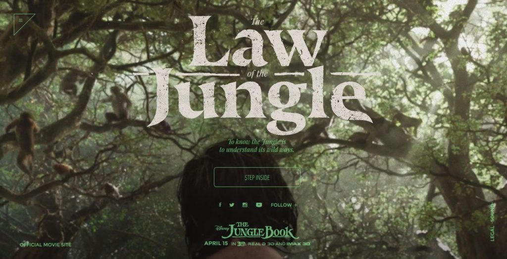
Especially full-screen video headers have become more popular in recent years and continue to do so in 2017. However, one element that I am personally quite excited about is cinemagraphs.

As you can see from the example above, cinemagraphs are a mix of mix of still and moving elements and open up some very exciting possibilities for visuals on your site.
This new type of visual medium is already taking social media channels by storm, but there are also first examples on websites.
Optimized Interstitial Anxiety
Interstitial anxiety is a common phrase among interaction designers (don’t worry if you hadn’t heard it before, neither had I). It refers to the short state of tension a user feels between taking an action and being rewarded with a response.
When it comes to websites, depending on the connection, there can be a delay between the two, triggering a brief moment of anxiety. If that is a repetitive experience with your site or product, it can build up and lead to frustration. However, it doesn’t have to be this way. It’s also possible to use this moment to your advantage by creating clever transitions that make the experience more seamless.
An important keyword here is micro-interactions. These are small, on-screen animations (such as Facebook’s Like button turning blue when you click it) which provide entertaining visual feedback to the users to lead them along on their journey. As browsers are getting more capable of dealing with moving elements, designers can use loading animations, UI transitions, the aforementioned cinemagraphs, and other visuals to keep them entertained.
We already saw a lot of this in 2016 and it will continue as one of the web design trends 2017. However, in the future, we will likely see a move away from JavaScript toward CSS-powered animations which have less technical overhead.
Card and (Unique) Grid Design
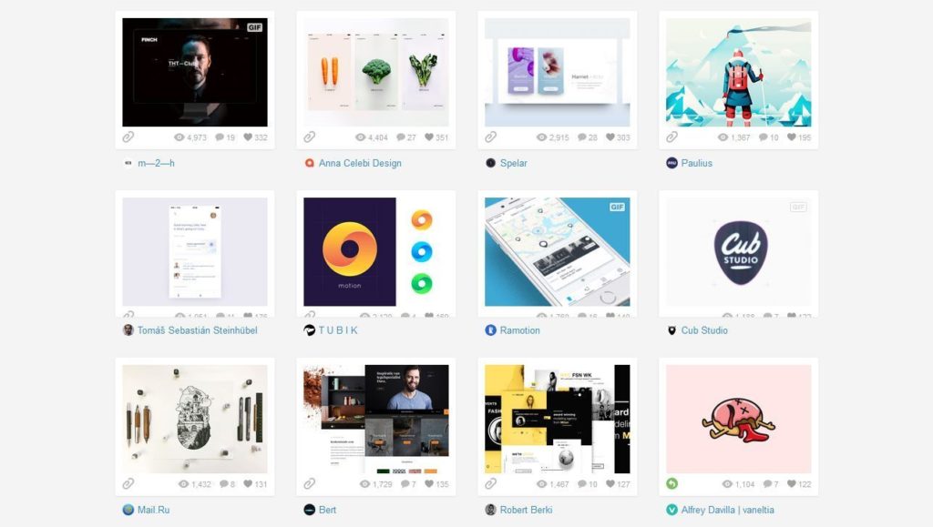
Card-based user interfaces have become more ubiquitous thanks to Pinterest, Facebook, Twitter, Netflix, and Google Material Design (especially their AMP cards).
Cards are a versatile way to divide pieces of content into sections and display large amounts of information in manageable chunks. They are easy to navigate and also work well with mobile-first and responsive design patterns. Therefore, we will be able to see more of them in the following year.
However, at the same time, we can also observe a development in the opposite direction. Designers breaking the standard grid for some stunning new design and layout experiments.
By not adhering to the classic order, websites are able to create more intriguing visuals and open creative possibilities full of layers, depth, and fluidity. If you plan to go down that road, make sure to always keep user friendliness as the focus of your site.
Scrolling Effects and Storytelling
Thanks to the rise of mobile devices, one-page websites were one of the biggest trends in recent years. Packing all the information onto a single page instead of several eliminated the need for clicking, making scrolling the go-to navigation move on the Internet.
This development offers loads of new options for designers to make site navigation more exciting. One of the most famous examples is, of course, Parallax scrolling. However, enough has been said on this topic and I will not go into it again.
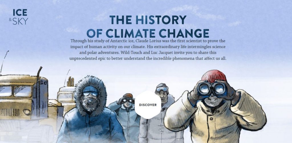
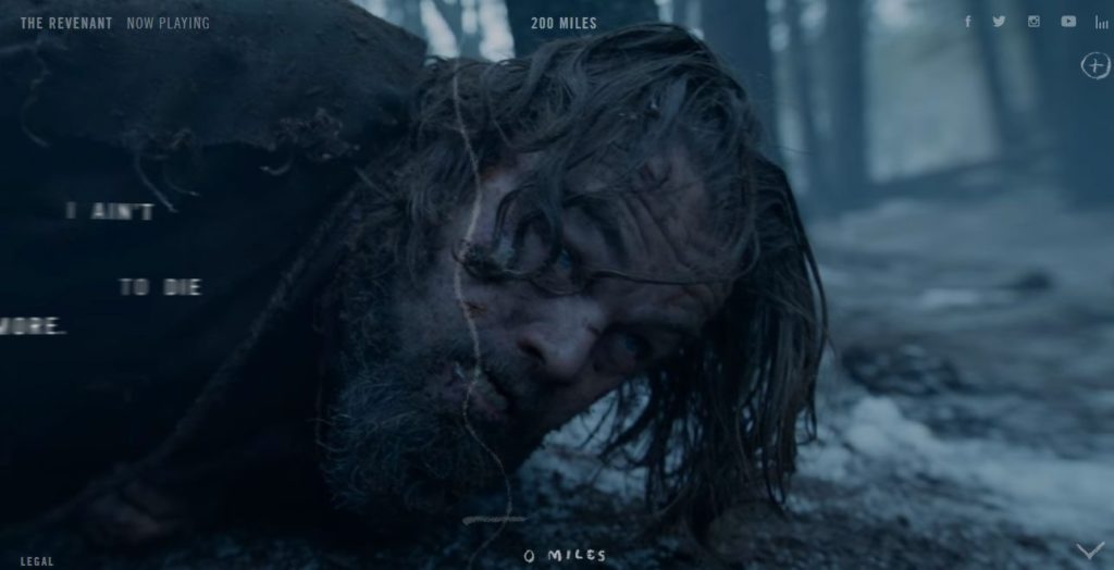
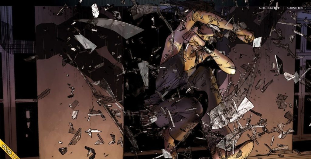
One of the most exciting examples of this trend is visual storytelling that a number of websites are getting into. Especially the graphic novel by Peugeot is a mind-blowing example of this. Apple’s product pages also like to use scrolling effects.
Flat 2.0 and Vivid Colors
In 2013, flat design started spreading like wildfire and began removing superfluous elements from the web. In 2014 it was followed by a rise of Google’s then-new material design and can by now be seen everywhere.
Yet, in 2017 we might see a move away from pure flatness as, frankly, a lot of websites have started looking very similar again. However, overall the Internet is rediscovering depth in the wake of flat design problems and with things like augmented and virtual reality becoming part of the mainstream. For that reason, get ready for more skeumorphic design elements like overlaps, shadows, and the aforementioned cards.
At the same time, we will also see a turn away from the rather bland color palette that came with this design approach as brands are becoming increasingly brave in their use of colors.
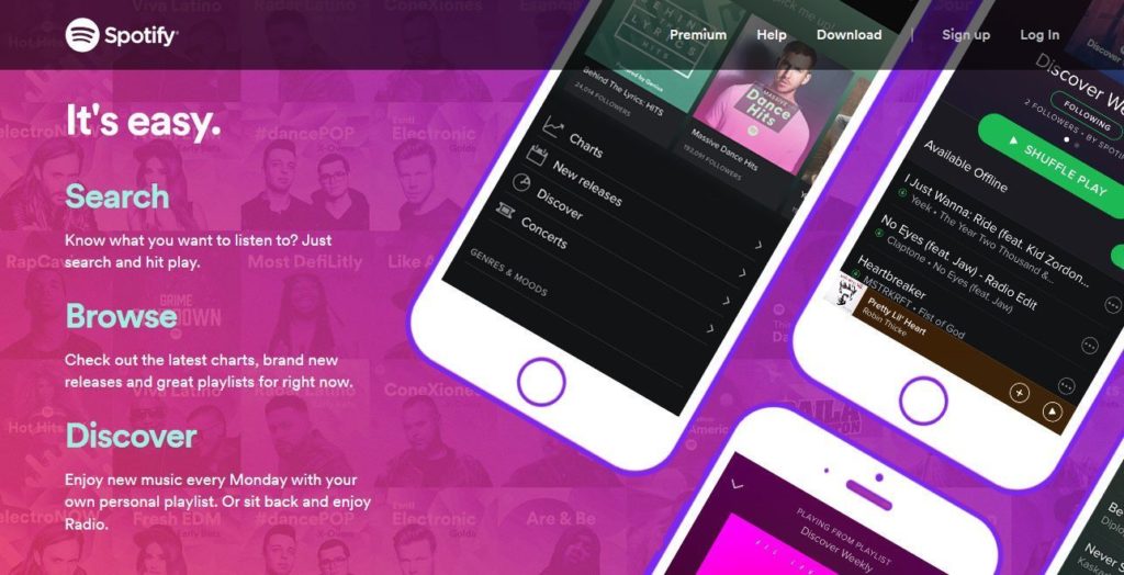
Helped by the fact that modern technology allows for better display of colors, get ready for oversaturation, vibrant hues, gradients and colorful shadows as one of the web design trends 2017. Not just in the color palettes of websites but also other visual media like photos and more.
Other
Apart from the above, here are a few more things we will probably see more of in 2017:
- Virtual Reality — Virtual reality gear is becoming more readily available. Loads of companies are making serious headway in that industry. Naturally, we can expect the web to react to this development. Together with emerging haptic technology, there is some crazy stuff ahead. WordPress.com announced the ability to view VR and 360 content.
- Speed — Fast loading speed, especially for mobile, will continue to be a web design trend in 2017. For some pointers on this topic, read our article on how to speed up WordPress.
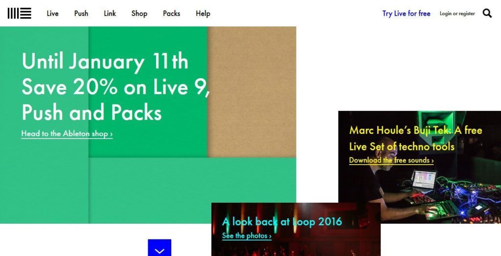
- Centered/Split Content — Changes between full-screen content and split content on the same web page is a good way to address different design needs in one place. Can also be combined with the scrolling effects we talked about earlier. Here is a great example.
- Encryption Everywhere — With high-profile hacks and developments like the free Let’s Encrypt SSL certificate, encryption is no longer just for online shops, banks and other handlers of sensitive information. Soon all websites will be expected to have it. Here’s a tutorial on that very topic.
What Are Your Web Design Trends 2017?
In an organic field like web design and development that is constantly evolving, it’s only natural that trends come and go. With changing technology, possibilities and user needs, nothing ever stays still.
As you can see from the list above, we have loads of new things to look forward to in 2017. The trends mentioned in this article are just a few of the core developments coming out of this year.
It’s also important to point out is that not everything on this list might be relevant to you, your website, or content. Just because they are web design trends, doesn’t mean you have to jump on the bandwagon. You should always decide on what you are working on and your client’s needs and other important factors.
At the same time, it doesn’t hurt to keep the latest developments in mind so you can take advantage of them when it makes sense.
What are your web design trends 2017? What would you like to see more of? What can you do without? Let us know in the comment section below.

19 Comments