You’ve probably seen a sticky header in action before, even on a WordPress site. They follow you as you scroll down the page, making navigating a website quicker and easier. They can even increase engagement by keeping the site menu always a click away.
But despite its popularity, this attractive UX design isn’t built into WordPress by default. Headers will usually stay put at the top of the website. So, how can you make your header sticky?
There are several different methods, from using WordPress blocks over installing a plugin to using code. Let’s cover a few of the best of them as well as best practices for using sticky headers on your site.
What is a Sticky Header?

As its name implies, a header rests at the top of the webpage. It’s usually distinguished by separate colors and a few important links. On this very website, the header contains the logo, links to the most useful pages, and a search bar.

A sticky header is also referred to as a fixed header. It’s the type that remains visible at the top of the screen even as you scroll down – it “sticks”. That means users don’t have to scroll all the way back up to use the navigation menu, search field, or any other elements you have in your header. Sometimes a sticky header will get smaller as you scroll, eliminating all but a few important elements.
You’ll find a good example of a sticky header on Elementor’s homepage, which cleverly blends into the hero image until you scroll down.
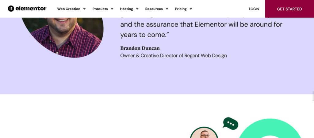
Yoast’s website also features a sticky header. This one is a little more fancy and has a few fun animations.

Why Add a Sticky Header to WordPress?
Sticky headers aren’t just a design choice – though they are visually interesting. They’re also a functional web design tool with a number of benefits.
- Lowered bounce rate and higher visitor retention – When people have navigational links in reach, they may choose to stick around. Conversely, having to scroll all the way to the top of a long webpage could cause them to give up and leave.
- Increased engagement – For similar reasons, you’ll find more people clicking the links in your header. People stay interested and browse longer if you make their life easier.
- Good UX – No one likes a ton of scrolling. A sticky header is simply a good UX choice on longer pages, reducing scroll time to one click rather than several seconds.
- Interesting design – As you can see from the examples above, a sticky header isn’t just useful; it gives you a chance to add cool transition animations and a little more visual interest.
- Better conversion rates – You could place CTA buttons in your sticky header, attracting more clicks since it remains on screen 100% of the time.
4 Ways to Add a Sticky Header to Your Website
Now let’s get into all the ways you can add a sticky header to WordPress. Most of these can be done with no coding knowledge at all, though we’ll also mention how to code a sticky header yourself.
Install a Sticky Header Plugin
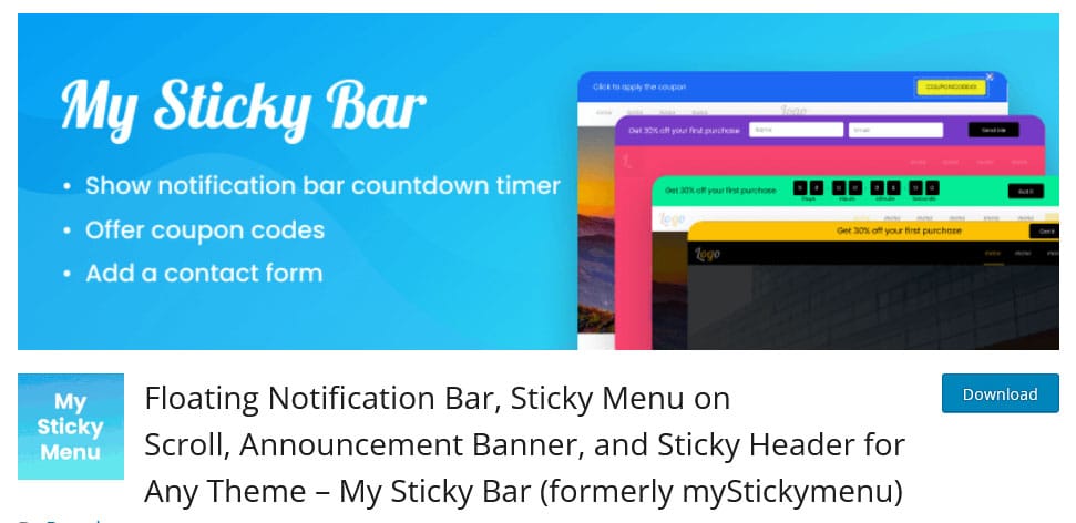
The simplest way to add a sticky header to WordPress is to install a plugin. This will let you make your headers sticky no matter what theme you’re using. Here are a few of the best sticky header plugins.
- My Sticky Bar – The most popular sticky menu plugin comes with a ton of functionality. While creating notification bars is one big draw, you can also make your header, sidebar, or menu sticky too. Some features, like CSS styling or disabling the sticky feature on certain pages, require the pro version.
- Sticky Menu & Sticky Header – Another popular sticky header plugin allows you to make anything on your website sticky – though only one element at a time. This will work perfectly for getting your header to scroll. The pro version of this plugin lets you stick any number of elements and use their visual element picker.
- Elementor – While Elementor is primarily a website builder, it also comes with various design tweaks, effects, and expansions for WordPress. One of these is the ability to make Elementor headers sticky.
- Divi – Similar to Elementor, Divi is a page builder that uses the Divi theme as a base. As part of its many page building features, you can also create a sticky header – or a sticky anything.
Install a Theme with Sticky Header Support
Instead of installing a separate plugin, you could instead download a theme that comes with sticky header functionality built in.
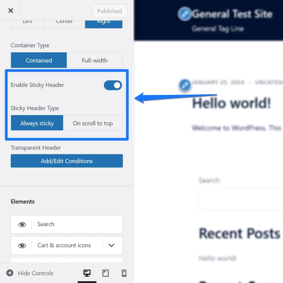
There are tons of themes out there with sticky headers, so you’ll have to go theme hunting. But here are a few themes that do include sticky headers.
- Sydney – Sydney is a well-known freemium WordPress theme tailored towards businesses. It features a clean and ergonomic design, and comes with plenty of design features to tweak, including sticky navigation.
- Online Shop – Just as the name implies, Online Shop is a free theme especially well-suited for ecommerce stores. There’s plenty of dynamic customizability, with a sticky menu and sidebar just one of many options.
- Astra – The immensely popular Astra theme was designed to be customizable, so it’s natural that it would include sticky elements. You’ll need to activate the Sticky Header module.
- Hestia – This beautiful, modern theme is great for business websites and portfolios. Sticky header functionality is built right into the theme.
- Blocksy – The Blocksy theme was made just for Gutenberg, designed to be versatile and fit in with a variety of website concepts. You’ll need the Blocksy Companion plugin to enable sticky headers.
- Delicio – This premium restaurant theme is beautiful and modern, and comes with plenty of design features to tweak, including the topic of this post.
- Felt LT – Felt LT is a beautiful full-screen magazine theme, featuring a modular layout with built-in widgets and a beautiful scrolling header.
Once you have your theme installed, you can generally find extra design settings like sticky header support in Appearance > Customize or Appearance > Editor on your Dashboard.
Use WordPress Blocks
Thanks to new features released in WordPress 6.2, you can now use the Group block to create a sticky header in WordPress without plugins. You’ll find an official tutorial on the Learn WordPress hub. Let’s go through it.
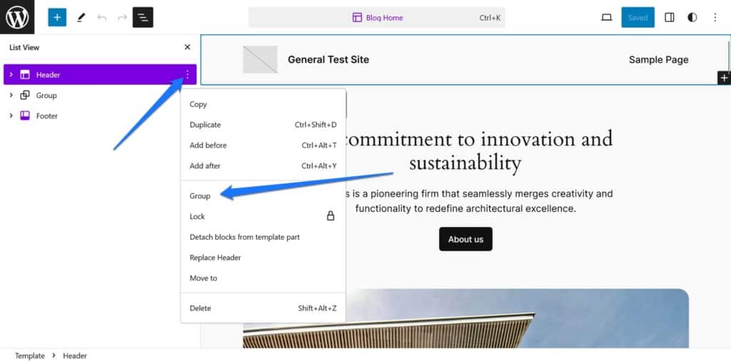
First, go to Appearance > Editor and open the Pages template (or wherever you want the header to appear). Click the three vertical lines to open List View.
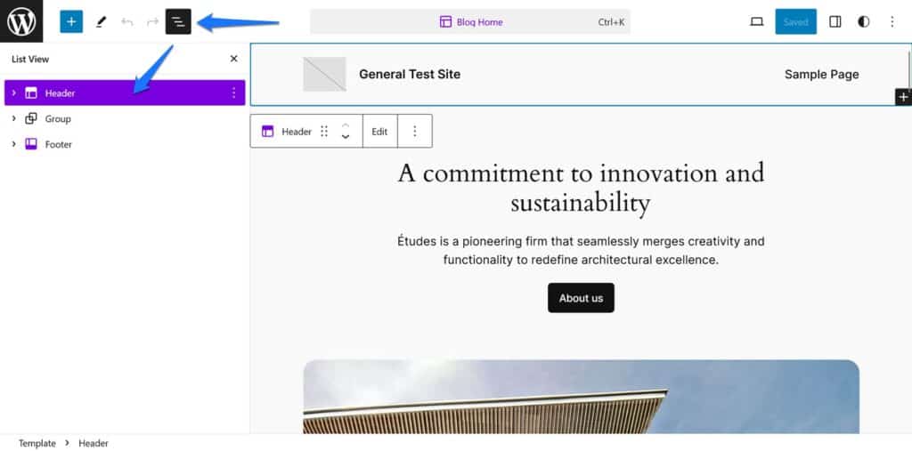
Select the header and click the three vertical dots next to it, then click Group to wrap your header in a group block.
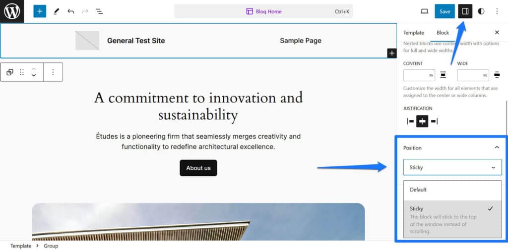
Now click the three vertical dots in the top right corner and open your Settings page. Open the Position tab and select Sticky.
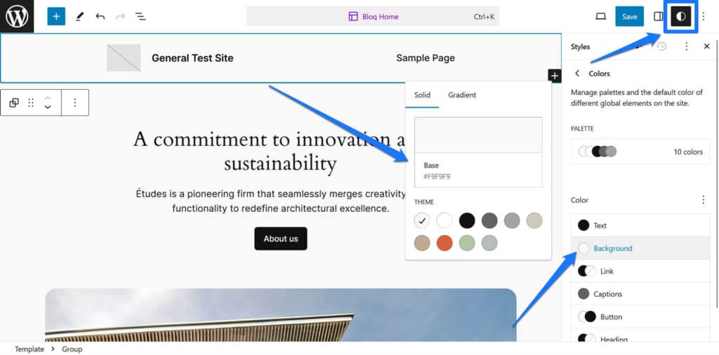
Now click the half moon symbol in the Settings tab and select a background color for your Group block. This is so your design doesn’t look weird if the sticky header is see-through.
With that, you have a simple sticky header, no plugins required! Now start styling your header and making it beautiful.
Code a Sticky Header
Finally, if you have the CSS and Javascript know-how, you can simply code your own sticky header. This requires some basic web development knowledge.
There are two ways to code a sticky header: With CSS and Javascript, or with pure CSS.
For example, theoretically, you can simply create a sticky header by adding the position: fixed; or position: sticky; property to it, like so:
.site-header {
	position: sticky;
}
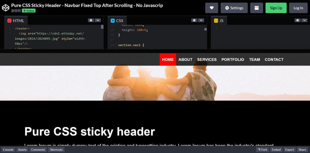
Unfortunately, in reality, it isn’t always that easy. If you want an example of a sticky header purely made with CSS, you can check this one on CodePen.
As mentioned, another possibility is to also use JavaScript. Here, you usually add a CSS class on scroll that provides the stickiness. In the sticky header tutorial on W3Schools, this is the part that adds the class:
// When the user scrolls the page, execute myFunction
window.onscroll = function() {myFunction()};

// Get the header
var header = document.getElementById("myHeader");

// Get the offset position of the navbar
var sticky = header.offsetTop;

// Add the sticky class to the header when you reach its scroll position. Remove "sticky" when you leave the scroll position
function myFunction() {
	if (window.pageYOffset > sticky) {
		header.classList.add("sticky");
	} else {
		header.classList.remove("sticky");
	}
}
And here is the CSS itself:
.sticky {
	position: fixed;
	top: 0;
	width: 100%
}
As you can see, it uses the same position: fixed; property that we already talked about earlier.
So, why would you use JavaScript instead of just pure CSS?
If you have the right skills, JavaScript enables you to add more animations to your sticky header. While there are also CSS animations, they don’t have the same range of possibilities. On the other hand, CSS still works even if visitors have disables Javascript in their browsers. In the end, the decisions is up to you.
And if all this is too much for you, you can always just hire a developer.
6 Sticky Header Best Practices
If you are about to implement a sticky header on your website, we have some design best practices for you to keep in mind. While these are just suggestions, deviating could turn your sticky header into an annoyance rather than a useful tool.
Keep it Simple

When it comes to elements that are permanently on screen, it’s best to keep it as simple as possible.
- Don’t let your sticky header take up a ton of screen space. A large header can cover up too much content and make reading and browsing annoying.
- Avoid overly obtrusive colors and designs. Keep any transition animations quick and subtle. You want to design your sticky header so there’s enough contrast that visitors can easily see it, but not so much that it’s actively distracting.
- Don’t clutter your header with too many menu items and links. Use only the most valuable ones. Use clear and descriptive labels.
- Reduce space by making use of icons, such as by having the search bar turn into a magnifying glass. This is especially helpful when optimizing for smaller screens.
Even if your website’s header is large, uses bright colors, or has a lot of links by default, you can always configure it so it simplifies and gets smaller on scroll.
Make it Responsive
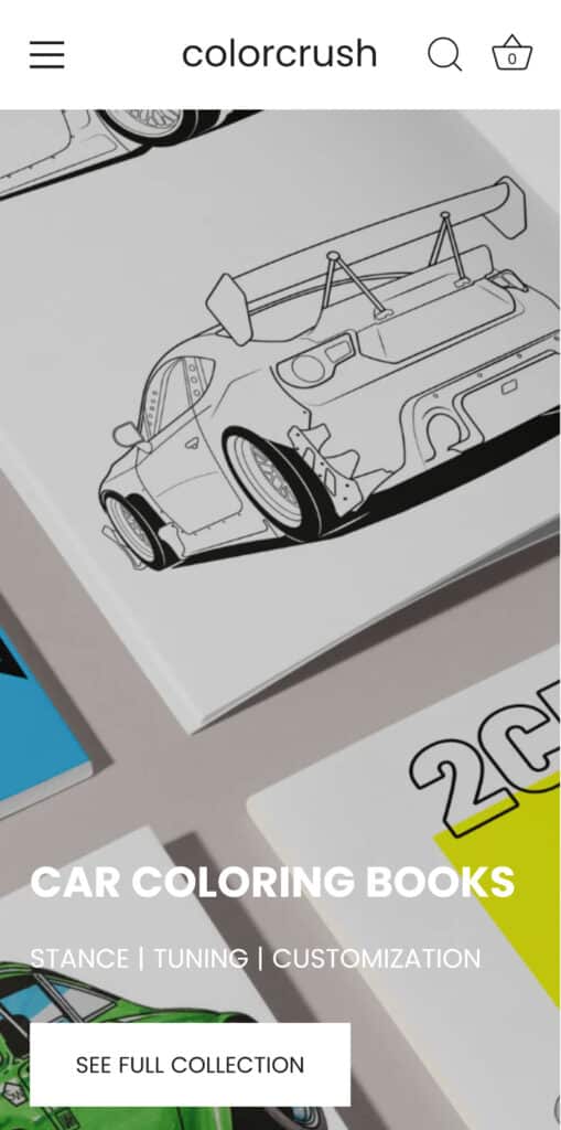
Don’t forget about small screens and mobile devices when creating a sticky header. When building your header, plan on a responsive design from the start.
- Make the menu get simpler and simpler as screen sizes get smaller. Remove less important links, reduce image/logo size, and turn text into icons.
- Reduce the header’s vertical space, as there’s little screen real estate to work with.
- Consider adding a single menu icon that pops out into a full navigation list.
- Make sure any elements are large enough to be easily tapped on mobile screens.
Add Animations
A little animation goes a long way in web design. Even subtle movement can make your sticky header seem so much more elegant.
- Add a small transition animation when users scroll down or back to the top.
- Especially on mobile, consider collapsing the menu and having it slide back on-screen when users scroll up.
- Consider making your sticky header transparent, appearing when users hover the top of the screen.
Ensure Accessibility
Sticky headers can unfortunately introduce accessibility issues if implemented improperly. Keep these tips in mind.
- Make sure your header works with assistive devices like screen readers. Provide ARIA attributes where necessary.
- Ensure sticky header animations don’t break keyboard navigation. Users should be able to navigate the menu using the tab key, and not have their browsing disrupted.
- Design the header so it has enough contrast that visually impaired visitors can read it.
- Use clear and readable fonts rather than decorative ones.
Tailor it to Your Brand
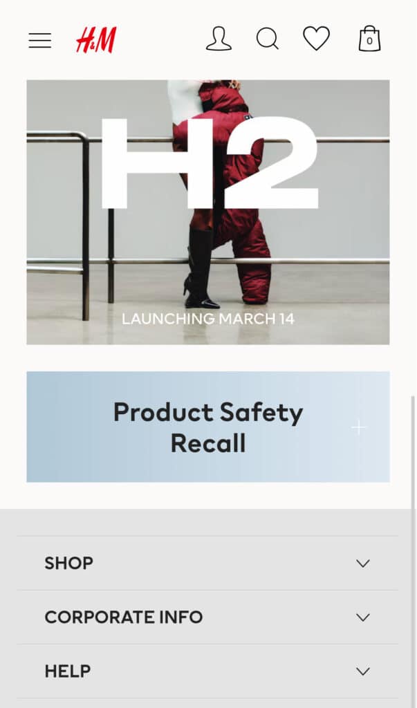
Your sticky header should look good on your website and fit in perfectly with its design. It’s also a chance to highlight your brand.
- Incorporate your logo. It can double as a link to your homepage.
- Use your brand colors in the background, text, and/or icons.
- Design your header so it blends in well with the rest of your website, rather than looking out of place.
Test it Out
Finally, always rigorously test your sticky header – and any other design choices on your website – to ensure it works well and is liked by users.
- Ensure that the header works properly on all devices and screen sizes. Test every responsive break point.
- Make sure it works on all commonly used browsers.
- Test out the various animations and make sure none of them break. See how it interacts with other elements like drop-down menus, rotating a mobile device, etc.
- Implement A/B testing to see what menu layout influences visitors to stick around or interact.
Final Thoughts: Better UX with Sticky Headers
Sticky headers are a small web design element that can really spice up your website and make things a lot more convenient for your users.
Whether you install a theme, add a plugin, or make the header yourself, make sure to keep our suggested best practices in mind. This will keep your sticky header beautiful, useful, and accessible to all users.
Which method did you use to add a sticky header to your website? Let us know in the comments!

No Comments